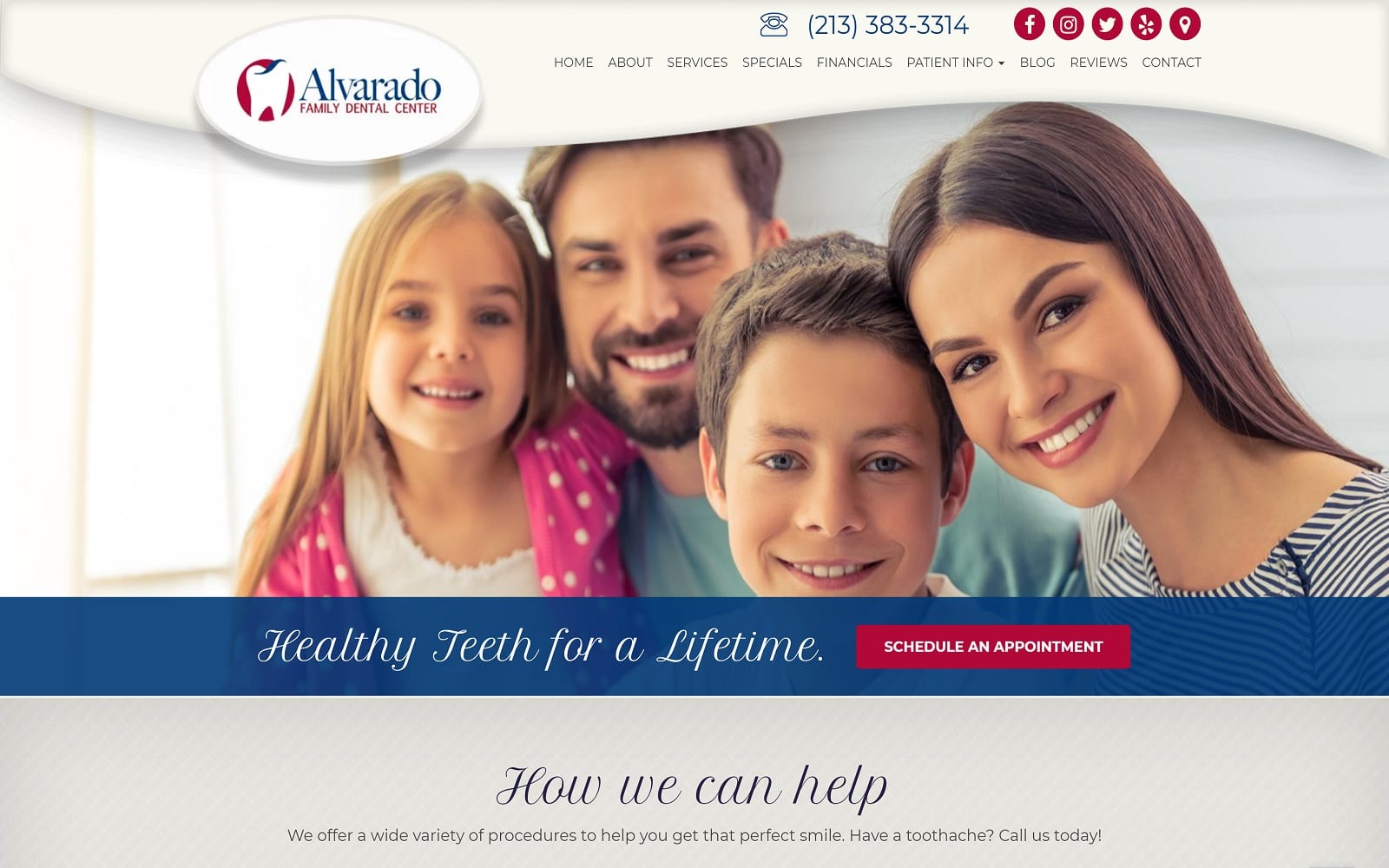
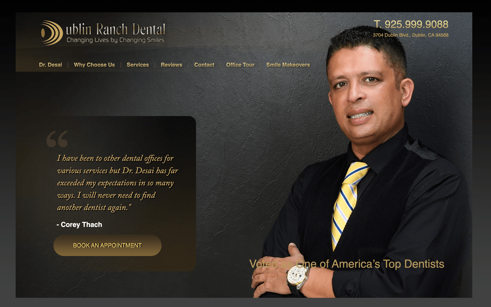
A welcoming family practice that opens with friendly, happy faces can be a great way to introduce new patients to your practice. Here you find a reliable, all-American color scheme that combined with a playful font to create a scheme that welcomes your visitors and makes them feel right at home. One of the most attractive parts of this dental website’s design is its understated yet modern style. The smiles on the patients on the opening page aren’t overdone, the photo of the staff isn’t over the top, everything indicates a relaxed, low-pressure office visit.
Overview Of The Design
Families are busy, and this website recognizes that by presenting all your appointment setting options at the top. Phone number, schedule an appointment button, even links to the office’s social media accounts can all be found there at the top, ready to put the visitor on their path to excellent dental care. Additional information is available as you scroll down, expanding on the links present at the top, so the inquisitive visitor will be easily directed to gaining more information on procedures and practices that can benefit their family.
Use Of Colors
The color scheme of this page is decidedly targeting a down-home, all-American feel. From the traditional reds and blues to the not quite white theme found throughout. This color scheme goes beyond a simple patriotic vibe; it mirrors the colors of middle America associated with affluence and comfort. The beige tones of khaki, the blue of denim, even some of the subtle patterning of the darker hues speaks of corduroy and herringbone. Overall the scheme is comfortable and welcoming and targeted at a middle-class sort of clientele.
When designing any website, it is important that the images clearly resonate with your target audience. Watch this YouTube video to learn how to use images on your website to increase audience engagement.
Analysis Of Design Elements
The overall design of this website combines two elements. One is to appeal to the traditional family; the other is to provide immediate and convenient access to all their services without any scrolling or clicking necessary. Additional information is available for those who wish to spend the time, but quick and convenient are inherent in the design.
Marketing Aspect
Convenience and accessibility are foremost in the design of this website, in addition to aiming at well-established middle-class families. Making a lasting first impression is important. The appeal of this site is a comfortable and recognizable environment that targets the community the visitor is a part of. Additionally, the visitors will be welcomed by a well-appointed staff that represents a relatively diverse background, reassuring them that the office is accustomed to dealing with the local community.
The Image this Website Reflects
Traditional values are clearly represented by this site as well as a familiarity with the concerns of its target audience. The warmth of the website also promises a comforting and welcoming atmosphere that will respect your time while valuing your family and the business they bring. The office that uses a website with this type of design is wanting to indicate a relaxed and laid-back air that never-the-less is steeped in professionalism. This is an excellent design foundation for companies in an area that either has a relaxed atmosphere or are competing with high-pressure regions by offering a low-key environment for the family on the go.
Alvarado Family Dental Center Designed by Optimized360


