Dr. Alexey Markelov came to us looking for a website that represented the joy that his patients feel after seeing results that bring out the beauty they’ve always felt inside. We started with light blues and natural vistas to represent the sense of freedom that results from the erasure of blemishes that have served as a weight around our self-confidence. Throughout the design, we worked with Dr. Markelov to support his ambitions.
Overview Of The Design
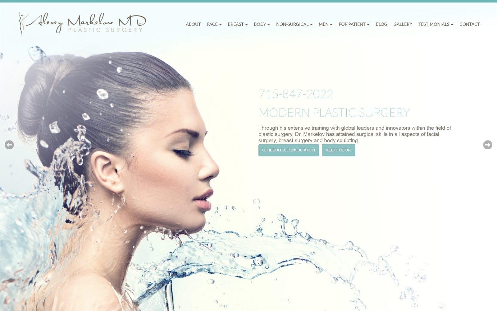
The website design flows smoothly from opening view through each individual page for the procedures, with the layout giving an open and airy design that is welcoming and uplifting. The overall design of the logo continues this theme, with gracefully flowing lines that impart a sense of playfulness that serves to brighten the personality.
To learn more about web design basics, here is a short 3 minute YouTube video to get you started.
Use Of Colors
The blue tones in the website are prevalent, bringing a sense of calm and purity to the site and blend with the white hues in a way that establishes confidence, authority, and professionalism. Throughout the site, color balance is used extensively to help encourage the visitor and help them see themselves in the happiness and confidence that Dr. Markelov’s procedures can bring them.
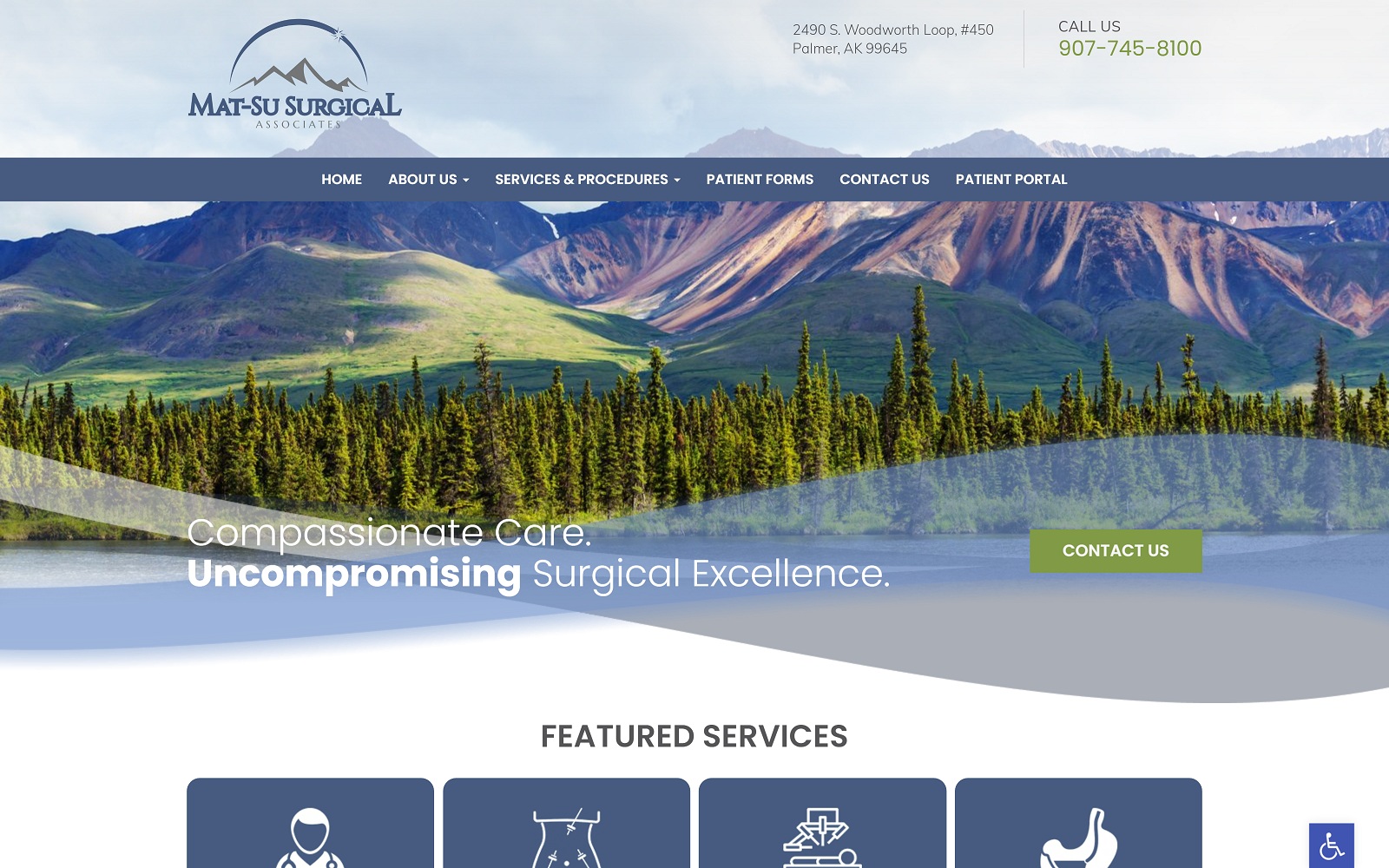
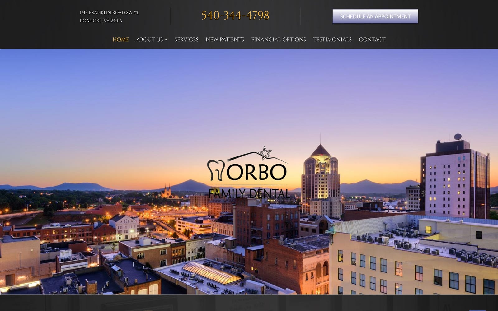
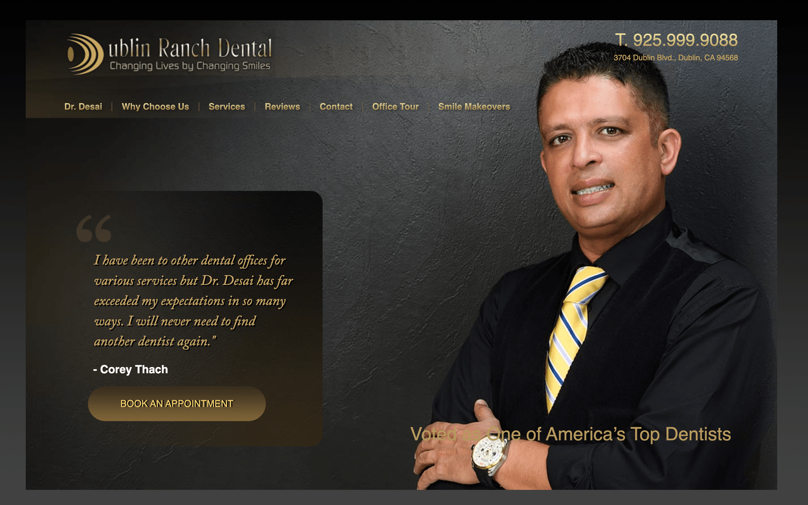
Here are some other examples of websites Optimized360 has successfully delivered to their clients that implement a blue color scheme:
Eden Cosmetic Surgery
Analysis Of Design Elements
The website’s design starts with bright pictures of confident people at play in beautiful surroundings, a combination of elements that serve to begin stimulating the visitor’s imagination. From those opening images, they’re swept into a process of seeing themselves as the recipient of these procedures, and those methods being the gateway to the freedom and confidence they feel is lacking in their life due to their blemishes. Behind each of the section, headers is a larger, lighter version of the header itself, an aesthetic choice that suggests bigger things held within.
Marketing Aspect
From the opening image to those that follow the primary marketing element within this website are pictures. These images are there to help the visitor dream of themselves after the treatments provided by the plastic surgeon, and encourage them to look deeper and see what the office has to offer. Contact information is available throughout the site, beckoning the viewer to make that call, set up that appointment, start on the road to their final destination. Throughout, however, the weight of the marketing is subtle. This kind of approach works well when visitors are looking for hope, and they don’t want to feel like they’re getting a hard sell.
The Image this Website Reflects
Youthful playfulness, beauty, and hope are the promises being made by this site from the first sight. Throughout there are hints of a better life visiting beautiful places with friends, love, and happiness with that perfect someone, and rejuvenation of joy. The plastic surgeon takes a secondary role in the page, only being introduced to the viewer once they’ve already been dreaming and are ready to meet the professional who will help them achieve their goals. Presenting a cosmetic surgery practice is all about presenting a dream to the visitor and making it happen, something this design does quite well.
Alexey Markelov Plastic Surgery Website Designed by Optimized360


