It’s no secret that when dealing with cosmetics, creating a website aesthetic that is sleek and classy is a must. Aesthetic2u specializes in mobile cosmetics, which means that their practice is constantly moving. This meant that when designing the project, all the call-to-actions, and sections on every web page had to serve a purpose. When visiting any website that is selling an upscale service, you have to present yourself as professional, modern, and informed with the latest trends in technology. We truly believe that we did just that with this cosmetic website.
Overview of the Design
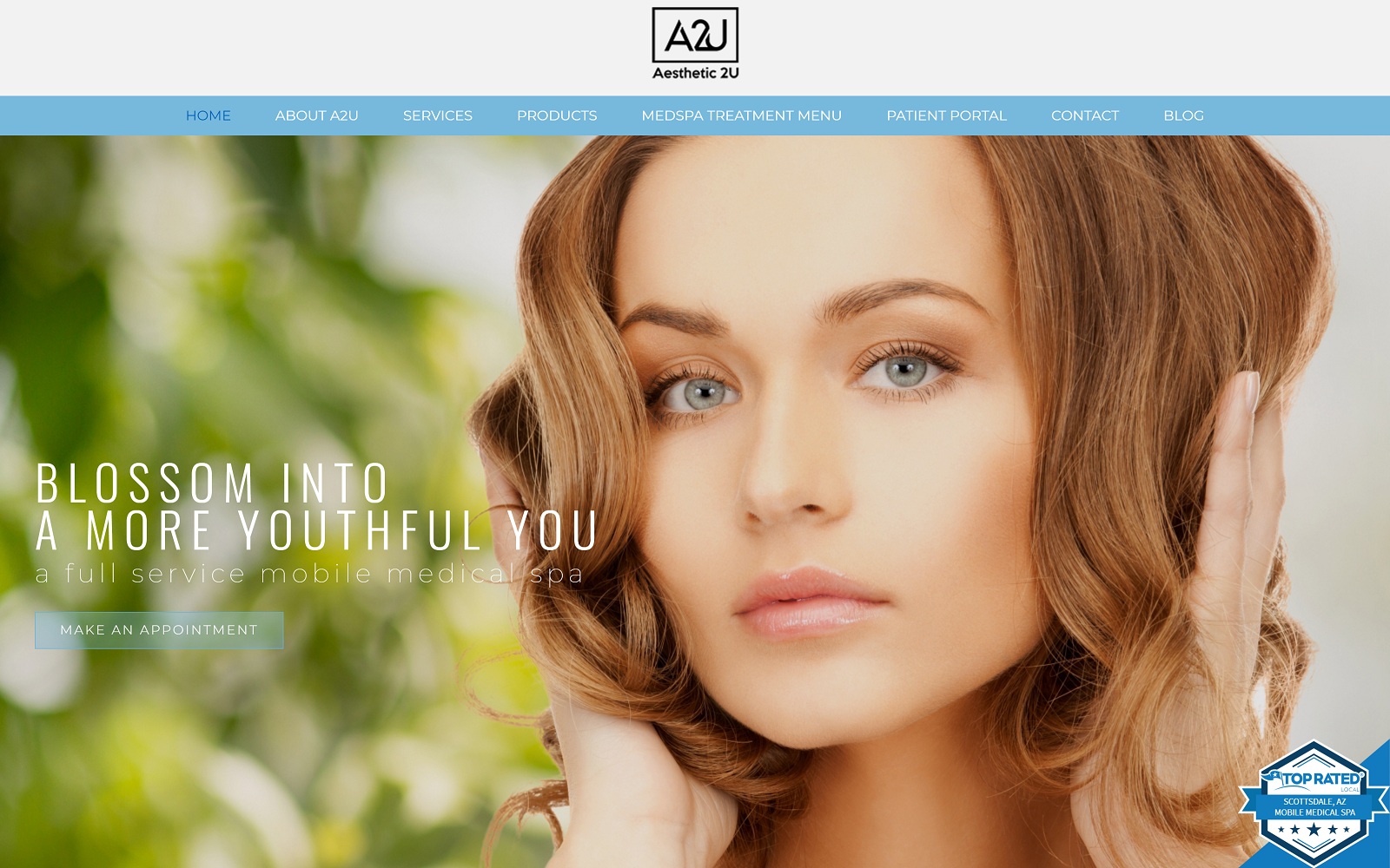
When visitors first visit the site, they are taken to a landing page that uses an immediate call to action right out the gate. When visitors hit the homepage, they are pleasantly greeted with a hero image the displays luxury and the possible results with cosmetic work. The homepage of any website should serve as a practice overview. Underneath the contact form strategically placed near the top of the homepage, visitors are treated to the different services offered by the mobile practice. We integrated parallax effects to add an additional layer of style.
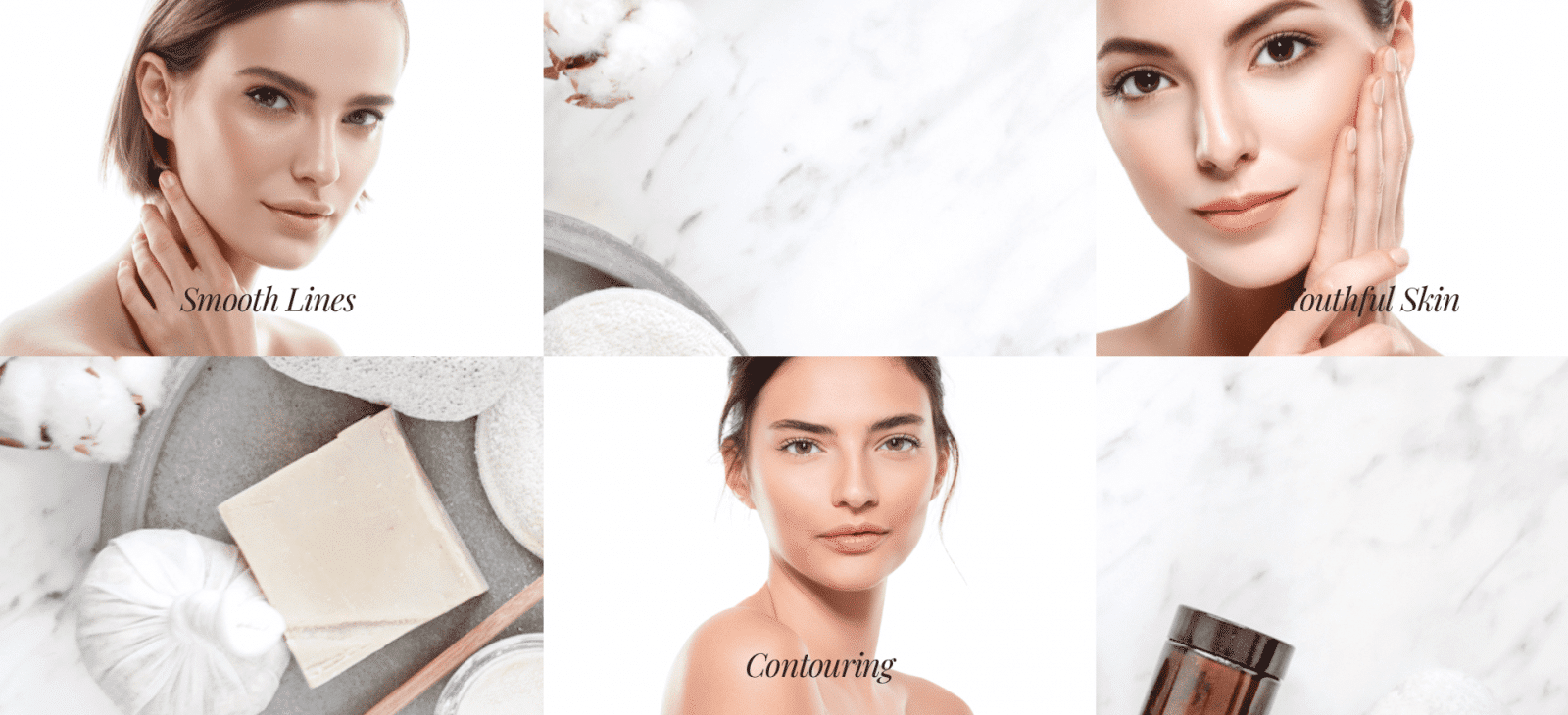
The inner pages take a different approach – balancing a square, boxed layout with class and elegance. We implemented different textures and design to ensure that the overall aesthetic would not be lost past the homepage. We also made sure that there were optimal space and legible text throughout the design to help patients get the information they wanted in a timely manner.
Use of Colors
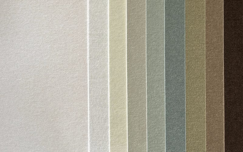
Throughout the website, we used different earth tones to compliment and balance out the white background. We primarily used a mix of beige, blue, green, and a hint of yellow on the inner pages for different sections to add diversity. On the homepage, we used the actual skin tone on the models to add texture and flavor.
Call-to-actions and buttons are labeled in blue to provide a sense of soothing and calm. No one wants to feel rushed or overwhelmed, especially not when dealing with botox or injections. We felt that blue was the perfect color to implement with our design to ensure that patients would feel safe and secure for the ride.
Design Elements
When it comes to designing any website, special effects can certainly be overdone. Sometimes less is more – we felt that way for Aesthetic2U. As a mobile practice, we decided to skip all the motion effects and entrance animations. Patients are always on the road, just like the practice. We kept the design straightforward and simple while adding different textures to keep the overall aesthetic appeal. We implemented subtle hovering effects where applicable and made sure that the information on the web page was not compromised by an overly-flashy design.
Marketing Aspect
Great, you have a modern website that is classy and elegant. Now what? Websites need to not only be modern and professional, but marketable as well. Throughout the website, there are contact forms to allow patients to ask about their questions and concerns. We also placed a contact form along with additional practice information on the bottom of every webpage. The practice also had a patient portal; we made sure to highlight this feature on our navigation menu.
The menu tab, in particular, is a great example of marketing done right. With featured services and pricing involved, we made sure that our design team added some flair to the page by adding box shadows and marble background. Appearance is half the sale – especially in cosmetic practices where patients are extremely visual and picky.
Image the Website Reflects
This website is the perfect balance of visual elegance along with being informative and welcoming. The earth tones throughout the website ensure that patients do not feel “less” about themselves, or not wealthy enough to have cosmetic work done. The web pages are engaging and urge visitors to make a call to their mobile practice. All in all, Aesthetic2U played their cards perfectly in crafting a website that would attract any and all site visitors.
