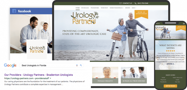
If you run a pharmacy, your website is one of the most important digital assets you have. A well-designed pharmacy site can be a total game-changer for your business. But what exactly makes for an effective pharmacy website design?
As a long-time pharmacy web developer, I’ve seen first-hand the difference a thoughtful website can make. A site with a clean layout, seamless functionality and strong user experience ultimately drives better patient satisfaction, increases script counts and revenue, and establishes your pharmacy as a modern digital leader.

So what are some pharmacy website design best practices? Here are my top tips:
- Make it mobile-friendly – Today’s patients access the web on their phones constantly. If your site doesn’t adapt to smaller screens, you’ll frustrate customers and lose business. Responsive mobile design is a must.
- Spotlight your services – Don’t make patients hunt for the services you offer. Prominently feature prescription management, immunizations, compounding, delivery, etc so visitors immediately see your value.
- Prioritize easy refills – Refilling medication is likely the #1 task for repeat pharmacy visitors. Make it simple for patients to request refills online. The fewer clicks the better.
- Design an intuitive site navigation – Eliminate clutter and organize site menus logically so customers can instantly find what they need. Group content and calls-to-action intuitively.
- Be accessible to all – Ensure your site follows ADA web accessibility guidelines through alt text, color contrast, headings structure, ARIA labels and more so patients with disabilities can navigate your site.
- Highlight ways to save money – Providing Rx discount programs or ways to lower prescription costs shows customers you’re looking out for their wallet. Promote these affordability resources upfront.
- Share health education content – Blog posts, videos and infographics about medication use, chronic conditions, preventive care and other health topics show your pharmacy offers meaningful guidance.
- Enable easy prescription transfers – Make it straightforward for new patients to transfer existing prescriptions to your pharmacy right from your website.
Investing in a thoughtfully designed pharmacy website generates tremendous value. If you apply these pharmacy website design tips, you’ll be rewarded with more loyal, satisfied patients and much stronger business performance.
The services provided by pharmacies cover ground as diverse as the communities to which they dedicate themselves to. While pharmacies are best known for merely being a place to fill your prescription, they are often so much more. They can serve as a community touchpoint, provide much-needed advice, and be the source of life-saving vaccines. Out of these elements comes the need for a pharmacy’s website to be distinctive, conveying its culture and role in its community. Each of the following websites accomplishes this goal in unique and effective ways.
1. The Williamsburg Drug Company
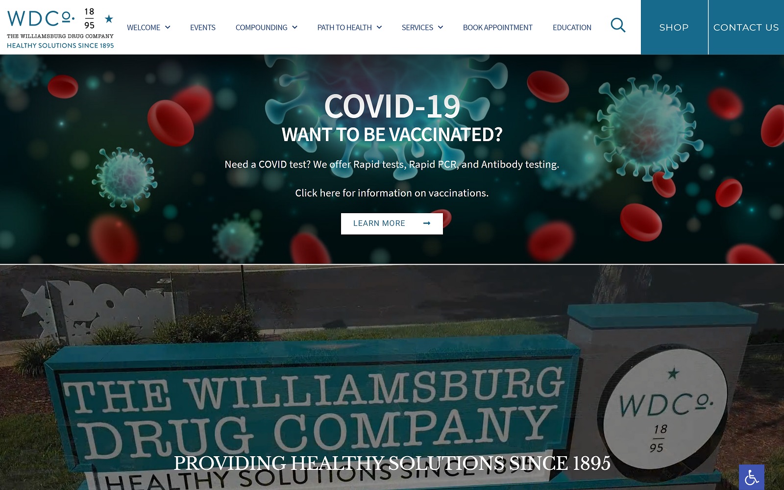
What We Love About This Pharmacy Website: Williamsburg Drug Company has been a part of its community for over a century. Through this time, it has become a cornerstone of its community and needed a website that continued this tradition. Their website provides essential services, from information on living healthy to critical educational materials. The video on the home page sits center stage, presenting the comforting and familiar site of the pharmacy serving its community. This website does an excellent job of showing how a business with over a century of history continues to remain modern and relevant.
2. WIRX Pharmacy

What We Love About This Pharmacy Website Design: Simplicity is key to this site’s design. On landing, you’re presented with a clean presentation providing only essential information and navigation points. However, you’re also introduced to one part of the pharmacy’s culture. The smiling face of a pharmacist clearly indicates the importance of relationships to their business model. They aren’t just serving the community; they’re a part of it. They also present their special focus on work-related injuries and a program for serving injured workers. Easy to navigate, a clean layout, and a smiling face make this design top the list.
7 Modern Ophthalmology Websites
3. North Fulton Compounding Pharmacy

What We Love About This Pharmacy Website Design: We often trust our families to the expertise of our pharmacists and the services they provide. Whether you’re getting the latest flu vaccine or picking up cough medicine for an ailing child, your pharmacist should feel like part of your family. The North Fulton Compounding Pharmacy makes the family the focus of their landing page. The powder green color scheme combines whites and blues to create a calming and welcoming experience. Quickly accessible contact information, pharmacy refill options, and even a convenient mobile app show they’re ready to keep pace with your family’s needs. A perfect blend of attractive design and full-featured functionality makes this an important addition to our list.
Why say no to a website template for your pharmacy?
4. AndroGenX

What We Love About This Pharmacy Website Design: Some pharmacies provide very specialized services, such as the case with AndroGenX. This website focuses on promoting men and their partners experiencing the benefits of their services. They provide extensive support for their specific clientele in the form of information, reviews, a vitamin store, and patient resources. Online scheduling helps to avoid embarrassment, and accessibility options mean they can accommodate any patient.
7 Great Pain Management Websites
5. DrugMart
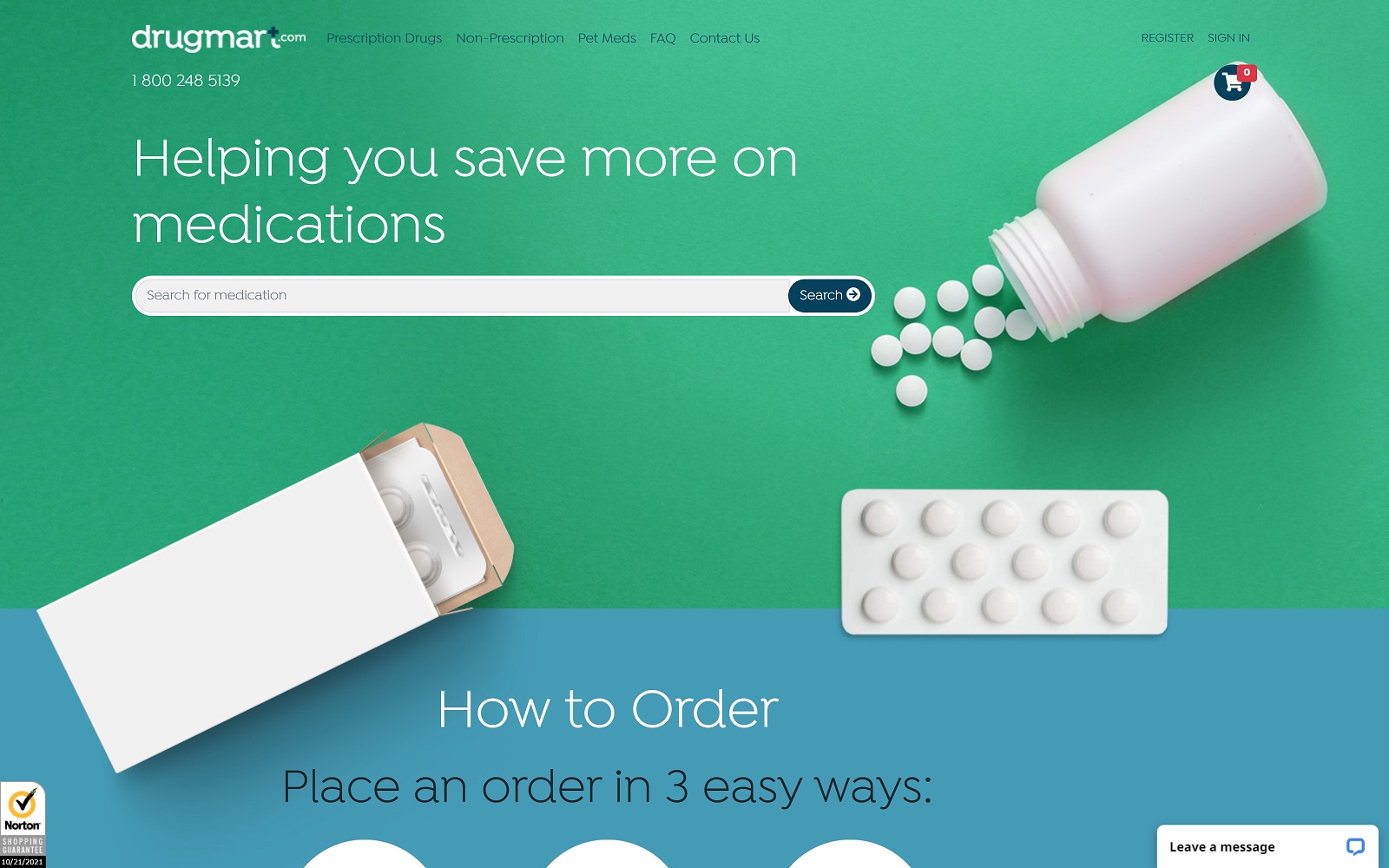
What We Love About This Pharmacy Website Design: It’s clear from its design that DrugMart was in the market for a clean and no-nonsense website. Visiting their site gets you straight into looking at what products they can offer and convenient ways to obtain them. While some pharmacies are hyper-specialized, like AndroGenX, DrugMart covers many clients. From standard human patients to their pets, DrugMart carries medication for everyone. Their focus is on expediency and convenience, even offering an auto-refill program to ensure you receive your medication on a regular basis. The light green and white color palette provides a welcoming environment.
6. Advantages Pharmacy
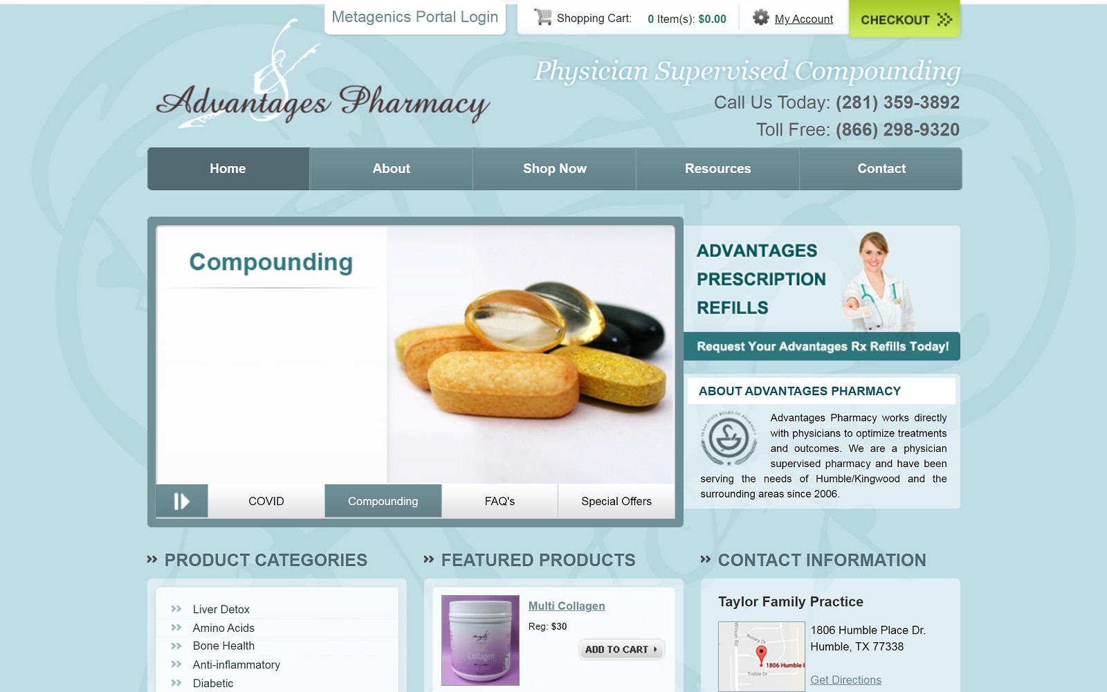
What We Love About This Pharmacy Website Design: Advantages Pharmacy’s website is lightweight and basic but packed with function and information. Its focus is on the products it provides and getting them to its patients. As part of a small-town family pharmacy, this website is a reflection of its customer base. In spite of its lightweight design, this site includes an online store that allows customers to quickly and easily get their pharmaceutical needs met without leaving the house. This kind of functionality has gone from being an extra service to a core principle in the post-pandemic website business.
7. Central Drugs Compounding Pharmacy
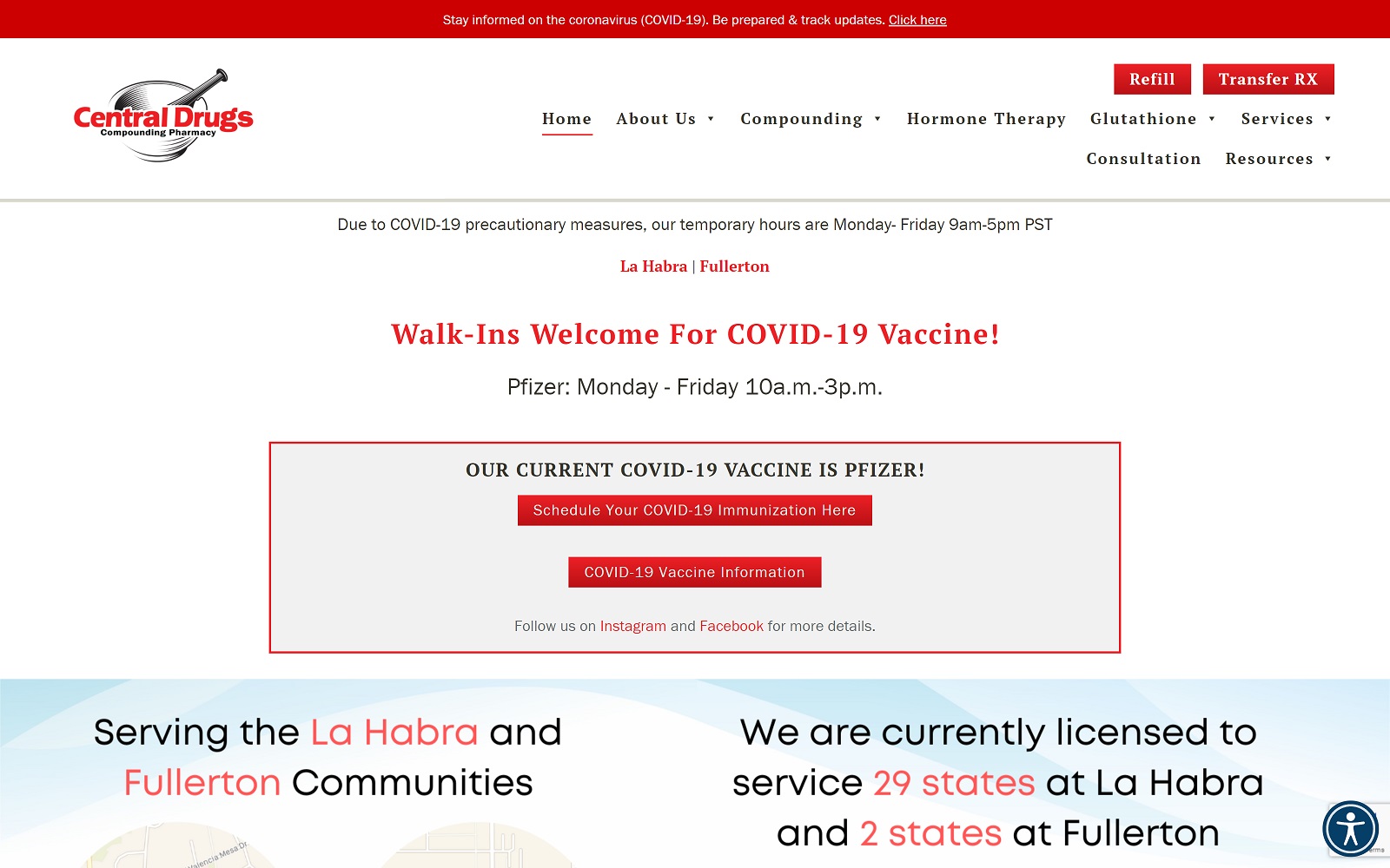
What We Love About This Pharmacy Website Design: Central Drugs Compounding Pharmacy’s website does an excellent job of providing comprehensive functionality along with straightforward web design. Red and white are common colors associated with the medical industry and show the sense of urgency the facility has for handling customer concerns. There’s an abundance of functions here, with online refill options, easy prescription transfer, and information about services offered by the clinic. Minimalism has its place in website design, and this is one example that clearly demonstrates that fact.
TOP PHARMACY WEBSITES OF 2022
1. Dyer Drugstore
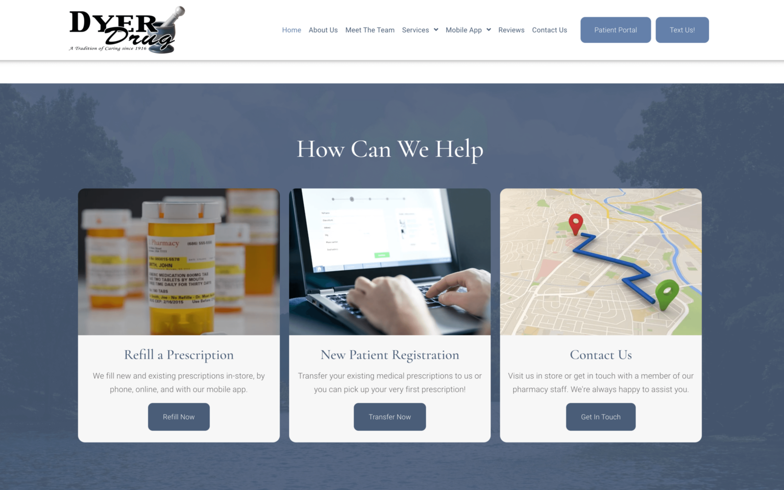
What we like about this design is the nostalgic feel of the design that you don’t see these days anymore.
2. Coastal Biotech
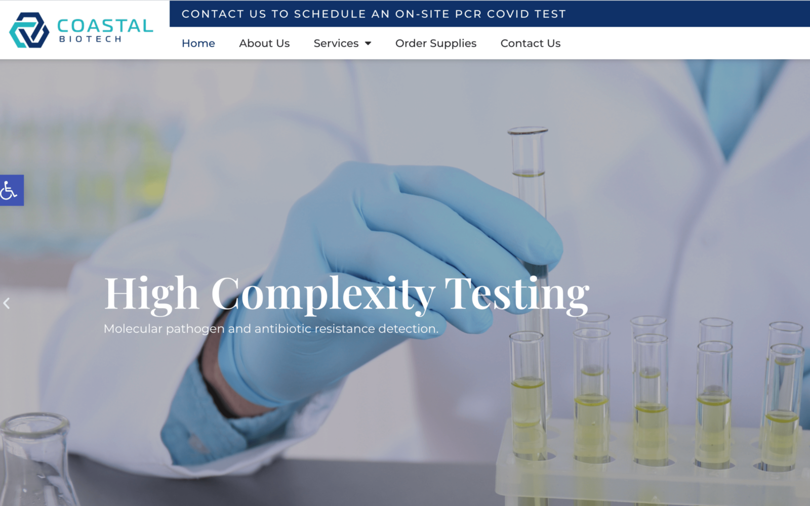
What we like about this design is the accurate reflection of a pharmaceutical company through the appropriate use of imagery and colors.
What Your Pharmacy Website Needs To Serve Your Customers
One point we’ve emphasized is how important it is for a pharmacy to know its customer base and its place in its community. Pharmacies come in every shape and size, with specialties ranging from general to highly specific. However, they are some basic points that every pharmacy needs to keep in mind when designing its website:
- Community Appeal – Know your audience, and present your website accordingly. If you serve a specific region or community, let that be reflected in your design. This includes both in terms of language, imagery, and references to local concerns.
- Functionality – Your website is there to do more than advertise your pharmacy and its services. Providing options such as online refills, and online stores for non-prescription products provide time-saving options for your patients. Consider adding click-to-drive and click-to-call links to your site to make reaching you easy.
- Education – Learning about staying healthy can be challenging. As an authority on health topics, it just makes sense for you to maintain a catalog of information about common concerns. Topics covered can range from national and global ones, such as COVID-19, or more local concerns.
These are just three important aspects of website design for your pharmacy. If you want the guidance of a professional, consider reaching out to Optimized360 for a consultation.
