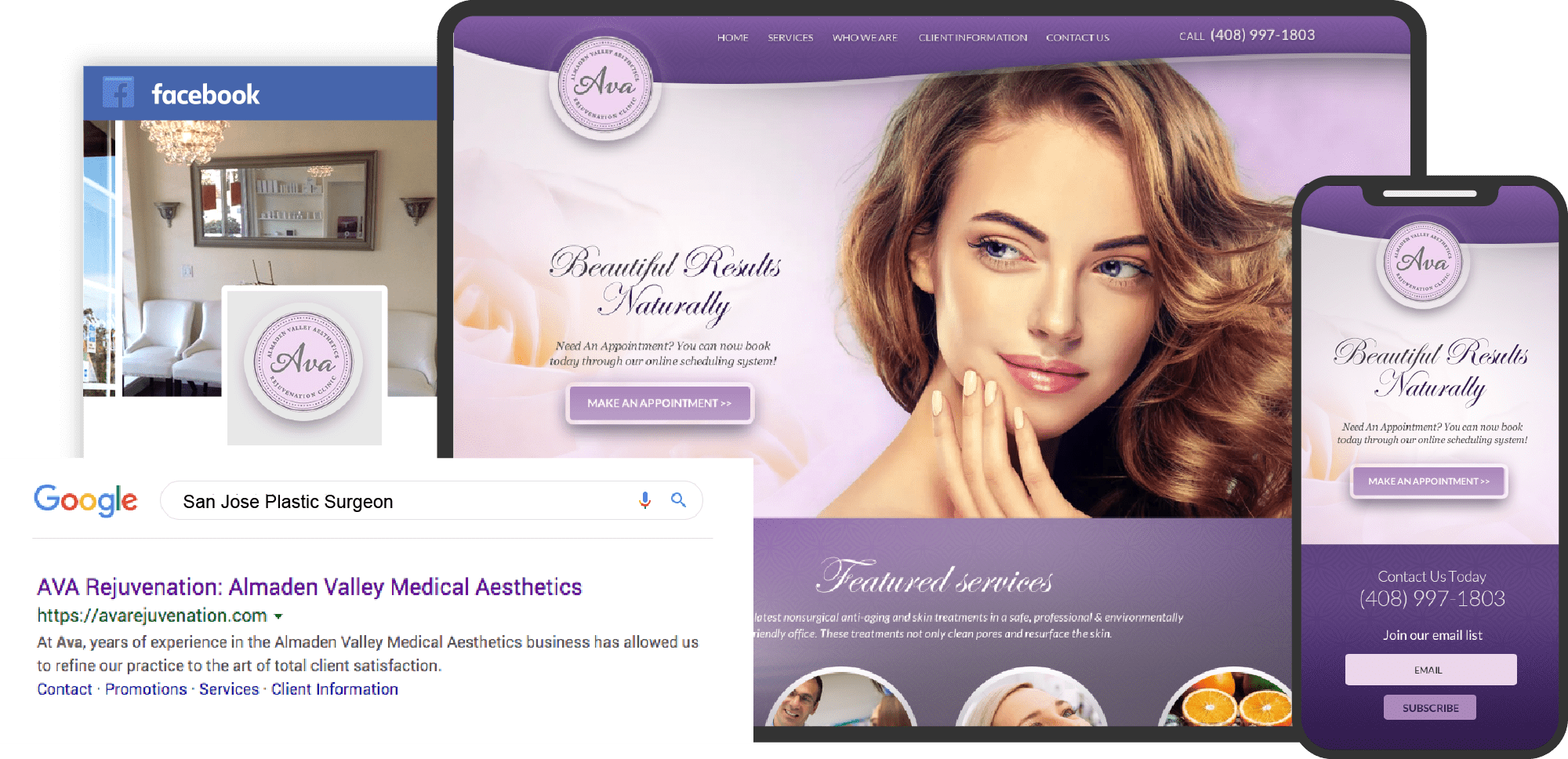
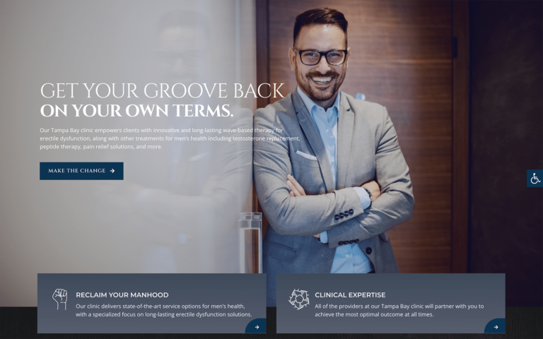
Plastic surgery is a booming business, and standing out among the competition is vital to a successful practice. A well-designed site can serve to boost your business and attract the clientele you want to serve, but there’s more to it than slapping up a site. There are elements of design and function that need to be understood, or your site will be unable to meet the requirements of the patients you seek to serve. A striking and memorable logo, intuitive navigation, and a color scheme that suits the character of your practice design are key.
Today’s marketplace means that your first impression of your client isn’t likely to be what they receive when they show up at the office. Instead, your first impression will occur all unknown to you as they drop by your site and see what it offers regarding information and convenience. Patient payment portals, direct-to-map navigation options, HIPAA-compliant forms, and more are expected by today’s patients. That’s all before they even start wondering what your practice can do to meet their needs. Below we have put together a combination of sites that stand out as examples of this design and explain how they are used together to create an effective site.
Table: Comparison of Top 7 Plastic Surgery Clinic Websites of 2022
| Practice Name | Color | Style | Mobile Compatible | Patient Portal | Video | Before and After |
|---|---|---|---|---|---|---|
| Blue Plastic Surgery | Blue, black | Rich and alluring | ✓ | ✓ | ✓ | ✓ |
| Aesthetics 2U | Blue, pink | Soft and nurturing | ✓ | X | X | ✓ |
| DC Plastic Surgery Boutique | Pink, white | Soft and feminine | ✓ | X | X | ✓ |
| BodRX Advanced Medical Procedures | Black, white | Striking and clean | ✓ | X | ✓ | ✓ |
| Premier Medical Aesthetics | Black, blue | Sleek and modern | ✓ | ✓ | ✓ | X |
| The Beverly Hills Institute | Black, white | Classy and sophisticated | ✓ | ✓ | ✓ | ✓ |
| Aesthetic Plastic Surgical Institute | Blue, white | Perfect form emphasized | ✓ | X | X | ✓ |
1. Blue Plastic Surgery Mirage Medispa
Visit Blue Plastic Surgery Mirage Medispa
Aesthetics
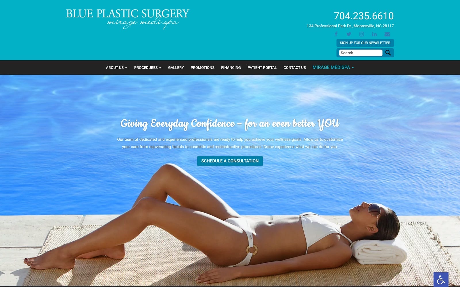
A combination of rich black and soothing blue blends together in a website design that is alluring to those who benefit from the clinic’s work. Blue and white are central themes of the site, with black primarily finding its place as an accent. This site focused heavily on conveying information and ideas through images to show potential patients what their results could be. A pleasant image of the physician is framed to help build rapport through familiarity, with their smile being a crucial component. Water elements are introduced in the design to produce a feeling of calm, cleanliness, and healing.
Functionality
This site uses a streamlined design that makes it fully accessible on both traditional PCs and mobile devices alike. Navigation features on the site are carefully optimized to make the menu intuitive to use. The menu design is designed to be able to accommodate any window size by converting from a traditional design to a compressed ‘hamburger’ style. Visitors to the site will know what to expect through the before and after images featured in the gallery. Following their visit, they can easily schedule follow-ups and receive information from the physician through the patient portal.
2. Aesthetics 2U
Aesthetics
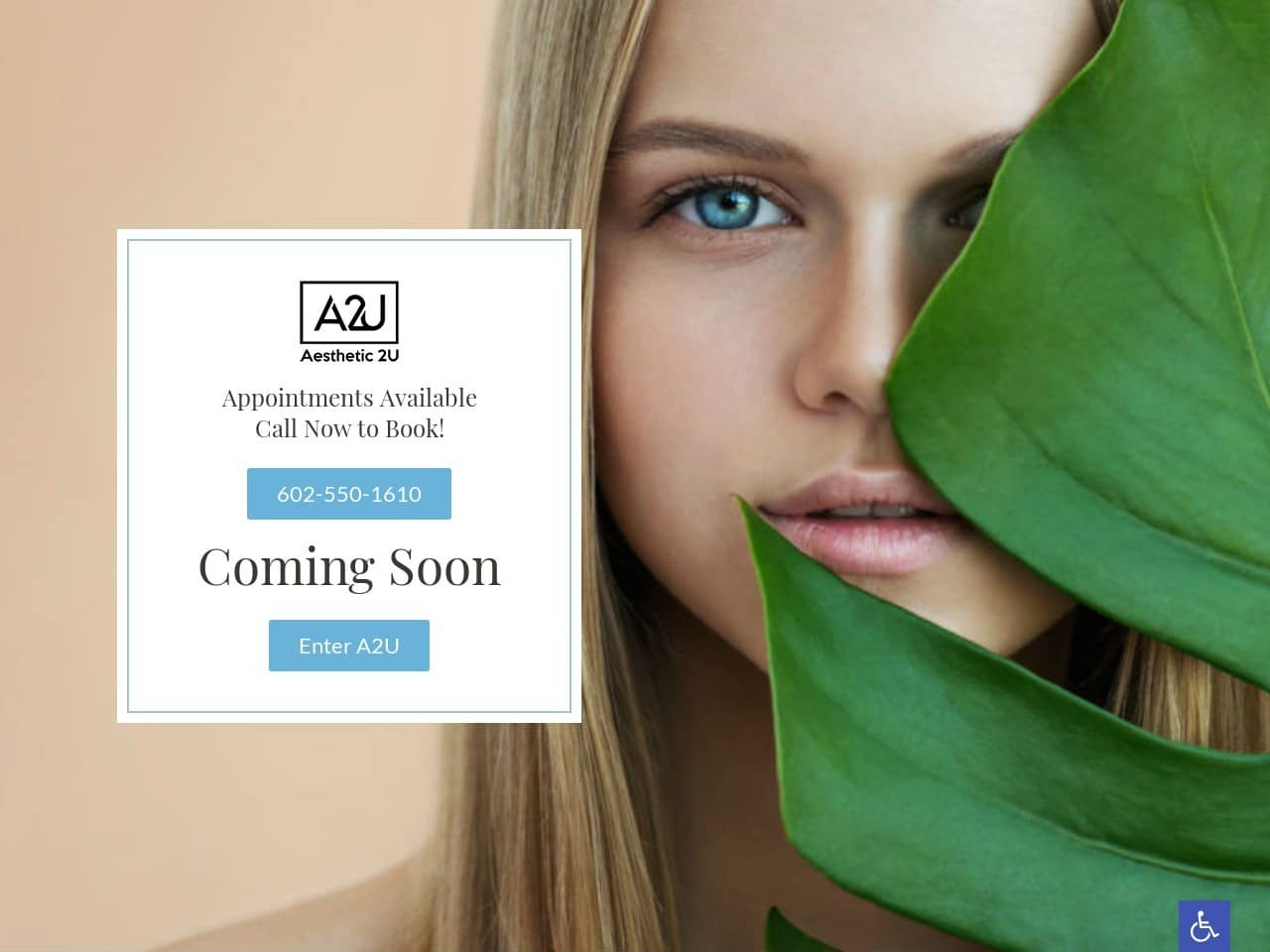
Visitors to the site are greeted with a palette of soft hues, including blue, white, and predominantly pink. The images used in the site mirror this color scheme, with the occasional inclusion of natural green to draw attention or accent an image. Sections of the site are separated with blue to help make headlines and blocks of information clearly visible. Additional information about services is offered through buttons that use striking imagery to enhance the site’s beauty.
Functionality
This blend of colors is popular for offices that offer dermatological services. Healthy, youthful skin and a sense of nurturing are hinted at in the pink elements, with blue indicating freedom from worry and hope. We find blue in this site being used as an action color, directing us to different areas of the site, and used to highlight contact information, buttons where further steps can be taken, and more. The service section of the site uses images to highlight results that patients could potentially receive and what procedures can produce them. There is a clever mechanic at use here where mousing over the image changes it from the results the patient wants to the technique that will accomplish it.
3. DC Plastic Surgery Boutique
Visit DC Plastic Surgery Boutique
Aesthetics
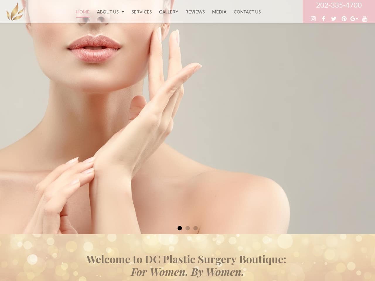
While most plastic surgery clinics see women as their largest customer base, DC Plastic Surgery Boutique opted to make them the focus of their business. A colorful pink, white, and gold color palette creates a soft feminine vibe. The slideshow visitors are greeted with shows slides of flawless, toned skin that the clinic promises to deliver. Gold is integrated into the background image but is also used for the text for a gentle contrast that is reminiscent of written content on make-up, creams, and other products of that type. As a visitor scrolls down the page, they’ll see service sections that focus on procedures and areas of the body. As the visitor reaches the bottom of the page, they’ll find a contact form framed by a beautiful image of the DC area, under which their awards and associations can be found.
Functionality
Pink has been a traditional color for women since the Victorian era, and this color palette plays on that fact to demonstrate the woman-focused nature of their business. This color is also commonly used to describe beautiful, healthy skin and is associated with youthful femininity that many plastic surgery patients are trying to recapture. Every element of this site’s design is focused on evoking images of youthful vitality, grace, and beauty to inspire the visitor’s imagination and give them hope for resolutions to their concerns. The image of DC, which is the backdrop of the contact form at the bottom of the site, helps to create a sense of locality for the patient. As visitors scroll through the site, they’ll find themselves accompanied by the ever-present menu bar at the top, which compresses to a hamburger menu on smaller windows. The gallery allows the physician to highlight their work and show the results other patients have received.
4. BodRX Advanced Medical Procedures
Visit BodRX Advanced Medical Procedures
Aesthetics
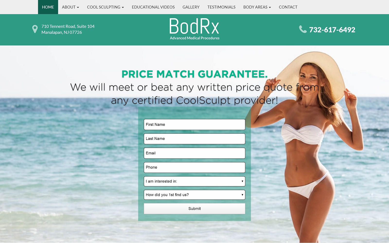
Firm beautiful bodies, a stunning beach scene, and a striking palette of black, white, and blue greet visitors to this site. A prominently placed form is available for those who are eager to get started. At the same time, a clean scrolling design is aimed at mobile users while remaining accessible to desktop visitors as well. The images on the site use color and form to attract the visitor’s eye to important information. Video testimonials are provided to ensure that patients hear results from actual patients in a spoken form rather than text format.
Functionality
When a visitor first lands on the site, the form provides immediate contact opportunities to patients who are pressed for time and looking for results. The menu found at the top of the page enables easy navigation, reducing to a hamburger menu on mobile devices to maintain functionality. Along with the contact form, the presence of phone numbers and access to all areas of the site ensures quick, easy navigation and use of the site. The main page is largely minimalist in design, providing only a few pieces of immediately pertinent information and contact information while giving interested visitors. Images used in this site are informative and focus on educating the client about the services and results they can expect.
5. Premier Medical Aesthetics
Visit Premier Medical Aesthetics
Aesthetics
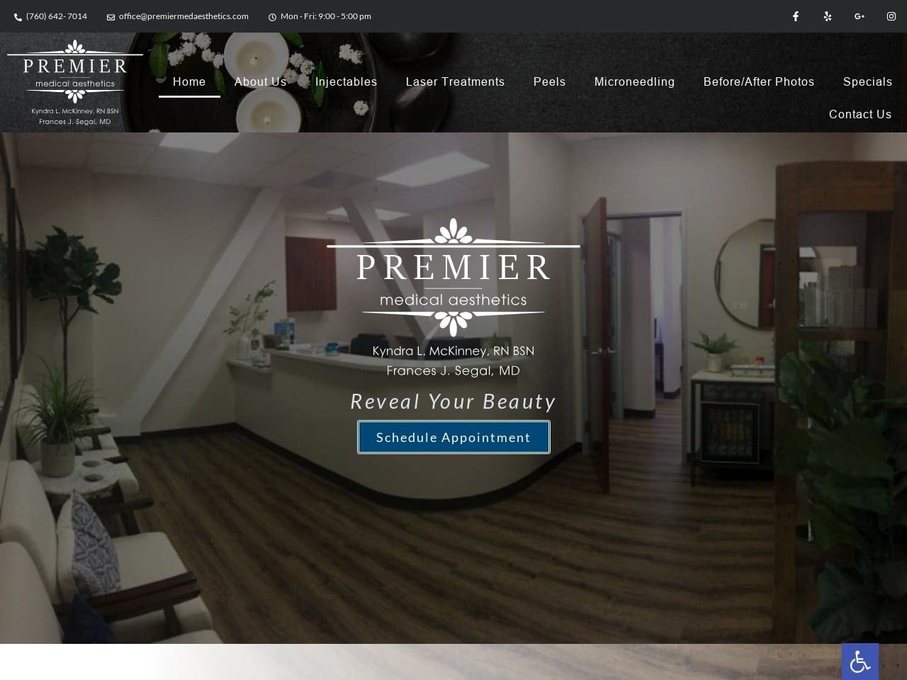
This website has focused on a modern design with a sleek, professional appearance using a black, blue, and white palette. Visitors are immediately greeted with a video introducing them to the office and a little ‘day in the life’ experience of visiting their plastic surgeon. A simple but aesthetically pleasing custom logo over a blue action appointment button plays center stage. Scrolling through the site finds gorgeous photography guiding patients to additional information while striking blue buttons are used to encourage the visitor to take action. The contact information and form provided at the bottom of the page are laid over a serene picture of a beautiful water scene that ties the whole page together.
Functionality
Black and blue are beautiful elements in this color scheme, used to evoke a sense of professionalism and hope that is central to many patients’ plastic surgery experiences. The video in the background of the landing page is used to build rapport and get the image of their being a clinic patient into their heads. A scrolling testimonial section reports the experiences of other patients in a large text, easy-to-read format that nonetheless makes maximum use of the space with a slide show of reviews. The images used for navigation help the patient see themselves with the results of the procedures while letting them know what can be done to help them with their concerns.
6. The Beverly Hills Institute
Visit The Beverly Hills Institute
Aesthetics
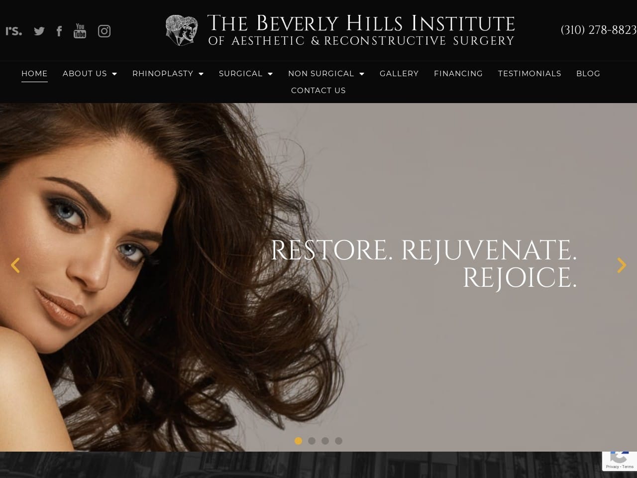
An aesthetic and reconstructive surgery clinic set in Beverly Hills has to appeal to high-class clientele. Every element of the design of this site is aimed at producing a classy, sophisticated vibe that will speak to the community it serves. Fashion-grade photography combined with a sleek black-and-white design sets the tone. Information about procedures is laid out using stunning backdrop photography, using a format that allows maximum use of imagery and text in a compact space. Before and after results are presented in a slideshow of gorgeous images of happy patients. Testimonials are presented on an eye-catching blue gradient background sharing exciting results from previous patients. The clinic’s contact information is at the bottom of the page, with a beautiful backdrop of a Beverly Hills neighborhood.
Functionality
An eye backs every aesthetic choice of this site for functionality. The slideshow uses fashion-grade photography to evoke the imagination of the future patient, showing results they can start dreaming of for themselves. The contact information provided prominently at the top of the screen allows returning patients to grab the information they need to start their journey immediately. Qualifications are important when getting plastic surgery, as is building rapport and trust with your physician. The presentation of the doctor’s qualifications was written with an eye to this, both in the composition of the photo and the way the information is presented. This same ambition results in the awards and associations the doctor is a part of being provided below the image.
7. Aesthetic Plastic Surgical Institute
Visit Aesthetic Plastic Surgical Institute
Aesthetics
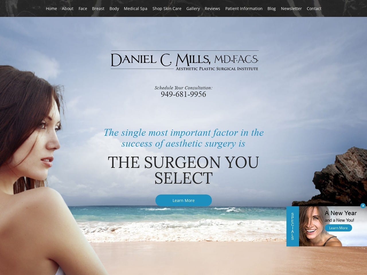
The prominent choice of imagery and scene in this website’s design clearly defines its location and client base. The background imagery emphasizes the perfect form, with models, patients, and even sculptures being integrated to show the perfection available to the patient. The blue, white, and black color scheme creates a striking variety of contrast, with each taking its turn as text, background, and accent. Every design element emphasizes ease of use and dream-building in the patient viewing the site. It naturally draws the user to explore the various services the clinic has to use by taking advantage of elegant web design practices.
Functionality
With its offices located in Laguna Beach, a beautiful beach body for glorious days under the sun is a central concern. The color scheme of black and blue combine professionalism and hope together in a combination that instills confidence in the viewer while simultaneously having their dream of the results of the procedures. Blue is emphasized as an action color throughout the site, being used in buttons and areas where the visitor’s attention is desired.
The entire site focuses on a mobile-first design that ensures ease of use on any device. The news section presents multiple entry teasers that entice the visitor to click through and learn more about the practice and its procedures. As visitors reach the bottom of the page, they are presented with multiple contact options, from phones and email to any of several social media outlets. The address is provided below, with the history of reviews the site has received being highlighted as well.
Conclusion
Every example above demonstrates an excellent execution of fundamental web design concepts while maintaining a distinct individuality all their own. Color palettes are selected to inspire, bring hope, and aid in navigation by highlighting important areas.
High-level functionality is provided using secure contact forms, directions on demand, and feedback sources to inform you and your patients. Putting together a website that contains all these elements can be tricky, but a little time spent researching and experimenting can get you far. By understanding your client base and designing your website to meet their needs, you instill confidence in your practice before they ever enter your office door. Learn how O360 was selected as the #1 Plastic Surgery Website Design Company.
