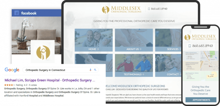
A lot has changed over the years in website design and the expectations modern patients require from their physicians. If you’ve been spending time looking over orthopedic website templates trying to find one that will serve as the basis of your clinic’s site, you’ve likely come to realize that all of them tend to fall short of the mark. Good Orthopedic websites don’t start with a template; a skilled team of designers handcrafts them with a skill base that crosses several disciplines.
To create a great orthopedic website, it’s necessary to understand what goes into making one. The top orthopedic websites include a striking logo incorporating an eye-catching color palette into a modern, mobile-friendly web design. Functions, including patient portals, click-to-dial functionality, and direct-to-map integration, start to complete the package, especially when combined with accessibility functions.
Below we’ve put together a series of the Top Orthopedic websites.
1. Bawa Orthopedic
Aesthetics
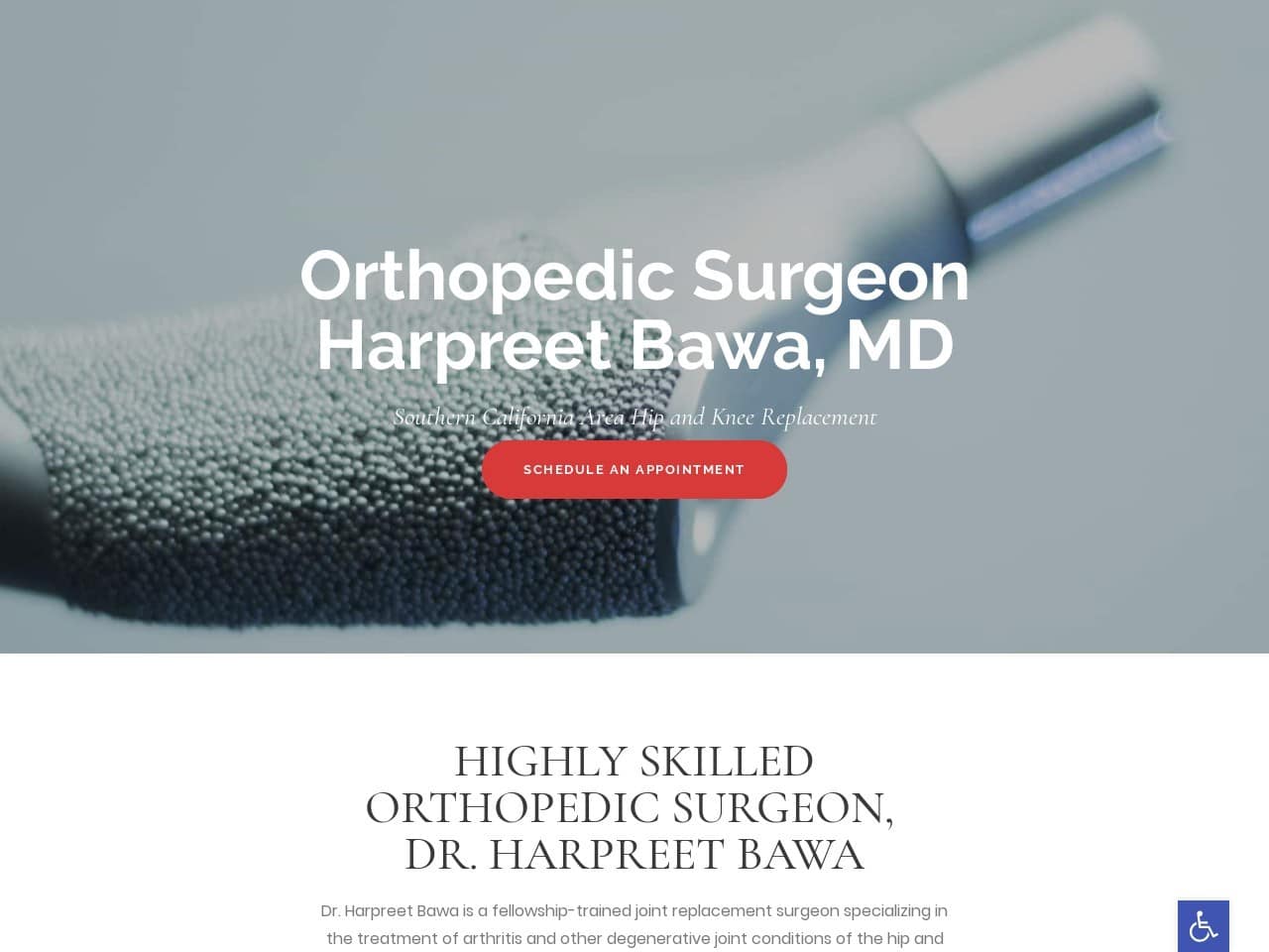
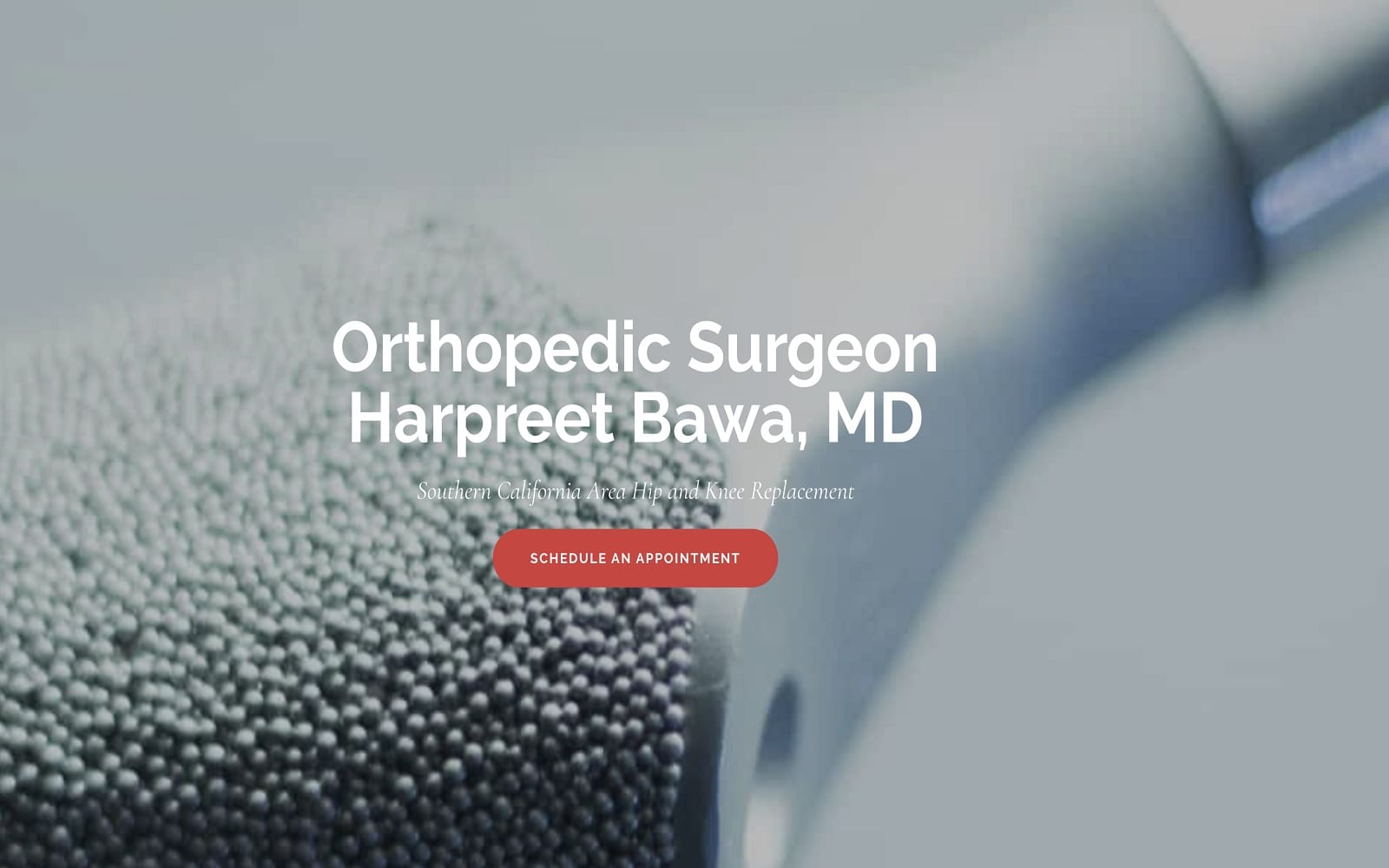
Hero images can serve amazing purposes, and here we have one clear example of hero images hard at work. Every image reveals the results of an orthopedic doctor hard at work, with patients living happy and active lives thanks to the support of their doctor. Moving past these images takes us into a beautifully designed site that continues using rich imagery to provide information to the patient. Every service the clinic offers is represented by an image that conveys the procedure and what it entails. The color red is used throughout the site to attract the eye to places the patient can take action, such as scheduling an appointment or learning more about Dr. Bawa’s qualifications.
Functionality
This site is optimized for mobile device use, evidenced by its streamlined design and lack of a navigation menu. As patients scroll through the site on a mobile device, they’ll discover that a full-screen wide image represents each service. Visitors can request further information using a HIPAA-compliant form and can read testimonials from a scrolling selection of praise from previous patients. Patients heading to the patient information page can learn about their first visit and download a printable patient medical history form to help them save time during it. Connecting with the clinic can be done by scheduling an appointment interface, their social media channels, or by phone calls.
2. Orthopaedic Institute of Henderson
Visit the Orthopaedic Institute of Henderson
Aesthetics
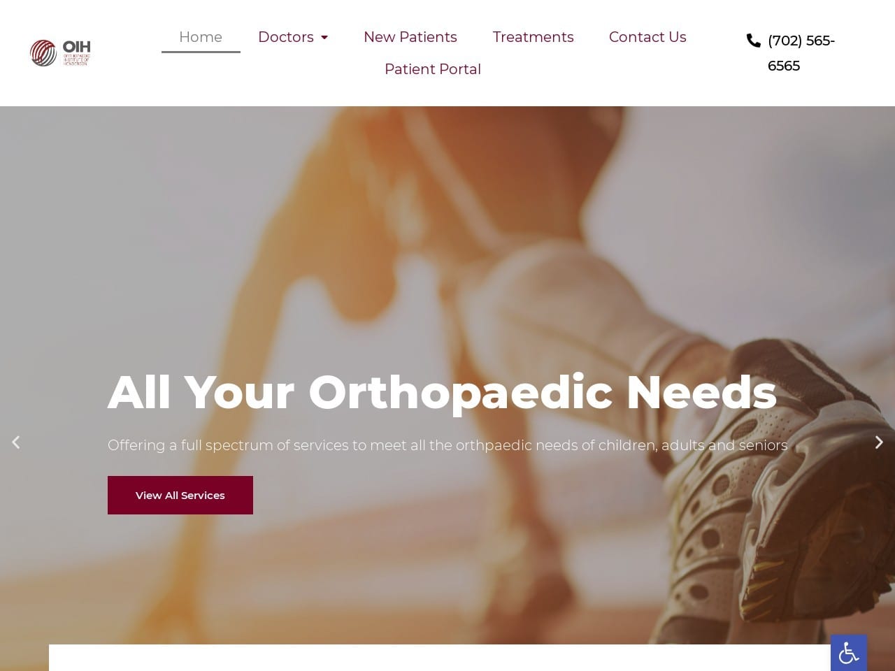
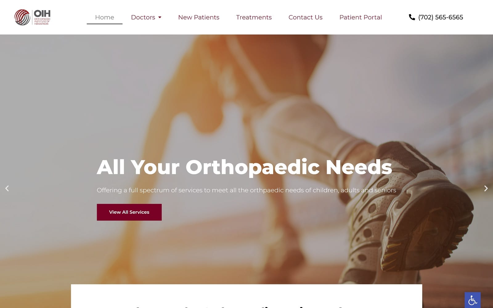
Patients visiting OIH’s website will feel like they’re at the starting line that brings them back to their active lifestyle. This inspirational image gives visitors the mindset that this clinic will be able to address their orthopedic needs and have them back enjoying their favorite activities in no time. The vibrant motivational reds used as the site’s action color catches visitors’ eyes and encourages them to take action and connect to the clinic. Each service section is highlighted with a picture representative of that service, a blurb of text, and a button that prompts them to learn more about it, providing valuable information. The site’s red and gray color palette is beautifully incorporated into the Orthopaedic Institute of Henderson Logo in an image that’s sure to capture the eye and be remembered by patients.
Functionality
The header of this website is packed with functionality, specifically aimed at providing visitors with a simple way of reaching out to the clinic for additional information. Click-to-dial functionality is just the beginning. OIH offers a patient portal from their static header via the menu, providing a secure way of sending and receiving additional information to the clinic. Accessibility options can be selected through the blue tab with the white handicap logo in the site’s bottom right corner. At the bottom of the page is a HIPAA secure form allowing new patients to safely and securely contact the clinic for information or to schedule a consultation.
3. Dearborn & Associates
Aesthetics
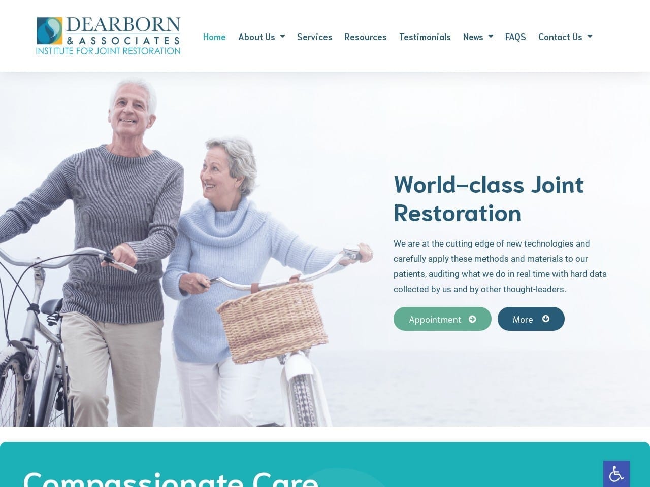
A beautifully bright and clean website design is the foundation of Dearborn & Associate’s web presence. It combines a clean white background with shades of blue, green, and orange in its design for a compelling high-contrast design that flows perfectly into the company logo. The site focuses on a very segmented design, with each section clearly presented using white space, images, and action buttons in an eye-catching blue tone. A series of question images appears below the introduction to the doctors that utilizes an active-on-mouse-over image that is attention-grabbing and encourages visitors to click through and read the valuable information to be found on the linked page.
Functionality
Dearborn & Associate’s website utilizes much of the basic functionality we’ve discussed so far. An appointment button directs patients to connect with the clinic, and the static header contains a comprehensive menu. The News section includes access to videos and interviews that serve to give the clinic credibility and the visitors a look at procedures performed by this office. Further down the page, direct-to-map functionality makes finding the clinic easy, while click-to-dial makes it easy for mobile users to reach out to the clinic with a click. Nestled in the bottom right corner of the page is the ever-present accessibility option tab in blue with the handicap emblem on it. Patients can take advantage of a high-contrast version of the website through this link.
4. Pacific Joint & Bone Clinic
Visit Pacific Joint & Bone Clinic
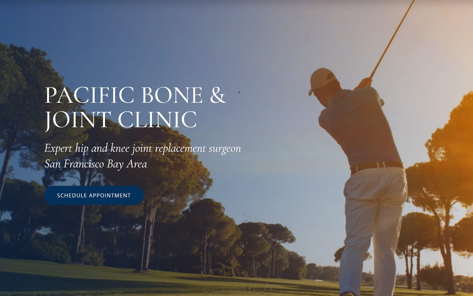
How This Website Supports Their Practice: Because Pacific Joint supports an active and affluent community, this practice reflects their professionalism through a more conservative, polished look with their website. Navy blue and white creates a cool, neutral palette, leveraging their imagery to attract their target audience and create a sense of sophistication. All information on their site guides new patients through action buttons, slideshows, hyperlinks, and interactive images. The website organizes its information to integrate with its closed-in design and overall creates a highly acceptable image for a practice that services those who require trustworthy, quality care.
5. Rehabilitation Consultants
Visit Rehabilitation Consultants
Aesthetics
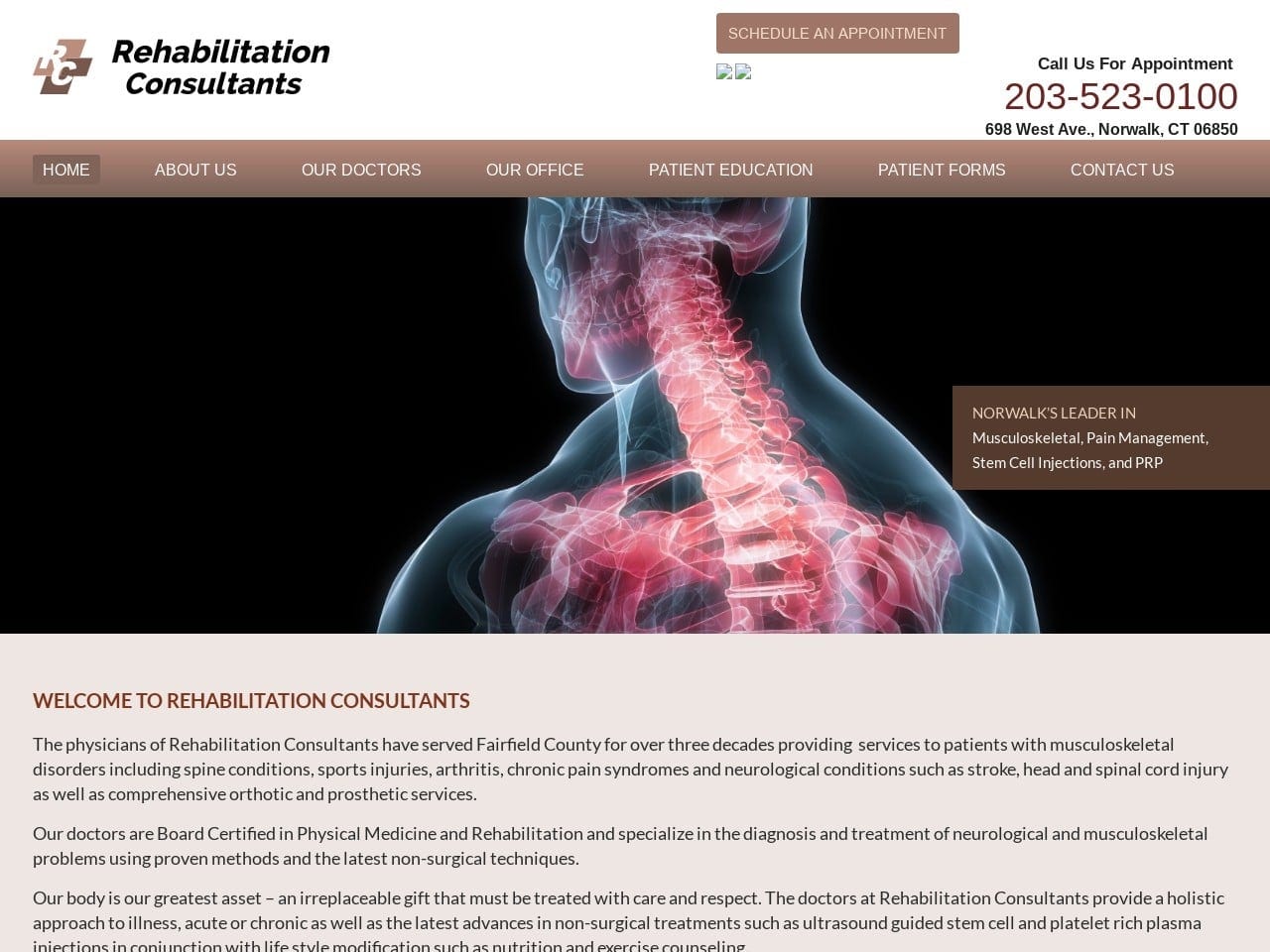
Brown, beige, and white can create a surprisingly attractive color palette for a site, as is evidenced by the Rehabilitation Consultants site. These same tones are used in the site’s logo, combining a classic medical plus sign with the clinic’s initials to create a striking and easily recognizable design that will stand out in correspondence from their office. The menu of special programs found below the site’s introduction shows that sometimes simple is enough with its brown-on-beige color scheme.
Functionality
Convenience is paramount in this site’s provision of features, starting with the “Schedule an Appointment” button prominently displayed in the header above two links to the clinic’s social media presence. The Patient Education section helps build confidence in visitors as they learn more about the services provided by the clinic and take an active role in their care. The Patient Forms section provides patients with a convenient way of preparing for the coming visit by completing the New Patient Packet and Pain Questionnaire before their arrival. Direct-to-map functionality can be found on their Contact Us page, allowing mobile users to get directions to the clinic from their devices easily.
6. Carl Talmo Orthopedic Surgery
Visit Carl Talmo Orthopedic Surgery
Aesthetics
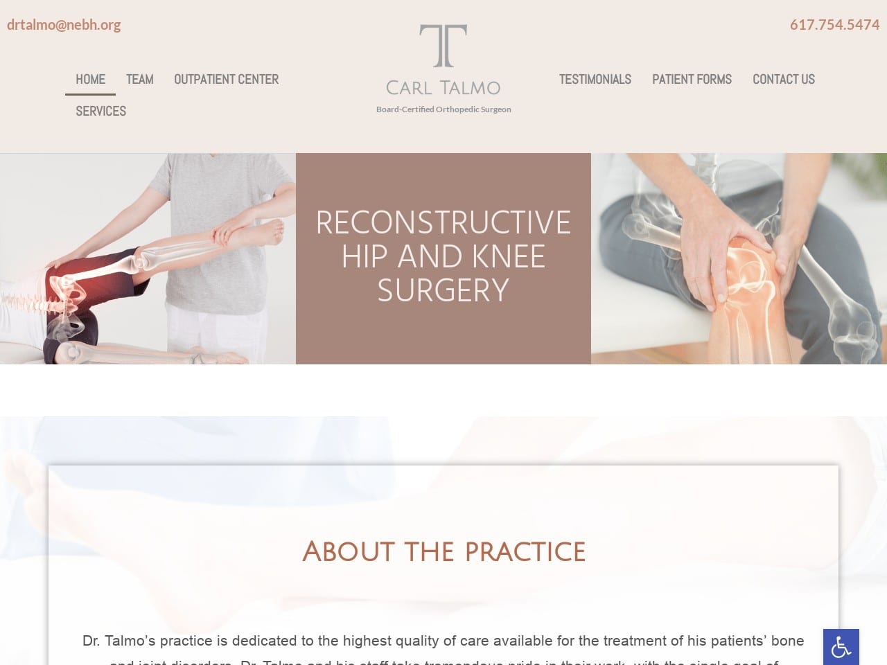
This site immediately gives the impression of being a modern medical website with its slide-in imagery and sleek design. This sort of active design can be found throughout the site with text that scrolls in or expands from the background. These elements give the impression of a modern design that gives patients the confidence that the clinic is up-to-date with the latest technologies. The Carl Talmo logo makes excellent use of the clinic and site’s color palette and would be immediately recognizable on any form of correspondence. In addition to the gray and pink colors found throughout the site, orange is used to draw attention to important parts of the site, including action points.
Functionality
Direct-To-Email and Click-to-dial functionality are immediately available in the header, convenient for patients using mobile devices to access the site. The stylish menu collapses into a hamburger menu on narrow screens while the page reorganizes itself for easier viewing on mobile devices. Patient forms are available in a downloadable format on the Patient Forms page, allowing visitors to prepare for their next visit easily. HIPAA secure forms can be found on this page to make requesting an appointment safe and convenient. In the bottom right corner of the site is a suite of accessibility options accessible through the blue tab with the handicap logo. The Contact Us page provides direct-to-map functionality to make getting directions to the clinic easy.
See how O360 became the #1 Web Design Company for Orthopedic Surgeons.
7. New England Orthopedic Surgeons
Visit New England Orthopedic Surgeons
Aesthetics
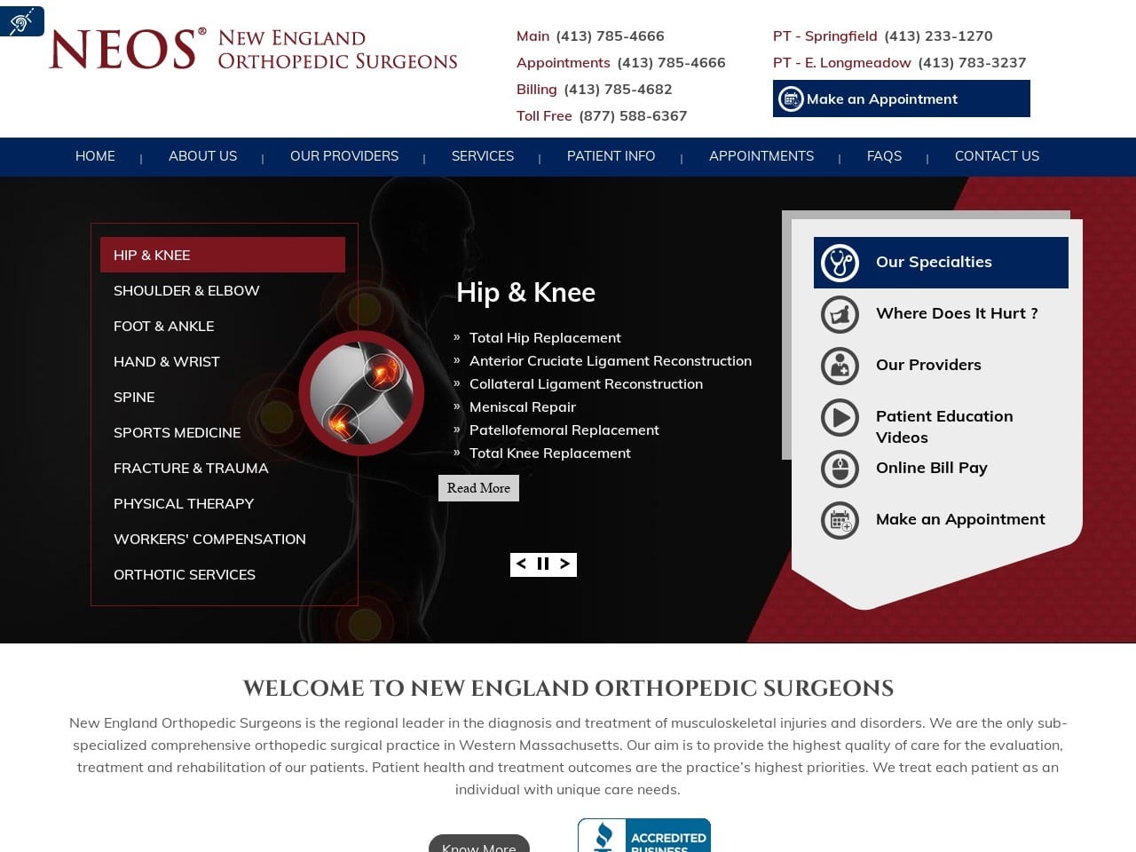
NEOS makes excellent use of its black, blue, and white color scheme in producing a striking site design. Their logo is simple yet effective, using color and text to create an image that will stand out in correspondence and be incredibly recognizable. Scrolling through the page reveals red, black, and blue, taking turns serving as the action color for the site. Each is used to highlight buttons, scroll menus, and more. The mobile reactive design ensures the webpage looks incredible at any resolution.
Functionality
With so many different clinics served by the same website, click-to-dial functionality needed to be included in the site’s header. Patients needed a quick and easily discernable way to connect with the correct clinic, and this design choice served that purpose. Convenience is an integral part of the website’s design requiring the inclusion of First Visit information and patient forms. Educational videos are included to help keep patients up-to-date with the latest information about the procedures offered by the clinic. Insurance information helps contribute to the conversion power of the site, as potential patients are more likely to contact the clinic when they know that their insurance will be accepted. In addition to all these features, the site provides its patients with a convenient payment portal.
2022 ORTHOPEDIC SURGERY DESIGNS
1. Christopher Miller MD
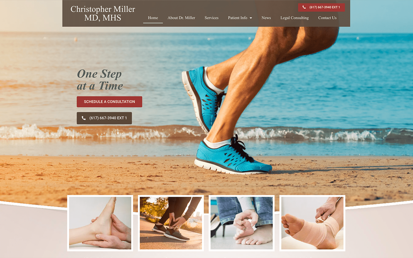
How This Website Supports Their Practice: Christopher Miller MD provides a website where every aspect of it serves a purpose. From the header to its primary images, all parts found within the website are connected to its color scheme, consisting of red, blue, and brown. Its color scheme is the backbone, combining its action buttons, header images, services, and icons throughout the site. Its imagery is welcoming, uplifting, and bright, appealing to a sense of healing and recovery. Its headers and sections are organized to present the practice upfront and give new patients an overall pleasing perspective on the practice’s dedication to their patients.
2. New Mexico Orthopaedics
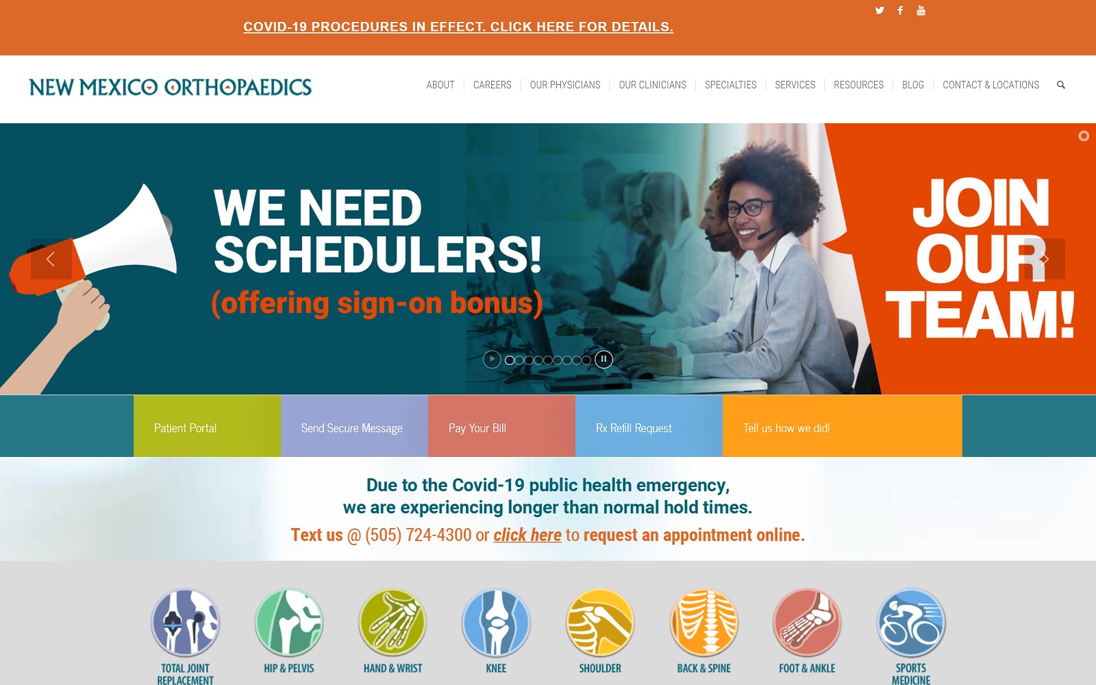
How This Website Supports Their Practice: New Mexico Orthopedics plays with vibrant colors, energizing imagery, and highly illustrated icons to create an attractive modern aesthetic that avoids overwhelming visitors. Its imagery focuses on positivity, reinforcing its focus on rejuvenation and healing. Its dynamic color scheme uses bright oranges and blues as the primary colors to detail information and highlights action buttons, services, and icons. Illustrations are added throughout the site to represent their modern approach to their practice and overall present itself as a professional medical practice with huge amounts of appeal.
3. Muir Orthopaedic Specialists
Visit Muir Orthopaedic Specialists
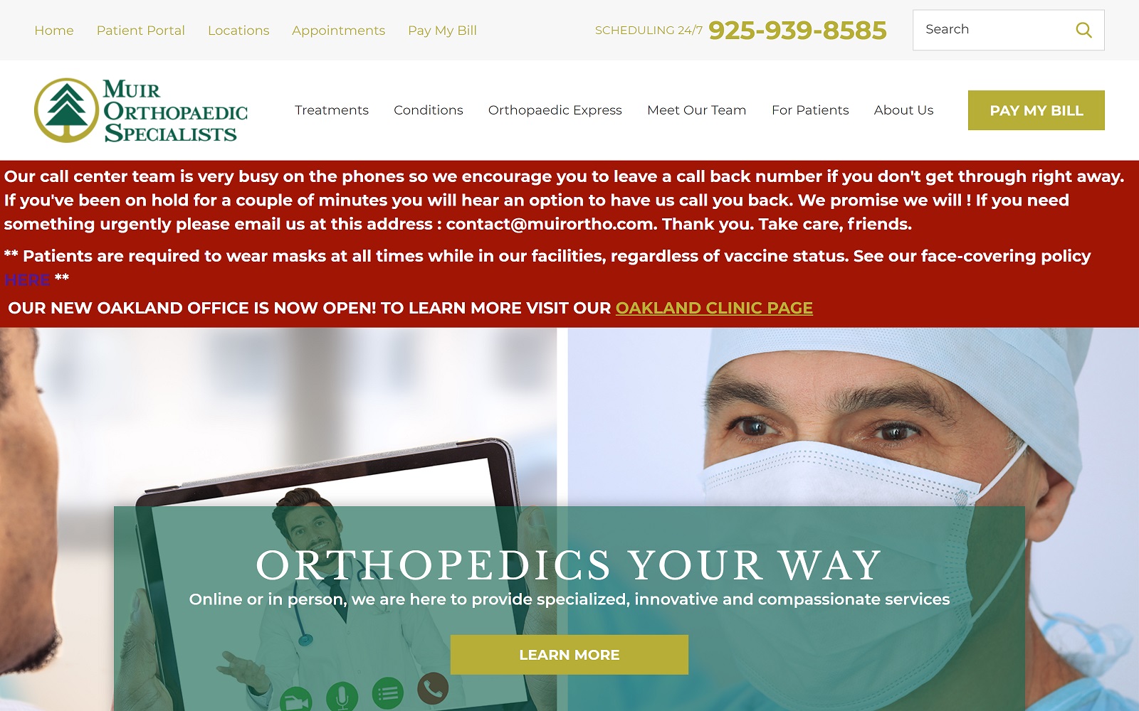
How This Website Supports Their Practice: Muir Orthopedic Specialists expands on its dynamic approach to orthopedic care, honing in on its focus on older patients and athletes as their target audience. Because of this focus, its dark forest greens and subdued yellows work to calm and soothe new patients while introducing the practice’s focus on medical expertise and technology to encourage healing and growth. Within the site, hyperlinks to videos, service pages, and other information pages help expand on the practice’s goals and aspirations. Through these elements, Muir Orthopedic Specialists makes their website the practice for those within their community through a detailed insider’s look into who they are.
ORTHOPEDIC SURGEONS WEBSITES OF 2020
Orthopedic marketing often lacks the finesse and new approaches medical practices use today, often due to the huge transition from a traditional presence to a completely digital platform. Marketing, however, will help improve how you communicate with your patients beyond the office, which cannot always be done through sales samples and show booths. Whether intending to work with your local hospitals or want to reach out to your patients more, understanding the digital platforms many patients work through can help you boost your retention rates and the future of your practice.
Because patients today rely on online searches and state-of-the-art research to understand their healthcare, it’s important to show how you differentiate from others in your field. By conveying this, you can help provide information about your procedures and gain honest interest from your new patients. One of the best ways to do that is by establishing an online website. To give you reasons why we’re going to look at some classic websites this year and give you a full summary of how these practices tell their story:
1. Pacific Joint & Bone Clinic

Visit Pacific Joint & Bone Clinic
How This Website Supports Their Practice: Because Pacific Joint supports an active and affluent community, this practice reflects their professionalism through a more conservative, polished look with their website. Navy blue and white creates a cool, neutral palette, leveraging their imagery to attract their target audience and create a sense of sophistication. All information on their site guides new patients through action buttons, slideshows, hyperlinks, and interactive images. The website organizes its information to integrate with its closed-in design and overall creates a highly acceptable image for a practice that services those who require trustworthy, quality care.
2. Orthopaedic Institute of Henderson
Visit the Orthopaedic Institute of Henderson
How This Website Supports Their Practice: The Orthopaedic Institute of Henderson establishes itself as a place of authority for orthopedic treatment, including powerful maroon as its active color to convey its dedication to responsibility. Its imagery uses warm hues to incite passion and healing. The website uses the available white space to engage with users through action buttons, service numbers, and transparent layers. All of these elements work to help new patients navigate through the site, and because of its clean design, it presents itself as a unique practice that works to provide honest, outstanding orthopedic care.
3. Dearborn & Associates Institute For Joint Restoration
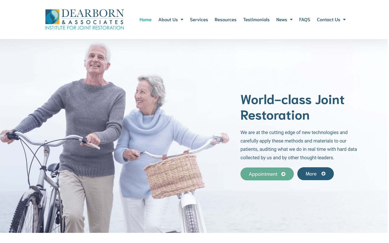
How This Website Supports Their Practice: Dearborn & Associates presents itself as a state-of-the-art institute focused on its technology to bring new patients quality care. The website uses shades of teal blue against a neutral white background to create a consistent theme of rejuvenation and clarity. Its imagery combines these tones to intricately match Dearborn’s theme of revitalizing patients back to health. All of these elements can be found through hyperlinks, service numbers, action buttons, and interactive images. Its information is direct, and the practice uses its website to convey that it focuses on the entire patient experience rather than the first visit.
4. Christopher Miller MD

How This Website Supports Their Practice: Christopher Miller MD provides a website where every aspect of it serves a purpose. From the header to its primary images, all parts found within the website are connected to its color scheme, consisting of red, blue, and brown. Its color scheme is the backbone, combining its action buttons, header images, services, and icons throughout the site. Its imagery is welcoming, uplifting, and bright, appealing to a sense of healing and recovery. Its headers and sections are organized to present the practice upfront and give new patients an overall pleasing perspective on the practice’s dedication to their patients.
5. Orthopedic Surgeon Harpreet Bawa, MD
Visit Orthopedic Surgeon Harpreet Bawa, MD
How This Website Supports Their Practice: Harpreet Bawa MD removes the center-aligned focus of most websites designed and expands on the available whitespace to take full advantage of its capabilities. The website uses minimal colors, relying heavily on imagery to convey its services, education, and contact us sections. Red is the primary color for the available action buttons, and it transitions to golden yellow to appeal to new patients. Overall, its imagery provides an inviting, warm, and invigorating atmosphere, and the website uses minimalism to appeal to a sense of security and comfort for newly arriving patients.
6. New Mexico Orthopaedics

How This Website Supports Their Practice: New Mexico Orthopedics plays with vibrant colors, energizing imagery, and highly illustrated icons to create an attractive modern aesthetic that avoids overwhelming visitors. Its imagery focuses on positivity, reinforcing its focus on rejuvenation and healing. Its dynamic color scheme uses bright oranges and blues as the primary colors to detail information and highlights action buttons, services, and icons. Illustrations are added throughout the site to represent their modern approach to their practice and overall present itself as a professional medical practice with huge amounts of appeal.
7. Muir Orthopaedic Specialists

Visit Muir Orthopaedic Specialists
How This Website Supports Their Practice: Muir Orthopedic Specialists expands on its dynamic approach to orthopedic care, honing in on its focus on older patients and athletes as their target audience. Because of this focus, its dark forest greens and subdued yellows work to calm and soothe new patients while introducing the practice’s focus on medical expertise and technology to encourage healing and growth. The site’s hyperlinks to videos, service pages, and other information pages help expand on the practice’s goals and aspirations. Through these elements, Muir Orthopedic Specialists makes their website the practice for those within their community through a detailed insider’s look into who they are.
Marketing Your Orthopedic Practice
Orthopedics has become a patient-driven business. More than ever, patients require businesses that get to the bone of the matter and truly understand the procedures and treatments they need to heal and manage their conditions. Your content matters on your website, blog, or social media. Our digital age has allowed patients to expand beyond the expertise of their doctors and see for themselves what it means to receive good healthcare, and as a practice, engaging with these patients directly is a good first step.
Conclusion
Each of these websites does an excellent job of representing the clinic it serves while providing a full suite of functionality for its patients. Varying color schemes, stylish logos, and layouts that can adjust back and forth between mobile devices and desktops ensure that all types of users are served. Accessibility options keep them within reach of patients of all levels of ability. The most important part of these designs is that they demonstrate how basic principles of excellent orthopedic website design can be adhered to while leaving plenty of room for individuality and fine-tuning your patient base.
As you continue your research, be sure to compile a list of features that are essential to serving your family of patients. Whether you notice a color scheme that appeals to you or a feature you feel is an absolute must-have, they should all go on this list. Also included should be elements you feel aren’t appropriate for your site or color combinations you dislike so you can provide these to your design team. Whether you’re building the site in-house or working with a contracted team of experts, this list will ensure you get the design you want.


