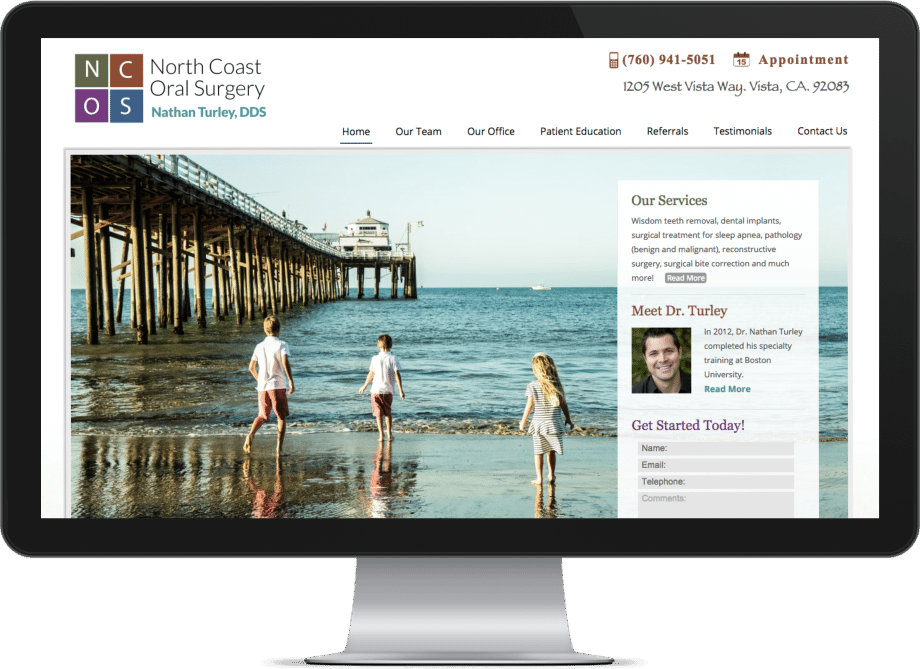
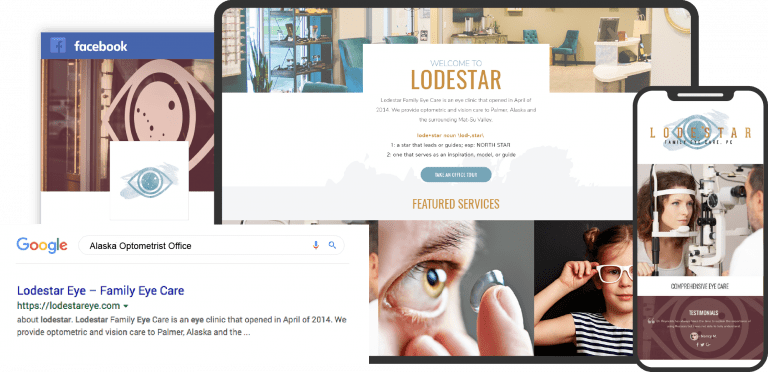
Designing a website for an oral surgery office can be tricky, but it’s as essential for your business. The issue is that oral surgery website design requires understanding the industry and the various disciplines that go into making a functional, secure, aesthetically pleasing website to represent your practice. While you can start with oral surgery website templates, they’ll only help you with the visual design. No template can ensure you’re HIPAA compliant or provide your patients with a full suite of essential features for a good first impression. Most importantly, no template can help you stand out.
Building a proper oral surgery website starts with selecting the right color palette to reflect the personality of your office. Check our article about choosing colors for medical websites. In most cases, a striking logo implementing these colors will come next, and then it’s time to start focusing on the overall design of your site. Selecting which functions to include, such as HIPAA-compliant forms, educational videos, and downloadable forms for patient convenience. Mobile responsiveness is a must, with direct-to-map directions and click-to-dial functionality ensuring patients can reach out to your clinic with a click.
Below we’ve compiled a list of excellent examples of some of the best oral surgery websites on the web today.
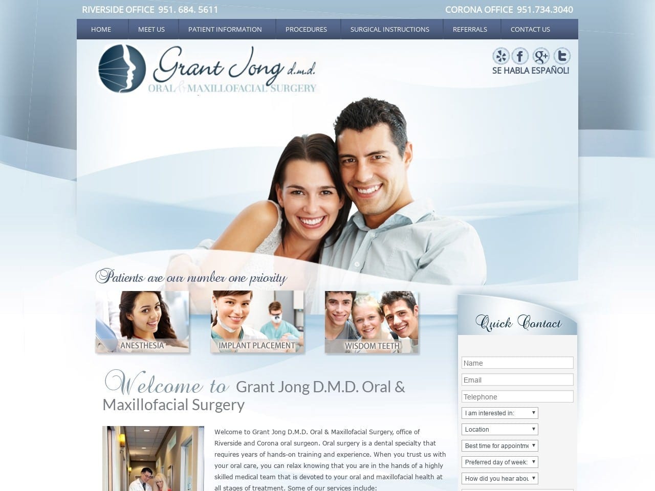
1. Grand Jong DMD
Aesthetics
Grant Jong, DMD, specializes in Oral & Maxillofacial Surgery. His website makes patients feel great when they land on the site and are greeted with a parade of shining smiles. The site’s blue palette helps evoke a sense of hope and calm in potential patients that are much needed in those potentially facing corrective or restorative surgery. The main page uses a very lightweight approach that makes finding what they’re looking for easy. A touch of class is added with the use of a swirling font. Each of the internal pages on the site sticks to providing information in a large text format, with a single highlighting image used to bring visual interest to the page.
Functionality
Connecting with the patient is an essential element of this website’s design, as evident from the host of social media channels.

On the right side of every page is a HIPAA secure form that patients can use to request or provide information to the clinic, request a callback, or even set up an appointment. A comprehensive breakdown of what patients should expect during their first visit and instructions on registering during their first visit. Referral forms are provided to make the process of starting care under the clinic easy for patients and physicians alike.
2. Advanced Dental Implant Services
Visit Advanced Dental Implant Services
Aesthetics
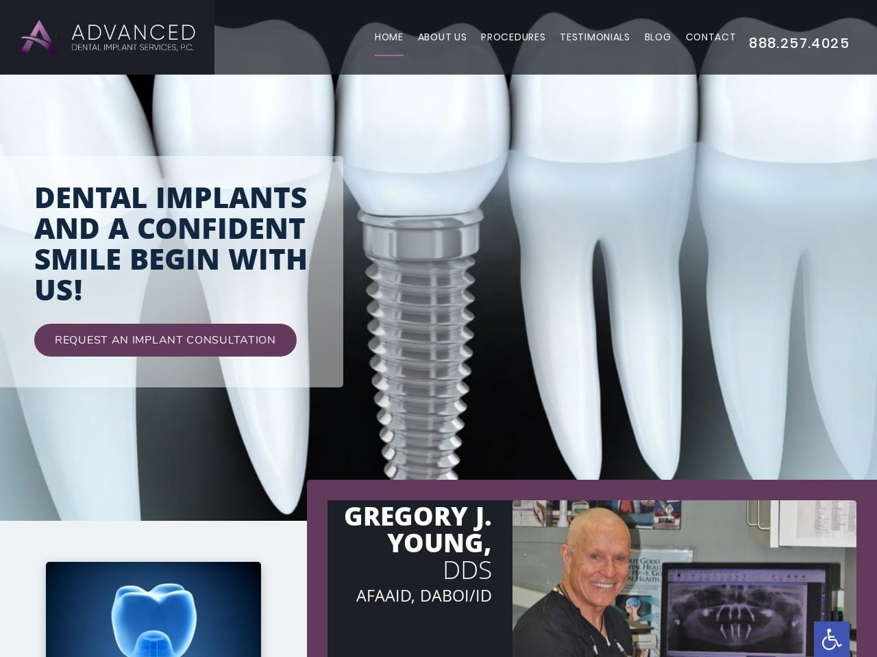
Advanced Dental Implant Services makes excellent use of black, white, and purple, one of the rarer colors in web design. Black and white provide a sense of sophistication, while purple conveys a luxury appropriate for a facility that provides patients with new surgical solutions. Bright imagery attracts the eye to each of the service sections and gives the site a bright appearance that is pleasant to interact with. The procedure page uses a beautiful and orderly design scheme that encloses each procedure link in a purple box that adapts to be perfect for mobile or desktop browsing depending on window size.
Functionality
Click-to-dial functionality is one of the first elements included on the page that makes reaching out to the clinic a cinch. As visitors explore the page, they’ll encounter a Request An Implant Consultation button that lets them reach out to the clinic through a HIPAA secure form. Also located on that page is a series of direct-to-map options for each location this clinic covers, where click-to-dial options will instantly connect mobile users to the office.
The bright imagery used for the services section attracts the eye and provides a guide on what information each section will contain. Mobile-optimized design is apparent throughout the site in how it dynamically responds to the size of the window it’s viewed in. This is an essential element of modern website design due to the rising number of patients who browse on a mobile device.
3. Greenville Oral Surgery & Dental Implant Center
Visit Greenville Oral Surgery & Dental Implant Center
Aesthetics
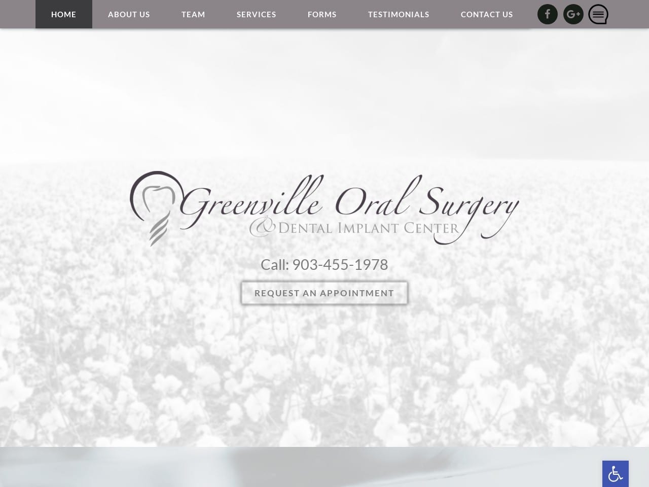
Greenville Oral Surgery’s aesthetic clearly shows how sometimes less is more. This website uses a minimal black, gray, and white palette to create striking and memorable imagery. This same color scheme is clearly demonstrated in its site logo as well, with the script providing a touch of elegance to a delightfully understated design. The buttons throughout the site demonstrate how bright, eye-catching color isn’t necessary for an effective action point.
The service section buttons on the direct site visitors use unique stylized art that captures the eye and hints at the information contained therein.
Functionality
The home page opens with a header containing a comprehensive menu, links to two social media platforms, and a business review site that shows the clinic believes in credibility and the voice of its patients. The introduction to the doctor helps build rapport with new and returning patients and invites them to meet the staff assisting with their care. The testimonial sections (learn how to ask for reviews) use the most limited amount of space by using a scrolling text design. The picture behind the testimonials subtly improves the visitor’s responsiveness to these testimonials through the happy smiles of the individuals in them.
The bottom of the site presents visitors with direct-to-map integration, one-click calling options, and email links. It all closes with a HIPAA secure form allowing patients to request further information or an appointment while protecting their personal info.
4. Seattle Jaw Surgery
Aesthetics
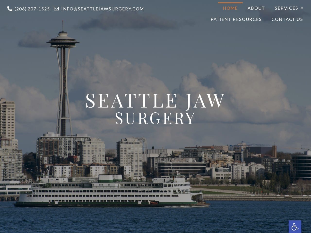
Establishing a locality can be a great way to build rapport with a clinic’s patient base, and Seattle Jaw Surgery uses striking images of the local area to do just that. The beautiful vistas of Puget Sound are something locals rightfully crow about, and a powerful connection is formed with them through that imagery here.
The site has a very sleek and modern appearance thanks to the sectional design that is equally powerful on mobile devices and desktop screens alike. The subtle combination of varying shades of calming blue and energizing orange creates a beautiful site using an uncommon palette.
Scrolling through the site will reveal orange being used as an action color, drawing visitors’ attention to those areas where they can provide additional information or receive info in turn. Images are used to introduce the areas of the site that go into the services provided by the clinic, with each one providing visual information about the concern or service indicated.
The page wraps up with a stunning sunset image of the Seattle skyline.
Functionality
Contacting the clinic is made as easy as possible for new visitors through click-to-dial integration and direct-to-email links at the top of the page. Alongside these features can be found the menu, compressed into a hamburger menu on smaller screens.
The sliding in of the screen elements as the visitor scrolls through the site is more than just an aesthetic choice; it adds to the site’s sleek modern appearance and credibility.
As patients approach the bottom of the page, they’ll find valuable information in the form of office hours, phone number, address, email address, and a HIPAA secure form to request additional information from the clinic.
5. University Oral Surgery Center
Visit University Oral Surgery Center
Aesthetics
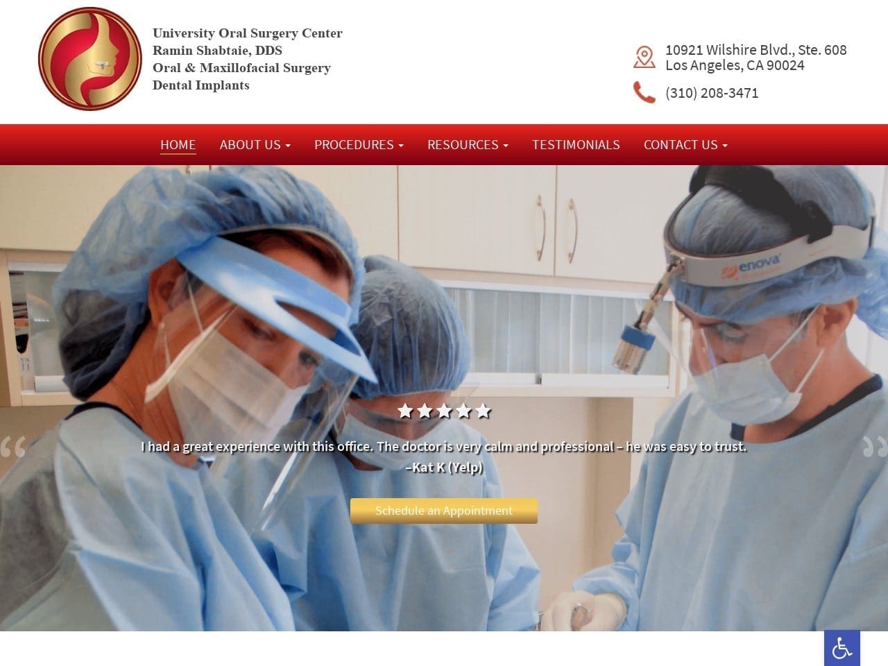
The University Oral Surgery Center website uses gold, red, and white to striking effect in its color palette. Red is known to be an energizing and motivational color, while gold is closely associated with elegance and luxury. These colors are known to contrast and complement each other very well, and it’s clear from their use on this site this is a well-deserved reputation. The red of the menu encourages patients to take action to learn more and explore the site, while the gold button catches the eye and directs them to schedule an appointment. The images throughout the site use colors that closely match the palette for a cohesive appearance.
Functionality
As soon as the page loads, visitors can get directions to the clinic or contact them by phone with a single click thanks to integrated direct-to-map and click-to-call technologies. The slide-show hero images show the visitor’s images of the staff performing the procedures and the clinic in which they’ll be treated, both valuable rapport points.
Accessibility options are available through the blue tab with the handicap emblem on it, making it easy for patients of all levels of ability to use the site fully. Near the bottom of the page can be found a HIPAA secure form common on other sites, but it also comes with an added feature, a CAPTCHA, to prevent spamming.
6. Kikuchi Oral Surgery & Dental Implant Center
Visit Kikuchi Oral Surgery & Dental Implant Center
Aesthetics
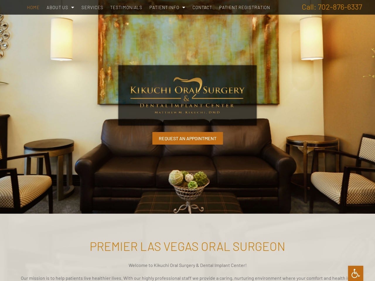
The rich colors and gold highlights of the Kikuchi Oral Surgery & Dental Site drip elegance and appeal to a more affluent class of patients. The site’s primary image shows the office’s warm, welcoming interior, immediately setting the patient’s mind at ease.
The imagery throughout the site takes a different slant than some of those we’ve looked at, using beautiful natural images that soothe the mind. Another element adding to the site’s credibility is its use of informational videos to further educate its patients on the services they provide.
Functionality
This site is packed full of functionality to keep it convenient for their busy and affluent client base for whom time is money. Patient registration is immediately available through a HIPAA secure form to smooth that process along. The videos help them quickly learn about the procedures they’ll undergo without lengthy dental visits or reading complicated documents.
The ability to read and leave testimonials helps them know they’re making the right choice. The “Your First Visit” page provides another venue for patient registration and downloadable patient forms that can be printed and filled out at the patient’s leisure. This process can save them up to 15 minutes from their busy day on the appointment day.
Another valuable piece of information provided to the patients is a comprehensive list of all the insurance networks the clinic can be on as a preferred provider.
7. Anthony M Del Vecchio Oral & Maxillofacial Surgery
Visit Anthony M Del Vecchio Oral & Maxillofacial Surgery
Aesthetics
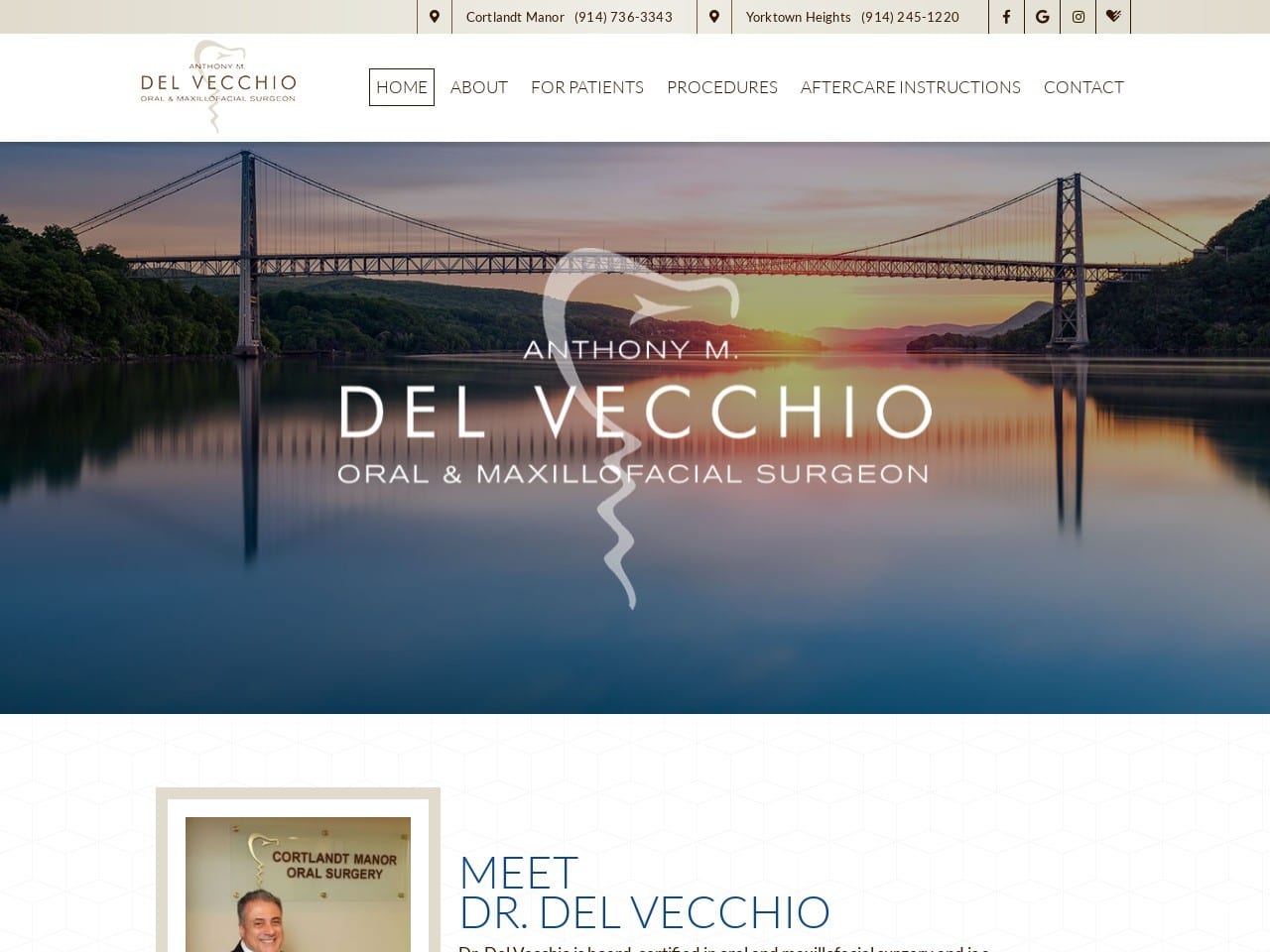
Del Vecchio is a website that knows how to take local imagery and incorporate it in a way that starts building rapport from the moment a visitor lands on the site. The site’s overall design tends towards a very open format trending into a combination of well-organized features.
Images of the staff make it clear that the clinic is interested in forming a personal relationship with each patient, ensuring the best possible care. As the visitor finds their way to the services section of the site, they’ll encounter stylized images over natural scenes that exude a sense of serenity nervous patients can appreciate.
Functionality
Arriving on the Del Vecchio site allows the visitor to reach out to the clinic through click-to-dial integration or to get directions to either of its locations instantly. Connection to their social media platforms, including a direct connection to the Health-grades, is also provided. This site provides an outlet for patients looking to send and receive information about their experiences with the clinic. Scrolling through the site allows patients to explore the credentials of the practice and the staff that works there. Links further down the page provide access to financial options, information that can help patients convert since they’ll be confident their coverage is accepted.
TOP OMFS WEBSITES OF 2022
Patients seeking oral surgery are looking to educate themselves about their treatments. In these cases, their family or general dentists refer them to oral surgeons due to suspicious lesions or impacted wisdom teeth or recommend oral surgeons for complex orthodontic cases.
In these cases, most patients today are looking for qualified, professional practices that can meet their needs, bypassing the traditional dentist referral system to meet with oral surgeons directly to learn more about their services.
So how does an oral surgeon meet these demands? Oral surgeon websites are now the optimal way to create first impressions for new patients, allowing patients to see for themselves how your practice compares to other oral surgery providers. In these moments, standing out matters. Today, we’ll look at a small section of the oral surgery websites gallery and further help you market your practice to your new patients.
1. Clifton Oral & Maxillofacial Surgery
Visit Clifton Oral & Maxillofacial Surgery
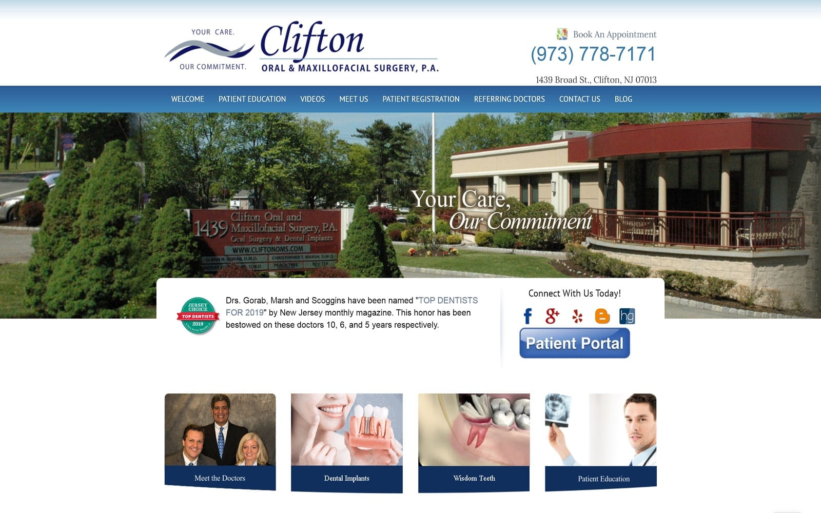
Why This Oral Surgery Website Works: Clifton Oral & Maxillofacial Surgery opens its web space up to its patients, using a refined, simple design to appeal to patients locally, and works to communicate a friendly disposition to its image. Their website utilizes the available whitespace to its advantage, incorporating navy blue headers and hyperlinks to engage its viewers fully. Overall, their website communicates positive experiences, showcasing their trustworthiness to those in the Northern New Jersey area.
2. Alamitos Oral Surgery
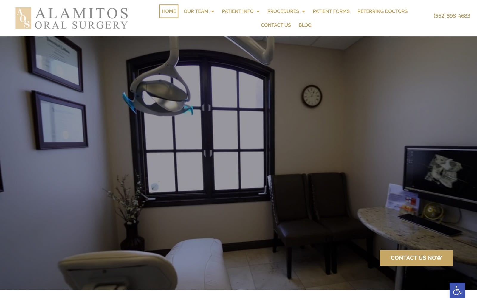
Why This Oral Surgery Website Works: Alamitos Oral Surgery relies on warmer, golden tones and ever-expanding whitespace to immediately create interaction with future patients, their headers use rotating slideshows, hyperlinked logos, transition slides, and embedded videos to fully and actively engage with their patients to establish authority. Alamitos Oral Surgery presents a sophisticated web design that strays beyond the traditional blues and brings out a warm, clean disposition through all of these modern elements.
3. Long Island Center For Oral and Maxillofacial Surgery
Visit Long Island Center For Oral and Maxillofacial Surgery
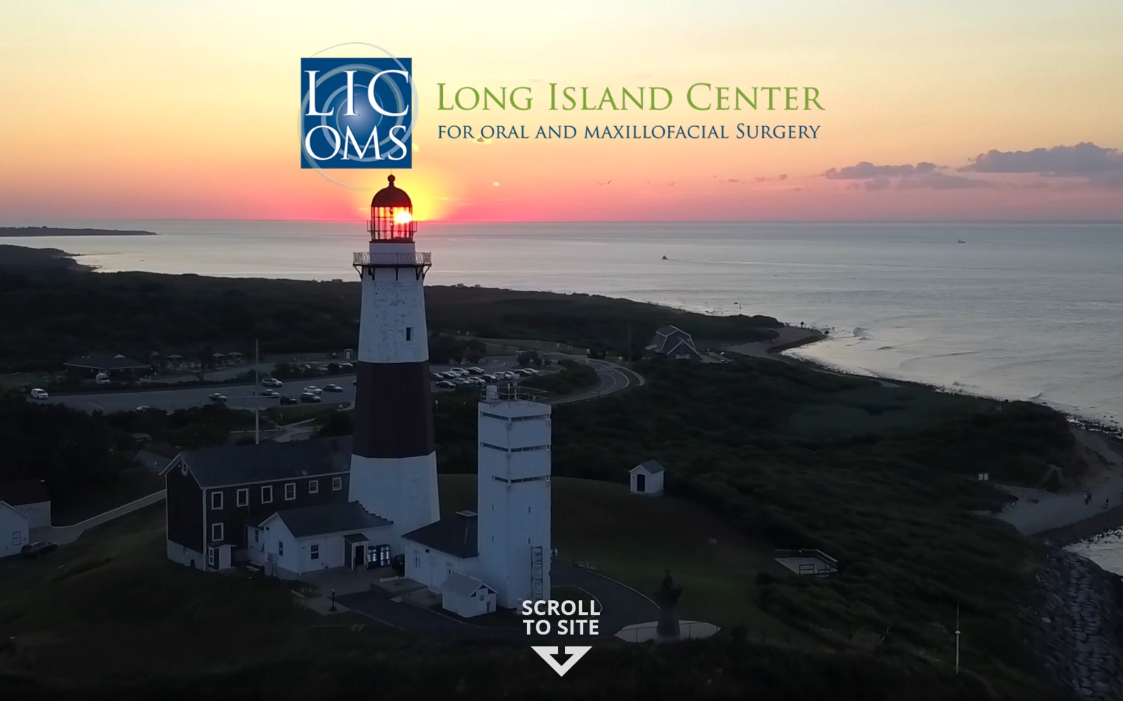
Why This Oral Surgery Website Works: Through a clean, refreshing color palette, Long Island Center for Oral and Maxillofacial Surgery greets patients with a transition video slideshow, using scenic views of their practice and location to appeal to their patient’s peace of mind. From there, patients are directed to scroll using icons, and all essential information is immediately available through action buttons, interactive videos, and hyperlinks. Its use of whites, bright blues, and vibrant yellow greens helps to entice viewers more actively and helps establish its conservative image upfront and personally.
4. Salem Peabody Oral Surgery
Visit Salem Peabody Oral Surgery
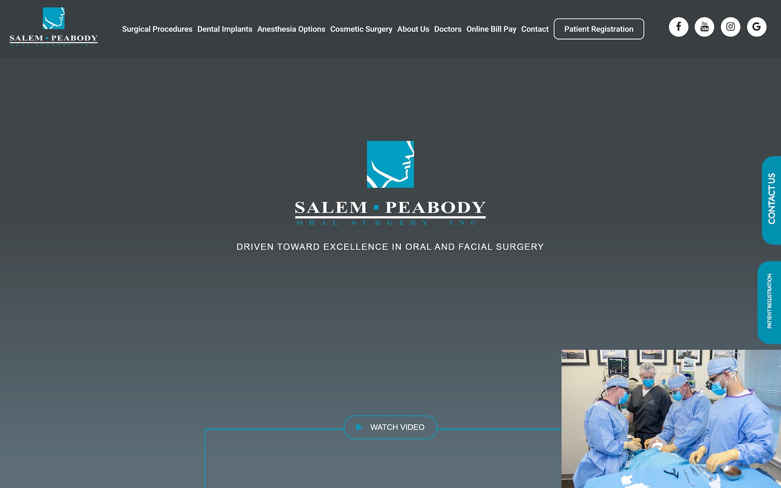
Why This Oral Surgery Website Works: Salem Peabody Oral Surgery focuses on its technological innovations as its advantage point above others, using a state-of-the-art video header to invite patients into their expertise immediately. Throughout their website, Salem Peabody relies highly on transparent layers and background images to convey their professionalism and authority in oral surgery. Its light blues, whites, and blacks make it classic yet distinctive in the medical industry. Overall, this visually appealing website places authority and trust as its main priority above all else.
Why Hire A Marketing Agency For Your Website Development
As the economic pressure rises in dental practices, hiring a marketing agency to keep up with these changes can be an excellent strategy to revamp your website and convey yourself to your new patients. Marketing agencies handle multiple aspects of marketing, including search engine optimization, writing ad copy, and generating free press. Marketing is made up of a large collection of specialists, and to narrow down and help you further develop your practice, there are two main categories for marketing specialists:
- Business Development: Business development refers to how your business builds relationships with hospitals, associated practices, and companies throughout your local area over time. This type of outsourcing handles the referral process that many patients use to contact your business.
- Marketing Communications: Those in marketing communications are responsible for websites, news releases, advertisements, and branding. All of these services can be completely outsourced and operates with the intention of building your brand from the ground up.
Medicine, business, and marketing are entirely different places of expertise and can make it challenging to determine what you need. Knowing your intentions and goals as a practice and establishing measurable goals when outsourcing is the key to a successful marketing plan. You can generate the new patients you need through a reputable company to transform your practice. Optimized360 is a marketing company specifically designed to work with dental practices like yours to meet your objectives and keep your business running long-term.
View full oral surgery website gallery

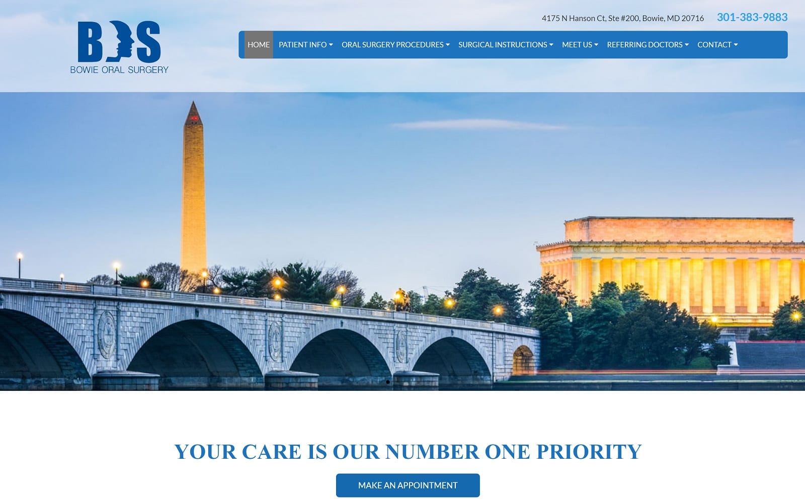
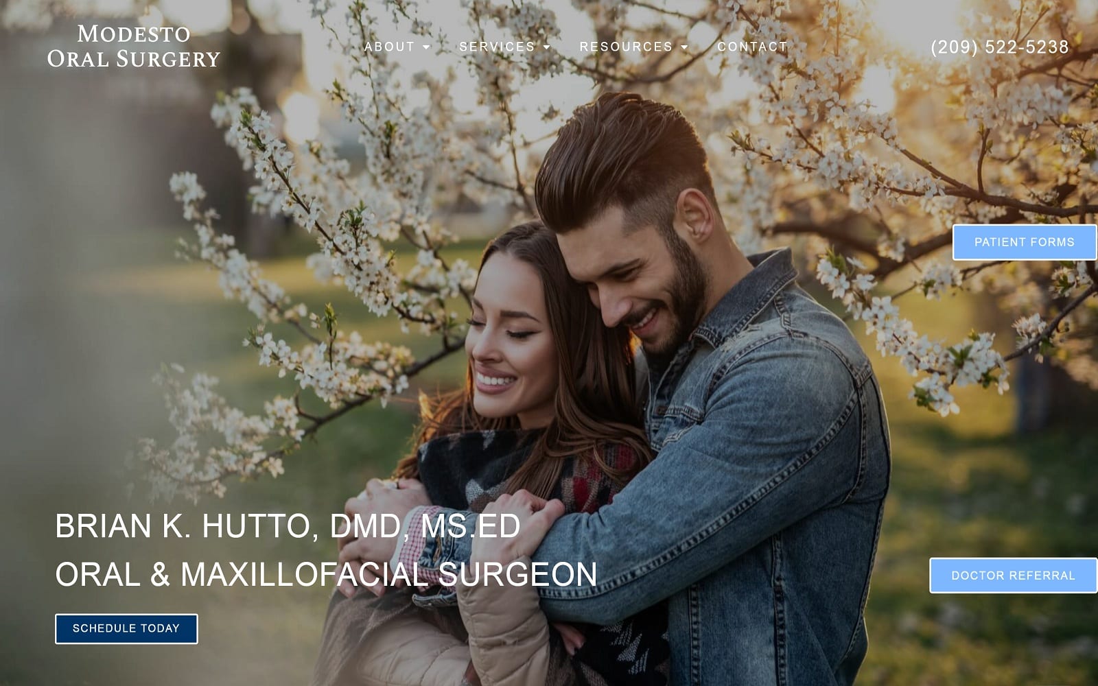
TOP DENTAL SURGERY WEBSITES OF 2021
The following five dental surgeon websites embrace the principles of cross-device design and provide an excellent viewing and interaction experience for potential customers regardless of platform. These site designs make it easy for site visitors to navigate pages, get the information they seek, and contact the business. A well-designed site is a powerful asset for acquiring new business and maintaining customer relationships. In the modern web, paying close attention to mobile website design is extremely important as more guests access mobile websites than traditional desktop and laptop computers. ComScore found that mobile devices overtook traditional computers in total web traffic in 2013. According to a SimilarWeb State of the Mobile Web US 2015 report, 56 percent of consumer traffic comes from mobile devices.
What is Responsive Design? What are its Goals?
Responsive web design aims to create a single website for all possible device types. It works by changing how content is displayed based on the screen or window resolution of the device or browser displaying the page. Modern websites are tasked with the job of displaying the same information across multiple device types with wildly varying screen sizes. In the early 2000s, web designers could anticipate the average site visitor was on a desktop computer with a screen resolution of 1024 by 768 pixels. This is no longer the case. When Internet-connected mobile devices with web browsers entered the market, websites handled this change by building two different websites: a desktop site and a mobile site. A few years later, tablets entered the fray, and devices of all classes started featuring a wide range of screen size variations. At this point, it made more sense to develop a single site for all devices that adjusts to the screen size instead of three different sites built to support the respective lowest common denominator.
1. OC Oral & Facial Surgical Specialists
Visit OC Oral & Facial Surgical Specialists
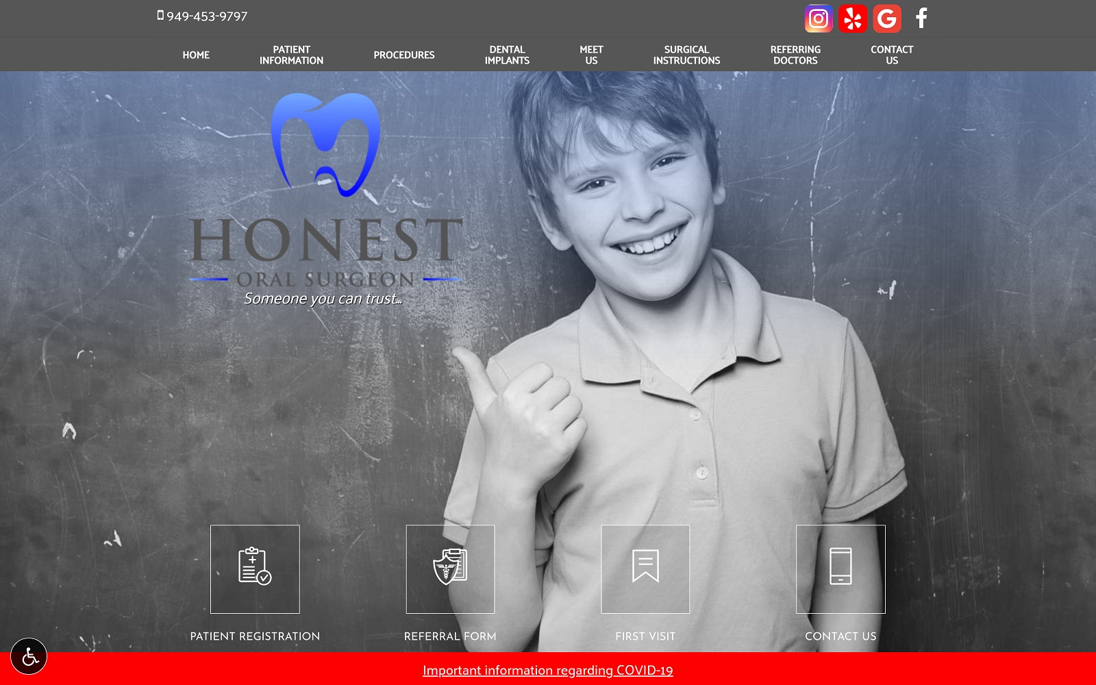
It’s a close call between the top two front runners, but this one takes it. OC Oral & Facial Surgical Specialists is another prime example of a dental surgeon website that embraces responsive design. The page design takes advantage of the full-screen real estate on large-screen desktop computers while being able to adjust itself to better display content as the screen size shrinks. The site does a fantastic job of reworking its navigation to play on the strengths of the respective screen size-related device types while making it incredibly easy to find the contact information on every page.
The page actually manages to rearrange content better than any other site on the list. The only noticeable downside is some text appears a little small on mobile devices, but it’s not enough to impact the typical user’s experience. Additionally, the site’s two-tier navigation system is fantastic for a guest trying to find specific information on a site that’s loaded with quality information. This site embodies a design built from mobile to desktop instead of the other way around. This is clear in how the site uses larger, touch-friendly buttons for links and displays articles and links in a scaffolding grid. From a usability standpoint, mobile sites don’t get much better than this. It feels like a full website, regardless of the device the guest uses to see it.
2. Clifton Oral & Maxillofacial Surgery, P.A.

Visit Clifton Oral & Maxillofacial Surgery, P.A.
Clifton Oral & Maxillofacial Surgery features an incredibly well-designed website that fully embraces responsive design concepts. All the information is easy to find on all screen sizes. Guests can see the site adjusting to a desktop computer by shrinking and expanding the window. If it’s on the desktop site, it’s on the mobile site: there are no content compromises here. This is a great feature because if a potential customer is trying to compare their notes and view the website simultaneously, the website can re-align itself so all the content appears on the page without needing horizontal scrolling. At the same time, the browser is set to occupy half of the screen.
The site’s easy-to-use menu appears across the top bar when in desktop mode and changes to a touch-friendly drop menu for other devices. The page content gracefully expands to occupy screen real estate for large screens and thins out for friendly scrolling on mobile devices. Contact and booking information is prominently displayed on the top of every page, office hours are easy to find, load times are lightning fast, and text is easy to read.
3. Inland Valley Oral Surgery & Implant Center

Visit Inland Valley Oral Surgery & Implant Center
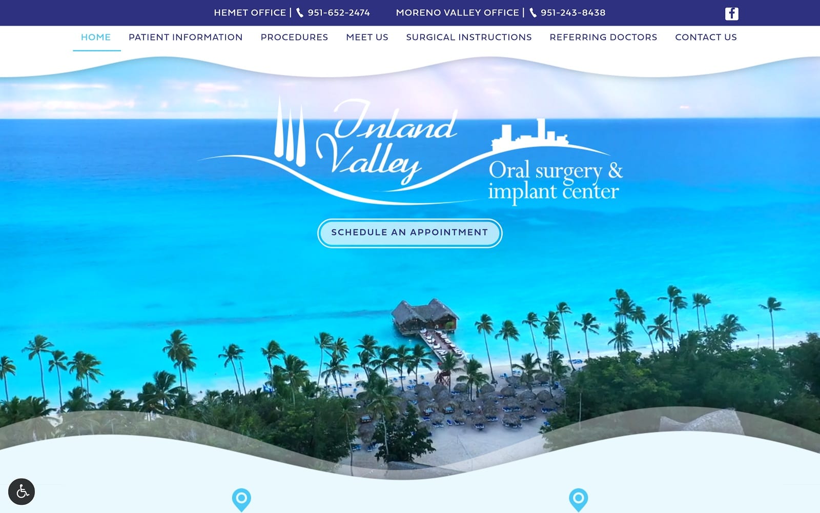
Inland Valley Oral Surgery & Implant Center sports attractively designed desktop and mobile sites. The desktop site is easy to navigate and puts all the important contact and appointment scheduling information in the header, making it easy for potential customers looking to contact the business. This is a site that focuses on communication. In addition to having easily available contact information, the homepage also features a quick contact option for comments and assistance.
The navigation balances the line well between having plenty of information and not overwhelming the visitor with a sea of unimportant links. The different pages divide content into manageable chunks that are both easy to understand and lend to fast load times. The mobile site plays to the strengths of the device type but ends up sacrificing much of the procedure information found on the full site to accommodate the smaller screen.
4. TorriMed Oral Surgery and Dental Implants
Visit TorriMed Oral Surgery and Dental Implants
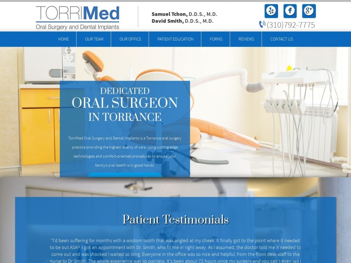
TorriMed Oral Surgery and Dental Implants features vibrantly designed desktop and mobile websites. The desktop site is tailored to be more of an informative site, whereas the mobile site changes the emphasis to easy contact for the guest. This site does an excellent job of focusing on the content that matters the most to the customer. The site features nine pages that are all loaded with helpful information for attracting customers, which is actually a positive thing because there’s no fluff wasting space on this site. Despite having two different sites, all information is available on both platforms.
Conclusion
Now that you’ve finished exploring some of the best oral surgery websites on the web, it’s time to start working on adding your own to the list. As you explore these sites, remember to gather information on which features and design elements capture your eye and, most importantly, those you dislike. When you’re ready to approach a website design company to get started on your site, be sure to bring this list with you. It will serve as an excellent guide to creating a website that serves your client base in a way that makes them confident they can rely on your clinic, its services, and its approach to customer convenience and service.
