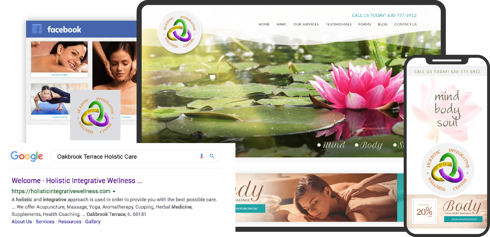
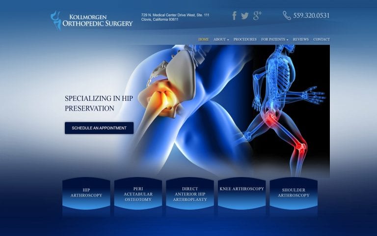
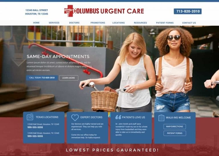
Holistic medicine website design is a creature all its own, following a seeming set of strictures that are mere guidelines in websites not dedicated to natural wellness. Elements, including image-heavy design and the common appearance of videos on the sites, are a direct response to the needs and demands of their clientele. Patients of Holistic Medicine take a lot from visual clues, such as the clinic’s dedication to natural sources of healing and alternative medicine.
If you’re setting out to design your own website for your holistic medicine practice, it’s important to remember its often patients’ first impression. Among these are color choices that appeal to your patient base, imagery that displays your services, and essential parts of the health style you promote. Click-to-dial and direct-to-map functionality is particularly essential in today’s society. Studies reveal that modern patients are frequently on the go and accessing websites from their mobile devices. The design of your logo is another important consideration and should reflect what your business is about.
Ultimate Web Development Guide for Holistic Websites
Below we’ve explored seven websites that perform these functions particularly well and serve as a great example for those looking to develop their own alternative medicine website.
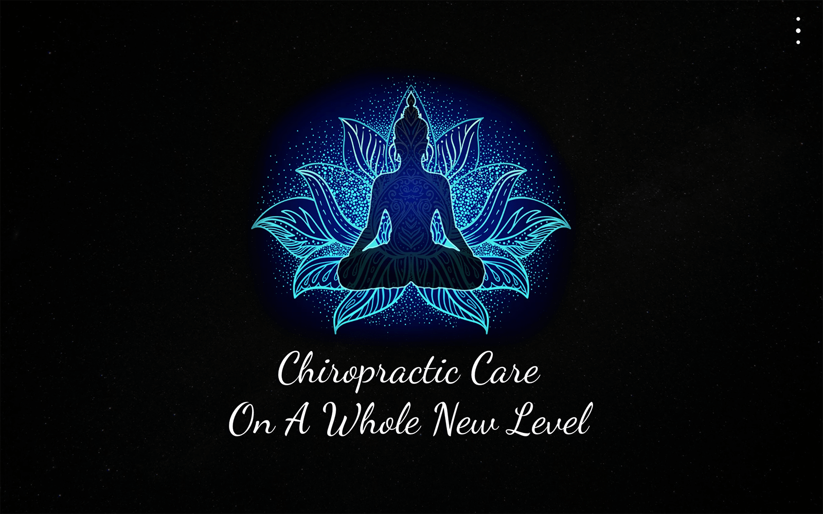
1. Align Chiropractic
Aesthetics
The Brain and Body wellness center opens with a slice-of-life scene, showing an elderly gentleman experiencing yet another birthday thanks to excellent health care. Located at the top of the page is a header where contact information and links to social media content can be found, as well as a convenient menu. This converts from having a transparent background to a mellow peach tone that compliments the green and white of the color palette well. Imagery and video are strongly favored throughout the site both to add in navigation and to highlight information attractively. Using a dancing couple of advanced years on the beach shows joyous results alongside a rotating selection of testimonials sharing the results experienced by other patients.
Functionality
The Brain and Body Wellness Center is packed with functionality and starts when patients arrive on the site. The top of the page provides a connection to social media channels and click-to-dial in the displayed phone number. The website’s mobile-integrated feature transitions from a moving video of a birthday scene to a static image Thanksgiving dinner with a family gathered around their grandparents. The green schedule an appointment button lets visitors start their journey with The Brain And Body Wellness Center immediately while inviting them to explore the site further. Information for patients about billing and connecting with the site is available through the related page, while a HIPAA secure contact form provides another method of making contact.
2. PainStop Wellness
Aesthetics
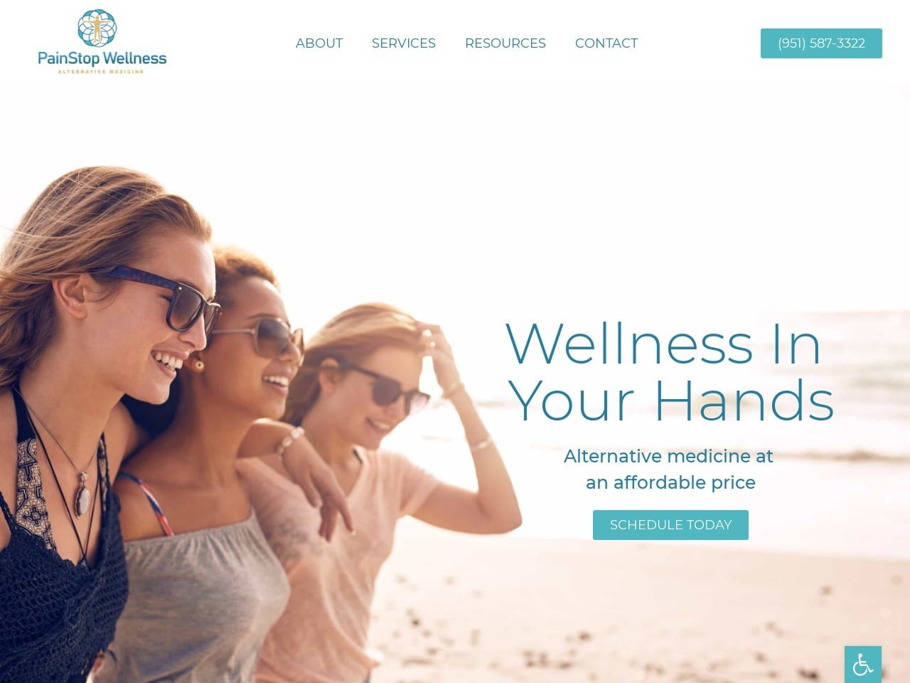
The first thing that strikes a visitor to this site is an image of happy women enjoying a day at the beach. A picture of an active, happy life among friends. Something that is craved among those who live a life with constant pain. The blue shades in the site evoke a sense of peace and hope, while the subtle pink tones indicate a nurturing atmosphere, all things that a patient seeking help with tackling pain hopes for in their provider. Imagery is used heavily in this site, guiding visitors to those areas of the site that have the information they require. The website’s design is remarkably light and open, enhancing the feeling of ease of movement that the first image evokes.
Functionality
The simple, image-heavy design isn’t accidental. Image-focused navigation is a powerful tool on mobile devices where text can be smaller and difficult to read. This design style helps alleviate those concerns by showing patients where they desire information through images that relate to the information provided in each highlighted section. The open and airy design makes it transfer between mobile and desktop viewing seamlessly and without losing any of its functionality or attractiveness. Reaching out to the clinic is a breeze thanks to the click-to-dial functionality that’s incorporated with the phone number in the header. As patients reach the bottom of the page, they’ll find a secure and easy-to-use form for contacting the clinic and easy one-click email, phone call, and map options.
3. OC Integrative Medicine
Aesthetics
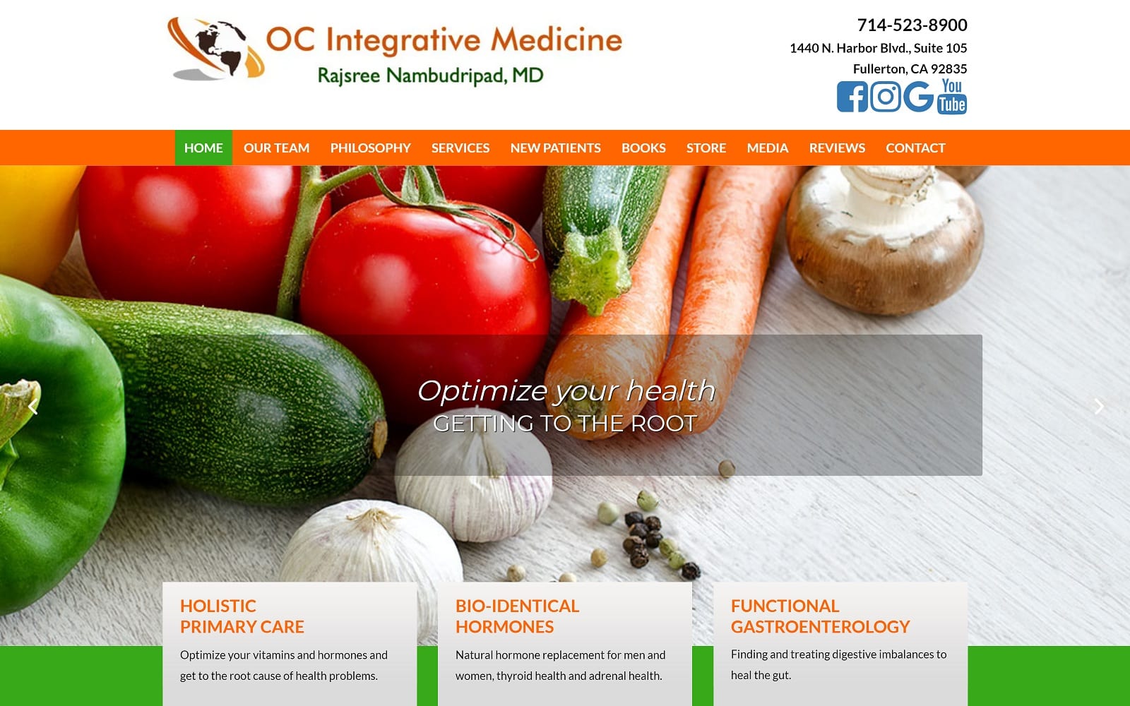
OC Integrative Medicine took a warm and natural approach to its holistic medicine website design, with the color palette being shared between the logo and the website itself. For a website focusing on natural medicine, green was an obvious choice, while orange made the site pop visually. The opening slide show shows inspirational messages, vibrant outdoor scenes, and healthy fruits and vegetables. Orange and green take turns as action colors, one offsetting the other to draw the eye to places the visitors can investigate further or take action to connect to the clinic. The website’s layout transforms quickly and easily between narrow window formats for mobile responsiveness and normal window formats for desktops to ensure its usable by today’s digitally-savvy patients.
Functionality
Connecting with OC Integrative Medicine is as easy as clicking on a prominently placed social media link or calling their clinic. Patients seeking additional information before reaching out can find abundant information through the clinic’s menu. Here there is important information for new patients, a link to the clinic’s store, and media. Videos throughout the site provide additional information and allow the patients to build rapport with the physician and their staff. A well-populated review page helps new and potential patients understand the experience that others have had with the physician and what they can expect. Throughout the site can be found HIPAA secure forms making it possible for the patients to reach out for more information about the clinic and what it can do for them.
4. Alabama Holistic Health
Aesthetics
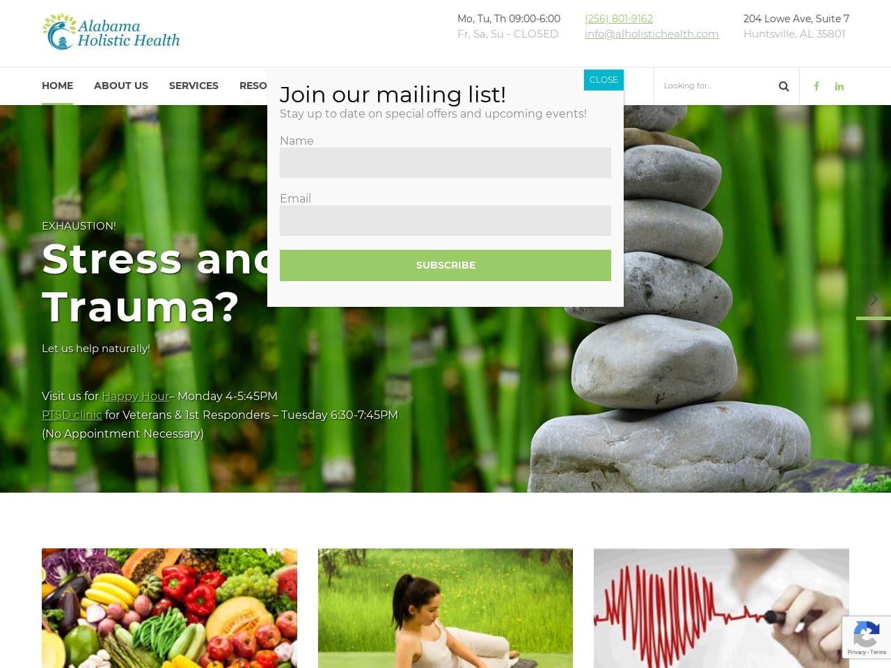
Arriving on the Alabama Holistic Health website allows visitors to sign up for their mailing list, making an instant connection between visitors and the clinic. A scrolling slideshow shows beautiful nature scenes, natural foods and medications, and leading questions and information about the clinic. The site has a mobile-centric design using large bright images to capture the eye and help direct patients to the areas of the site they are most interested in. Green and blue are the primary features of the website’s color palette, partly due to the association green has with nature and healing.
Functionality
This site emphasizes the importance of connection, whether it be reaching out to the clinic through their newsletter or learning how to connect diet and health. The simple menu on the site consists of a drop-down menu that provides instant links to the clinic by phone, email, or address while also giving the viewer access to the site’s office hours. The images in the site do more than mark the various sections of the site; they communicate messages of health, promises of a better life, and service. Videos throughout the site help connect the patient with the clinic and its physicians, while images highlight the clinic’s special products and services. The site has a full suite of options to connect to the clinic, including office hours, click-to-dial numbers, direct-to-map directions, email connection, and appointment scheduling. This is an excellent example of a fully functional and operational website.
5. Family Clinic of Natural Medicine
Visit Family Clinic of Natural Medicine
Aesthetics
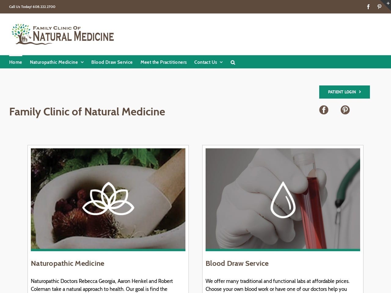
Warm browns, light greens, and a palette of clean white greet visitors to the Family Clinic of Natural Medicine’s website. Image-heavy design is popular among holistic medicine websites, often featuring their practices and natural ingredients. The earthy quality of brown meshes with natural healing green to create a traditional palette highlighting nature’s wonders. Once off the main page, the imagery becomes less prevalent. Instead, a focus can be seen on the clean, unfettered information delivery that aids the site’s mobile usability by keeping it lightweight. An exception can be found on the clinics ‘meet our practitioners’ page, where the entire staff is introduced to the visitor in a series of striking photos.
Functionality
This website is optimized for mobile devices while remaining attractive for desktop users. The function is integrated smoothly into the site, starting with the click-to-call option immediately at the top of the page, a perfect and easy way for mobile device users to reach out. A green button highlights access to the patient portal where clinic clients can receive and deliver information to their physician through a HIPAA secure format. Images are used throughout the site to guide users to important areas where they can collect valuable information about the services they require. Videos are a valuable patient education tool, as well as providing an opportunity for rapport building and demonstrating the practice’s acclaim.
6. Seattle Integrative Medicine
Visit Seattle Integrative Medicine
Aesthetics
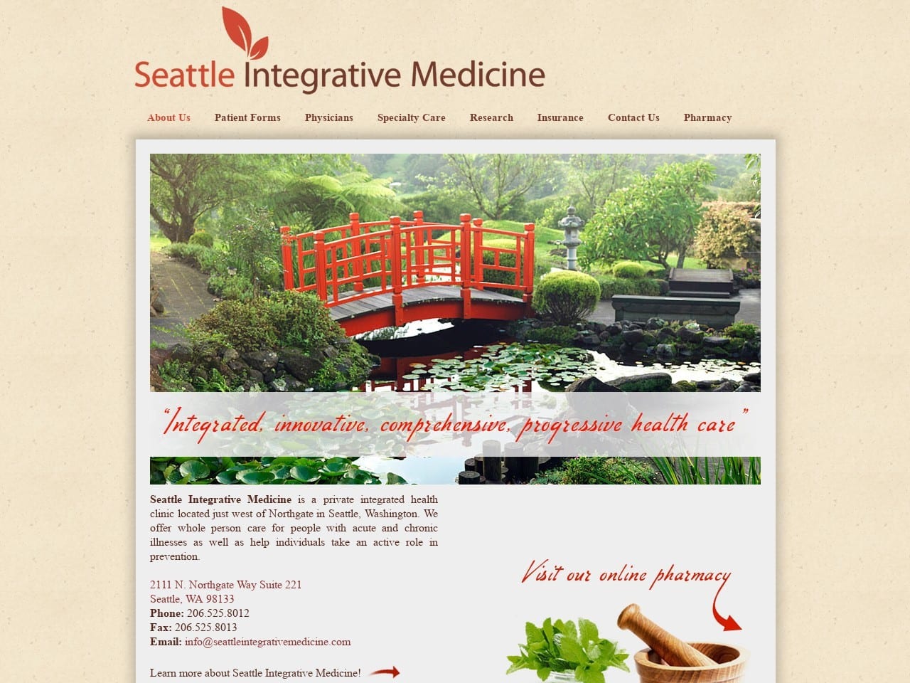
A soothing image of the Japanese Gardens in Seattle greets the viewer, setting them in mind a peaceful moment of healing and reminding them of the source of many of today’s alternative medicine practices. The orange tones of the clinic’s logo are reflected both in the site and in the color of the bridge in the image, giving a sense of connectivity and order to its appearance. The lightweight nature of the website’s design makes it easily accessible, especially on mobile devices. This design is carried out through all areas of the site, with only critical text and informative images being used to keep site visitors moving swiftly and easily throughout.
Functionality
The main page is incredibly lightweight, using only a few images and minimal text to provide information about reaching the clinic. This makes the site quick to load on mobile and desktop devices alike, perfect for the busy potential patient on the go. The menu provides ample information to potential patients, including first-visit guides, forms, and information about HIPAA practices. Links to the clinic’s pharmacy are available at the base of every page. In contrast, the contact us page includes useful functionality for mobile users, including click-to-dial and direct-to-map features. The Pharmacy link directs visitors to a fully-featured e-commerce store that provides valuable information to visitors.
7. Mandala Integrative Medicine Clinic
Visit Mandala Integrative Medicine Clinic
Aesthetics
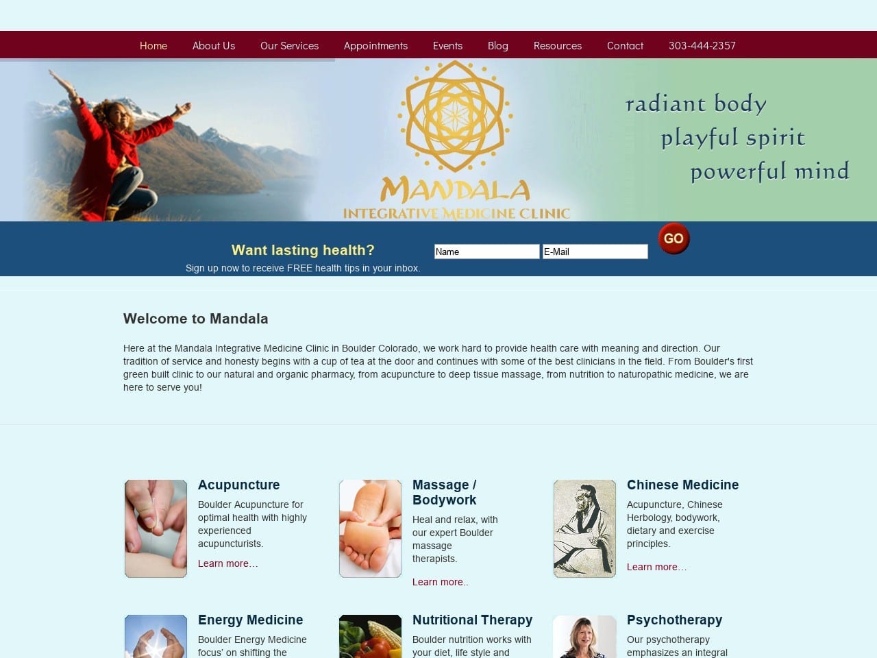
Mandala Integrative Medicine has a very clean and attractive site, which is beautifully divided using traditional straight-line sectioning. The images at the top of the site stand as a feature, rather than a focus, of the landing page, but use images that convey happiness, health, and active life outdoors that are attractive to many patients of natural medicine. Simple but relevant images are used to direct patients to valuable information. On mobile devices, the menu on this page collapses to a drop-down menu that is easy to use, providing access to all site areas with just a click. The balance of images to text continues throughout the site, with the practitioner’s page introducing visitors directly to the staff with a warm and receptive image.
Functionality
The design of this website includes basic functionality that should be standard on any website, including click-to-dial functionality found in the phone number in the site’s slide show image. The HIPAA secure form beneath that provides access to the clinic’s newsletter, essential for staying in touch with your patients and reminding them about important events. Forms are made available to aid patients in preparing for their first visit to the clinic, and the blog provides an educational element essential to an educated client base.
THE BEST 7 FUNCTIONAL MEDICINE WEBSITES OF 2021
As a growing field that remains poorly understood by the general public, holistic medical practices need informative and effective websites. Presenting your clinic’s techniques, practices, and philosophies is essential to reaching your target audience. Perhaps more importantly, a site that is clean, accessible, and informative ensures that those new to holistic practice can easily understand the benefits it has to offer. Below we present a series of sites that demonstrate these principles and have helped propel these practices to prominence.
1. Alternative Health Center of the Woodlands
Visit Alternative Health Center of the Woodlands
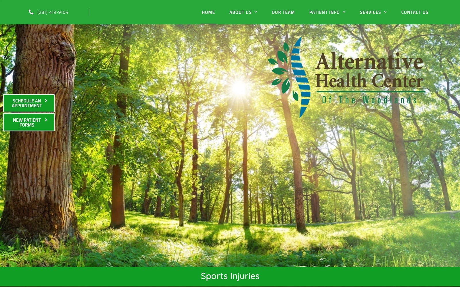
What We Love About This Holistic Medicine Website: It starts with immersion in healing, beautiful green. From there, it elegantly presents its services in a way that’s easy to digest. Access to new patient forms is immediate, easing the transition of visitors into patients. Combined with a schedule appointment button, this helps the time spent on the first visit be more effective. Telehealth options are provided immediately, showing their dedication to the convenience and health of their patients. The earthy browns used in the layout also provide a sense of stability and reliability. Overall a fantastic website with great design elements. An important endnote: Accessibility features placed prominently on the first-page show dedication to respecting patients’ experiences.
2. MLK Acupuncture
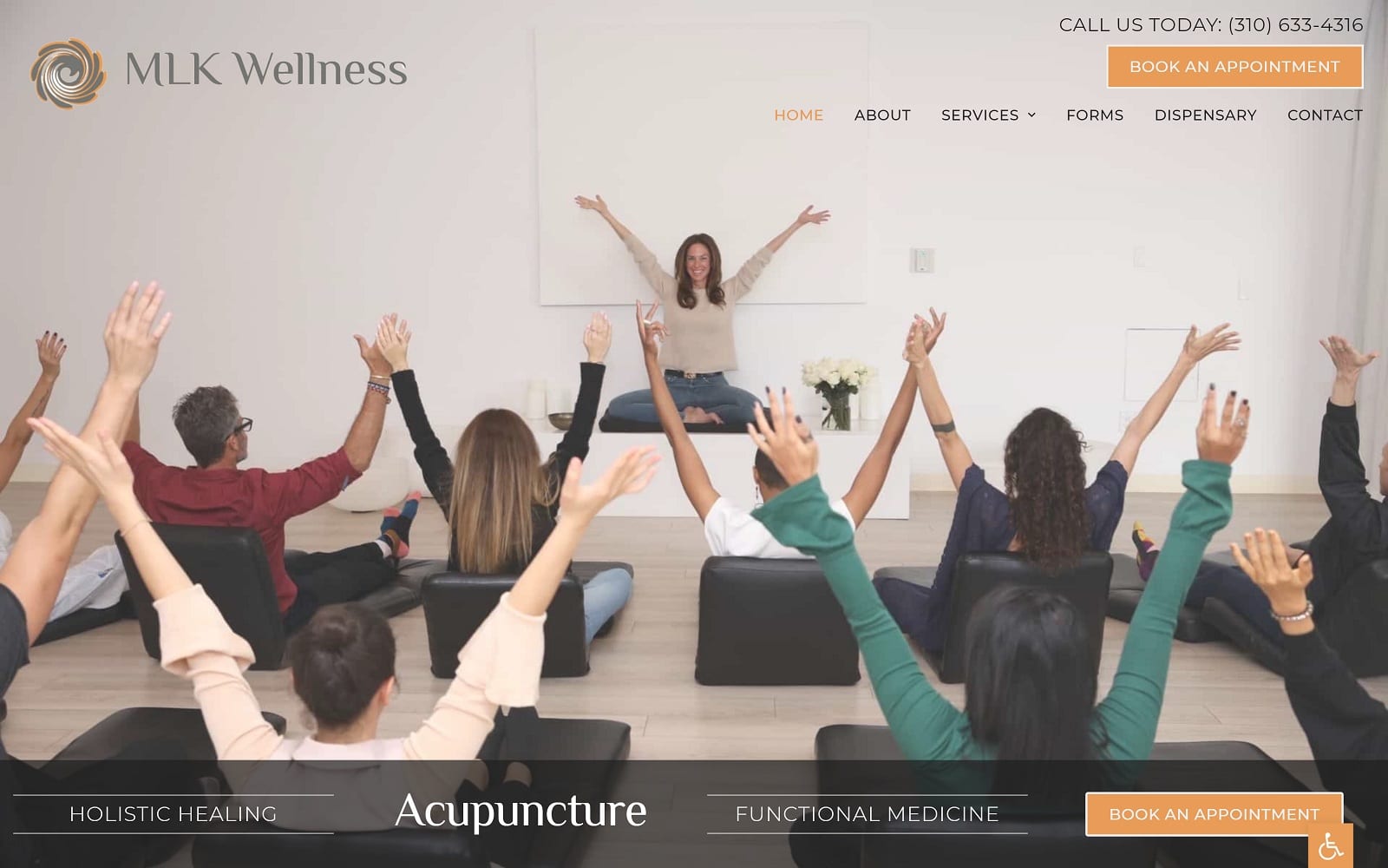
What We Love About This Holistic Medicine Website: MLK Acupuncture wants to help visitors feel welcome and at home at their clinic. They begin sending this message through the use of the main page slideshow that showcases their interior. A willingness to approach different treatment methods and serve various walks of life is evident throughout. One beautiful indicator of this is the spiral imagery in their logo, with the yin-yang symbol at its core. This site also emphasizes the accessibility of information for the patient. This is achieved by making new patient forms available, easy-access pages about insurance acceptance, and more. Connection is also a core principle, as seen in click-to-map and dial functionality availability.
3. OC Integrative Medicine

What We Love About This Holistic Medicine Website: Bright, vibrant colors, nature scenes, and whole foods are a central tenet of this site’s imagery. Holistic care often focuses on natural health practices emphasizing more natural food options. The clinic’s primary services are also prominently visible on the home page. In addition, their menu provides access to information, including books, media references, and the philosophy of their clinic. Orange and green indicate vitality, nature, healing, and action, all things many holistic patients hope to achieve and preserve throughout their lives.
4. South Atlanta Integrative Medicine
Visit South Atlanta Integrative Medicine
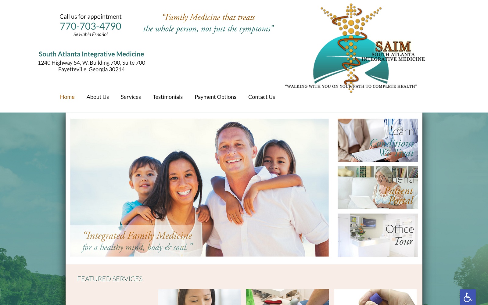
What We Love About This Holistic Medicine Website: This design integrates the clinical nature of traditional medical site design, emphasizing natural themes. The background presents beautiful nature scenes, while the visuals of the core site provide information about their services. Everything you need to schedule an appointment can be found on the home page, but a deeper investigation provides ample information about their services. Payment options, testimonials, phone numbers, and directions are all prominently featured at the top of the home page. The white, blue, and subtle green hues send messages of healing, clarity, and hope to site visitors.
5. Physicians Premiere Weight & Wellness Center

Visit Physicians Premiere Weight & Wellness Center
What We Love About This Holistic Medicine Website: While holistic practices often lean towards a more earthy and nature-bound design, that’s not the only way to build a solid wellness site. This site focuses on a professional and modern feel that is striking and suitable for a more sophisticated clientele. Even their logo has a distinctly upscale feel to it appropriate to their target patient base. Book Online options make scheduling an appointment easy, encouraged by reviews from enthused past clients. The placement and color choices for the menu bar continue to support the feel of elegance while providing easy access to every important aspect of the site. The end result is a site that demonstrates the philosophy of the clinic and its practitioners smoothly while veering away from the nature-themed elements prominent in other sites.
6. Seattle Integrative Medicine
Visit Seattle Integrative Medicine
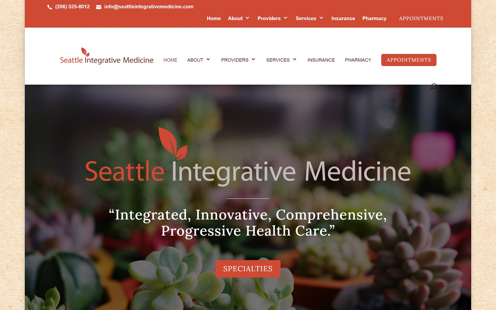
What We Love About This Holistic Medicine Website: Rich natural imagery greets visitors, connecting them to the fundamental philosophies of holistic medicine. This site stands out due to its non-traditional color choices. Blues and whites are largely absent, with warm tones, off-whites, and oranges playing prominent roles. These colors represent welcome, health, and, most importantly, action. Seattle Integrative Medicine is about more than just generalized holistic health. Instead, it covers a broad set of integrated medical practices covering all health areas. Their design makes it easy to connect with the clinic, take advantage of their online pharmacy, and easily find your way to their location. It’s a beautifully detailed site with great functionality.
7. Family Clinic of Natural Medicine
Visit Family Clinic of Natural Medicine
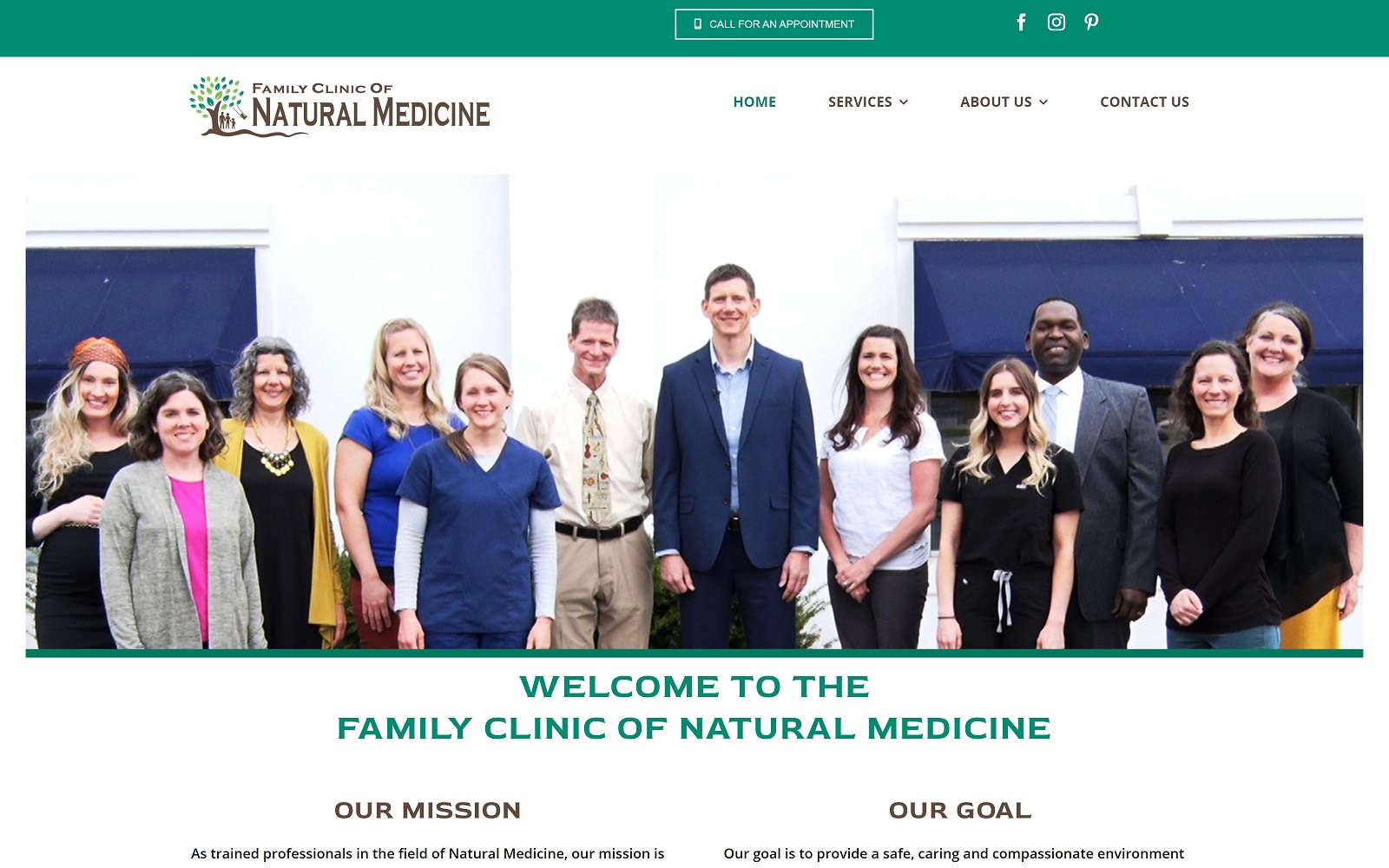
What We Love About This Holistic Medicine Website: Sometimes minimalism is your best approach, and sometimes it’s a balancing act. Family Clinic of Natural Medicine can’t quite be called minimalist, but it’s light on the visual elements. The imagery used is simplistic, almost iconographic, in nature. However, in the context of the rest of the site, it delivers a message of straightforward care with down-to-earth principles. Relationships with patients are clearly communicated as a central focus of the clinic through its presentation of its staff first and foremost. This style of choice delivers a message of welcome and community and that patients are more than faces and income streams.
Important Factors In Designing A Holistic Medicine Site
Holistic medicine isn’t well understood by the majority of patients. Those looking into it for the first time must be presented with solid information affirming its effectiveness and validity.
- Authority Through Appearances: Presentation is essential for patients new to holistic medicine and those who have experienced its benefits. A well-formed landing site will help alleviate concerns in those unfamiliar with the holistic practice. It will also inform the knowledge that your clinic will provide the kind of care they seek.
- Provide Accessible Information: Ensuring that information is easily accessible is critical. It must be easy to find and understand by the layman. This can be accomplished through a well-designed site.

Finding a website designer who understands the special concerns often facing holistic medical offices can be useful. Optimized360 is one such designed and supports a range of holistic medicine practitioners with their professionally designed holistic sites.
Conclusion
Each website brings something unique to its presentation that helps them stand out from its competition. While doing so, they pay attention to essential design elements, including ease of navigation, aesthetically appealing imagery, and convenient functionality for their viewers. As you set out on your own journey to develop a holistic medicine website, be sure to take the time to examine your competition’s design and whether they’re using a template. Each of them will have something that catches your eye as a great design decision or something you want to avoid.
Once you have compiled this list, you can decide how your website will be designed. This is often best accomplished by sitting down with a team of professionals and discussing your vision. They’ll work with you and provide the necessary expertise to create a cohesive and functional website that provides your patients with all the elements required for a great experience with your clinic. Remember that your digital presence often serves as the first impression you never know you made, so make sure your site makes it count.
