This article highlights the 7 best urgent care websites of 2024, selected for their exceptional design and ability to build trust with patients. Created by a team of expert web designers, these websites serve as a source of inspiration for those looking to create or improve their own urgent care website design.
Our aim is to show you how a well-designed website can enhance patient experience, strengthen your online presence, and foster trust. You can also check out more examples in our urgent care web design portfolio to see our designs.
The secrets behind urgent care websites.
So, what makes up a custom-built website? Beautiful graphics, fresh content, and a unique layout are just parts of how you represent your practice outside your community. Your online website is your ownership of your practice, and it’s important to consider how website design can impact your practice in this ever-changing environment. To see what we mean, here are some of the top urgent care websites out there that set an example:
1. Universal Point Clinics
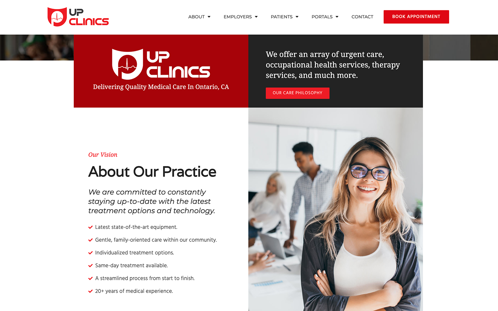
How This Urgent Care Website Inspires Us: Universal Point Clinics is renowned for its services to both patients and employers and acts as a multi-specialty clinic. Through vibrant reds, neutral dark grays, and whites, UP clinics commit itself to its professional outlook by expanding greatly on its content. Bullet points, action buttons, and executive-style imagery appeal to industrial companies and employees seeking urgent care services. It presents a technologically advanced design featuring a clean format that appeals to the need for trust and security.
The Best Urgent Care Marketing Ideas
2. MD First Primary & Urgent Care
Visit MD First Primary & Urgent Care
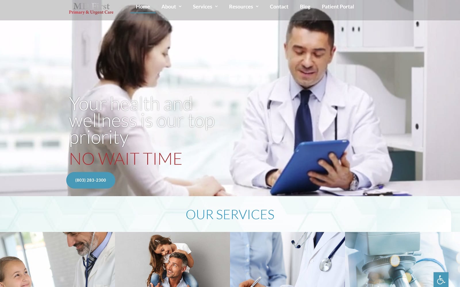
How This Urgent Care Website Inspires Us: MD First Primary and Urgent Care focuses on its appeal to families through engaging header videos, light, airy imagery, and softer color palettes. Light blues, reds, and whites work to accent the main focus of the website’s direction, implementing its use of white space to expand on its family-focused imagery and medical approach to urgent care. Its website layout asks its visitors to take their time through its soft transparent layers and expanded content and plays with multi-layered elements to create a fully encompassing and comforting experience.
3. Rolling Hills Clinic
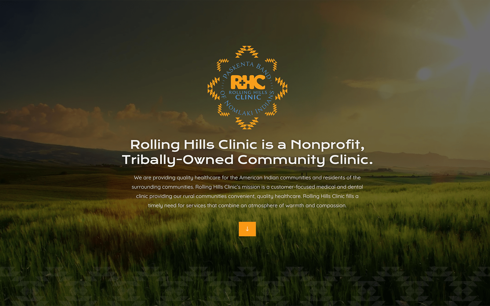
How This Urgent Care Website Inspires Us: Rolling Hills Clinic works to engage with a unique audience, focusing its efforts on American Indian minorities and other residents within their community to provide its urgent care services. Because of this specialty’s warm yellows, cool blues, and intricate pattern work play into these goals without losing its main identity. Expansive imagery provides a framework for its visitors and works to engage those visitors through action buttons, transparent layers, embedded videos, and other widgets. Its appeal to minorities and its surrounding communities makes it an iconic example of urgent care that’s founded in its image.
4. Coastal Injury and Rehab
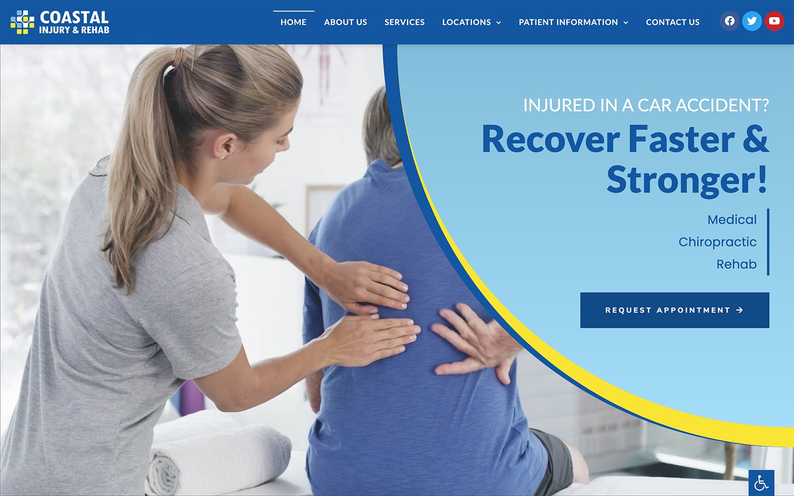
Visit Coastal Injury and Rehab
How This Urgent Care Website Inspires Us: Coastal Injury and Rehab provides a subsection of urgent care that extends into physical therapy and rehabilitation. For those with major injuries, this practice captures the attention of their potential patients through bright colors, playful animations, and smooth transitions. Bright yellow works as the action color for contrast against the cool blues, and its animated videos, topic-focused imagery, and icons help direct visitors toward its content. Through these elements, their focus on spinal treatments and other injuries makes their practice highly valuable in the urgent care industry.
5. Valley Med Urgent Care
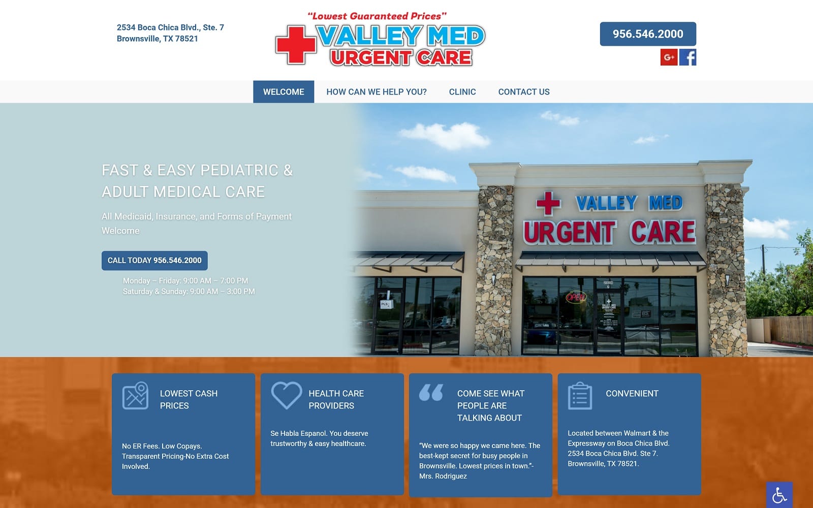
How This Urgent Care Website Inspires Us: Valley Med Urgent Care works to interest those within their local community by keeping their website simplistic and colorful. Using complementary colors that work to contrast its elements, Valley Med Urgent Care creates a design that allows patients to easily navigate throughout the website with large headers, map widgets, locality-focused imagery, and simple navigation menus that make this urgent care office all the more engaging.
6. AllCare Clinic
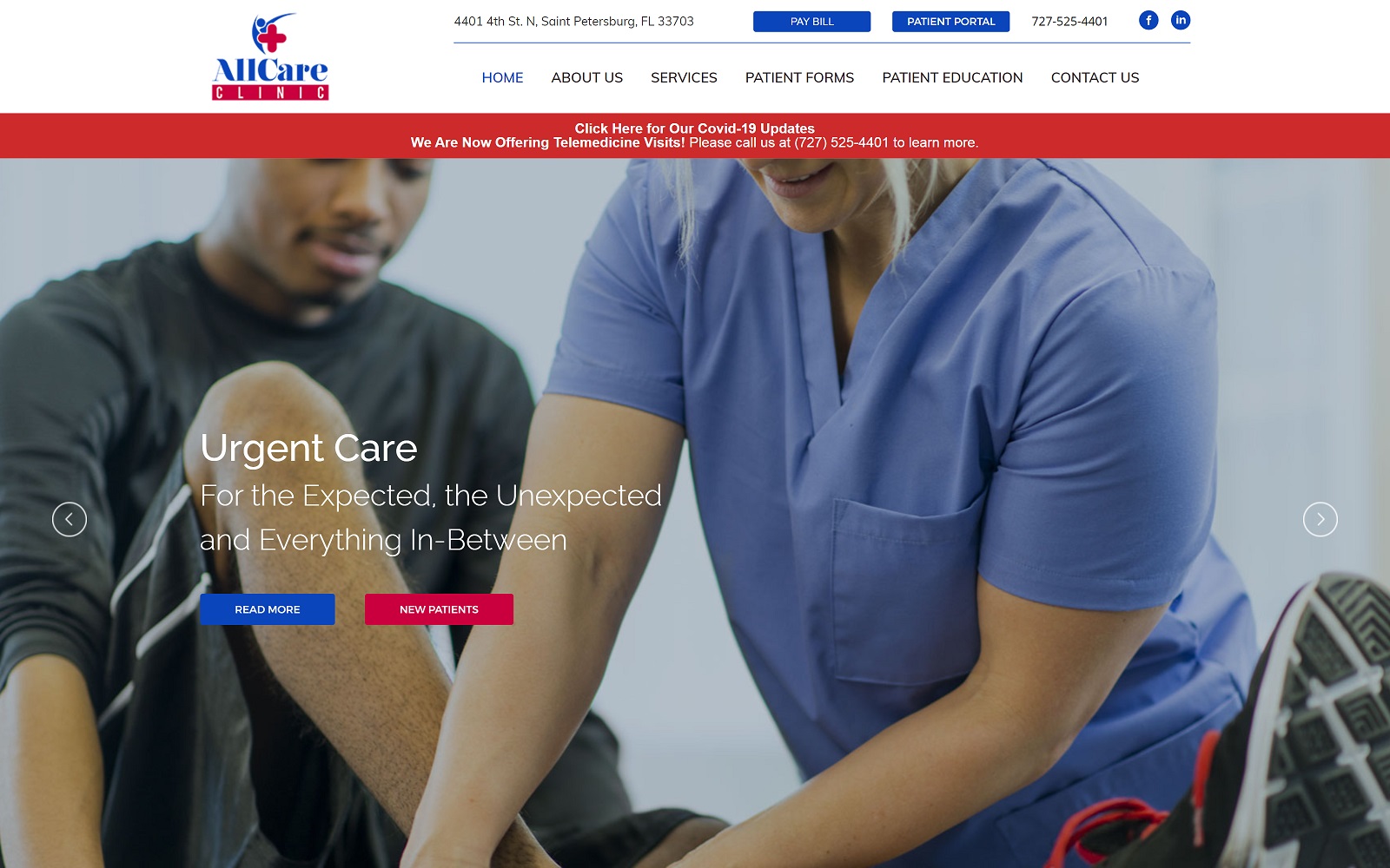
How This Urgent Care Website Inspires Us: AllCare Clinic expands its services beyond urgent care, creating subsects of primary care that focus on men’s and women’s health, medical aesthetics, diagnostic imaging, and preventative care. Because of these expansive topics, AllCare Clinic sticks with the traditional blue and white color palette to appeal to patients’ identification with the medical industry. From there, friendly, topic-focused imagery, hyperlinks, and action buttons are accents to the main content that educates patients about their website and services.
7. MedExpress Urgent Care
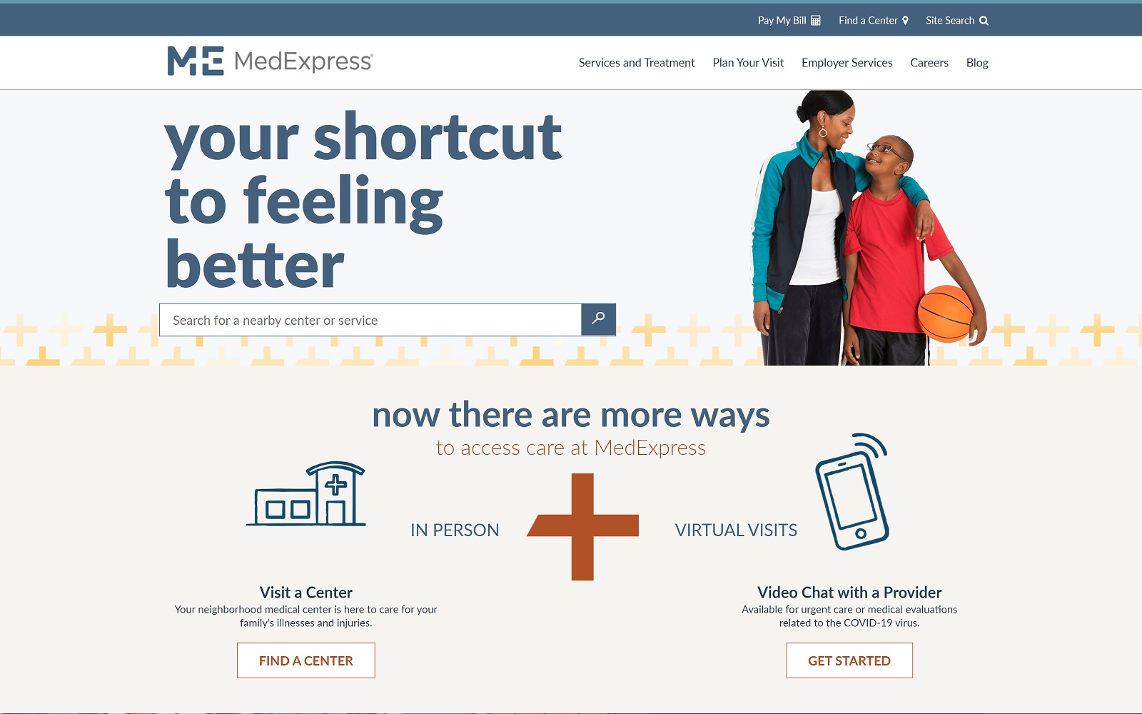
How This Urgent Care Website Inspires Us: MedExpress, as one of the most popular chain-brand practices for urgent care, has earned its spot for a reason. Its dark navy blue outlines and playful color schemes all work to provide contrast for various sections. Its imagery is focused on inclusivity, compassion, and its expansive outreach to local communities. Because of its dynamic color palette, its colors place more emphasis on the available content. Its large text and action buttons then act as the targeting point, engaging visitors to become new patients at their local practice location, making their commercial practice an example to follow.
How Your Brand Identity Influences Your Patients Experience

Out of all the selected practices, each one of them focuses on its online presence through its identity. Urgent care practices servicing their communities means that not only do they need to provide web design elements to improve local search rankings, but they also have an identity that matches the goals and aspirations of how they provide patients with quality care. Outreaching your audience means understanding what you can provide. Ultimately, sticking to a core identity that fosters healthy, positive relationships with patients can improve the experiences they receive and ultimately influence your website’s online reputation.
But improving your website’s reputation also means following your aspirations with a strategic plan to reform your website’s appearance. Optimized360 can provide marketing plans that encompass all of your requirements, and you can see what our marketing agency can provide through our urgent care website gallery.
Key Factors for Building a Great Urgent Care Website
To create a great urgent care website, you need to focus on these key factors:
- Domain Name
Your domain name is your first impression online, and it needs to be clear and memorable. For example, a name like “CityUrgentCare.com” tells patients exactly what they need to know, who you are, and what you do. It’s easy to remember and directly connects with your services.
But a name like “HealthSolutionsQuickly.com” is vague and doesn’t communicate that it’s an urgent care facility. The simpler and more relevant your domain name, the easier it is for patients to find and trust your practice.
- Platform and Hosting
Choosing the right platform can help you design a website that looks great and functions smoothly. O360 offers a comprehensive platform designed specifically for healthcare professionals, including urgent care providers.
We provide a full range of services like custom website design, logo creation, and HIPAA-compliant communication tools. Their websites come with integrated features such as appointment booking systems and patient forms, ensuring secure, seamless communication and efficient online management for your practice
Additionally, O360’s accessibility plugin helps ensure that websites are compliant with accessibility standards, making them more user-friendly for patients with disabilities.
Once your website is ready, O360 provides fast and reliable hosting, ensuring that your site stays online and loads quickly, so patients can easily access the care they need without frustration.
- Content and Images
Content needs to be straightforward and written in a way that speaks directly to patients. Avoid using complicated medical jargon and focus on explaining your services in a way that anyone can understand. For example, instead of saying “comprehensive urgent care solutions,” explain what you offer, like walk-in services or extended hours.
Also, include real images of your clinic, staff, and patients (with their consent) to help make your website feel more personal. Patients appreciate seeing who they’re going to trust with their care, and authentic visuals can help build that connection.
- Know Your Audience
Knowing your audience means creating a website that delivers the information they’re looking for right away. Patients coming to an urgent care website usually want quick answers.
Your site should make it easy for them to find important information, like your services, location, and hours of operation.
Tips to Keep Your Website Fast and Efficient
- Secure Your Site: Use HTTPS and SSL to make sure patient data is protected. Security helps build trust and ensures privacy.
- Optimize Images: Large images can slow down your site. Compress them while keeping the quality intact to ensure fast loading times.
- SEO and Speed: A fast site improves your chances of ranking higher in search results, so regularly check for anything that might slow it down, like outdated plugins or large files.
- Listen to Feedback: Pay attention to user feedback regarding site speed or navigation and address issues as soon as they come up.
- Check PPC Landing Pages: If you’re using pay-per-click ads, make sure your landing pages load quickly to avoid losing potential patients.
- Update Content Regularly: Keeping your content up to date ensures your website stays relevant and doesn’t get bogged down by old, unused files.
- Use a Reliable Hosting Provider: Cheap hosting might seem appealing, but it often leads to slow speeds during high traffic. Invest in a reliable hosting provider like 0360 with strong performance and good support.
Final Remarks
A great urgent care website design helps patients find the information they need quickly and easily. When your site is fast, well-organised, and communicates your services clearly, patients are more likely to trust your practice and choose you for their care.
Keep in mind that a good website not only boosts your online presence but also improves patient engagement and makes your practice accessible to anyone searching for urgent care.If you’re ready to build a site that does all of this, reach out to O360. We’ll create a site that’s efficient, professional, and tailored to your practice’s needs.
