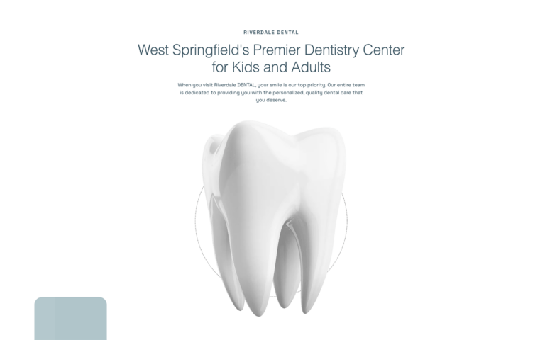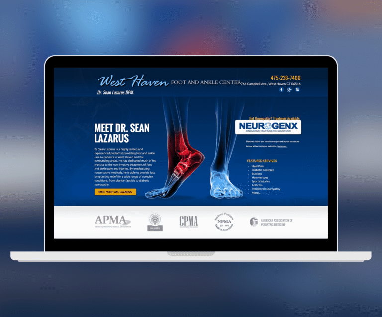

A medical website is not a brochure. It is the front door of your practice — the place where a person in pain, a worried parent, or a patient comparing three providers decides whether to call you or the practice down the street. Over the years, our team at O360 has designed more than 500 websites for doctors, dentists, and healthcare organizations, and that experience has taught us exactly what separates a website that wins patients from one that quietly loses them.
This guide collects everything we tell our own clients, illustrated with real designs from our portfolio — not theory, but the actual work.
1. Patients Judge Your Practice Before They Read a Word
Research consistently shows visitors form an impression of a website in a fraction of a second — long before they read your credentials. For a healthcare practice, that impression is a proxy for clinical quality: an outdated, cluttered site suggests an outdated practice, however unfair that is. The design must communicate three things instantly: this practice is professional, this practice is current, and I am in the right place.
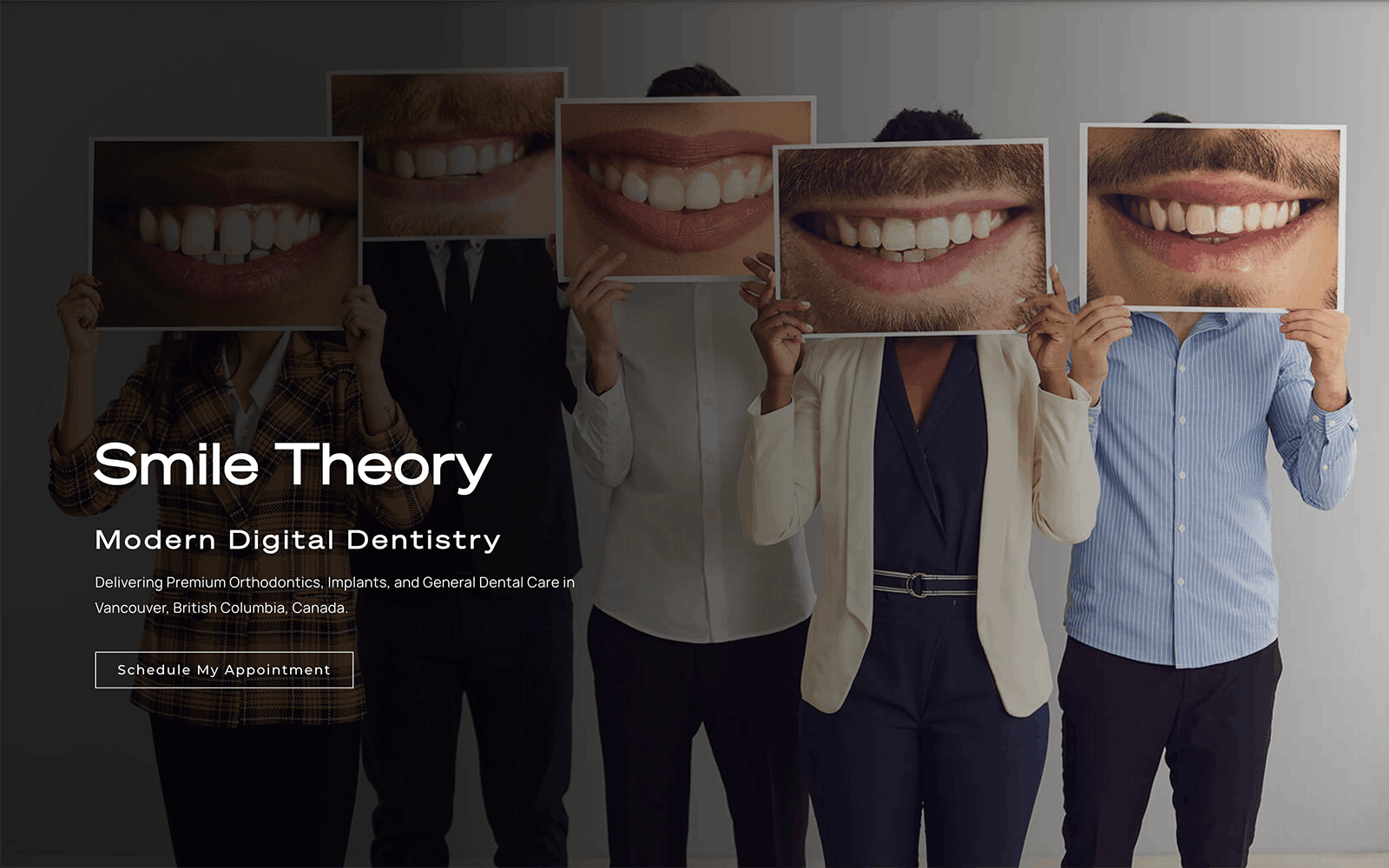
In our Smile Theory design above, notice what you do not see: no wall of text, no competing menus, no stock collage. One striking visual, a clear promise, and an obvious next step. That restraint is deliberate — every element you remove makes the remaining ones stronger.
2. Design Around the Appointment, Not the Brochure
Every page of a medical website has one real job: help the patient take the next step. When we audit underperforming healthcare sites, the most common failure is a beautiful site where the path to booking is buried. We design every layout around three persistent actions:
- Call — a tappable phone number visible on every screen, especially on mobile.
- Book — an appointment request or online scheduler reachable in one click from anywhere.
- Find — location, hours, and insurance information that answers the practical questions before they become objections.
3. Your Specialty Should Shape the Design
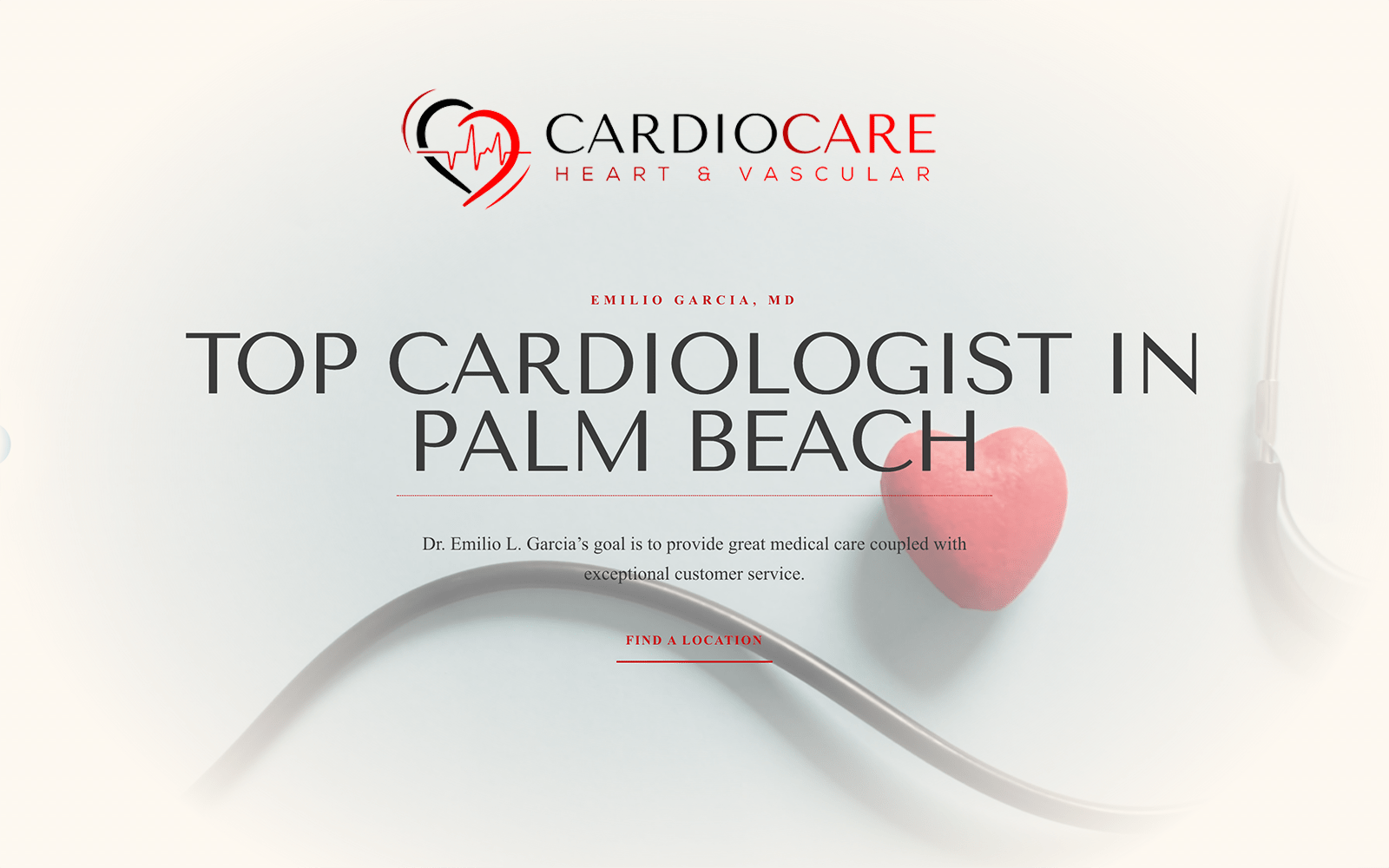
A pediatric dentist and a cardiothoracic surgeon should not have interchangeable websites. Patients arrive with different emotions — excitement, anxiety, embarrassment, hope — and the design’s color, typography, imagery, and pacing should meet them where they are. Here is how that plays out across the specialties we work with most.
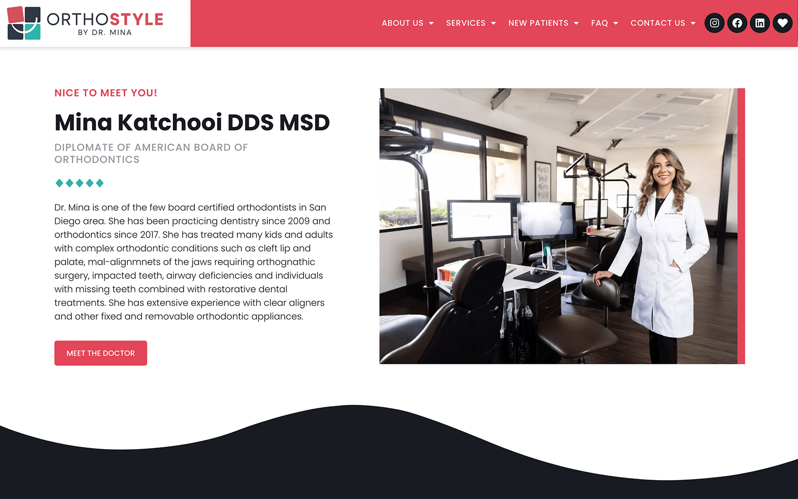
Dental and Orthodontics
Dentistry is one of the few medical fields where the result is visible, so the design should be too. Smile photography, before-and-after galleries, and warm, confident color palettes outperform clinical sterility. For orthodontics, where the audience skews younger, we push the style further.
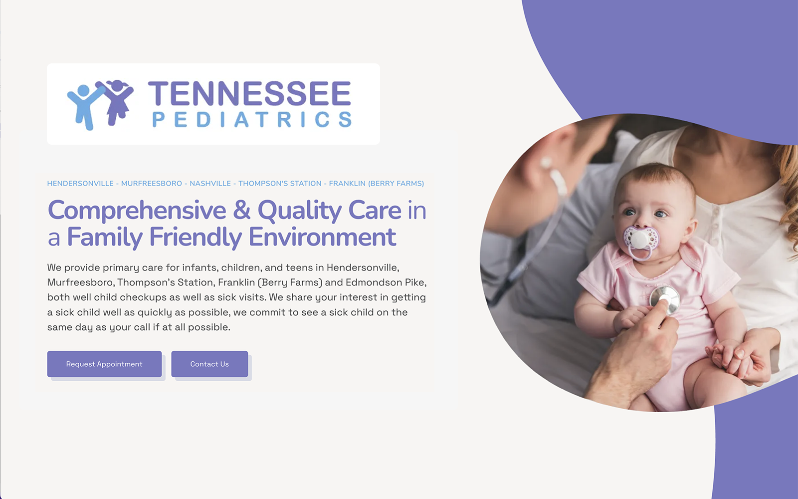
Pediatrics
The patient is a child, but the visitor is a parent. The design has to do both jobs: playful enough to signal a child-friendly environment, organized enough to reassure the parent making the decision. Illustration, soft shapes, and bright-but-not-loud palettes work; clutter and cartoons everywhere do not.
Plastic Surgery and Aesthetics
Aesthetic patients are choosing a result, and the website is the first evidence of your taste. These designs earn trust through restraint: generous white space, editorial photography, refined typography. If the website looks like a luxury brand, patients extend that expectation to the practice.

Mental Health
Visitors to a psychiatry or therapy website are often at a vulnerable moment, and many are overwhelmed. The design should lower the temperature: muted palettes, human photography, short reassuring copy, and a gentle, low-pressure path to reaching out. Nothing should shout.

Ophthalmology, LASIK, and Procedure-Driven Practices
When a practice is built around a signature procedure, the website should be too. Patients researching LASIK or cataract surgery are comparison shopping on outcomes, technology, and credibility — so the design leads with the procedure, the evidence, and a clear consultation path rather than a generic services menu.

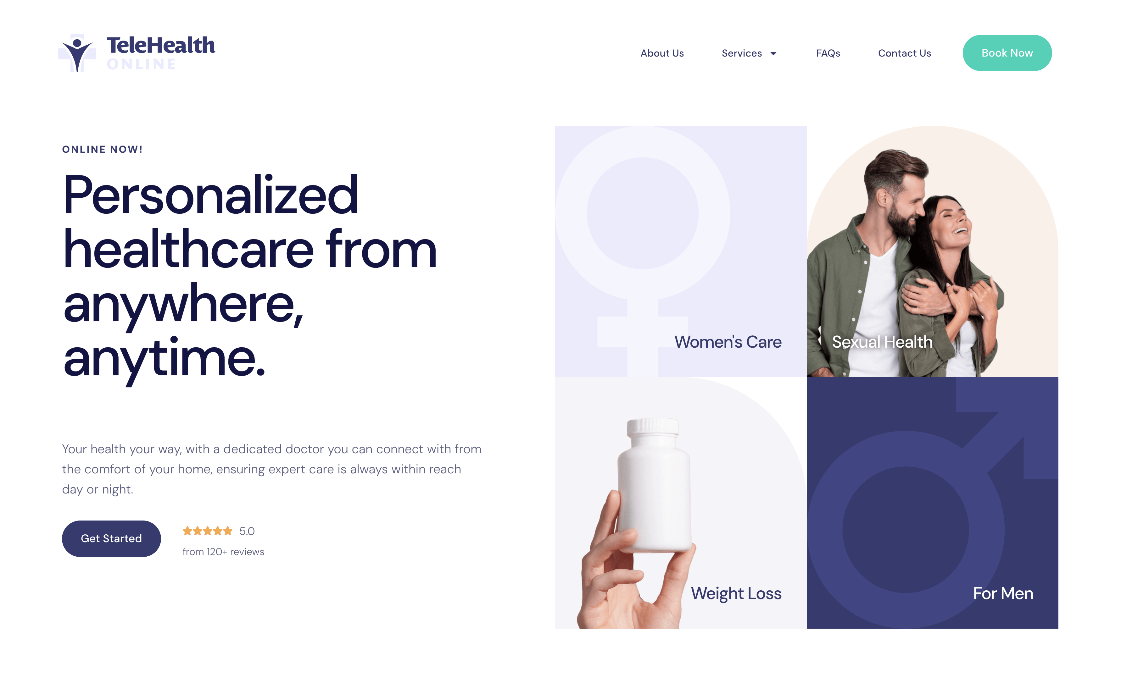
Telehealth and Multi-Location Groups
For telehealth providers and growing groups, the website is not supporting the service — it is the front office. Onboarding flows, state or location coverage, and what-happens-next clarity matter more than any visual flourish.
4. Mobile Is the Primary Device
For most of the practices we work with, well over half of traffic is mobile — and for urgent specialties like dental emergencies or urgent care, it is higher still. Mobile is not a smaller version of the site; it is the main event. We design mobile layouts first: thumb-reachable call buttons, forms short enough to finish in a waiting room, and menus that collapse to the three things a patient actually needs.
5. Accessibility Is Not Optional
Healthcare websites serve exactly the populations accessibility standards exist for — older patients, low-vision users, people navigating by keyboard or screen reader. Beyond the ethics, ADA-related lawsuits against medical practices are a real and growing risk, and accessible markup also happens to be what search engines reward. Contrast, focus states, alt text, and logical heading structure are baseline requirements in every design we ship. There is even a federal tax credit that can offset the cost — we covered it in detail in our guide to the ADA website accessibility tax credit.
6. HIPAA and Patient Privacy
The moment your website collects patient information — an appointment form, a chat widget, even certain analytics — privacy rules enter the picture. The common failures are mundane: contact forms that email unencrypted patient details, embedded trackers that leak page visits tied to health conditions, and third-party widgets no one vetted. Our approach is simple: assume every form field is PHI, encrypt in transit and at rest, and keep marketing scripts away from patient-facing flows. Our HIPAA-compliant website solutions cover this in depth.
7. Speed Decides Who Stays
A slow medical website loses the exact patients you most want: the ones on a phone, on cellular, ready to book now. Google’s data shows abandonment rises steeply with every second of load time. The design decisions matter as much as the hosting: image-heavy medical sites need aggressive image optimization, lazy loading, and caching from day one — performance is designed in, not bolted on.
8. Design and SEO Are Inseparable
Patients cannot choose a website they never find. The structure of a well-designed site — one topic per page, clean heading hierarchy, descriptive navigation, fast loading, local signals like embedded maps and consistent practice information — is the same structure search engines rank. We treat SEO as an input to the design, not a retrofit; that philosophy runs through our medical marketing services as well.
9. Real Photography Beats Stock
Patients can spot stock photography instantly — the too-perfect team in a too-white office — and it quietly erodes trust. The strongest healthcare sites we have built feature the actual doctor, the actual team, and the actual office. Patients are choosing a person, and showing that person is the single highest-impact content upgrade a practice can make. Where real photography is not yet available, we choose imagery that at least feels editorial and specific rather than generic.
10. Custom Design vs. Templates
Templates are how a practice ends up with the same website as three competitors in the same city. They also age poorly: built to be everything for everyone, they accumulate bloat that hurts speed and SEO. A custom design starts from your specialty, your patients, and your brand — every example in this guide was designed from scratch for that specific practice. That is the difference patients feel even when they cannot name it. You can read more about how we approach custom medical web design, or compare options on our pricing page.
Where to Start
If your current website fails even one of the tests above — slow on a phone, no clear path to booking, stock photos where your team should be, a design that could belong to any practice — that is the place to begin. Browse our portfolio of healthcare designs to see how these principles look across specialties, or schedule a consultation and we will review your current site with you, honestly and specifically.