Dr. Blaess, Dr. Longoria and Dr. Lowery specialize in beautifying smiles and helping you improve your overall appearance. Their experienced and friendly dentists and hygienists take great pride in keeping your smile beautiful. The doctors at De Zavala Dental wanted a warm and friendly dental website for their patients of all ages. The use of earth tones such as greens and dark browns give the site a warm feeling set against a patterned background. Important information is easily accessible through a top navigation menu. Combine that with the modern aesthetic that accompanies the users throughout the navigation experience and you have the backbone for an amazing general dentist website.
Design Overview
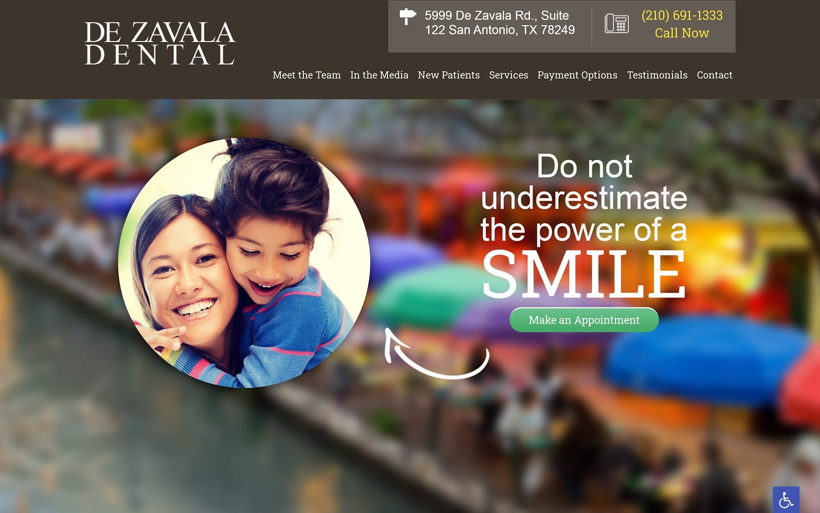
When you are confident in your abilities to craft an amazing smile, you don’t need to hide behind all the fancy lights. The team at De Zavala Dental make that apparently clear by displaying their slogan “do not underestimate the power of a smile” boldly as a healthy portion of the homepage display. Around the slogan, are colorful and vivid rotating pictures that accompany the color palette throughout the website. The brown, green, and white earth tone colors that resonate throughout the website give users a friendly and soothing interface. At the bottom of the homepage are 200+ reviews that boast and solidify their 4.8/5.0 score.
Use of Color
Warm, inviting earth tones run through this website, colors that are psychologically associated with enthusiasm and warmth. Beige is known to evoke ideas of dependability and relaxation, and we feel these aspects come together in a way that is both aesthetically pleasing and achieves its goal effortlessly. The rich browns used to showcase the various services they provide combined with the subtle autumn tones in the images themselves inviting viewers to investigate and find out what the office can do for them.
We also used green to highlight certain call to action buttons as well. Green is associated with healing and comfort- both key elements to increasing your case acceptance rate!
Analysis of Design Elements
The square borders help establish a distinctive frame for the pictures and text. Both are equally spaced out and distinctive. The services tab features all the additional services that the dental office offers. When you click on the title of any of these services, you will be redirected towards a new web page. This web page describes the operation as well as answering a few of the most frequently asked questions surrounding the operation.
In addition to testimonials and contact pages, there is also a separate link alongside the sleek navigation bar that features the dental office in the media. This can be great for clients who want to ensure they are working with a reputable selection of doctors and dentists. Marketing wise, all the images on the website reflect the general nature of dentistry and focuses on soothing the audience. The homepage alone is comprised of professional still-shots of happy, go-lucky families after receiving dental care.
Marketing Aspect
The greatest part about this website, in particular, is how easy it is to tell that they actually care about their work. A page full of testimonials and a plethora of optimal reviews generate marketing and traffic alone. Everything is easily accessible and convenient for the users to find the information they are looking for. When it comes to general dentistry, De Zavala gets website design RIGHT.


