The aesthetics of a website can make or break an overall web design. Cosmetic surgeons know this firsthand. When Dr. Daiel Moullet reached out to O360 to design his laser aesthetic and laser spa website from scratch, we were more than happy to do so! Create a website that is welcoming and approachable while implementing modern design elements is key to patient retention and creating an overall lasting online presence.
Overview of the Design
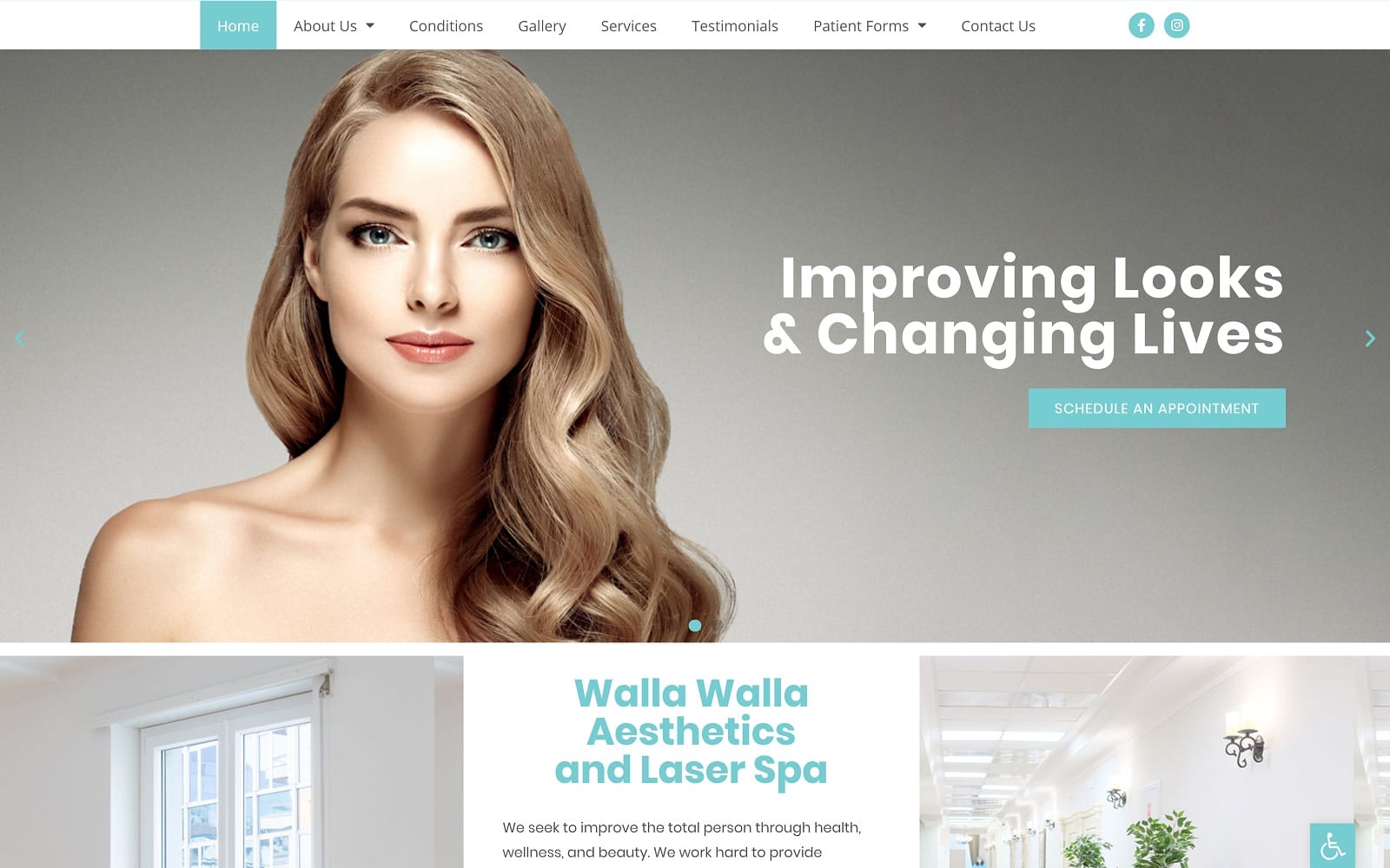
Simplicity and minimalism are the hearts of this website’s design, with nothing to distract a visitor from the information presented or the services that can be offered. These kinds of websites are aimed at those visitors who have a clear understanding of the services sites like these offer and are here to make sure this aesthetician is the right one for them. Upon arrival, you’re immediately introduced to the doctor’s credentials, experience, and services offered.
The design is boxed and uses various sections to highlight promotions, testimonials, and various calls to action. not an ounce of design space is wasted as patients will always have something to click and interact with.
Use of Colors
Colors are a great way to inject life and positivity into any website. We matched the specialty of the practice by utilizing turquoise variants to create an aesthetic that was both classy, yet professional. We also utilized skin tones from the images to help add an additional layer of texture as well.
Blue also conveys a sense of hope and calm. no one wants to feel rushed or worried while getting injections or botox. With our overall design, patients can rest at ease and leave the hard work to Dr. Moullet!
Design Elements
We kept all the special effects to a minimum as we really wanted the design and color scheme to speak for itself. We used a rotating slideshow on the front of the homepage to give visitors a sneak peek into the results that they can achieve at the office. We also made sure that the site was easy to navigate through by making the menu stick to the top for easy access.
Marketing Aspect
Dr. Moullet’s years within the industry speaks for itself. If you are not convinced, you can check out the gallery provided on his website. Dr. Moullet’s experience also taught him that patients hate waiting around while in the office – he helped streamline the office process by adding patient forms to the website. If you are still not convinced, there are also real testimonials from previous patients that can help back up the Texan’s knowledge and expertise.
Image the Website Reflects
This website reflects a direct, no-nonsense approach to aesthetic surgery and treatments, with the entire focus on landing being on the youthful features of the central image. This sets the visitors imagination in motion dreaming of what results they can expect from receiving Dr. Moullet’s services. There is little frivolous here, little that is unnecessary or that clutters the page. Direct, straightforward, and informative are the key themes of this site.


