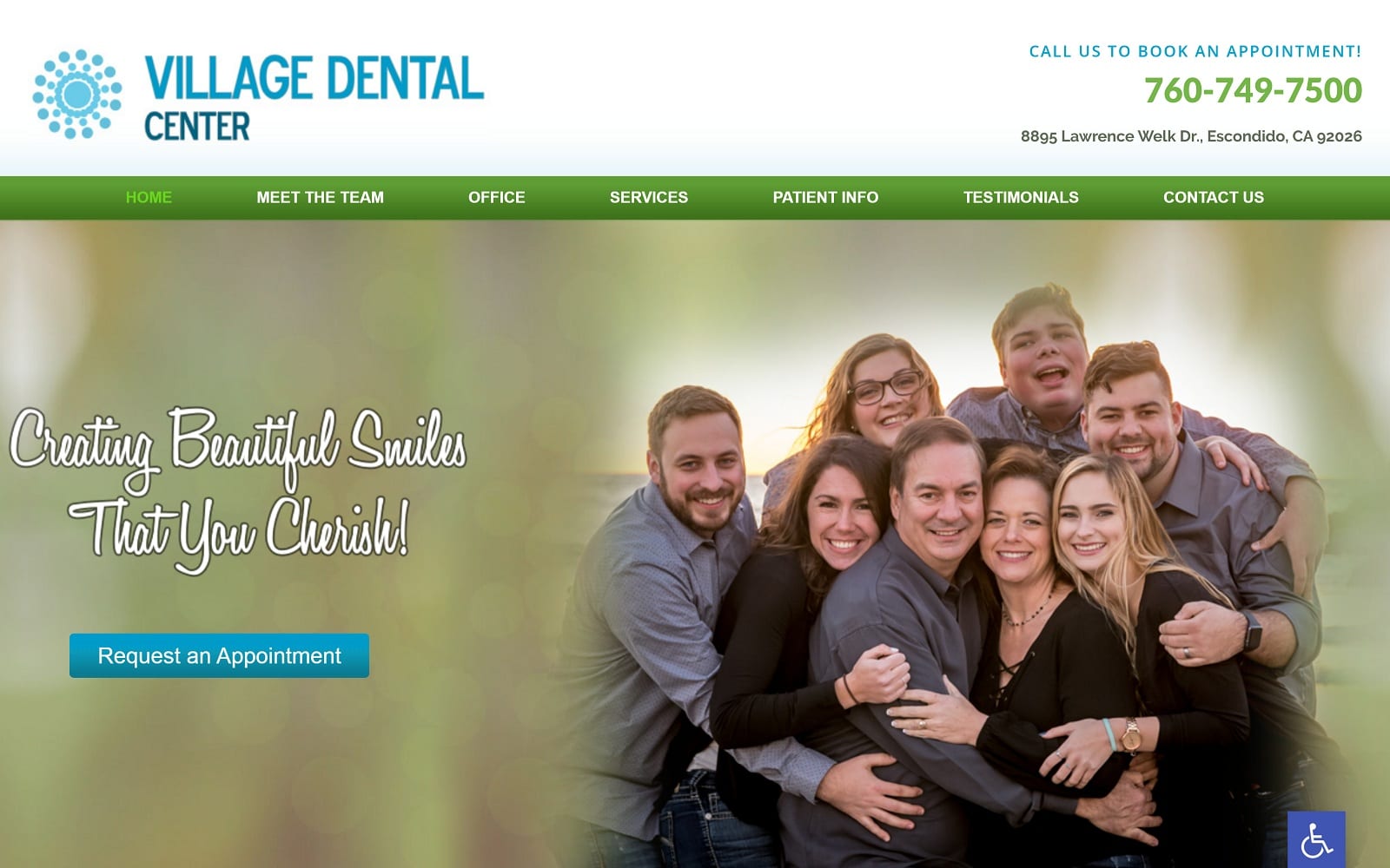
Dr. Kendall Ricks manages the Village Dental Center. Featuring her services towards cosmetic dentistry, we designed a site layout that would place them at the forefront of the industry by highlighting the cutting-edge technology they use that separates them from the competition. The patient experience matters. Dr. Ricks and her staff are ready at any given time to take care of your oral and dental needs.
Design Overview
When you first enter the website, you will immediately notice the image of the Village Dental team beaming back at you on the home page. The website layout is quirky, yet modern and professional. We added a brief mission statement to the homepage while also highlighting the different services offered at the dental office. We rounded out the front page by also adding additional links to new-patient promotions and the team’s social media.
Use of Color
Since we were dealing with a dental specialty, we figured it would only be right to incorporate a light blue hue when designing the color theme. The site is predominately featured with a mixture of blue and green. This allows for optimal reading accessibility. Most of the information on the website was to inform. We kept that in mind when choosing the color theme. The mixture of blue and green is easy on the reader’s eyes. This allows them to digest the information in front of them with ease. The last thing you want to do on any website is to steer your readers away by using a harsh color theme.
The personalized logo designed just for Villiage Center also uses blue to be eye-catching as well. We made sure that our use of color stood out to give the impression that Dr. Rick’s dental office is all about being progressive with dental care.
Design Elements
The services page is home to a plethora of information. Here, readers can learn more about the different procedures offered. When you click on any of the procedures specifically, you are redirected to another page that answers frequently asked questions. Regardless of what web page you are on, we included three additional widgets on the side that highlight the key services that Villiage Dental has to offer.
Everything is evenly spaced out throughout the website. There is establish white space around the next to ensure that nothing is extremely overbearing. Navigating through this website is always a breeze. The navigation menu is always accessible and is home to any and all sources of information you may be looking for. All the design elements are comprehensive and flow well together in unison. The office tab in particular features live photos from the dental office itself. This is a great way to increase reader engagement and persuade first-time web visitors to drop by the office when they are near the area.
Marketing Aspect
At the bottom of each page, we provided a call to action in the form of a directional guide and contact information. We also provided quick links to other services and web pages for easy access and enhancing web traffic. The patient information tab features in-house promotions and new-patients forms. Overall, the website’s optimal color scheme in addition to the simplistic layout makes it a great medium for both young and older patients. All the web pages are accessible and easy to find along the nature-like color theme. Everything is direct and to the point – patients are always the number one priority!
Last but not least, Dr. Ricks understands the security is an evergrowing issue. She has taken the necessary steps to ensure that all her patients’ information is protected with SSL Security. SSL Security encrypts important information such as credit card numbers and home addresses before they are sent off to the actual database. This means that hackers will have no chance with this particular website!


