Dr. Chris and Dr. Kristie Vinson both manage Oklahoma’s very own Tulsa Precision Dental. With over a decade of experience each, both Dr. Chris and Vinson have made the patient’s smile their top priority. Tulsa Precision Dental promotes the highest quality and esthetic dentistry while preserving and promoting the most optimum oral hygiene there is. The personalized attention and range of dental services offered at the office utilize the most advanced dental technology and techniques. We made it our mission to match their dedication to their craft by creating a dental website that stood above the rest.
Design Overview
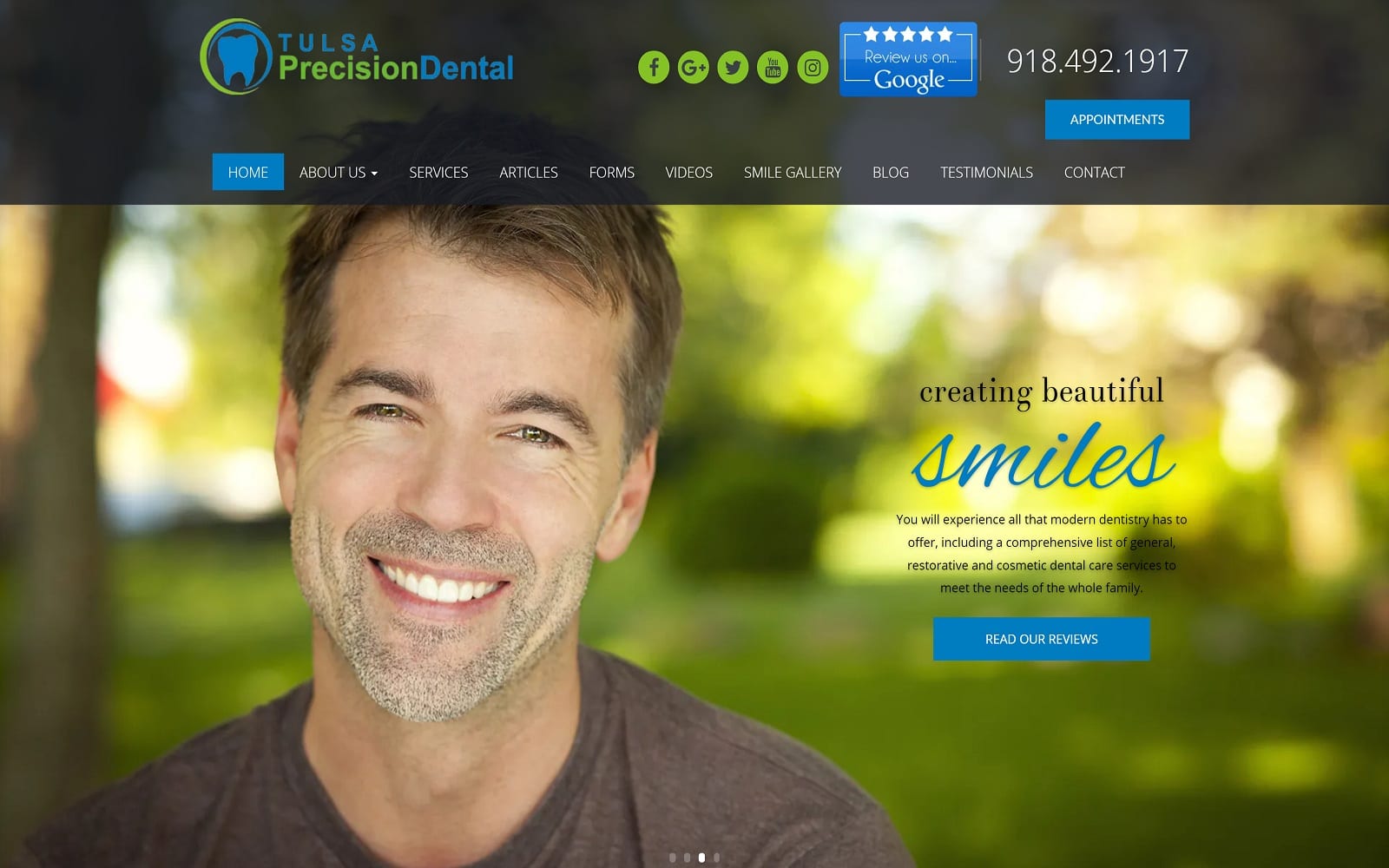
To match their mission statement, we went with a modernized website design. When first-time web visitors enter the website, they will immediately be captured by the alternating image gallery that radiates over the home page. Not only does this create a beautiful aesthetic, but also helps readers zone in on the different services and procedures offered at the dentistry. Heading down the home page, there is a short but simple mission statement and an appointment-maker. The home page is all about using crisp, modern images that help convey a sense of helpfulness and optimism.
Use of Color
We utilized a simple color theme of blue and green to create nature-like scenery. In addition to the professional still shots provided by the images, the colors help add another layer of visuals. We primarily used blue colors to highlight calls to action on the home page and navigation bar. Green serves as a secondary highlighter. When placed side by side, the colors add a memorable aesthetic to the site.
Design Elements
When incorporating multiple elements of design in any website, you want to make sure that everything flows together. We made sure spacing was expertly managed throughout the site by using white space to establish image areas and frame text. Navigation is spacious. No matter which web page you are on, the navigation menu is always available.
The service tab in particular displays all the procedures and services offered. Each service is displayed side-by-side with a professional image. When you click on the actual title of the procedure, you are redirected to an additional page that breaks down the procedure in more detail.
Marketing Aspect
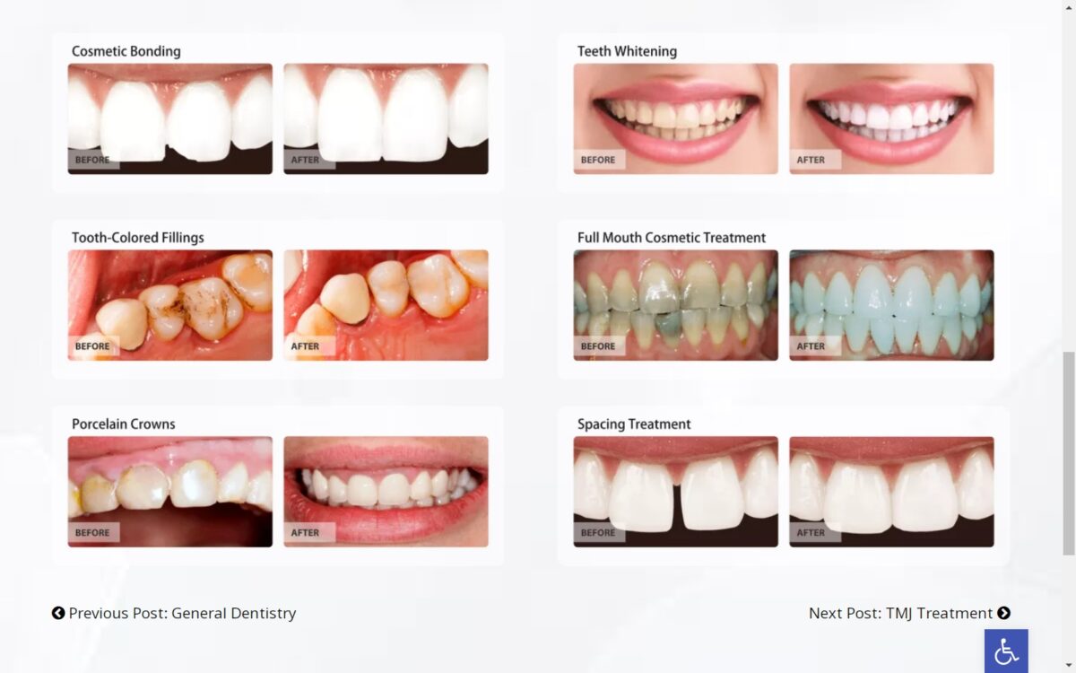
The testimonials tab on your navigation menu is the home to multiple reviews from real patients. We have also made it easier than ever to schedule an appointment by implementing a link to an appointment page on the top banner of every webpage. The smile gallery gives patients a feeling of security and trust by establishing multiple before-and-after photos as well.
Blogging is a huge part of growing your website traffic accordingly. Underneath the articles tab, Tulsa Dental covers many of dentistry’s most frequently asked questions. Patients also have incredibly easy access to the patient forms located on our navigation menu. Not only does this mean less time spent in the waiting room, but this also translates to more time with the specialists at hand. To top it all off, the Oklahoma veterans understand how important it is to keep patient information secure. As a result, they have incorporated SSL Security in their website. This means that patient information will be inaccessible to hackers around the world.
