Kedzie Dental Clinic is all about setting themselves away from the crowd. The clinic is set on being the one-stop destination for all dental needs. Basing their procedures on a more conservative dental approach, the Chicago-based dental team is dedicated to patient education and awareness. They offer a number of niche dentistry procedures such as no-prep veneers, one-day dentals, and the All-On-4 procedure, just to name a few.
Overview of Design
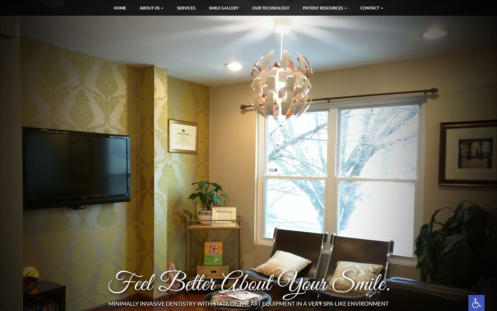
When you enter the website, you are greeted with a wide panel of images that hover and pop as you scroll over them. When dealing with niche procedures, you want to make sure the website innovation matches the procedure innovation. You can go to any dental website and get a prototypical website layout. We went the extra mile and added special effects and actual shots provided by the Kedzie Dental Clinic to make the site more personable. You can view a tour of the office setting and the dentists at work as you enter the landing page. The navigation bar is spacious and clearly labeled as well. As you head down the home page, you will find the Kedzie mission statement – right next to our customized logo. The cursive font and distinct logo add an extra layer of personality that is often missing within other dental websites.
Use of Color
![]()
We kept to a general color scheme of grey and lime green. With the cursive headings and fonts that engulf the various web pages, we did not want to overdo it with the coloring. We purposely matched the colors with the logo. We subtly added green to highlight certain call to actions. For example, the navigation bar is purposely illuminated with a green background. The white background allows optimal reading exposure and spacing. Although some may claim that the cursive headings may come off as distracting and unreadable, we beg to differ. The practice’s logo also uses the very same grey and green color scheme!
Elements of Design
On the services and technology tabs, we integrated professional images alongside the text. Not only does adding visuals help reader engagement while reading, but it also is a clear reflection of the personality that the Kedzie Dental Clinic hopes to emit. No matter where you scroll on the website, the navigation menu will always be available – fully equipped with drop down elements. The about us tab, in particular, is extremely rich in information and compliments the experience and education of the dental team particularly well. The smile gallery also has sliding effects integrated. This gives the website an additional touch of modernism and flare.
Marketing Aspect
The smile gallery is a great marketing aspect that the Kedzie Dental Clinic utilizes on its website. Not only do they provide patients with live photo results, but they also lack the experience that the office has to offer. They also list the accepted insurance and payment options on the website under the about us tab. This is a great way to save both the patients’ and dentists’ time and patience for the things that do matter. The photos provided by the Kedzie Dental Clinic also provide actual images of the office. Something as simple as office imagery can be enough to have certain patients commit to visiting the clinic in real time. True to customer satisfaction, the site is also conveniently protected through SSL Security. This means that hackers will not be able to steal important customer information such as credit card numbers, phone numbers, and affiliating addresses.
Images the Website Represents

This website reflects a modern company that has a sense of decorum as well as a level of sophistication that ensures the most innovative forms of care. The images are bright and striking but are downplayed by the darker background, making it easy on the eyes in any lighting and at any resolution. Everything comes off as professional and approachable.