Both Dr. Jerry Kronbquist and Dr. Rae Kronbquist manage Sunset Dental Group in Santa Ana, California. True to their dental motto Art of the Perfect Smile, Sunset Dental focuses on Cosmetic Dentistry, Sedation Dentistry, and Implant Dentistry. Since the client was based in California, we knew that we had to design a website that was both modern and professional. With all the dental services available around the area, we took on the challenge of designing a website that would blow past the competition.
Design Overview
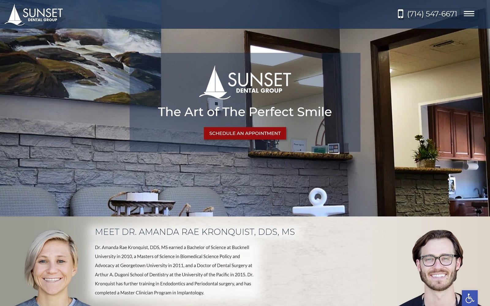
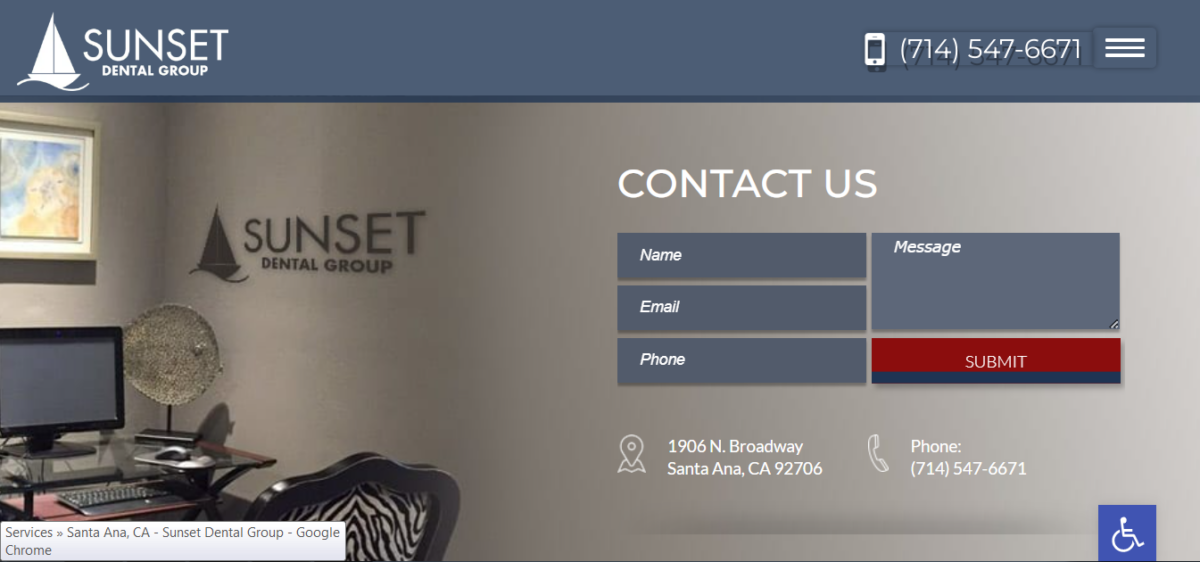
We made sure everything was expertly spaced throughout the website. One of the main standout features of this website is the hamburger menu on the home page. Instead of a navigation bar, there is only a single drop-down menu, located on the top right of the home page. This allows readers to focus on the information on the home page. The background of the home page features actual photos from Sunset Dental, giving a homely vibe. The home page primarily serves to highlight the mission statement and different services offered. We rounded out the home page with a simple contact form and some testimonials.
Use of Color
To complement the office images, we stuck to a simple color theme using grey and red. Red and grey both compliment each other well without coming off as too harsh or soft on the eyes. Red is used to highlight calls to action and attract the reader’s eyes. Grey stands as the primary background color to its natural tone. Red is a great color to create a sense of urgency as well. When both grey and red are blended together, it creates a sense of urgent professionalism.
Design Elements
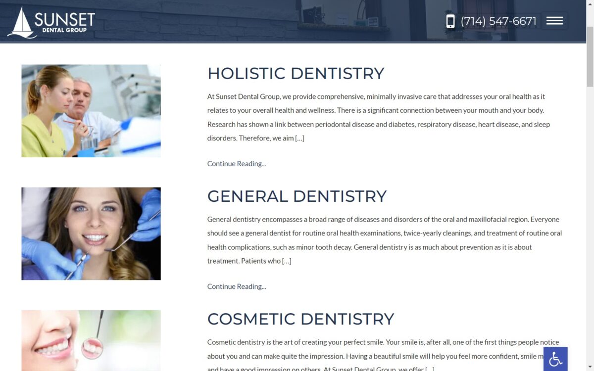
We used square borders to manage space accordingly throughout the website. All the text and images on the website are aligned accordingly; nothing is overbearing or blown out of proportion. The services page displays the different services offered at Sunset Dentistry. Next to the text, there is an image that relates to the topic. When you click on the actual article, you are redirected to a new webpage that breaks down the procedure in even more detail. Just like on the homepage, the about us tab features actual pictures from the Santa Ana natives. There is accessible information wherever you go on the website. The hamburger menu is always available at the top of the page.
Marketing Aspect
On the bottom of each web page, we incorporated a contact form to allow easy access for all incoming site-visitors. The phone number of the office is also always available near the hamburger menu. The testimonials tab redirects you to another web page that features all the reviews about the office. There is even an interactive Google map for patients who want to check their estimated time of arrival.
Blogging is a great way to educate and inform your patients. This can be a great way to turn first-time visitors into lifelong patients. Sunset Dental’s blog information is also located on the hamburger menu. The smile gallery also shows multiple before-and-after pictures from the doctors themselves. This can be great for visual learners who want to see the office’s previous work.
Image the Website Represents
From the color theme to the images used, the website represents the professional uniqueness of the Santa Ana natives. The smiling patients placed throughout the video gives visitors a great first impression – that Sunset Dental Group is approachable, yet serious with their work!
