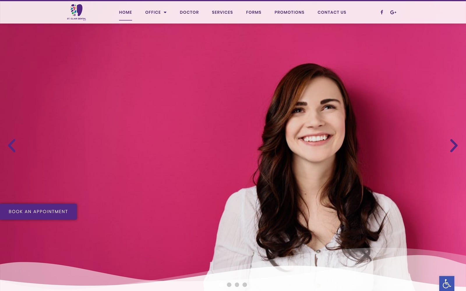
With indigo as the primary color and action color, while white is used as the monochromatic hue that neutralizes the powerful impact that indigo can have. Indigo can be represented as a natural pigment that’s restorative, authoritative, and filled to the brim with wisdom. As a spectral color, it’s placement allows the visitor to focus on the common themes and connections throughout the dental website, leading the visitor’s eye directly to the bottom of the page. Combining both stimulation and calming qualities, St. Clair Dental uses the opulence it radiates and turns the color into an energizing experience. By using simple color combinations and making them colorful, its design communicates a sense of confidence and vitality throughout.
By focusing on using subtle functions, each rotating header image aligns with the website’s primary color, creating color combinations that don’t overwhelm the visitor, but rather invite the visitor to the website’s service. The translucent header, which contains the main menu section, helps the visitor focus on the variety of services while also be impacted by the colorful imagery. Along the left side of the page contains the click-to-action button for scheduling an appointment. Below the header image, the dentistry’s services can be found with associated image icons. Cut off by intricate, wavy design; the testimonials can be found in a slideshow widget, with each testimonial rotating every few seconds. After previewing its care treatment options in the next section, the footer of the page contains the dentistry’s contact us information with click-to-call and click-to-email options.


