Overview of the Design
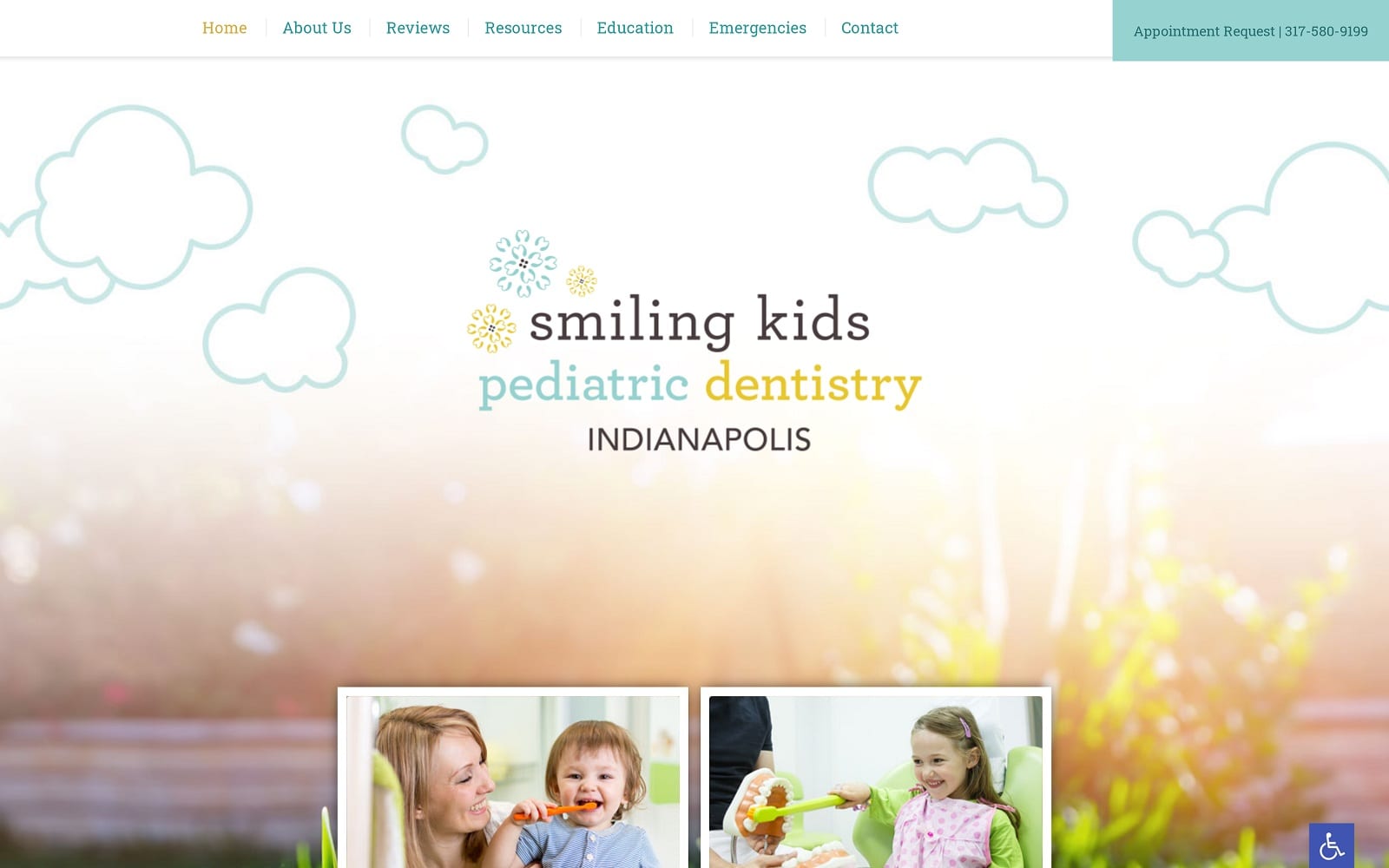
Pediatric dental websites allow for greater creativity in their design and appearance than many other types of medical specialties. For Smiling Kids Pediatric Dentistry, we wanted to create a space that reflects the friendly and gentle nature of the practice. The design is playful, combining colorful illustration with images of smiling children. A traditional navigation menu anchors the top of the page, and image links to four spotlighted sections of the website take center stage. The remainder of the home page emphasizes the practice commitment to preventative care, followed by an introduction to the dentists and a few parent reviews.
The remainder of this website offers an in-depth exploration of patient educational resources, including a comprehensive pediatric dental library, multiple videos, and a link to the practice blog. We also included a section for additional office information, financial policies, patient reviews, and what to do in case of a pediatric dental emergency. Finally, the contact page includes directions to each of the practice locations, as well as an integrated appointment request form.
Use of Colors
This is a colorful website of green, orange, and blue set against a white and gray gradient. These colors are largely considered cheerful and child-like, especially when paired with illustrations of flowers, ladybug, and clouds in the sky.
Analysis of Design Elements
We included many unique design elements within this custom pediatric dental website. The header image blends photo and illustration in a way that seems to blend the real world with the imagination of a child. The four image-based menu tiles in the center of the home page react as they are selected, and the video that follows offers a more interesting alternative for educating viewers than by text alone. We also included real parent reviews at the bottom of the page, which scroll automatically when viewed.
Marketing Aspect
Online pediatric dental marketing is all about capturing the attention and interests of parents who are looking for the very best care for their children. For this website, we used the playfulness of the design itself to prove the relevance of the practice in children’s dentistry. Parent reviews help sway undecided visitors, and an integrated appointment request form makes it easy to schedule a first-time visit. Since parents often bring their children to the dentist multiple times per year, we also included links to the practice social media account so that they could remain connected between visits.
Image the Website Represents
Imagery on this site speaks a thousand words from start to finish. The background image includes a picture of the sun shining down on beautiful green grass from the view of a child who is playing outdoors. Illustrations add to the lightheartedness of the website, while videos, articles, and blog posts speak to the concerns and interests of parents. Overall, we felt that this design would best represent the qualifications of Dr. Singh and Dr. Bullard to treat any child in the Indianapolis and Noblesville areas.
Pediatric Dentistry Website Designed by Optimized360


