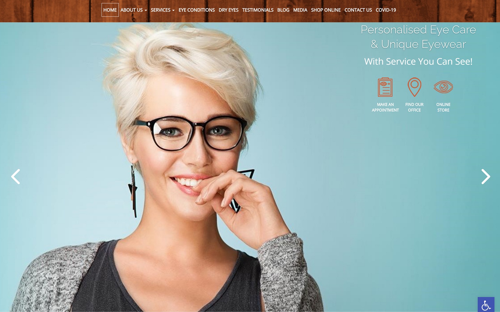
Life with clear vision is simply better, and the fine details of this site are aimed at uplifting those who suffer from vision problems with promises of the vision they could have. The wood grain and sky-blue backgrounds of the Shelbourne Optometry website give a strong impression of a down-to-earth practice that is free and uplifting while still maintaining an overall appearance of professionalism.
Overview Of The Design
The entire site was designed to combine an earthy yet professional air with bright smiles and promises of a future with better eyesight. The complex patterned backgrounds that appear as you scroll down the page further represent the overall cheerful wistfulness of the office. No one wants their visit to the optometrist to be serious and dire, and this design promises that it won’t be. Further, there are subtle promises of life much improved that can be found in the images they offer. In spite of all this evident whimsy, there is a clear trail of information provided as you go down the page, showing that the professional isn’t afraid to step up and share what the patient needs to know.
Use Of Colors
The color used on this website is decidedly driven by color accents, with a primarily white and gray tone background covered with splashes of color that immediately draw the eye. Is there a splash of blue? Information ahead, take note. The feeling portrayed by the site is welcoming and joyful, subtly promising that this can be the patient’s life once they get new glasses without pushing hard selling in their face. Overall the colors seem to play across the page rather than stark and constrained.
Analysis Of Design Elements
“Welcome to a warm natural place,” says the wooden paneling “be happy and relaxed and look good with our optical care,” says the photo. Every step of the road down the site provides you with additional information and a bright personality, all without losing that sense of order and professionalism. As you proceed down the page you are presented with additional information about the serves that might apply to you, before it all wraps up with a series of social media links and testimonials that demonstrate their connectedness. It is clear that the owner of this site likes to communicate, as evidenced not just by the social media links but by the sheer amount of information found on the home page.
To learn more about web design basics, here is a short 3 minute YouTube video to get you started.
Marketing Aspect
“Come in, sit down, let’s have a chat about glasses!” is the message this site clearly conveys. For those visitors that enjoy a warm and welcoming experience, every element of this site is going to draw them in. There’s a steady stream of information meant to feed the inquisitive and well-informed visitor while the accessibility of the various sections of the site permits information to be found quickly. From opening to close this site is going to be inviting the visitor to come in and be part of the family and enjoy friendly camaraderie.
When designing any website, it is important that the images clearly resonate with your target audience. Watch this YouTube video to learn how to use images on your website to increase audience engagement.
The Image this Website Reflects
Open, friendly, trendy. These three words are clearly the image that this site portrays. They’re all aimed at a very modern and chic environment where conversation can be had with those who share your concerns. What’s that? It’s just an optometrist? Not with this optometry website design, with this design it’s practically a day spa enticing people to come and spend time picking out their glasses while enjoying the friendly atmosphere of the office.
