Dr. Karim Sadik, a Harvard trained triple board-certified plastic and reconstructive surgeon, is focused on providing you with the absolute best plastic surgery experience in the area. They offer the most advanced treatments in a safe, state of the art facility. Whether you are visiting the new Tioga Downs Casino or relaxing in the picturesque wineries of the Finger Lakes, stop by for a free consultation. Experience how Dr. Sadik can transform your natural beauty into splendor.
Design Overview
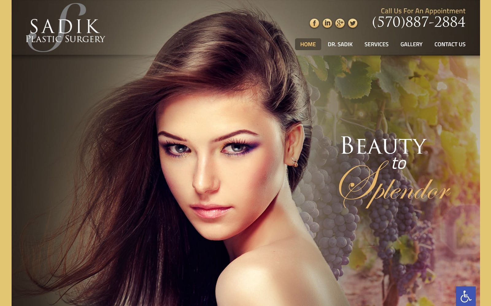
Dr. Sadik visualized a modern plastic surgery website using the colors black and gold. The elegant photos used on his website helps bring out the beauty of plastic surgery. The different procedures he offers is conveniently listed under services in alphabetical order so that it is easy to access. We made sure to integrate a sleek interface along with smooth, square widgets throughout the website to create a modern style. Drawing client interaction is half the battle – a sleek website with a rich gold color theme ensures that.
Use of Color
The website is dipped in gold and black – two colors that are synonymous with lux and class. Plastic surgery is often seen as a luxury option, instead of a simple choice. As a result, Dr. Sadik handles high-class patients. Our color theme will help these patients feel right at home the second they enter the website!
Design Elements
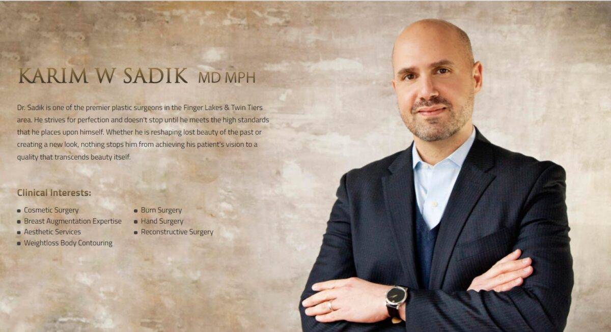
In an age where technology is rapidly expanding, the last thing you need is an outdated website. We ensured that would not be the case with Dr. Sadik’s website. The lush gold lining throughout the website along with the black exterior background makes this a visual highlight for anyone stopping by for a peek. The navigation bar is simple and effective in directing users around the website. Accordingly, there is also a biography page of Dr. Sadik himself. Perfect for any patients who wish to go with a more personable doctor. On this page, you will find some of the doctor’s hobbies, interests, and educational history.
Marketing Aspect
Plastic procedures can be an extremely stressful and draining process. We made sure to incorporate nature-themed photos throughout the website to ease patients as well. When you consider that images can tell a story better than words can, we made sure that the images we selected are a concise reflection of Dr. Sadik’s profession. In general, all the design elements used to format the website is a direct reflection of Dr. Sadik’s work ethic: golden.
Image the Website Represents
Dr. Sadik’s website is aesthetically pleasing, from top to bottom. The website represents a higher class and luxury. Balancing lux and class, Dr. Sadik’s certifications and training experience within the industry make for a great first impression for any skeptical visitors as well. The best of both worlds.
