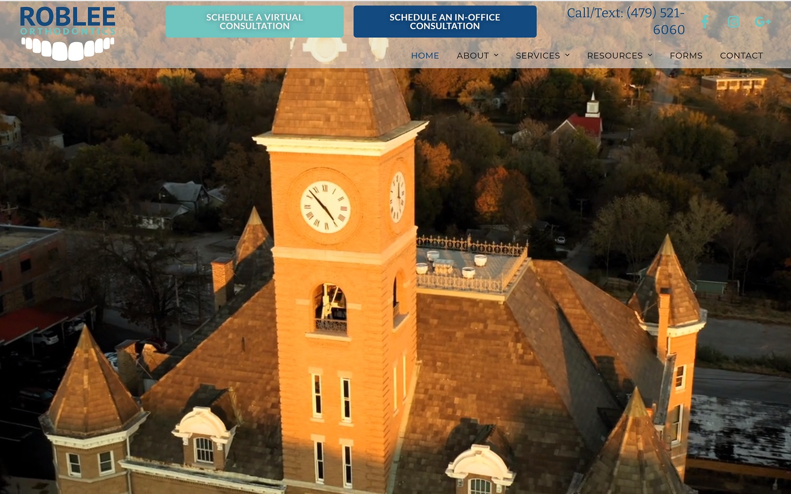
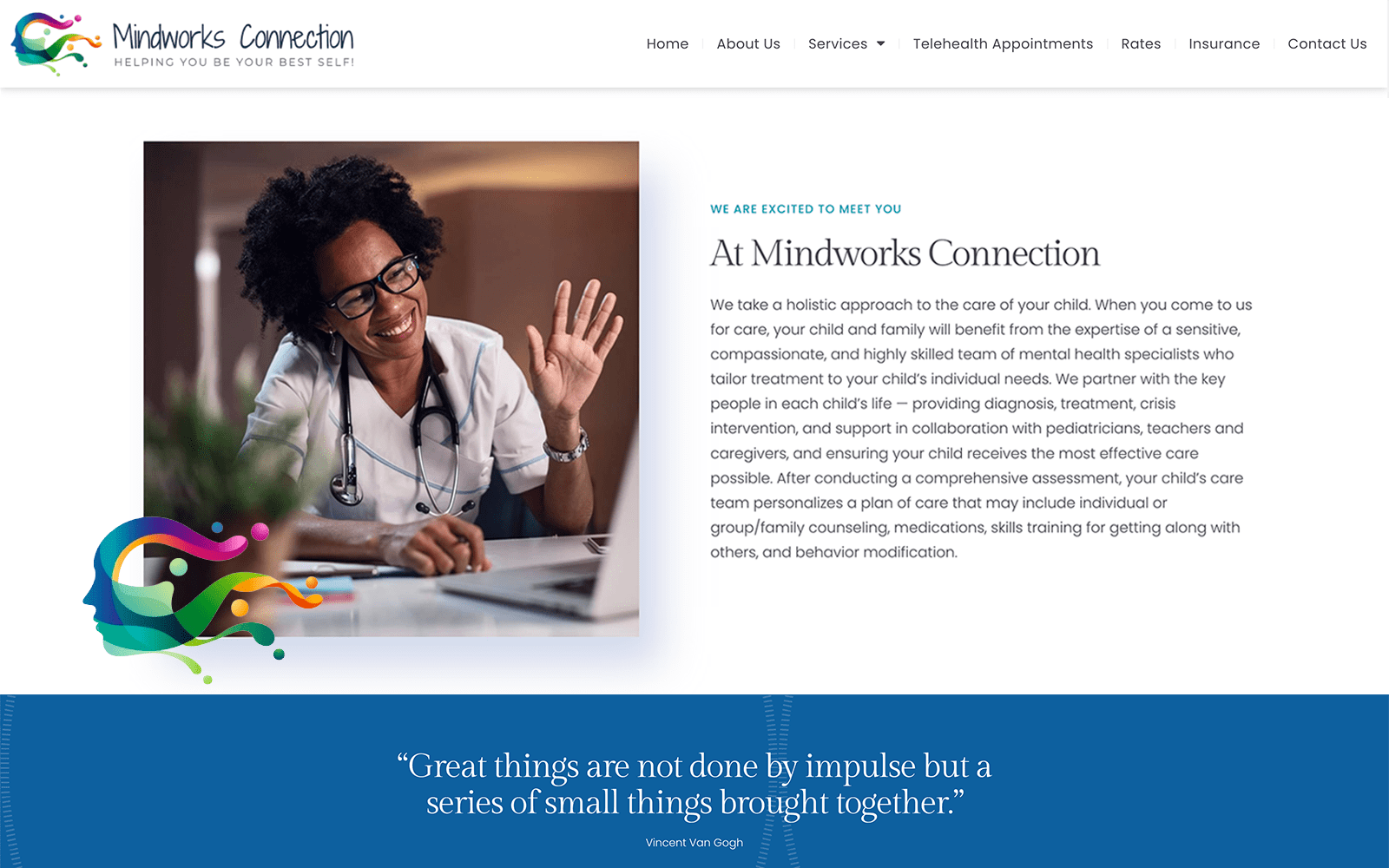
A soothing palette of blue and white greets visitors to the Roblee Orthodontics website. The uplifting and hope-inspiring nature of these colors helps to set the tone for the patient’s time with the clinic. The broad range of ages in the hero images represents the clientele that the clinic services. This imagery is carried through in the service links, each showing smiling people enjoying the results of their orthodontic treatment. The paneled design of Roblee Orthodontics meshes seamlessly with the mobile-responsive design, ensuring that visitors have a smooth experience regardless of the platform they use to visit the site. Once patients click deeper into the site, they’ll encounter clean and open pages that provide ample information on the services without image clutter.
This orthodontics site is designed to be easily accessible and effortless to use for all the clinic’s patients. The standardized static header design ensures that all areas of the site are just a click or two away. Getting directions or reaching out to the clinic by phone can be accomplished in an instant, ensuring that when the impulse to convert from visitor to patient hits, they can act on it easily. The contact us page is packed with functionality for the visitor, including a HIPAA secure form to reach out by email. This form ensures the security of the patient’s information and uses a minimalist design to boost use by visitors. The Contact Us page also integrates click-to-email function along with Fax options and direct-to-map navigation.


