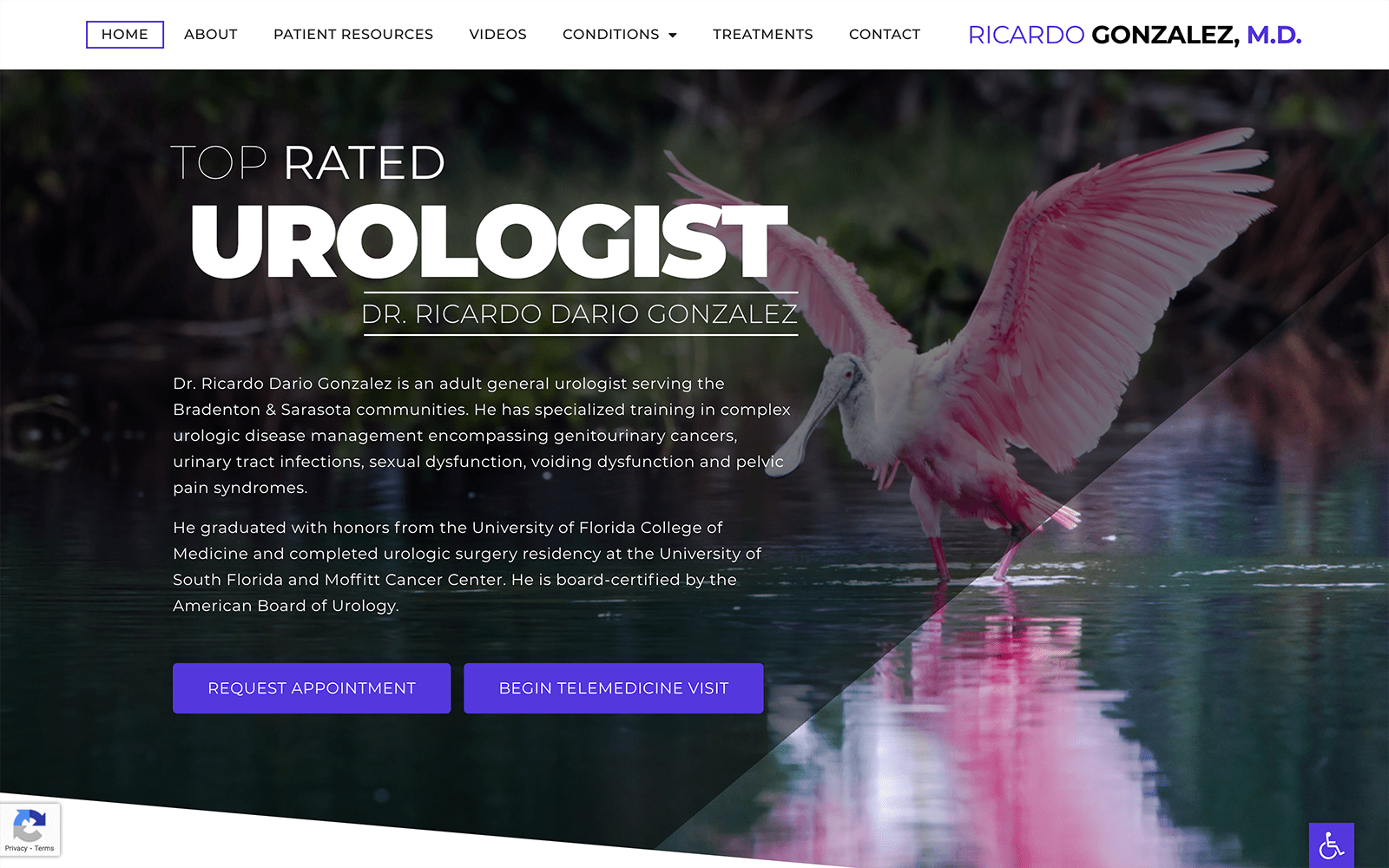
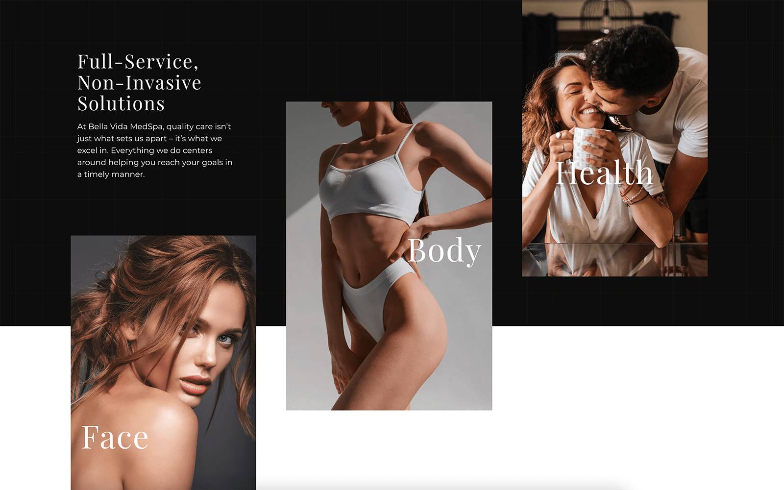
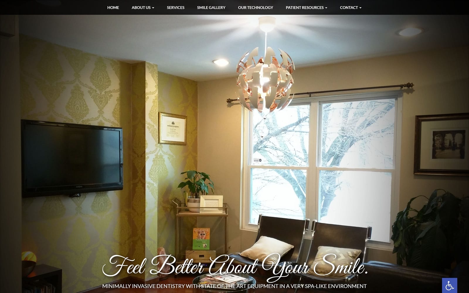
Breathtaking photography of stunning vistas reflecting the practices home in Florida is the first thing that greets a visitor to this Urological Clinic website. The steady changing of the hero images visually engages while it begins lending the page a sense of locality that helps connect with viewers. The site’s design balances images and text to deliver information in an easily readable and aesthetically pleasing way. A purple and black color palette lends the website a sense of quality and professionalism that’s important in the first impression the site delivers for the clinic. The two colors contrast against each in a striking way. Black on white text provides excellent contrast for the majority of the site’s information.
Mobile functionality is a central focus of this website, which is evident in its layout. The menu automatically collapses down into a hamburger menu on smaller screens, while the site is able to flow seamlessly on any platform. Educational videos on the sites specialty are included so patients have the opportunity to educate themselves on the services the clinic provides and how it aids their overall health. Today’s patients tend to take a more active role in their healthcare, and videos appeal to those seeking to learn as much as they can about their health concerns. The patient resource page contains an immense amount of options, including a secure patient portal, printable intake forms in multiple languages, and logs the patients can use in tracking their urological activity.


