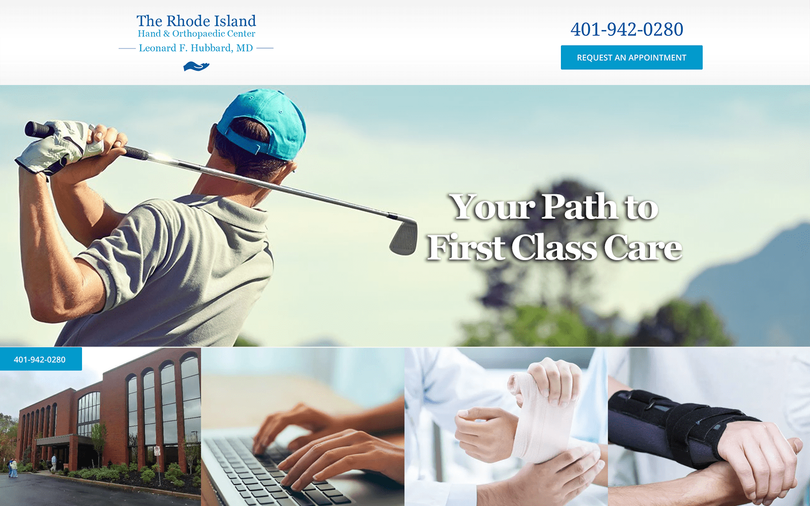
Your path to first class care starts at the Rhode Island Hand & Orthopedic Center. Dr. Hubbard manages the orthopedic center and has special expertise and experience in problems regarding the hands, elbow, wrist, and shoulder. We aimed to place his mastery of orthopedics up for the world to see through a clean and open website design that would attract both young and older patients to his office doors.
Design Overview
The website instantly makes a memorable impression with pictures of Dr. Hubbard and his staff on the home page. We opted to go with a full-length layout rather than the traditional website design with marginal white spaces to provide the site with a professional and modern feel.
The navigation menu features drop-down elements that break down the additional services and conditions Dr. Hubbard treats. The majority of the home page is dedicated to introducing patients to Dr. Hubbard’s mission statement. Introducing patients to your specialty and expertise is just as important as making your website memorable.
If you are new to mission statements and website designs, here is a quick, 1 minute YouTube video about the importance of a mission statement for any business.
Use of Colors
We went with a simple blue and white color theme when designing the website. Since we were working with preventive and orthopedic care, we wanted to evoke a sense of hope. The white background allows for the blue to truly pop out at the users as well. When set amidst a wave of white, blue jumps out at the viewer without being too assertive or flashy. It is primarily used to highlight calls to action. When combined together, blue and white make for a dynamic team. We also used different hues of blue when creating the main logo for Dr. Hubbard.
Use of Images and Visuals
All the images on the website give a sense of ease and well-being. When dealing with any special healthcare niche, it is especially important to provide a soothing and hopeful atmosphere for the incoming web-visitors. Testimonials, services, and an overall concern to help all play critical roles when patients are deciding to commit to a new profession or doctor. We made sure all these key aspects were highlighted on the navigation menu.
gaining the trust and commitment of the patient is the initial, and most important step of the process. We made sure the images and visuals on the site clearly reflected that. The about us tab features images of Dr. Hubbard and his fellow staff in action under the knife.
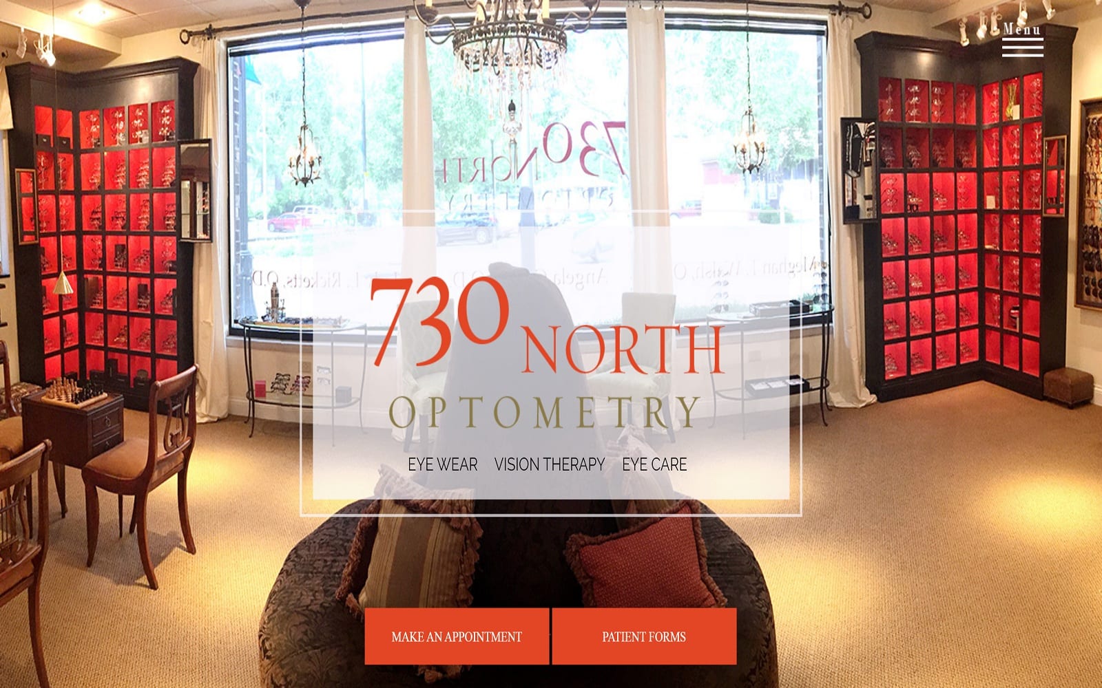
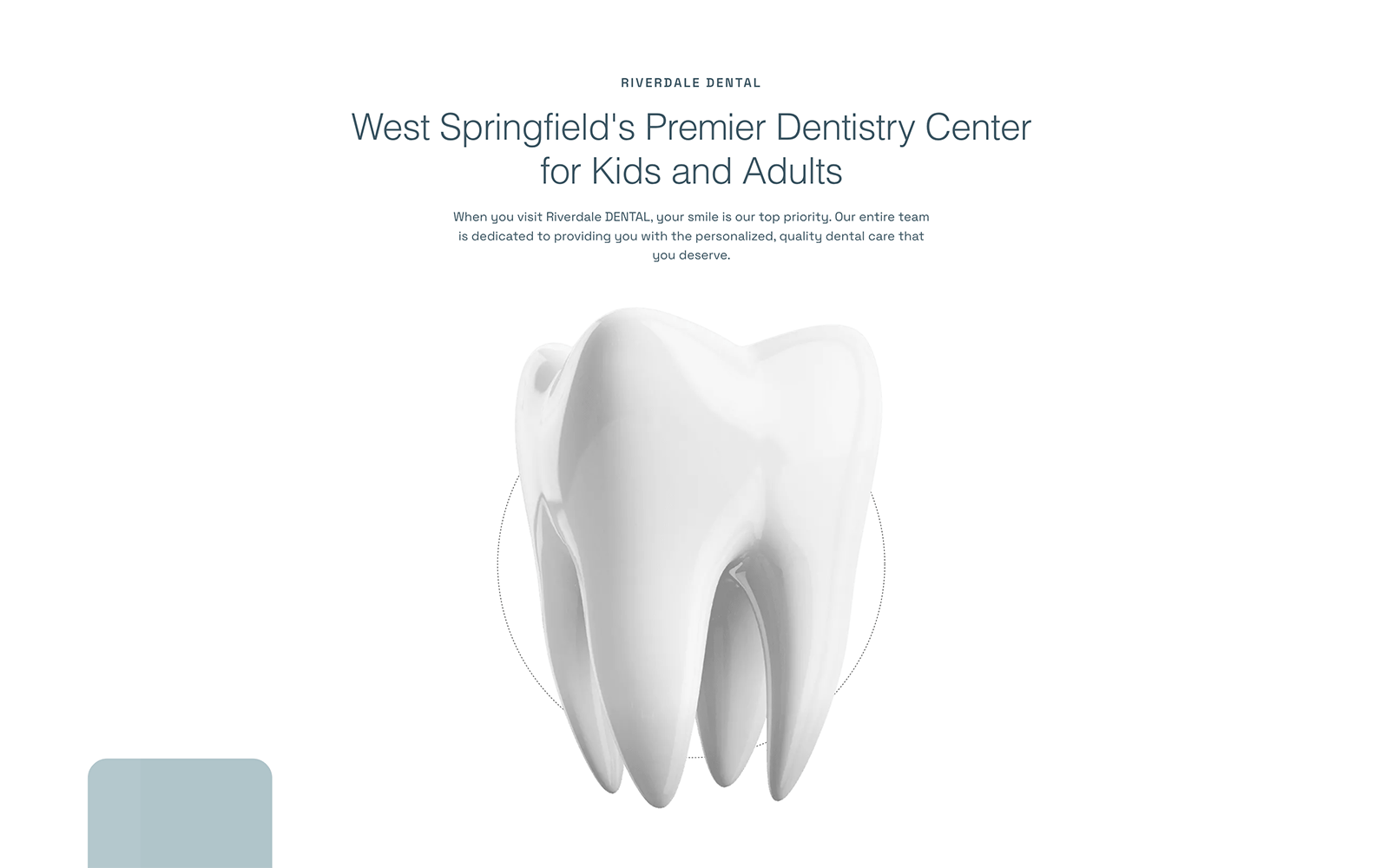
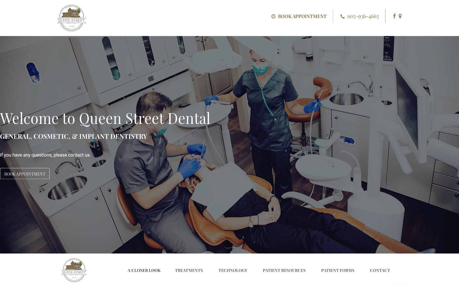
A picture can tell 1,000 words. Here are some additional websites that Optimized360 has created that focus heavily on imagery.
California Brain and Spinal Clinic
Design Elements and Marketing Aspect
Sitting around in the waiting rooms all day can drain even the most patient people. We made sure to include patient forms and resources to avoid this issue. This means less time waiting around, and more time being treated! We also included a link to request an appointment on the top banner of each web page. There is also a small widget that directly calls the Rhode Island office included on the left-hand side of each web page as well.
Dr. Hubbard understands the importance of providing patient security. As a precautionary measure, Rhode Island Hand & Orthopedic Center’s website is covered through SSL Security. This is represented by the little lock displayed near the URL bar – a great way to prevent sneaky hackers from leaking important customer information. The overall reflection of the website is made to be friendly and accessible to both the young and old. We wanted to ensure that we marketed for everyone. Plus, a little personality and flair go a long way in such a robotic industry. With a special niche in his toolkit, we wanted to ensure that Dr. Hubbard’s marketing would be accessible and approachable to all ages.


