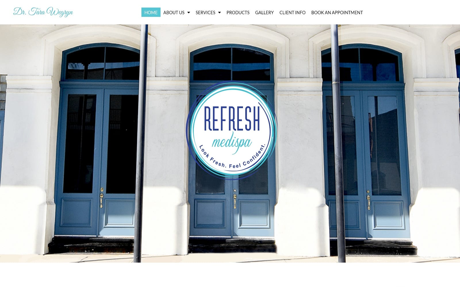
Refresh Medispa’s website is built around presenting a browsing experience as uplifting and refreshing as the services they provide. The first image the viewer is presented with is the front doors of the clinic itself, along with its fresh and popping logo and catch-phrase. The prevalence of white in its color scheme reflects the cleansing refreshment visitors can expect to feel, while the shades of blue represent peace and serenity. This logo is reflected in each of the service links which feature mouse-over responsiveness in the form of a visual bump towards the viewer, encouraging them to click through and learn more. The medical spa site‘s design is compact and mobile-responsive giving it an up-to-date and modern feel that appeals to tech savvy visitors.
The static header on this site features an ever-present menu that makes the user able to go anywhere in the site with just a couple clicks. As a medispa they offer a selection of at-home treatments that are available through the site’s online marketplace. In keeping with its fresh modern aesthetic it provides access to the social media platforms it keeps updated. Instagram is included to emphasize the visual focus of the results offered by the clinic’s services. Click-to-dial functionality helps visitors reach out to the clinic while on the go, turning dialing into a single-click experience. Clients seeking additional information can reach out to the clinic through their email connection, while subscribing to their newsletter ensures regular updates.


