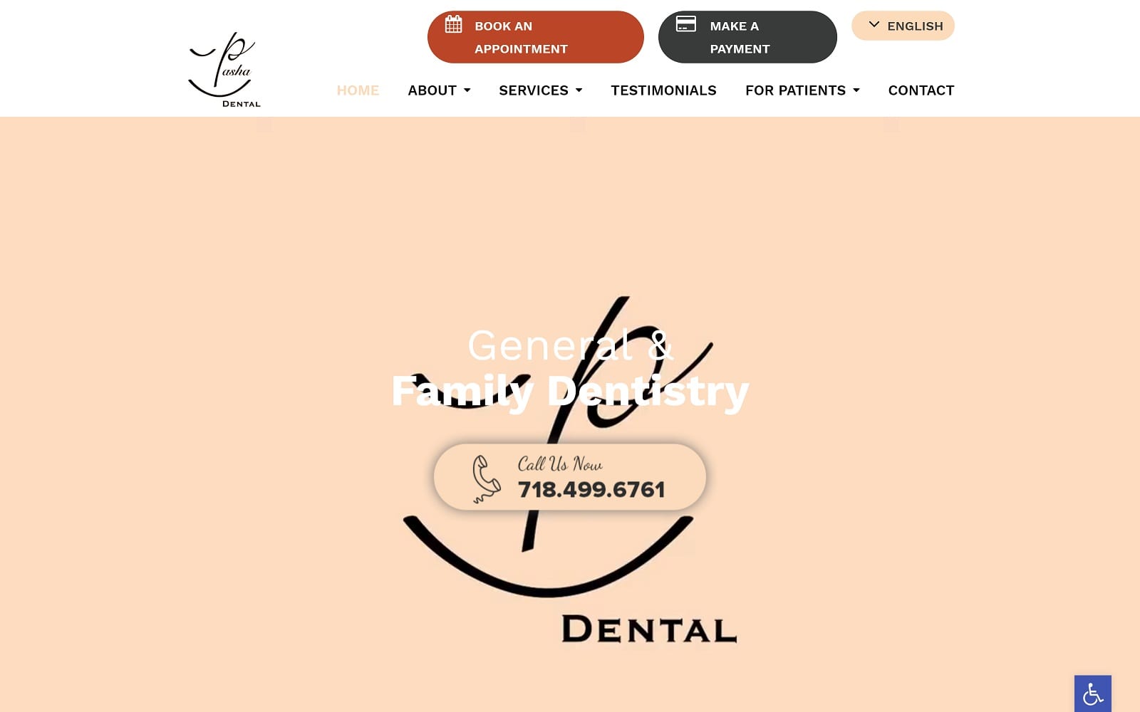
Pasha Dental opens with an active video hero image that gives the site a slick and modern look, engaging the visitor immediately. The color scheme used includes reds, pinks, blacks, and a baseline white to produce stunning contrast and visibility. The main page of the dental site is smoothly designed and creates a clean and uncluttered browsing experience for visitors, especially when combined with the sites mobile responsive design. Each of the pages in the site mimic this design, using a limited amount of immediately visible text in combination with informative imagery. Pages with additional information provide a modern feel by using drop down sections that expand to provide more data for the visitor. These all come together to give the site an interactive and engaging design that’s a pleasure to view.
Convenience is key to Pasha Dental’s design, starting with options to Make a Payment or Book an Appointment through clearly available links. An integrated translation app ensures that the site is accessible to the diverse population that makes up the neighborhoods in and around Brooklyn. Patients seeking to make contact with the clinic by email can do so using the HIPAA secure form located at the bottom of the page. Preparing for their first visit is a breeze thanks to an integrated electronic patient form that can be filled out before they ever enter the office, except for the final signature to make sure everything is accurate. The Contact Us page is loaded with useful information for contacting the clinic with click-to-dial, direct-to-map, and instant email options alongside their office hours and guides for common commute methods.


