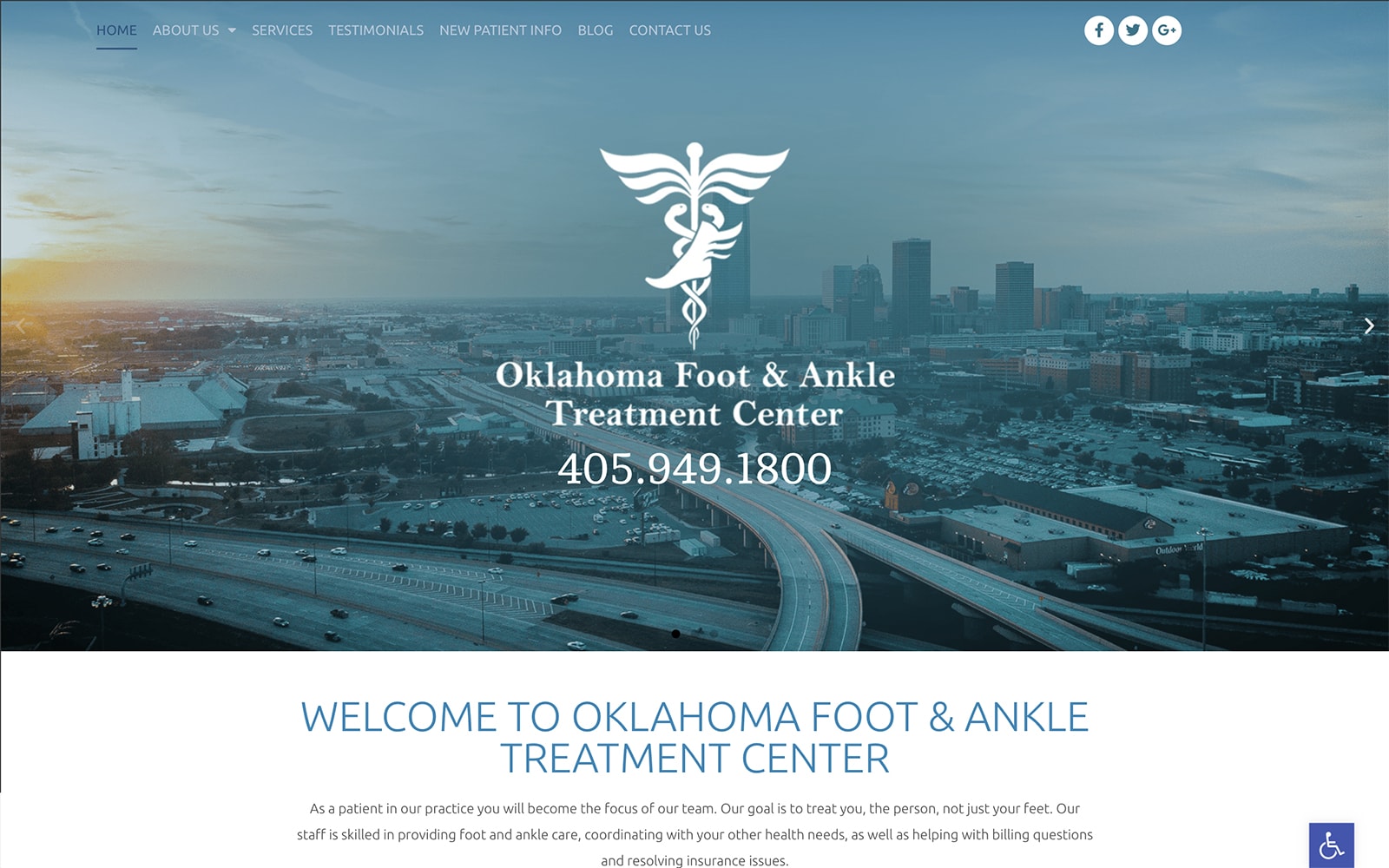
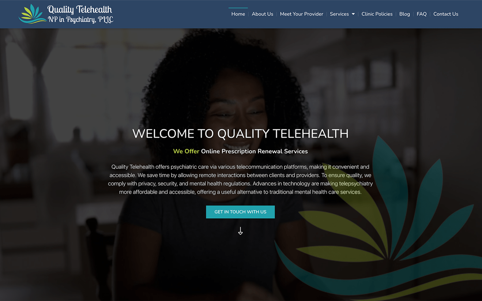
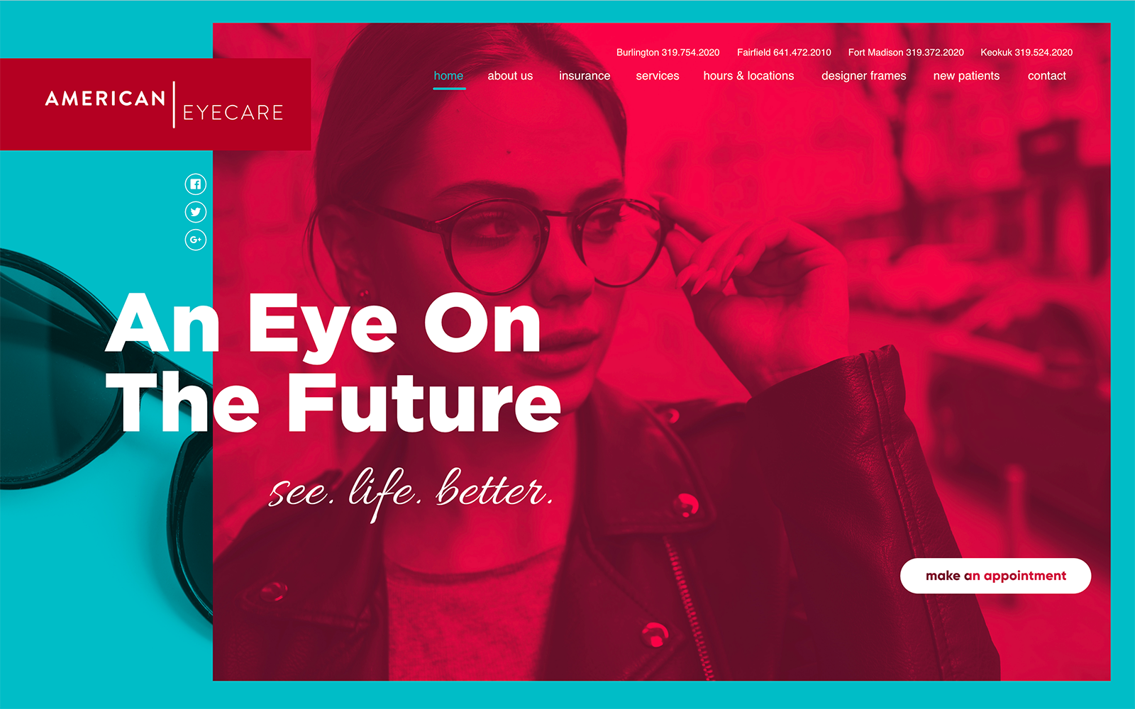
The Oklahoma Foot and Ankle Treatment Center integrates classic colors, using a mono-blue grotto scheme to accentuate the website’s design. The site also includes transparent shading with black and gray to add a semi-flat dimension to each element of the website, including the action buttons, testimonials, and click-to-action links. By incorporating different shades of blue grotto throughout the site, the center plays with usually tropical colors. The color turns its calming properties into a place of authority, expertise, and proficiency in their medical line of work. The website integrates many design elements, such as slide show presentations, hamburger menus, and semi-flat elements, to add multi-layered facets to its overall image. These assets turn can show a sense of reliability, responsibility, and professionalism in their medical occupation.
The podiatry website starts with a transparent header, that when resized, transitions into a hamburger menu for mobile accessibility. The treatment center then incorporates a slideshow widget, using multiple hero images, each presenting the layer containing the business logo, title, and click-to-call phone number. Each section includes elements ranging from action buttons and social media icons for interaction and interlinking within the website’s domain. Its services section uses semi-flat design, that when interacted with, covers the image and hyperlinked text with a monochromatic layer. Its biographies are aligned diagonally from one another for contrast, and its testimonials are presented through a slideshow widget. At its footer, visitors can find the HIPPA secure form, google maps widget, and other relevant information such as click-to-call phone numbers and email addresses. The lower right side of the page also contains the accessibility tool for smooth interaction.


