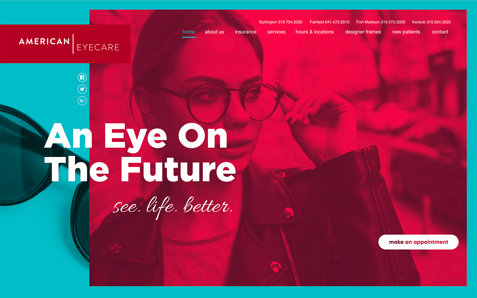
American Eyecare takes sophistication with a twist by combining a dark scarlet red, pewter, dark gray, and an intermixing of blue-green for an ambitious, cultured, and confident design layout to reflect their services and their goals. Scarlet red bring energy, vitality, and power to its web layout, attracting the visitor to their page right from the beginning. However, it’s used so sparingly among its white and dark gray backgrounds that it increases the impression of professionalism throughout. Its use of cool neutral colors in combination with the red that the gray creates a formal, conservative impression for the visitor. It’s light use of blue-green with some of the optical website’s click-to-call numbers, and even borders help to attract the visitor and thus is used as the action color throughout the website.
With sleek, geometric shapes intertwined with offsets of color, American Eyecare introduces its website by beginning with its eye-catching logo on the left-hand side of the page. Instead of a static hero image, a background video’s used to showcase its office, services, and employees. The video contains its main menu section that transparent above the video and contains click-to-call numbers for each of its locations. At the lower right side of the video, an action button can be found. By using a wide selection of fonts to create a dynamic design, each of its divisions is sectioned off with angled design elements. For instance, its team section greets the visitor with semi-flat layers that expand when hovered over and action buttons for its Yelp reviews regarding its locations. Its footer contains its HIPPA contact us form, main menu section, action buttons, and click-to-call service numbers for its various locations.