Commitment to excellent dental care is Northtown Dental’s number one priority. The Minnesota natives understand that seeing a dentist can be quite daunting for many. They wanted to create a website that would help solve these issues by educating and informing the web visitors. We welcomed their challenge of beating dental anxiety by designing a layout that was user-friendly and easy to navigate.
Design Overview
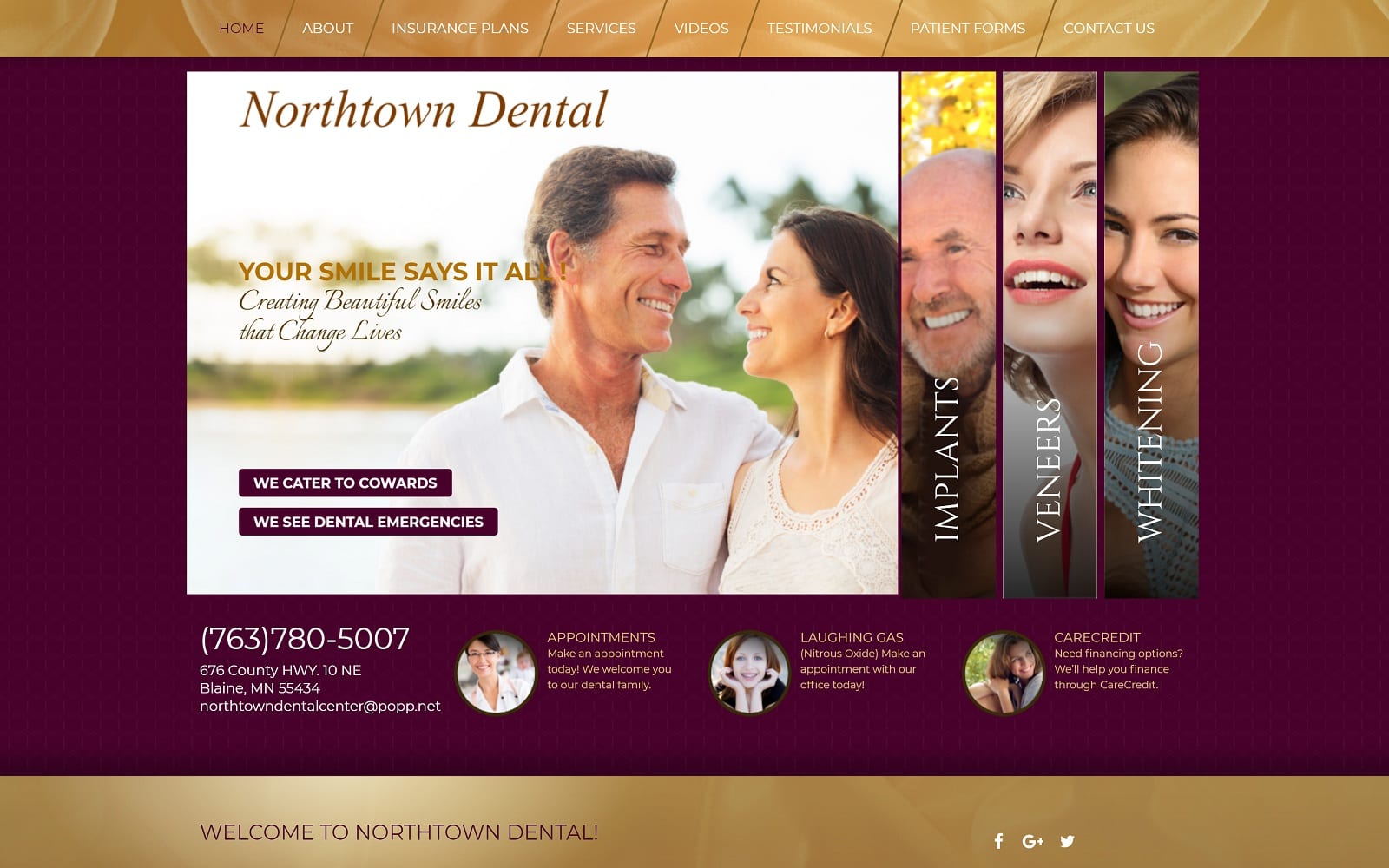
To make everything accessible and easy to read, we went light on the graphics and design. We opted for a simple layout that would cover all the services offered. The homepage is using a parallax feature to showcase the different services offered. Patients can also view the different patient forms and testimonials all in one place. On the bottom half of the home page, you will find the team’s mission statement and a contact menu as well.
Use of Color
To soothe any sense of anxiety, we used a purple and gold color theme. These colors work well together as they are neutral tones. We made sure that the colors would complement the company’s mission to fight against dental anxiety. The site is primarily covered with gold. Purple is used as a highlight and is action oriented. When you scroll over a tab on our navigation menu, it turns purple. This can be eye-catching and appealing for both young and old viewers.
Elements of Design
Space is expertly managed throughout the website. Nothing is crammed or shoved together. Everything is positioned accordingly. The navigation menu is home to the videos tab. With tackling dental anxiety, having visuals about the procedure may help. Northtown dental knew this and incorporated videos accordingly. The about page covers all the educational and experience information patients would want to know about the doctors at Northtown dental. We made sure to add actual photos of the doctors to help patients visually picture the staff. There is a homely vibe to the website. Everything is written to the audience and makes sure that there are plenty of instructions and additional services offered. Combine this with the professional layout and you have a blueprint to a dental website that is complete and easily digestible.
Marketing Aspect
If you ever want to find the closest clinic to you, look no further than our navigation menu or the bottom banner of each web page. We equipped the bottom of each web page with a link to book an appointment or access the patient portal for previous patients. Links to the medical groups’ social media is conveniently located just below these links. Under the patient resources tab, patients may download several forms before heading towards an appointment. Not only is this a great way to commit patients to an appointment, but to also spend less time in a waiting room and more time spent on the stuff that truly matters.
Image the Website Reflects
A gentle, approachable dental practice that invites you to become part of their family, and wants to become part of yours. Throughout the site educational information can be found without the use of bright, over-the-top pictures aimed at catching the eye and demanding attention. Visitors to this site will be picking up the phone to call a clinic they already consider an old friend, all thanks to the steady and comfortable design.


