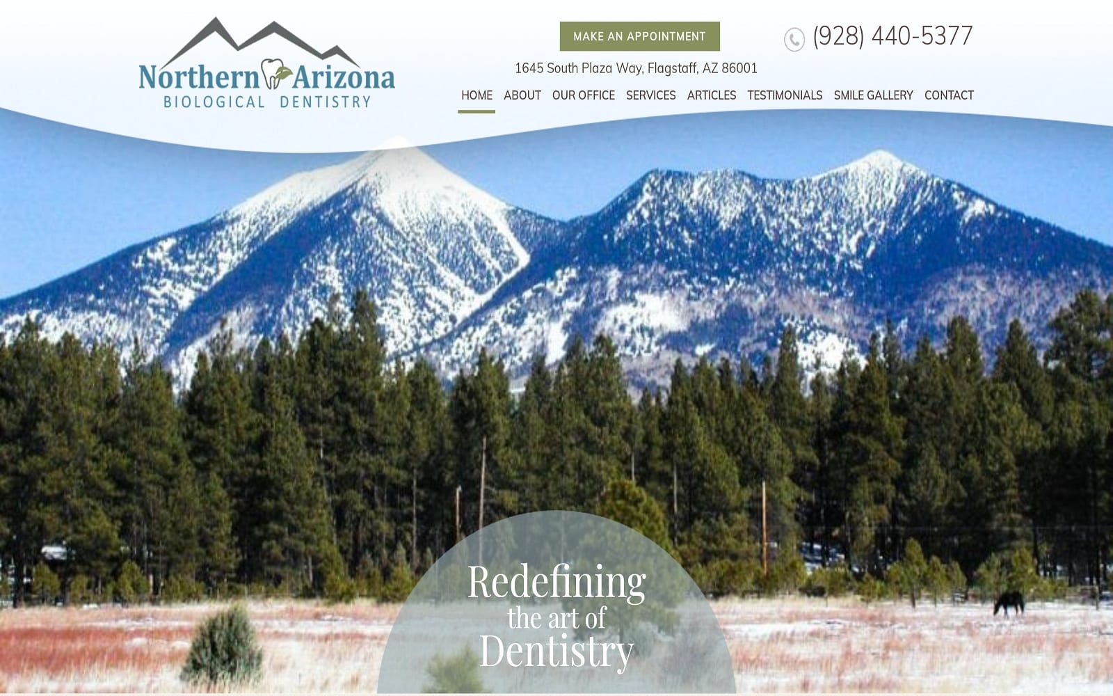
Northern Arizona Biological Dentistry is all about redefining the art of Dentistry. It is the motto that they live by. Located in Arizona, Northern Arizona aims to be at the forefront of the dental industry by using cutting-edge technology and offering services normally not offered at the average dental office.
Design Overview
The project style uses a full-width layout instead of the traditional website with marginal white space. We also went with a nature theme to help soothe and calm incoming web visitors. We also implemented a personalized logo for an added touch of personality as well.
Use of Colors
To complement the nature-encompassing theme throughout the website, we used a mixture of blue and green to highlight the different calls to action and buttons on the website. Blue and green are also the main colors used on Northern Arizona’s personalized logo.
Blue: Is the primary color attributed to the medical field. When used in conjunction with the wide white background, blue helps establish a sense of hope to the patients.
Green: Is used to highlight different buttons on the website. Not only does it add a touch of personality to the site, but it also helps establish a sense of comfortability and comfort as well.
The colors you choose to use on your website have to match your specialty and the manner you want to display to your target audience. To learn more about how to use the psychology of color schemes on your website click HERE!
Elements of Design
Navigating through any website should always be simple and pleasant. Web visitors should never feel rushed or cramped within any website. We made sure to take this into consideration when designing the website. Spacing is expertly managed throughout the website to ensure that the text and image frames were evenly spaced out. Nothing is overbearing or too strong for all the different elements of design. In short, everything works well with each other!
We used an ample amount of white space throughout the website to ensure that readers would have no trouble digesting the information in front of them. Navigation is always readily available. No matter where you scroll throughout the website, our navigation menu is always available near the top of the banner of any web page.
Marketing Aspect
Marketing and the aesthetic design of a website can make or break a patient’s decision to invest with your dental practice. We made sure to highlight the different services, articles, and testimonials on the navigation menu for the Arizona natives. Their smile gallery also adds a great visual aspect to help patients see true results from the office itself. The office tab also features the insurance and payment options available for the patient’s convenience.
We also provide visitors easy access to the office’s phone number and a widget to schedule an appointment on the top banner. All of Northern Arizon Biological Dentistry’s contact information can be found at the bottom of each web page as well.
Image the Website Represents
The entire website places an emphasis on calming and soothing incoming visitors. When dealing with any dental website, we always make sure to stay clear of harsh, painful visuals at all costs. Overall, the website helps makes the Arizona natives make a great first impression that will hopefully translate into an office walk-in or an appointment call!
