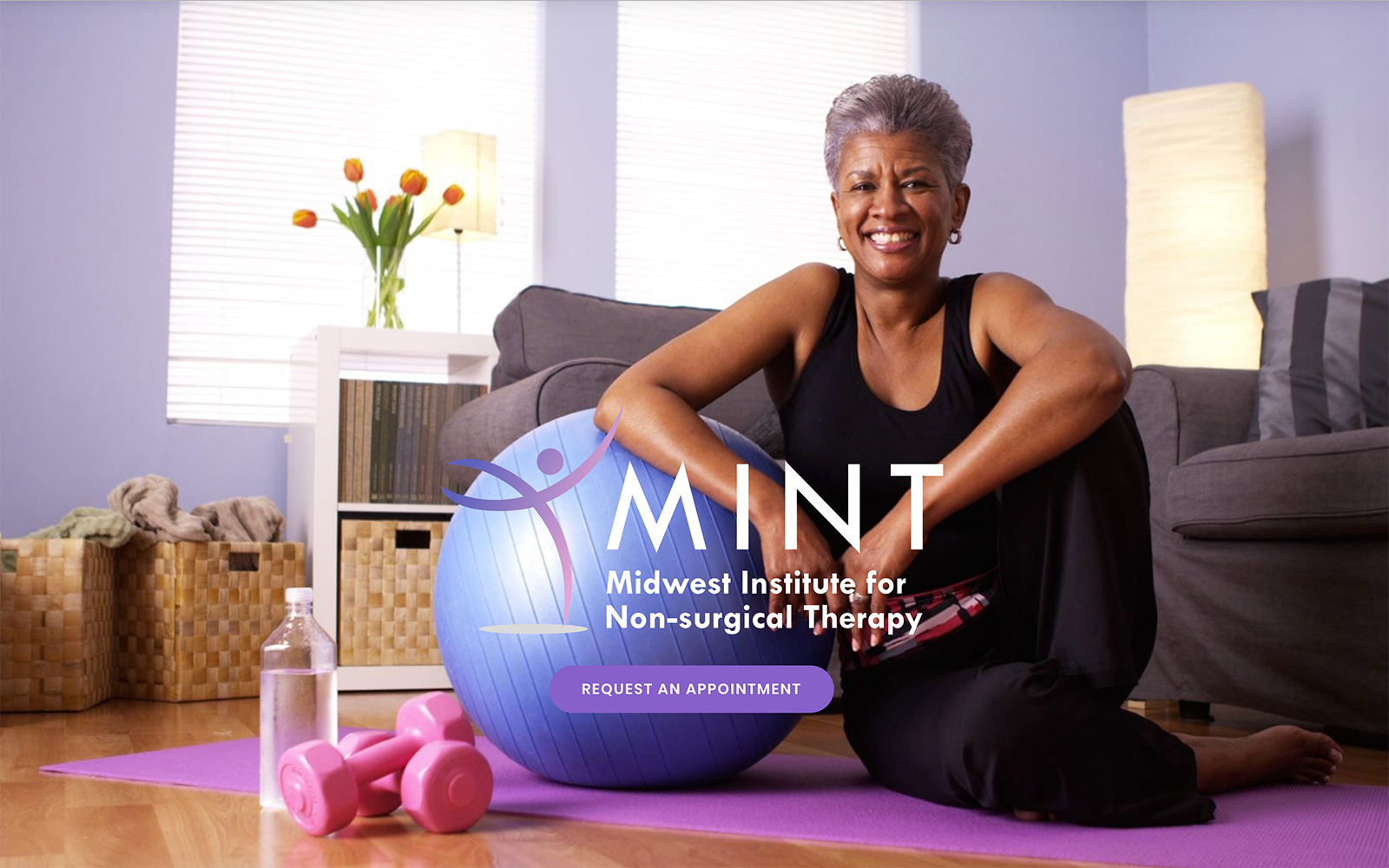
Midwest Institute for Non-Surgical Therapy opens with a smiling woman leaning on a medicine ball, showing one of the tools patients will use on their road to recovery. The logo is a stylized human form in an open and free pose that conveys the goals of the clinic when working with its patients. The color scheme is a striking purple and white combination that uses a variety of shades of both throughout to create excellent contrast and a beautiful appearance. The color palette is more than just aesthetically pleasing; purple conveys a feeling of devotion and the independence of those working through physical therapy crave. The mobile responsive design helps the site feel modern and culturally savvy, serving the needs of today’s digitally connected patients.
MINT’s medical website provides patients with an immediate ability to connect to the office through the click-to-dial enabled phone number located in the header. The mobile-responsive design presents a variable menu that switches between a traditional header style and a collapsed hamburger menu depending on the screen size used. Patients looking to connect and follow their accounts with MINT closely will find the Patient Portal invaluable. Those visitors looking to become patients will find the Financial section worthwhile as it presents payment and financing options along with a list of the insurance that MINT accepts. As visitors reach the bottom of the page, they’ll discover a direct-to-map link that will pull up directions on their favorite mapping program, as well as email and social media connections.


