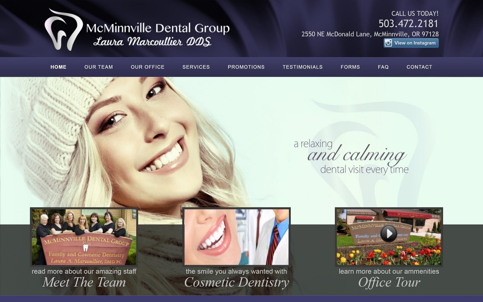
Dental technology is ever-changing and constantly evolving. Dr. Laura Marcoullier does her best to stay relevant to the needs of patients using advanced technology that helps better diagnose and treat oral conditions and diseases. McMinnville Dental Group’s office features innovative oral health technology that makes it possible to provide unsurpassed patient care not available just a few years ago.
Design Overview
We have designed and coded Dr. Marcoullier’s dental website to reflect the highest of the technology of her dental practice. We’ve included the most secure appointment forms and latest website videos to keep up with website trends in social media and interaction with patients. We committed the homepage to display testimonials, services, and the teams’ mission statement for optimal oral health.
Use of Color
Dentistry is all about aesthetics and designs. We designed our color scheme accordingly. The website primarily uses purple and yellow for a flashy, but professional aesthetic. Both purple and yellow make for a good contrast to make navigation on the site and reading content enjoyable. The visual aspect of the colors makes for a comfortable read in any sort of lighting. We used yellow to highlight the call to actions and purple to create a vibrant theme.
Analysis of Design Elements
One standout aspect of the website is the location of the navigation menu. Instead of the menu being placed near the top of the web page, the hamburger menu and search bar is placed at the very bottom of the page. This allows for more reading room for site visitors. When the hamburger menu is utilized, the navigation menu fills the screen, allowing visitors to find what they need – and quickly.
The site is open and spacious in design. This allows the site to load quickly on both mobile and desktop. The imagery is welcoming and invites visitors to book an appointment. To seal the deal, the about us page on the navigation menu also has contact information. From phone numbers to the address, all of the practice’s information is easily accessible wherever you are.
Marketing Aspect
The hamburger menu is an essential part of the sites marketing design, as full menus have been shown to be less well received by viewers. It also helps to keep the page open and clean and is the best way of providing menu access to mobile users. Imagery on the site helps connect the office to the local community while the prevalence of easily accessible access information makes calling for an appointment a breeze. There is also a new patients tab that answers frequently asked questions and other concerns!
Image the Website Represents
Everything about the site is accessible without being overpowering or pushy, and it’s design provides the perfect open and welcoming air to encourage without pressuring. Aesthetics and proper dental care are all present in this site, making the site an ideal blueprint for others within the Austin area.


