Out of their office in Lacombe, Louisiana Lacombe Dental runs a thriving practice for their growing family of patients. They came to us to help them reach out to even more people by developing an engaging and beautiful website that was representative of the beautiful area of the country in which they live.
Overview Of The Design
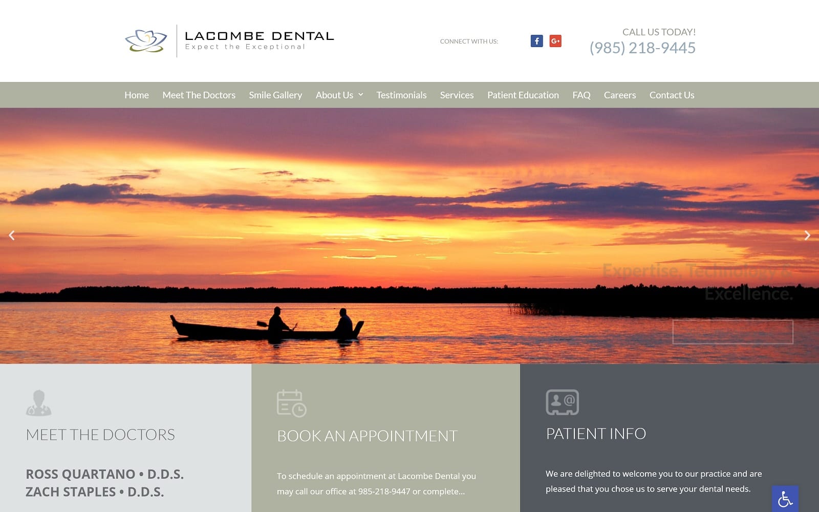
Rich verdant greenery, lush bayous, and beautiful Spanish Moss are reflected in the design of the site as part of its community connection, serving as a mainstay of the site’s imagery. The colors used in its palette were selected to highlight the images found throughout the site, which play a major part in passing information to the visitor.
Use Of Colors
Light greys, white, and faded blues come together to create a muted palette that serves as the perfect backdrop for the images that guide visitors through the site and demonstrate the capability of the practitioners that form their team.
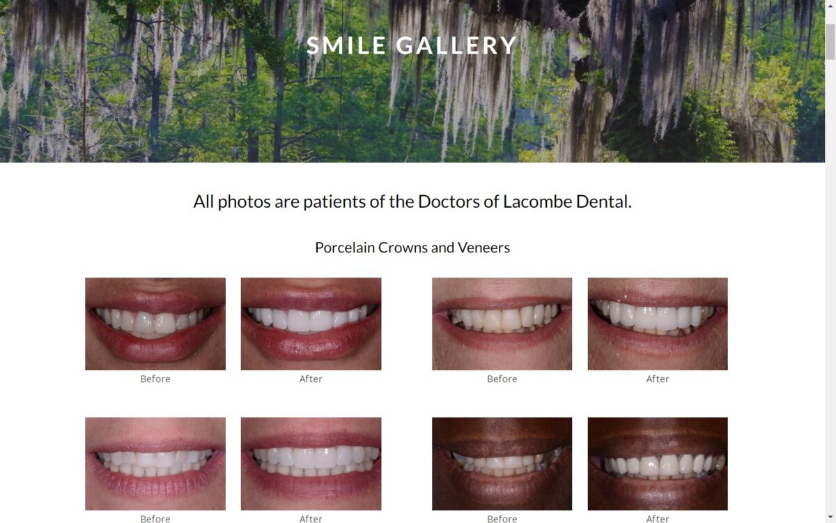
• Contrast – Light greyish greens pair with white and a faded blue to help the other aspects of this dental site stand out. The slideshow that is comprised of before and after imagery pops off the page thanks to its understated color scheme.
• Action Oriented – The bright colors found in the images combine with the muted tones of the sites color scheme to help direct users to valuable information and services available throughout the Lacombe Dental website.
• Community Ties – It’s less about the colors and more about the imagery drawn from local sources. The colors serve only as a backdrop to help highlight the beauty and natural wonder of the Lacombe area and the Louisiana Bayous.
Analysis Of Design Elements
Medical website design calls on the web developer to make it stand out in a field packed with competition, and their work doesn’t stop with the selection of a color scheme. From there they have to take into consideration the use of negative, or white, space, how the visitor is going to navigate the page, and more. The design found in Lacombe Dental’s website helps bring these design principles into alignment.
• Space – White space is used to break the website into specific categories while framing blocks of text and highlighting some of the imagery used throughout the site to create an experience that will keep your visitors coming back.
• Navigation – Navigating this site is designed to be easy, with the full menu being present at the top of the screen as you scroll through its contents. In mobile mode, you’ll discover that the menu contracts down to a hamburger menu available to be opened with a mere click.
• About Us – The About Us page continues the theme of stunning imagery by providing more screenshots of Live Oaks dripping with Spanish Moss in a bayou that’s exploding with scintillating green. These are familiar sights to the residents of the Lacombe Area, and help to drive home the idea that this is a local company.
• Contact Information – Like most good website designs this one sequesters all the contact information and social media links at the base of the page in the footer, ensuring that even a new visitor knows exactly where to get the information they need.
Marketing Aspect
Without marketing your website is just a painting in an unvisited museum, unable to be appreciated or engaged with. Even medical websites need to take marketing into consideration, especially given the way the Internet has made finding a dentist or other practitioner much easier, and more competitive. Once your potential patients have found their way to your website, the following marketing elements increase the odds that they’ll convert into regular members of your practices family.
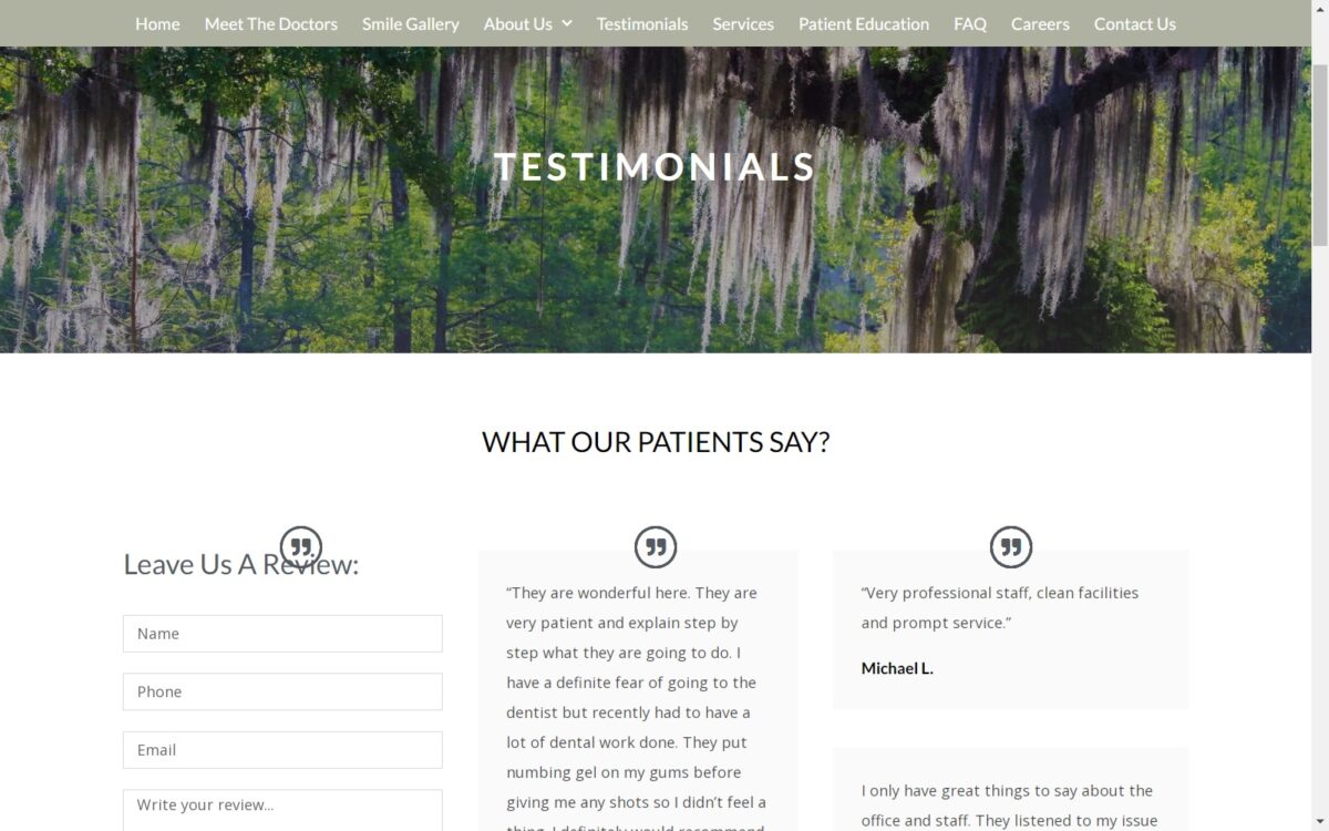
• Testimonials – There’s nothing like the voice of a satisfied patient to entice others into giving your facility a try. Word of mouth advertising hasn’t gone out of vogue, it’s alive and well in the form of testimonials and reviews. The Lacombe Dentistry website features an ever-growing body of beaming reviews from their existing patients.
• Smile Gallery – If seeing is believing then a smile gallery is a dentist’s best friend. Dental Websites regularly feature these sections to showcase the work they’ve performed and the smiles they’ve restored.
The Image this Website Reflects
The Lacombe Dental site reflects a practice dedicated to its community and providing dental care with a smile. Patient involvement is showcased as part of their patient education page, making it clear that the relationship between patient and dentist is going to be collaborative. If you’re looking for a site style that will connect you to your community this one is an excellent choice.
