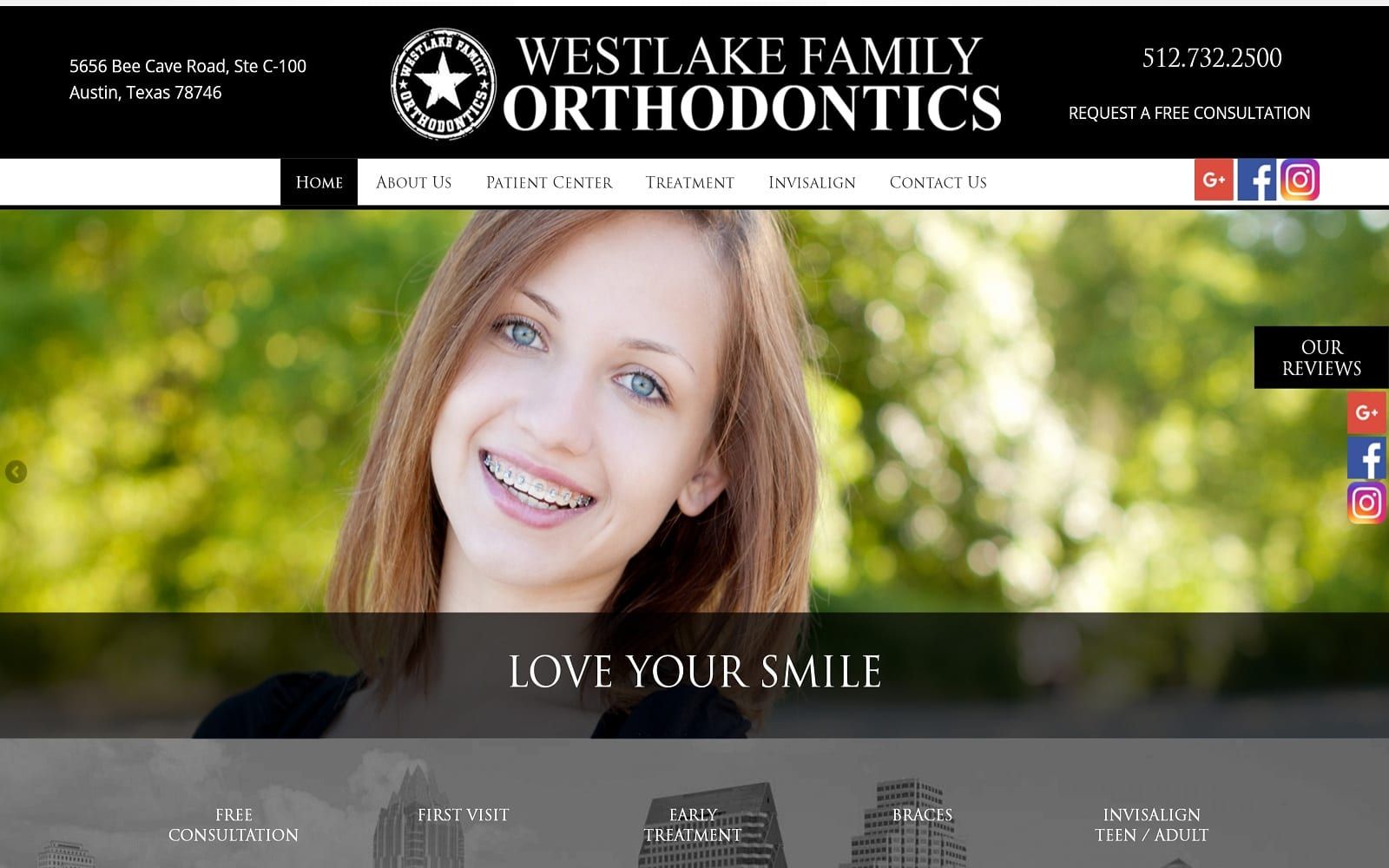
At Westlake Family Orthodontics, we work hard to treat our patients the same way we would like to be treated: with professionalism, respect, and care toward your specific needs. We strive to do everything we can to ensure that each patient has a great experience at our office. The doctors are Westlake Family Orthodontics wanted to present a family atmosphere for their orthodontic website by using bright and colorful images. The photos provide a comfortable setting for visitors to their site. The menu at the top of the website is easily accessible to all information about Westlake Family Orthodontics.
Overview of Design
We went with an extremely bold and interactive interface when designing Westlake’s website. Located in the heart of Austin TX, we wanted to design a website that would match the bravado that Texas is known for. The homepage features an extensive look at the office and the services the dentists provide. Specializing in Orthodontics, we wanted to design the website around the specialty at hand. We integrated colorful professional images to capture the radiance and personality of the dental team. The navigation bar is spacious, legible, and easily accessible on all web pages.
Use of Colors

We stuck to the basics to help add contrast to the bold interface that surrounds the website. We used a black and white color theme to make sure all the reading material was legible and engaging. Black enforces a sense of luxury and class while white helps add credibility and professionalism to any website. We did splash in a bit of blue to highlight certain calls to action on the website and add some pop to the material. We did not want to go overboard with the color theme as it would add TOO MUCH contrast to the already bold font. Using bold font on some areas of the website helps reader interaction with the information in front of them.
Design Elements
The website is formatted to be wide-spaced and modern. The scrolling header images lend in with the surrounding text. Spacing is expertly managed throughout the website. Each tab on the navigation menu comes equipped with drop down options that reflect the different services offered. The services tab comes with actual patient pictures as a living testament to their work.

In such an impacted field of work, standing out is extremely difficult; even with exceptional service, you need an exceptional website to back you up. The personalized logo in addition to the in-depth office and doctor tour under the About Us tab helps add a sense of trust and genuine wellbeing. Communicating and building a relationship with your dentist or doctor is key extremely important to many patients. Thanks to our design elements, patients can get to know the doctors involved with their smile makeover before even entering the physical office themselves!
Marketing Aspect

Call to actions are carefully placed throughout the website. On the right-hand side of the website, in particular, there are widgets strategically placed to navigate readers towards their different social media platforms and testimonials. The patients’ tab in our navigation bar hosts plenty of patient before-and-after shots as well as informative videos to help educate incoming patients. On the bottom of the home page, you will also find an interactive map that users can utilize to help determine their drive to the office.
Image the Website Represents
Westlake Family Orthodontics represents a friendly and welcoming practice that is focused on providing good information, open accessibility to their reviews, and a new place for your family to seek their care. The information is available and open, inviting visitors to make contact and turn their search for a new dentist into their first appointment. The color theme and design elements all provide a welcoming first impression for first-time site visitors.