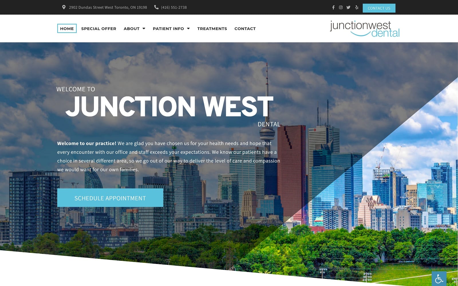
Junction West opening with a beautiful vista of its home town of Toronto, ON that gives it an immediate connection to the community it serves. It uses a gentle color scheme of blue and white with the occasional splash of black for contrast. Blue is a color that uplifts visitors spirits with hope for a bright dental future, while black gives the site a touch of professionalism that instills confidence in the viewer. The “Our Office” page presents the clinic in a series of bright and beautiful images that reflect the blue color scheme of the dental website, both with features captured in the photo and the framing used.
The hero image serves to establish locality for visitors to the site, telling them that the clinic is invested in its community and is proud to serve them. The “Our Office” page uses images that help the patient begin to imagine themselves in the space, building a familiarity before they ever arrive that helps drive conversion. The page dedicated to Dr. Venus Sobhi builds rapport between the potential patient, the dentist, and the team that will help serve them. The connection created helps them to become comfortable with their provider from the beginning, and encourages them to choose them as their dentist. The “Home Care Instructions” also conveys that the clinic’s care for its patients doesn’t end when they leave the clinic. Sharing care tips helps to establish that their relationship with the patients is ongoing and about long-term results.


