New design idea

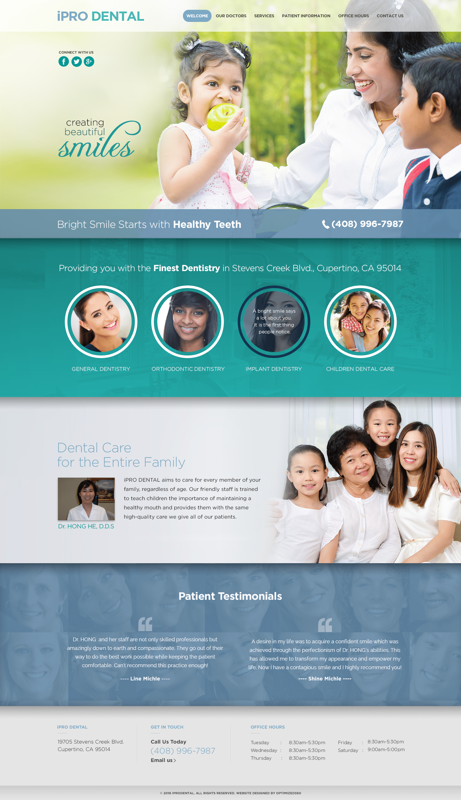
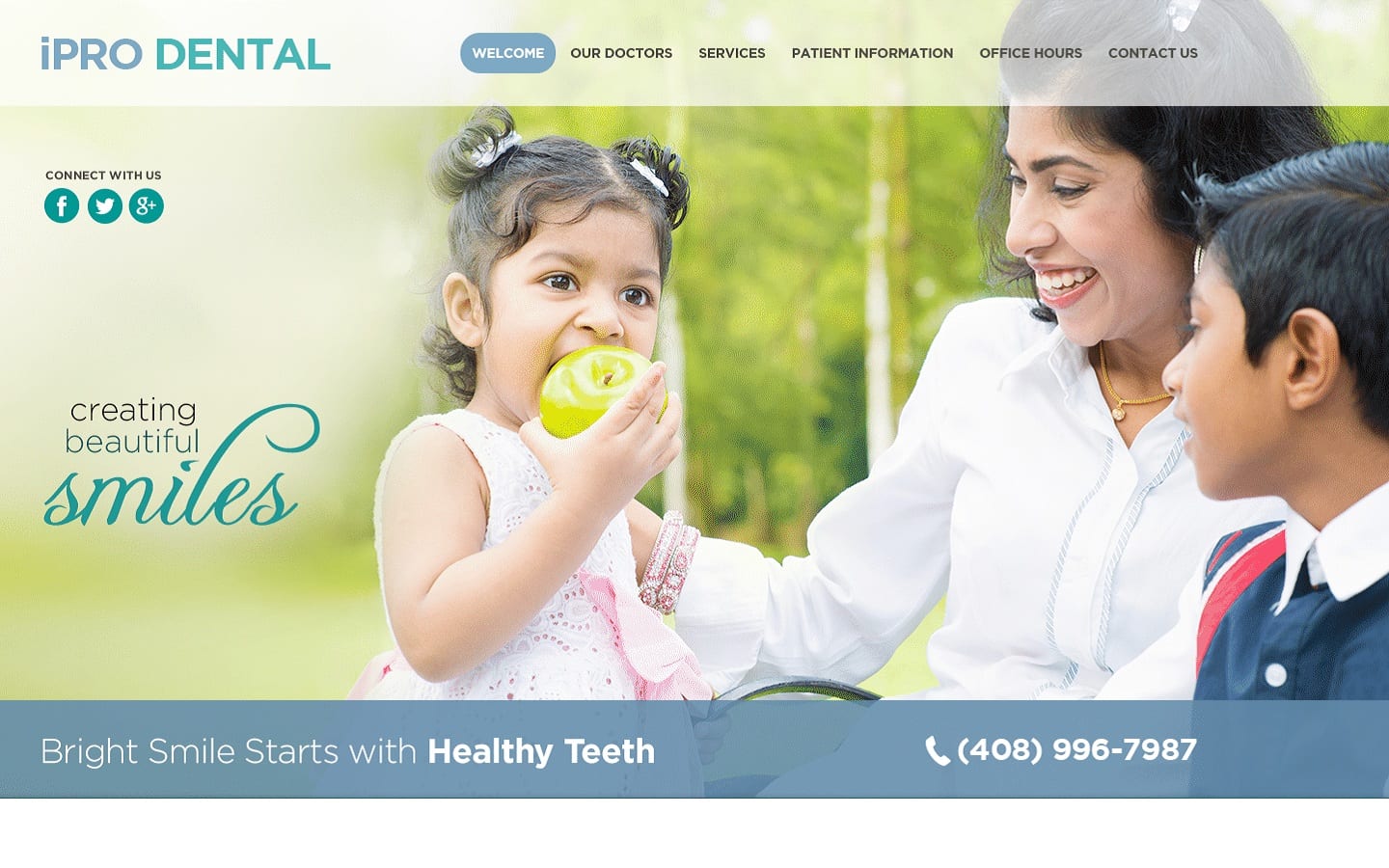
An open, colorful, and welcoming design greets patients reaching out to iPro Dental website design. The hero image immediately conveys the clinic’s family focus. The imagery used in this site carries through this impression as visitors explore the site. The site is cleanly sectioned using the blue and white elements that make up its primary color palette. The mouse-over responsive images encourage patients to explore the information available in the site while conveying a sense of thoughtful design. The introduction to the dentist includes a compelling image of her family gathered together, reinforcing the family-oriented impression of the clinic.
This website makes immediate efforts to connect with its visitors through the presentation of social media links and a click-to-dial phone number. The site integrates mobile-responsive design to connect with modern patients and provide ease of use to those on the go. Patients seeking to learn more about the services provided and how to prepare for their visit can learn more through the patient information link, while the contact us page provides multiple options for reaching out to them. Click-to-dial and direct-to-map functionality is incorporated into the footer alongside the office hours. Patients looking to connect through email can do so via the link provided here as well.


