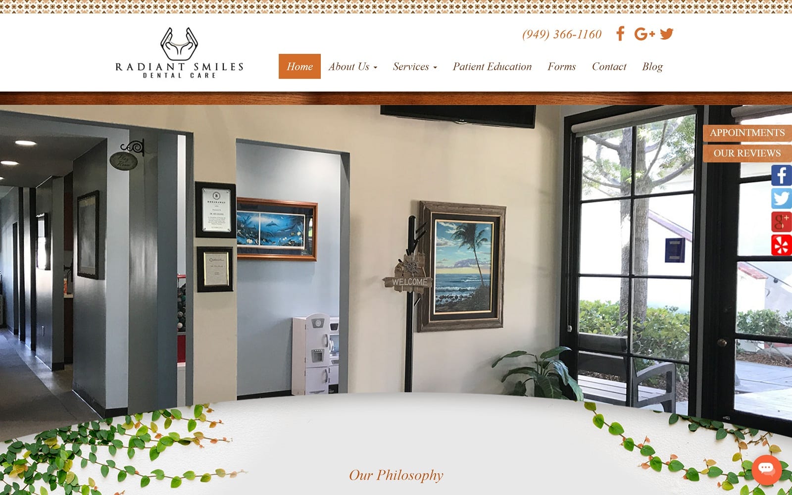
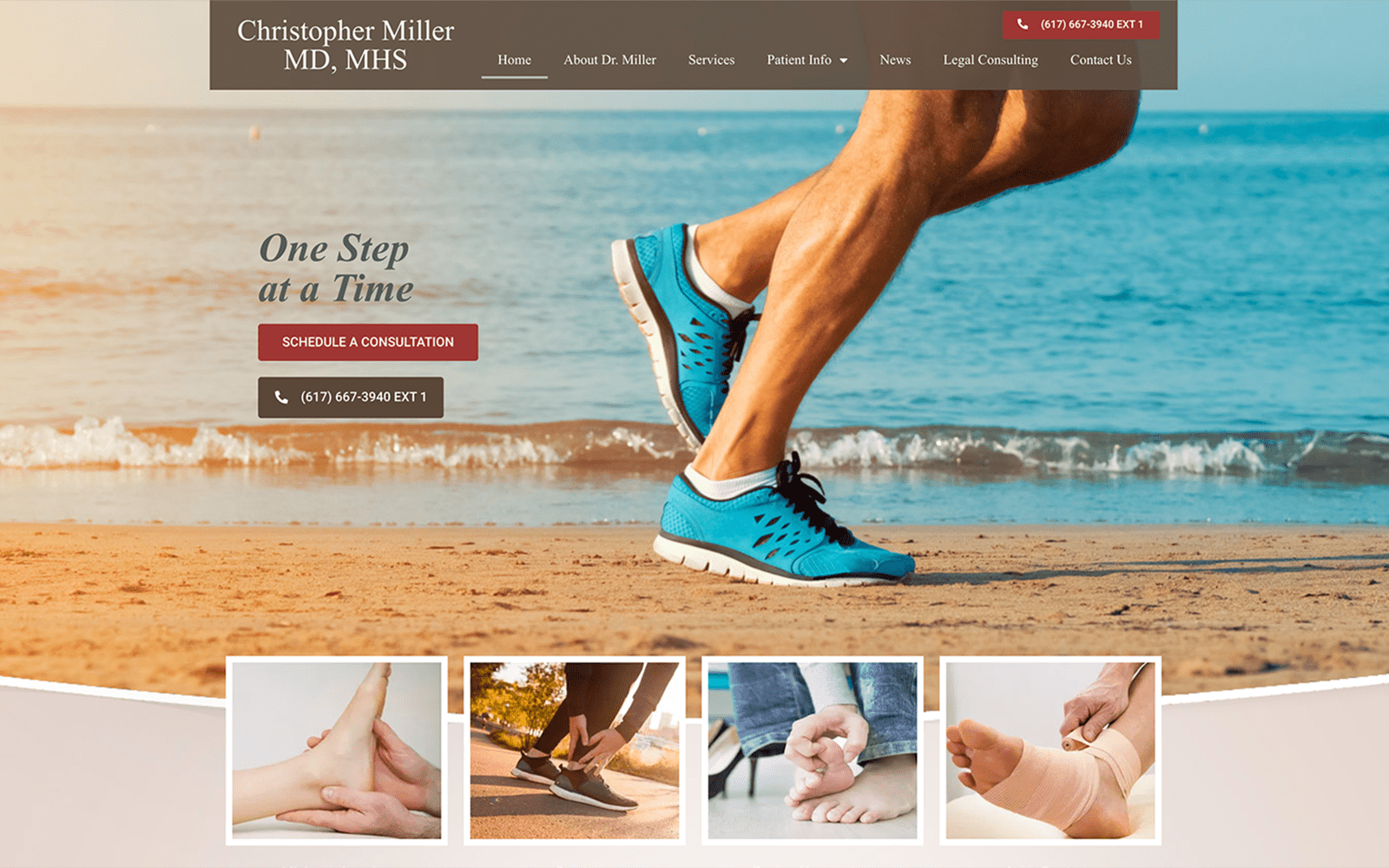
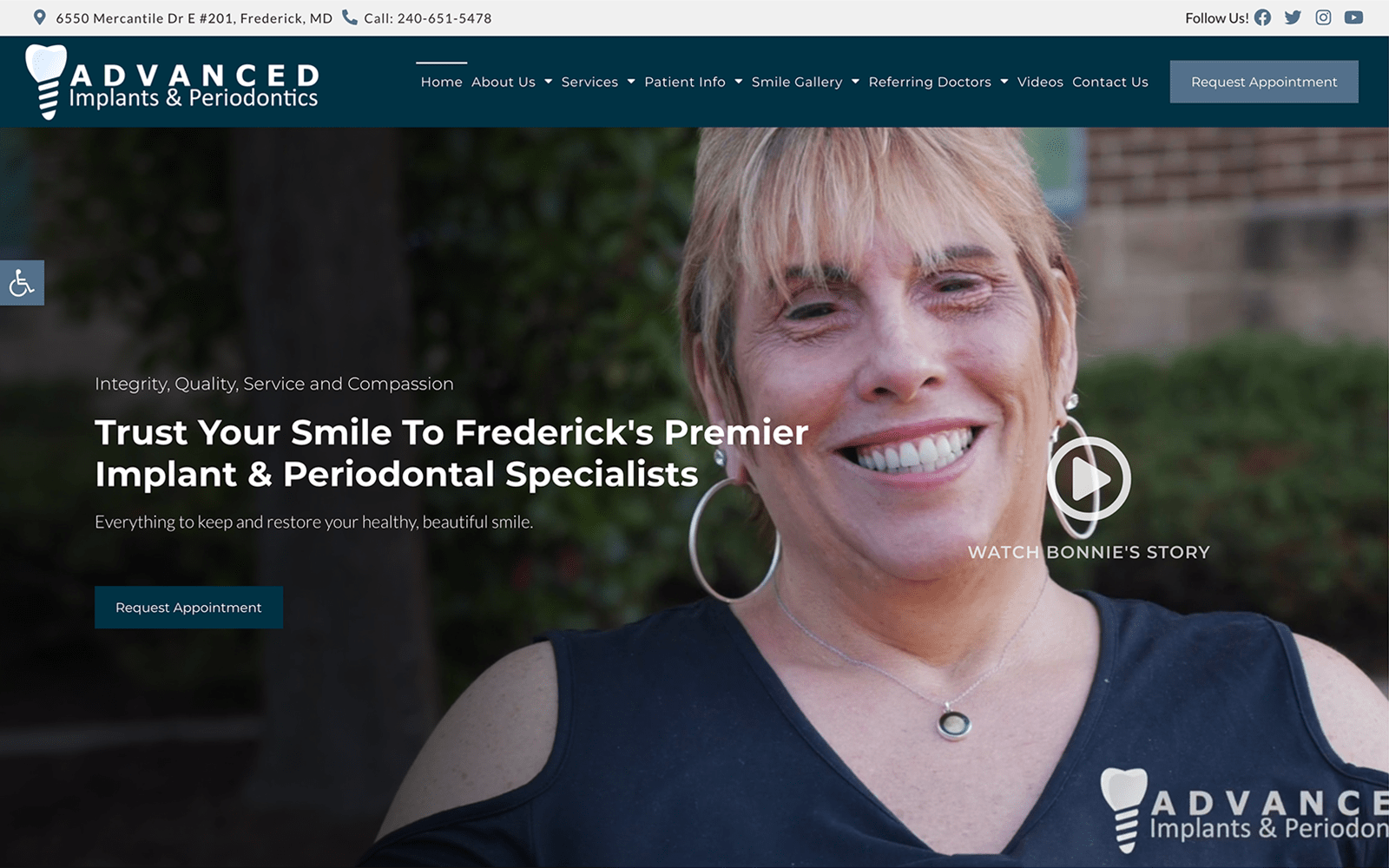
Located in the heart of New York, Dr. Gordon understands his patient demographics can be extremely picky. With all the different dental offices around the city, we welcomed creating a website design that would stand out among the crowd.
Design Overview
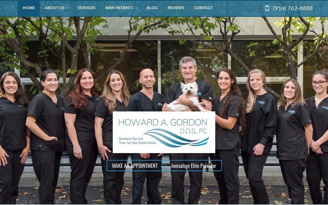
Dr. Gordon’s website features full-width navigation. The homepage has the dental team’s mission statement, along with a short biography about Dr. Gordon himself. We made sure to include testimonials and the different services available on the home page to provide easy access for web visitors. The navigation menu features drop-down elements for more extensive information.
Use of Color
To match the dentistry field, we went with a simple color scheme of blue and white. Blue and white offer a stable contrast that pops well when used to highlight a call to action. The white space helps the blue stand out amongst the text. Blue is primarily used on the navigation bar to add a splash of color and bring a sense of hope to the readers. White offers a professional appeal while blue gives an air of fresh hope to incoming site visitors. It is no coincidence that most medical websites are blue and white!
Design Elements
To match New York’s culture, we match the highly visual website with many modern design elements. Most notably, most of the pictures used on the website are from the team themselves. This adds an extra layer of personability and goes to show the amount of effort Dr. Gordon is willing to give when beating the competition. The services tab features all the different procedures they have available. When you click on a particular procedure, you are taken to a new page where the procedure is described in greater detail. No matter where you go on the website, the navigation menu will always be available. Space is expertly managed throughout the website. Nothing is ever cramped or jumbled together.
Marketing Aspect
Dr. Gordon makes scheduling an appointment as easy as possible by providing contact information throughout the website. The contact page in particular also holds an interactive Google map for patients who want to time their estimated time of arrival. A link to their blog is also available on the navigation menu. This provides a great way to educate and inform their patients. When you go out of your way to educate your audience, they are more willing to commit and trust your services. To top it all off, Dr. Gordon understands that waiting around in a waiting room in New York is not a great feeling. By providing patient forms to alleviate this issue, Dr. Gordon ensures that all his patients get ample time to meet and discuss their issues with him personally.
Image the Website Represents
This website represents a warm and friendly practice that is eager to help its patients with their most important dental health needs. The overall design makes it easily accessible while the depth of patient education options ensures that your visitors will understand that your relationship is seen as a partnering between the patient and professional.


