New design idea

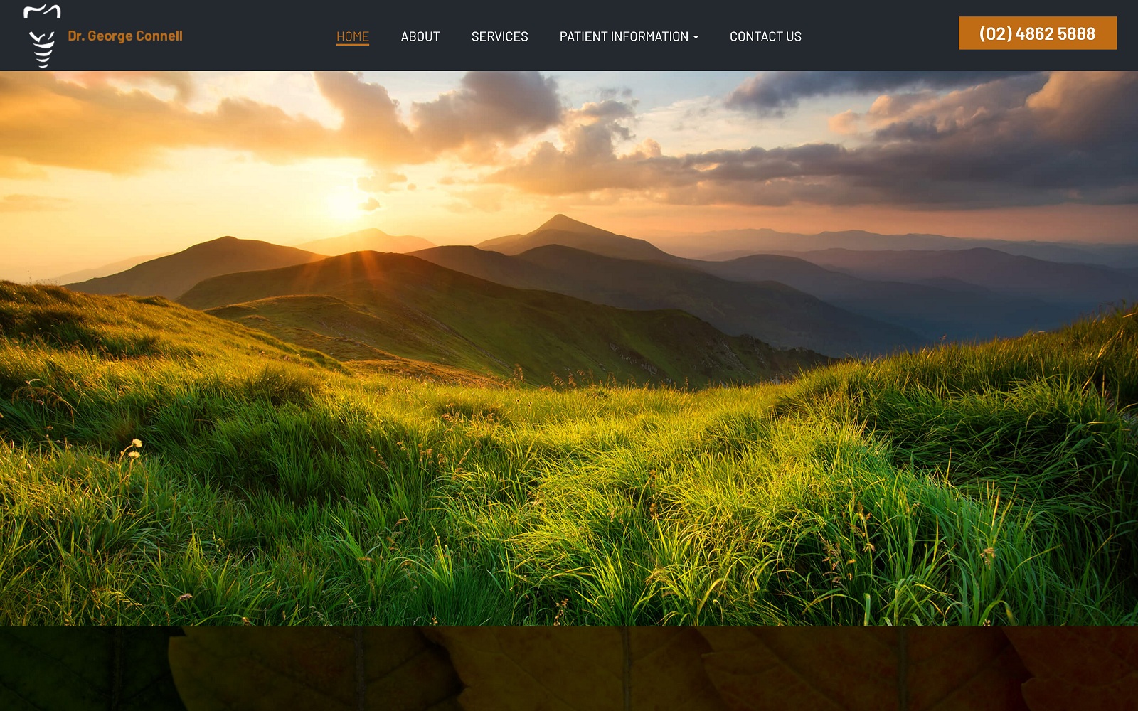
HD Dental Group gives people a reason to smile by bringing enthusiasm, charm, and, most of all, warmth to their website. With a dynamic color scheme of yellow-orange, musty brown, peach, and jet black, Highlands Dental focuses on the themes of autumn, with its primary color, orange, is used to invite the visitor to their website to convey a sense of sincerity, maturity, and softness. Its use of black for its background creates elegance and timelessness along with its joyful imagery. Sophistication and cheerfulness go hand in hand to create a balanced composition, and overall, the dental website design‘s aesthetic radiates qualities related to productivity and uplifting luxury.
HD Dental Group’s page begins with a small header, overlay by its logo, and highlighted in its action color is the click-to-call phone number. Its hero image contains a hyperlink button for appointments, and below that, a semi-risen section contains the business’s introduction, along with bullet points for highlighting key aspects of its business mission and goals. Its services section highlights in its action color, and throughout the home page, transition colors help to overlap the images to present information and bring a sense of unity throughout. Its testimonials section contains arrow icons for interaction, and at the footer of the page, the HIPPA contact us form can be found adjacent to the left side of the page. It’s footer also contains click-to-call phone numbers, addresses, and a repeating main menu section for emphasis. Also, the footer contains the dentist’s accepted insurances and accreditations.
