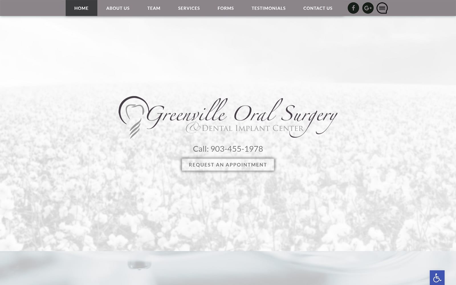
Elegant, quiet, and calming, Greenville Oral Surgery works with light neutral colors with variances of warm neutrals, such as white smoke, brown-gray, and chocolate brown to soothe and entice users to their website. Greenville Oral Surgery works with airy, elegant design elements, such as script text, faded white layers, and soft transitions to reassure its users of their capabilities and services. As the primary color, brown-gray contains both the warm effects of brown and the cool tones of gray and is used as a calming effect throughout the website’s borders and action buttons to give its image a sense of richness. Whitesmoke, combined with its light, airy cotton imagery, creates a serene, pure aesthetic to the website’s image. Chocolate brown’s used lightly at the footer of the page to distinguish it from its cooler counterparts and encourages healing, reliability, and resilience. Overall, the website’s focus on calming effects creates a sense of sophistication and elegance that’s unique to its image.
Greenville Oral Surgery website design opens with its solid border, which shrinks to a hamburger menu for mobile accessibility. Its header contains the website’s main menu services, along with an icon that links to the website’s review page. In the hero image, the business title and logo expands across the page, allowing users to engage with the website’s click-to-call service number and action button. Each of its services contains a white layer for readability, as well as various elements such as slideshow widget, service icons, and action buttons for active engagement. At the footer, the google maps widget and HIPPA secure form can be found, along with the website’s contact information and the accessibility tool.


