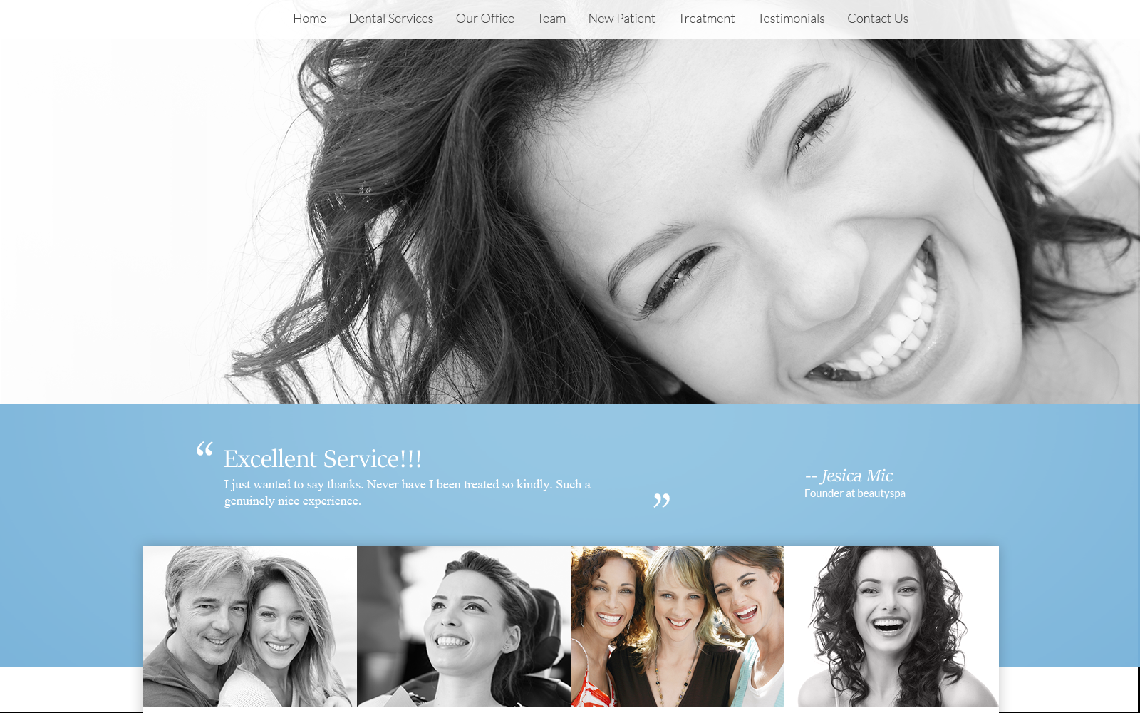
Overview of the Design
The overall design is intended to be inviting and welcoming as Dr. Bloom is focused on building relationships with her patients that last a lifetime. As a family dentist, the patient’s smile is always the number one priority. We mirrored this philosophy by creating a website that was clean and easy to navigate. We made sure to cater to their audience by allowing a smooth and spacious interface that would attract both young and old. It is family dentistry after all!
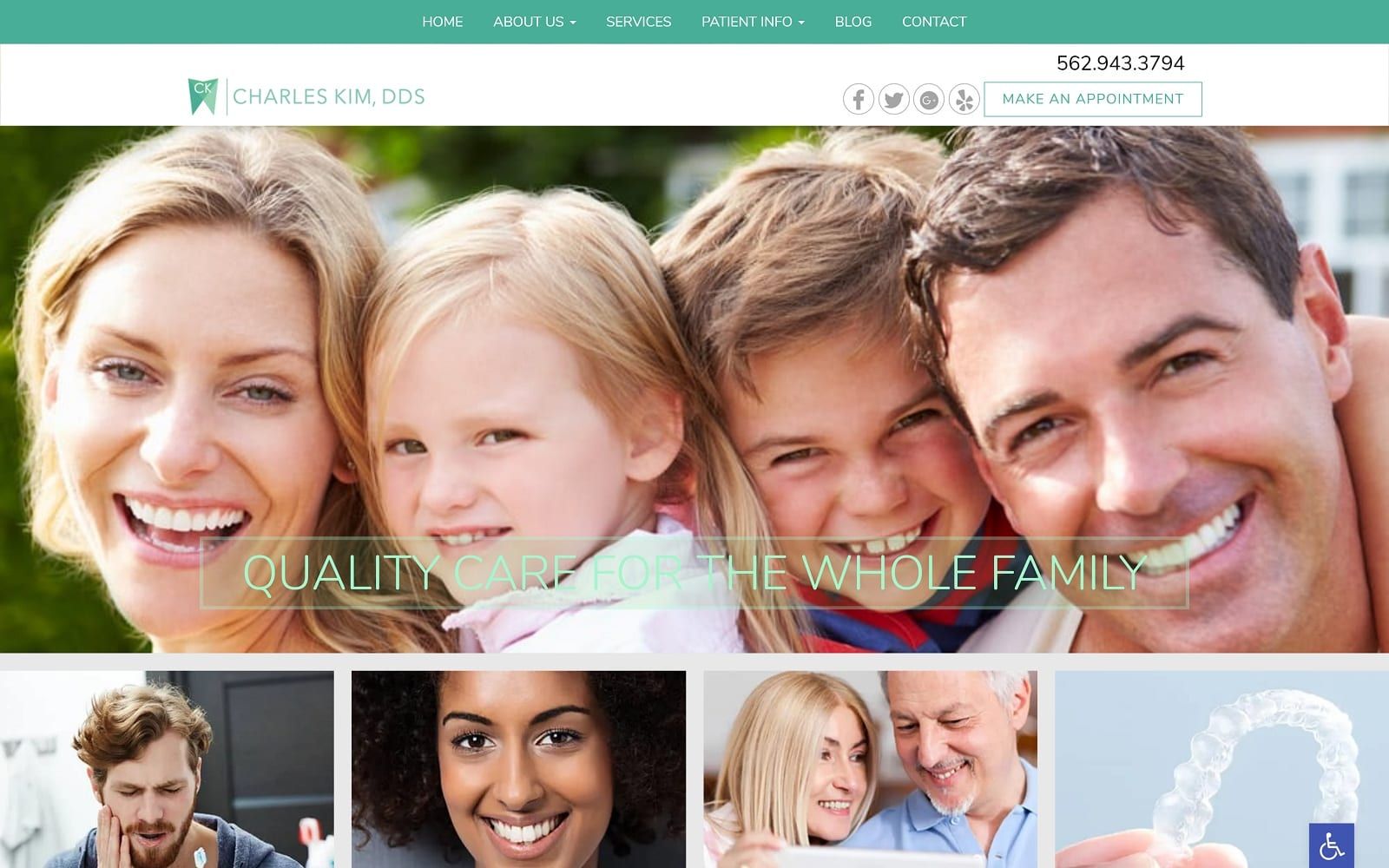
Use of Colors
Green and white are excellent colors to bring confidence and hope to those visiting the site. White ensures that the site is bright and uplifting, while also presenting a feeling of purity and professionalism. The green is primarily utilized through the site’s branding guide.
Design Elements
The wide navigation and clear white background also make reading easier to digest. Providing service is only half of Dr. Bloomer’s story. Providing patient resources to the masses is the other half of the puzzle. We made sure to add FAQs and informational blog articles (accessible through our sleek navigation menu) for easy access for incoming visitors. All the text and font throughout the website display professionalism and legibility – a clear reflection of the dental team in question.
Marketing Aspect
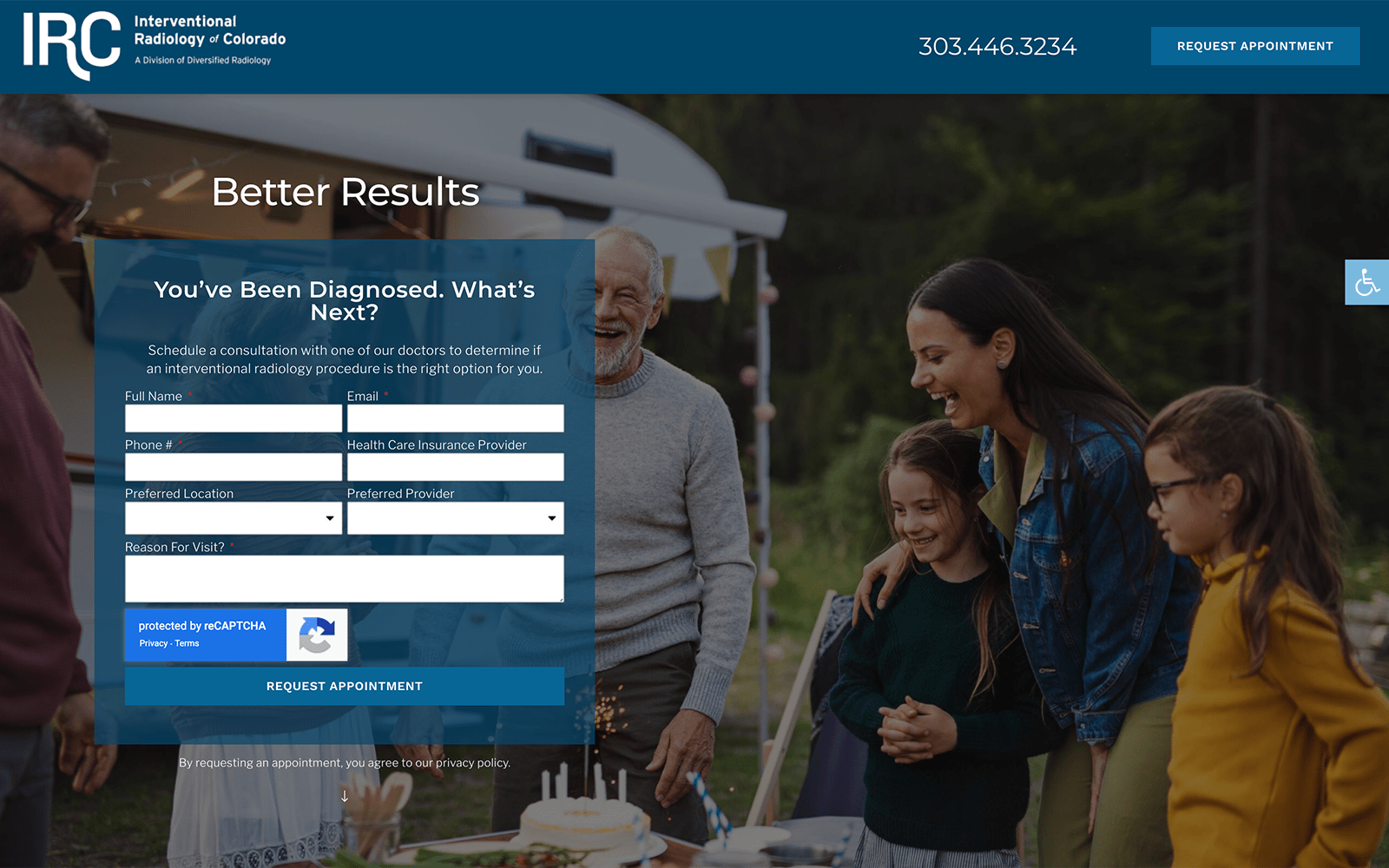
Patients also have incredibly easy access to the patient forms located on the navigation menu. Not only does this mean less time spent in the waiting room, but this also translates to more time with the dentist. To top it all off, Dr. Bloom understands how important it is to keep patient information secure. As a result, she has incorporated SSL Security onto her website. This means that valuable patient information will be inaccessible to hackers around the world.
Their image is gentle and so is their approach to marketing. Just like this approach does nothing to hinder their practice, nor does the gentle approach do anything to hinder their marketing. The subtle elements are there, properly placed keywords and headings that draw the customer in from web searches, but the site itself also carries off the target goal well.
At the bottom of each page, we also provided a call to action in the form of a directional guide and contact information. Soft yet prevalent links at the top that encourage inquiry, a phone number, and links to the social media platforms all hint at the desire to build relationships with the customer.
Image the Website Reflects
A gentle, approachable dental practice that invites you to become part of their family, and wants to become part of yours. Throughout the site educational information can be found without the use of bright, over-the-top pictures aimed at catching the eye and demanding attention. Visitors to this site will be picking up the phone to call a clinic they already consider an old friend, all thanks to the steady and comfortable design.