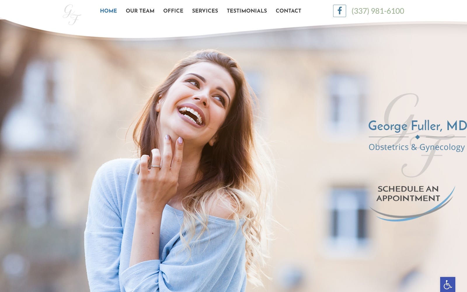
Dr. George Fuller specializes in obstetrics and gynecology. Having been providing compassionate quality care for women since 1985, Dr. Fuller prides himself in being committed to providing the highest level of patient care throughout the State of Iowa. We knew that when dealing with such a delicate and feminine field such as obstetrics and gynecology, we needed to design a website that was reassuring and comforting for the incoming web-visitors.
Design Overview
Obstetrics and gynecology work should always be taken seriously. You need to ensure that the doctor you are committing to is reputable, trustworthy, and experienced. We made sure highlight the services Dr. Fuller offered, along with previous testimonials on the navigation menu located on the top of every web page. To match the navigation menu, we added a rotating testimonial gallery and additional links to redirect new visitors to the different services offered.
Adding redirect links to your website is absolutely critical to promote engagement and SEO growth. For a quick FAQ video all about using redirect links for SEO, click HERE.
Use of Color
The website primarily uses a mixture of green and blue, set against a white background. Having a white background allows potential patients to surf around on the website without feeling cluttered. White also helps add credibility and professionalism as well.
Blue – We wanted to complement the specialty by using blue to soothe and calm the patients. Blue is synonymous with healthcare and femininity. We primarily used blue to highlight calls to action throughout the site.
Green – serves to add a bit of flair amidst the mixture of blue and white. Green is also associated with growth and healing as well. When used in conjunction, all the colors create a modern and cheerful environment for site visitors.
Images
Images are a great way to capture a reader’s attention. We made sure to use images that reflected the specialty at hand. Incoming visitors are greeted with smiling, joyful faces that can calm any sort of anxiety they may have. Under the our team tab on the navigation menu, you will also find actual images of Dr. Fuller and his team.
Elements of Design
The home page features popping special effects that help grab the readers attention to their call to action. We also made sure patients would have no trouble scheduling an appointment by adding a button to the home page. The services page features all the procedure options available to the patient. We also added an FAQ where applicable on the service pages.
Wherever you go on the site, the navigation bar will always be available to you on the top banner. Dr. Fuller’s site is also ADA Website Compliant. This means that his website is fully optimized to service to those who may have some sort of disability.
Marketing Aspect
Female patients who may be in need of obstetrics and gynecology work need to be catered to as soon as possible. We included a direct link to call Dr. Fuller’s office on the top banner of each web page. This also makes contacting the office much easier for mobile users as well.
Testimonials are also another great way to prove your experience and dedication to patient care. We made sure space out the testimonials with a square border and conveniently provided a contact form for patients on the same page.


