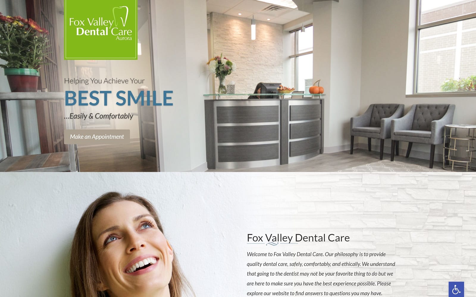
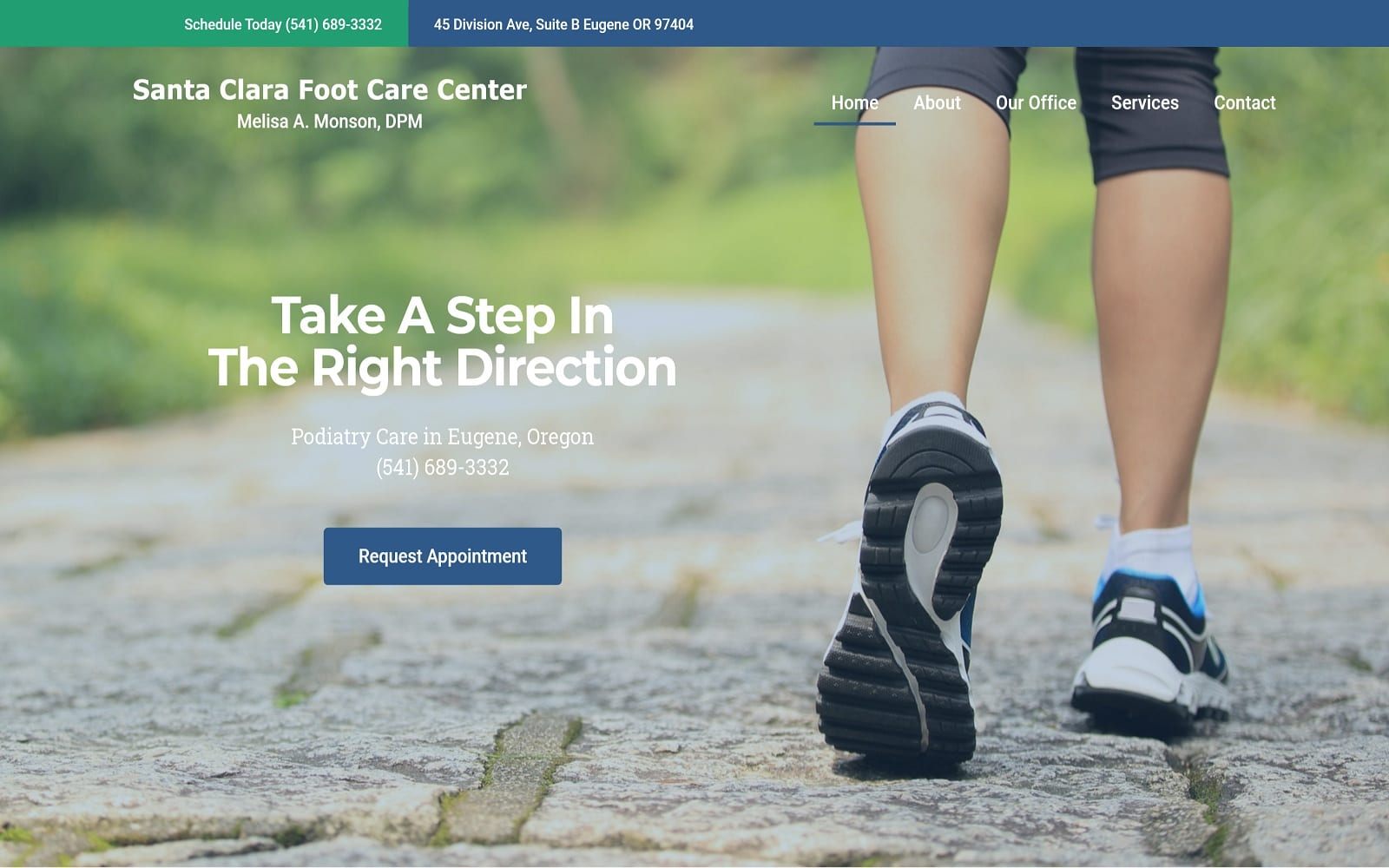
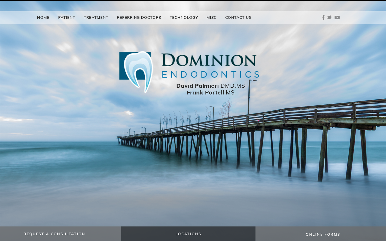
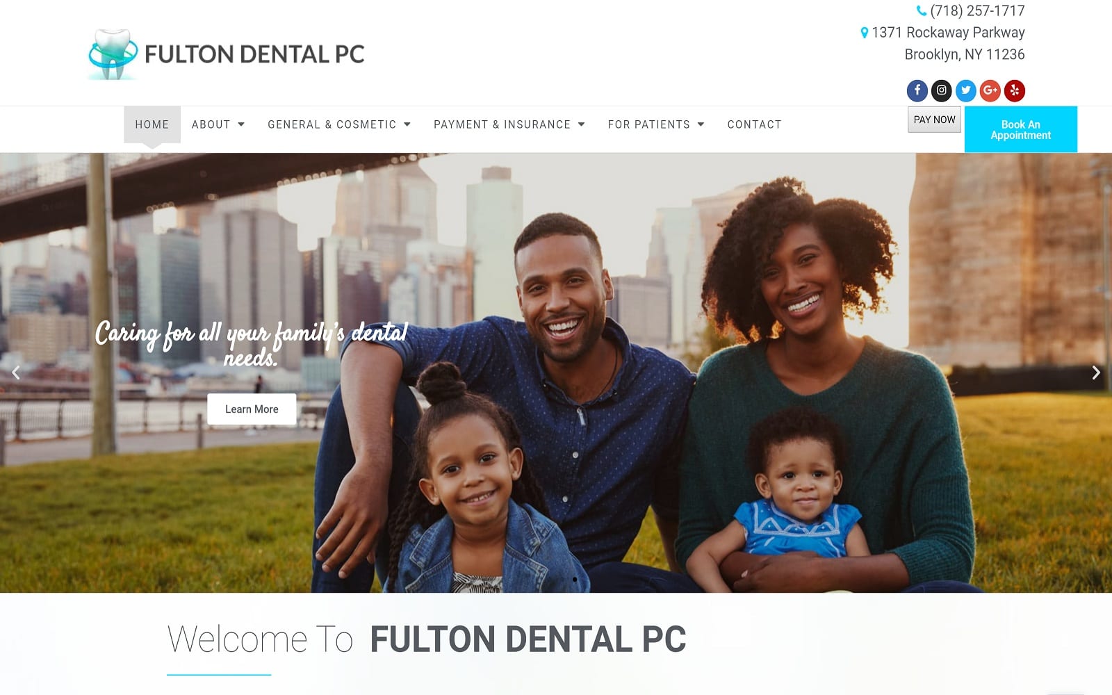
Fox Valley Dental Care cares about quality dental care. To provide a safe and comfortable approach to dentistry, the Illinois natives try their best to provide each and every patient with the best experience possible. They understand that going to the dentist can be a daunting experience. They wanted to create a website full of visuals and modern interfaces to help ease any uneasiness heading into their office.
Overview of Design
The doctors at Fox Valley Dental wanted a vibrant medical website using visuals and imagery. Their belief in a holistic approach to general dentistry is emphasized through these means. Plenty of white space throughout the site allows patients to easily read their practice information. The overarching design of the webpage incorporates a squared-off theme with a simple homepage. Simplicity is key in this situation. The navigation menu bar is a host to all sorts of additional information including biographical and educational information about the dental team. The personalized logo also adds a small touch of creativity to the already standout website.
Use of Color
To highlight the massive amount of visuals on the website, we opted for a basic color theme using only neutral tones. With the main focus on visuals, we did not want to overdo the colors. The last thing we want is to have both imagery and colors battling against each other and not working alongside each other. The visuals on the homepage light up in full color once you scroll over them. This helps add a small pop to the visuals in addition to all the other images on the page.
Design Elements
Fox Valley is a highly visual website with many modern design elements. most notably, visitors will notice the scrolling header images on the home page that fade into another. These images display the different services offered at the office. All of the images on the site are professional and reflect the different practices offered at the office. There go as far as incorporating some actual CT scans and x-rays within their website to make the procedures more relatable than other dental websites.
Space is expertly managed throughout the website. The ample amount of white background along the text helps the patients navigate through the site with ease. The contact page also has an interactive Google map for those wishing to find their estimated time of arrival to the office.
Marketing Aspect
As proven through their website design, patient care is Fox Valley’s number one priority. The articles tab on the navigation menu is essentially the Fox Valley’s blog. Blogging is one of the easiest and most organic ways to build your following and client base. The videos of the various dental procedures are a great way to show incoming patients what to expect.
Do you get dental anxiety while waiting to be taken inside from the waiting room? Help reduce this feeling by utilizing the patient forms provided on the site. This is a great way to speed up your treatment and help out the dental team in the process. Last but not least, there is an interactive map located on the contact page for those who wish to find out their estimated time of arrival.


