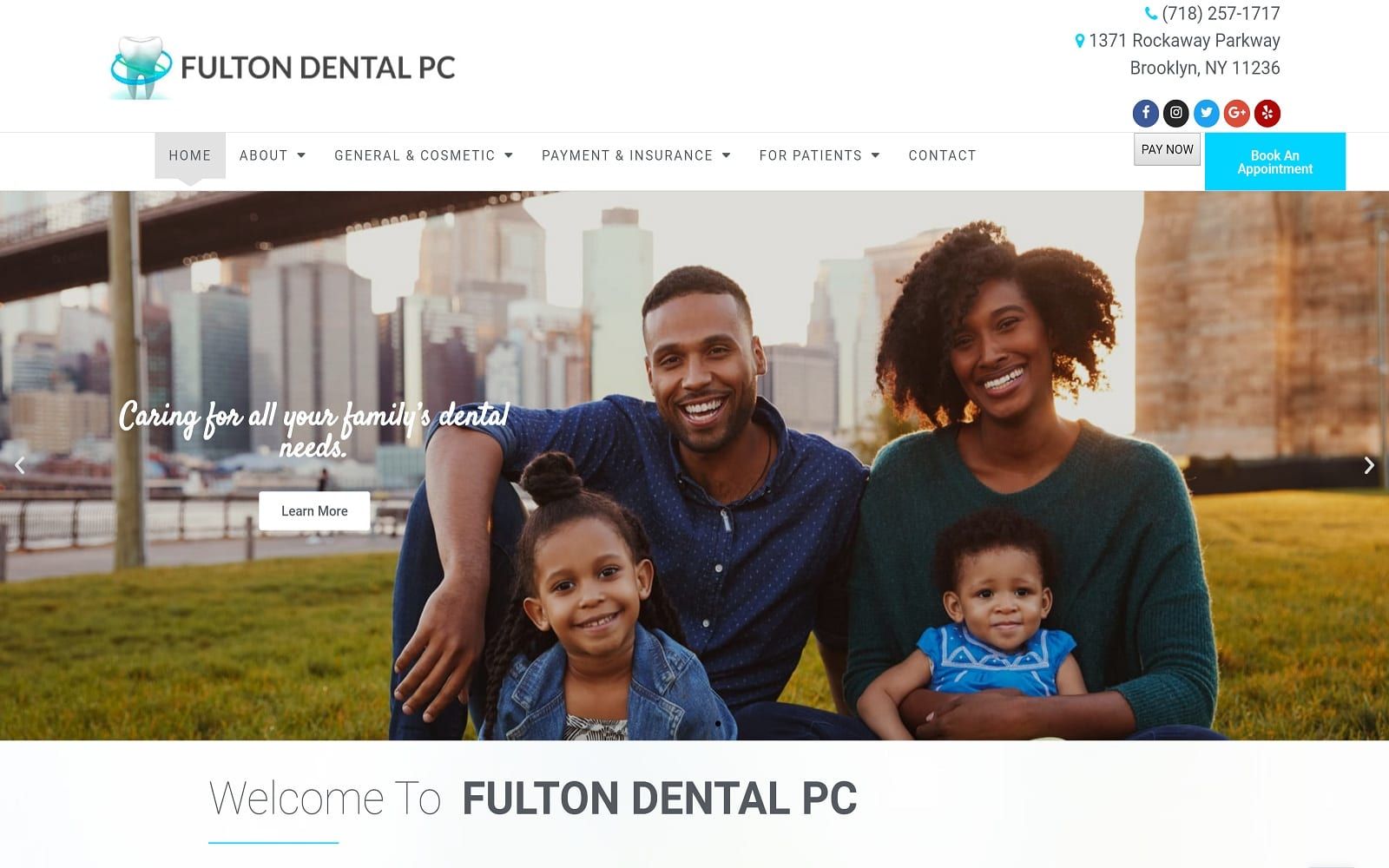
Fulton Dental PC was intended to grab the spirit of its community and bring it to the page, demonstrating that visiting this Brooklyn based cosmetic dentist office was a great choice. Throughout the site, you’ll find bright, welcoming colors, the city skyline, and clean welcoming offices. The end result is the perfect blend of effective and accessible website design and community connection.
Overview Of The Design
Fulton Dental went with some traditional design elements in their site, including the full-scale menu across the top, their prominent company logo, and a list of their contact information in the upper-right section of the first page. They also have integrated a payment method into their site, as well as a bright blue book appointment button. From the very first instant, the typical visitor has the ability to address any of their needs with a click.
Use Of Colors
White can be an extremely effective primary color in our site designs, and we feel that the Fulton Dental PC site uses it to its best advantage. Combining with the bright, friendly blue tone and a subtle brush of gray (mostly in the color of the text), this site is a piece of classic internet architecture.
• Contrast – White has the benefit of contrasting well with just about any other color combination, and it does an excellent job of highlighting everything else in this site. From the bright smiling faces in the hero images to the cheery blue buttons encouraging you to make an appointment, everything here really pops.• Action Oriented – Blue is predominantly used throughout the site to highlight those areas intended to draw customer interaction, especially the navigation buttons and the “How Can We Help You?” areas of the site.
Analysis Of Design Elements
The Fulton Dental site makes excellent use of some core elements in its design, including the placement of buttons, the overall use of space, and accessibility of information.
• Space – The site has a clean and open look, assisted by their choice of white as a primary color.
• Navigation – Navigation throughout the site is easy, with prominent links being displayed regularly, and the Book Appointment option always being just a click away.

• About Us – The About Us page is a comfortably direct approach for the customer, a simple statement about what they can offer and what to look for when trying to find the office.
Marketing Aspect
• Contact Information – The prominence of contact information throughout the site is a major part of its marketing design. A potential clients decision to make an appointment can be fleeting and impulsive, the ever-present ‘book appointment’ button makes sure they have time to act before the impulse passes.
• Concise Forms – When you provide a form for your customer to give you information through, it’s vital that you keep it clean, concise, and eye-catching so they won’t miss it or grow bored half-way through filling it out. The forms on this site are an excellent example.

• Testimonials – Word of mouth, even in digital format, is a great way to build confidence in your visitors. This site’s use of a scrolling bar of reviews from previous customers gives potentials a first-hand glance at the satisfaction your office provides.
The Image this Website Reflects
This site is bright, clean, and clinical while remaining friendly and down-to-the-point. The imagery of the city skyline connects it to its community, as does the imagery on the About Us page clearly showing the front door of the office. If you’re looking for a clean and concise site that’s easy to navigate, this would be an excellent choice.