New design idea

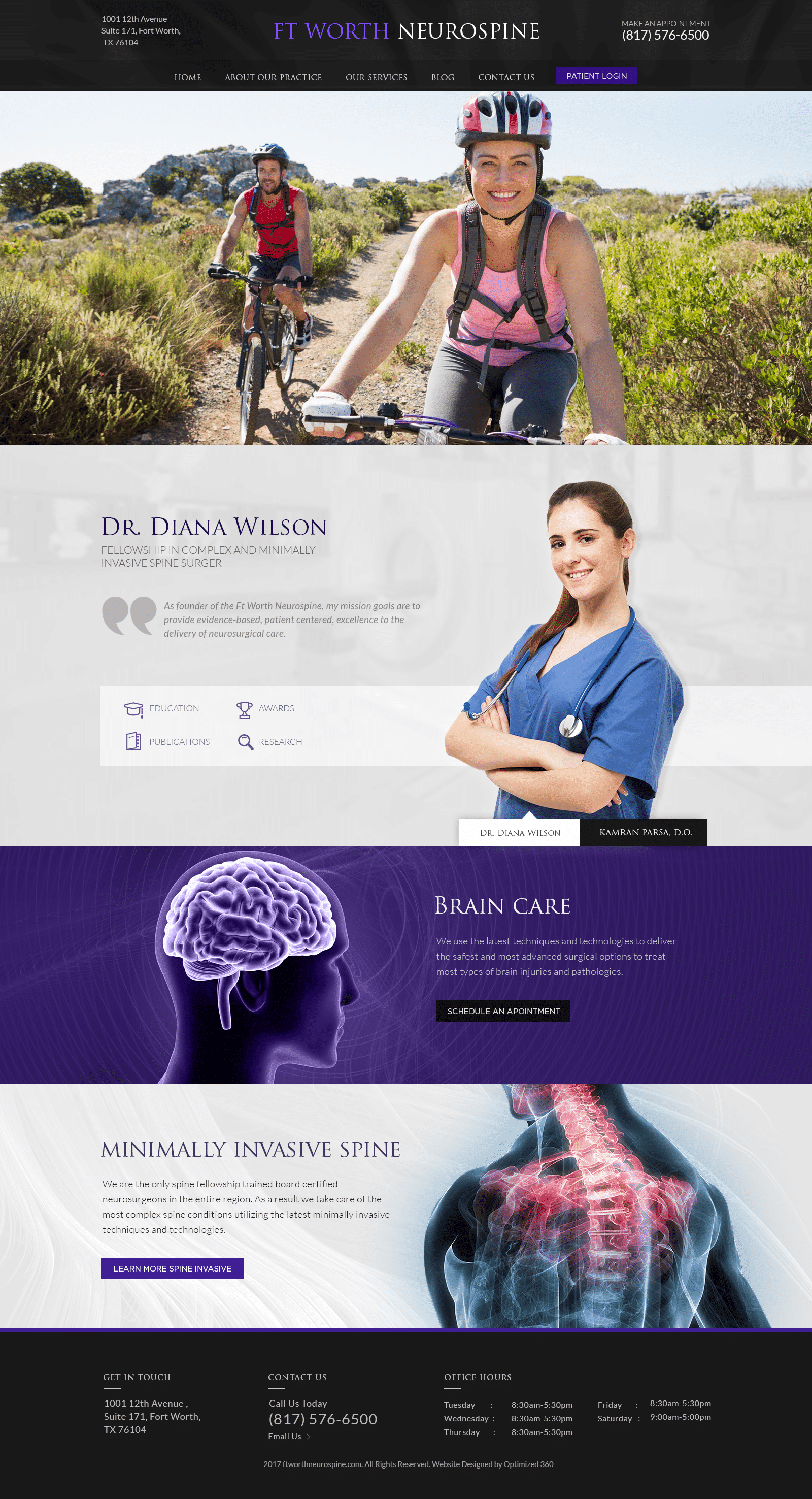
Forth North Neurosurgeons appeals to users with a sleek, elegant, but relatable design, using powerfully dynamic colors such as blue iris purple, jet black, and slate gray to draw in attention and approach its users with confidence and allure. As the action color, blue iris purple takes on the authoritative qualities of blue and the enigmatic qualities of purple and combines them in such as way that it creates a calming, meditative space for the user to interact with and engage with the website’s content. Its neutral compliments combine the elegance of black and the modern edge of gray to form a website that’s actively engaging, contemporary, and effective. Its imagery, both in its presentation of people and its medical descriptions, work to interconnect and educate its users on its services. Its presentation of its services provides clarity, remaining diligent in its image.
Forth North Neurosurgeons website design establishes a confident opening by immediately introducing the user with its header, which contains elements such as its business logo, click-to-call service number, main menu services, and its patient portal. Its hero image showcases its target audience and does not use any introduction text or action buttons, thus allowing the user to fully encompass the image in its entirety. Throughout the home page, users can interact with various action buttons that detail content, such as the business’s doctor’s biographies, appointment scheduling features, and their methods of minimally invasive spine procedures. At the footer of the page, users can get in contact with the business through its click-to-call service number and click-to-action email address.


