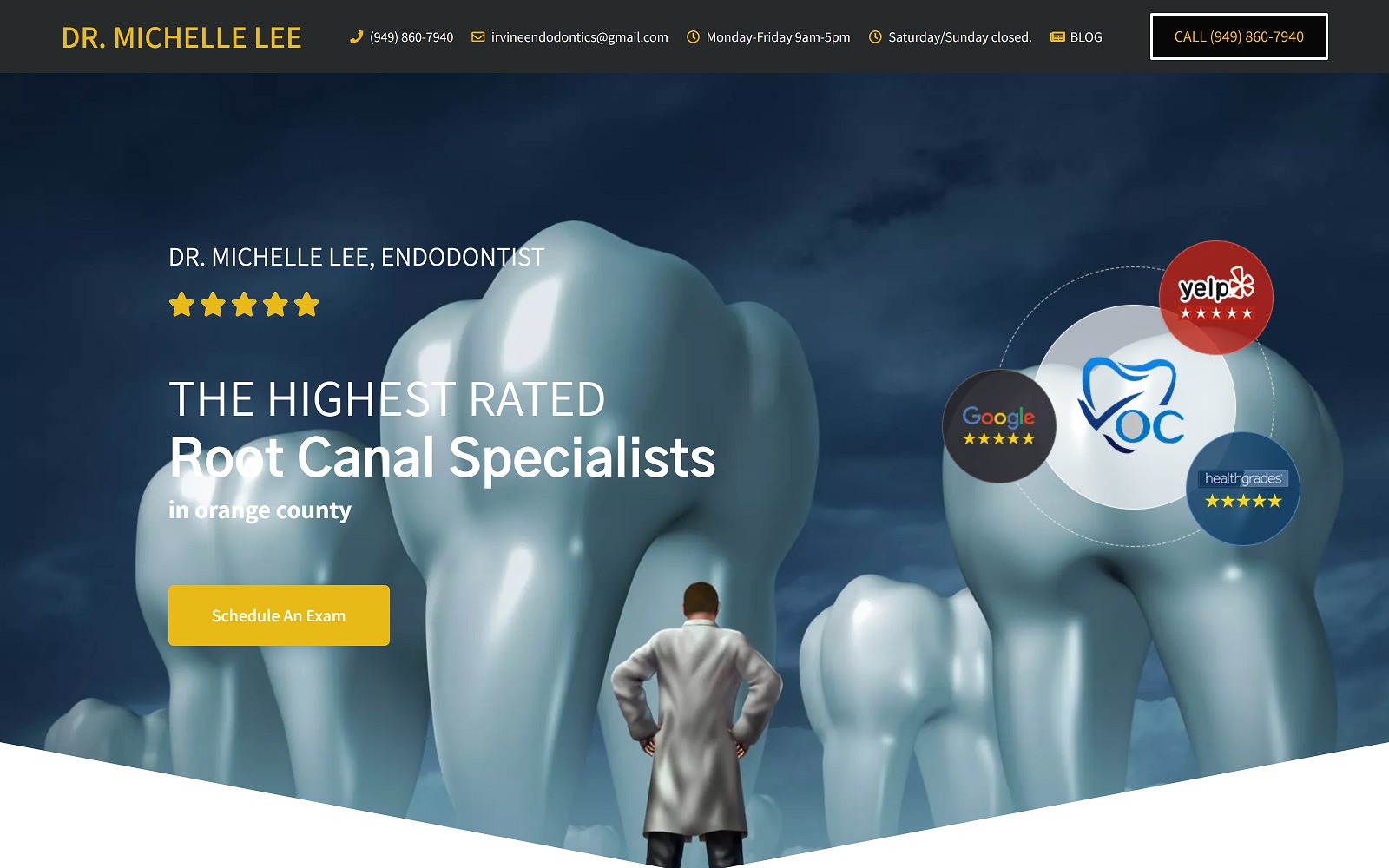
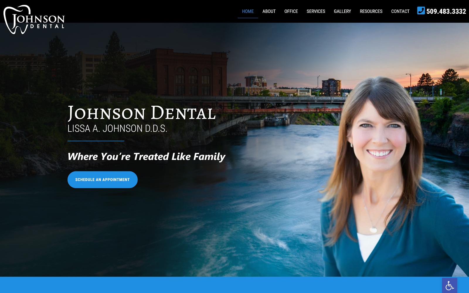
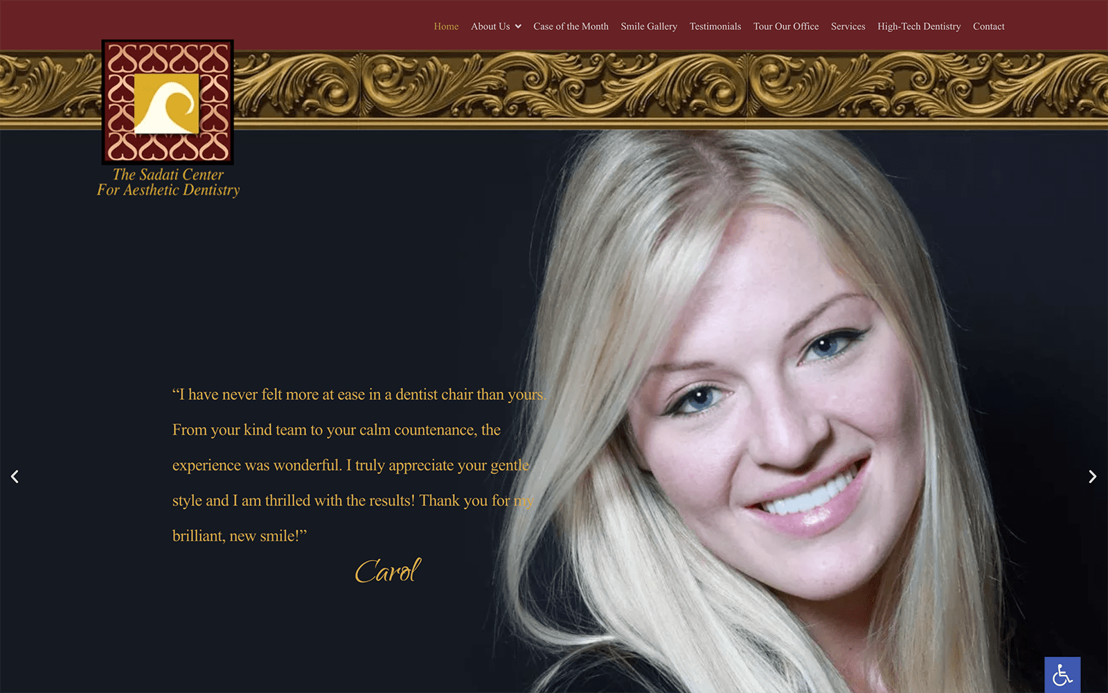
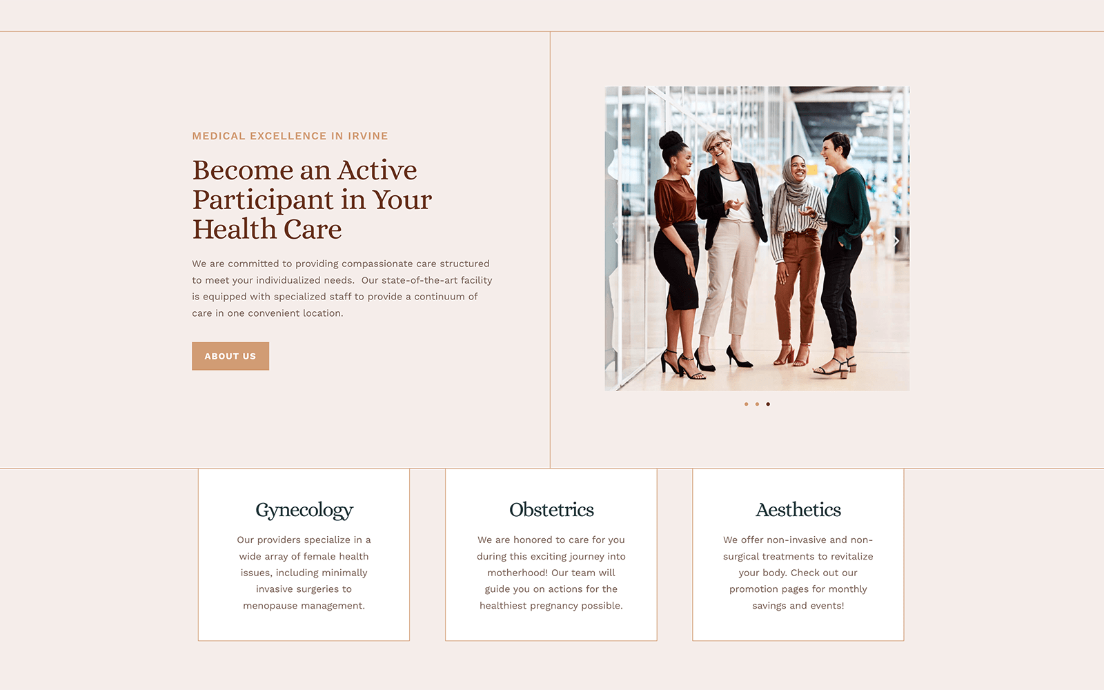
Root Canal Treatments may sound intimidating to patients, therefore, we have designed the site in blue and white tones to provide a calming experience on the website. This endodontist’s website has had extensive SEO applied on-site and off-site via Social Media, Google Listings and much more. Our detailed SEO programs resulted in Irvine Endodontist being on Google’s top pages. If you are in Irvine and looking for a root canal specialist, stop by Dr. Jason Cho’s modern Endodontic office.
Design Overview
The arching overview of the website is interactive and modern. With a simple layout and design, our goal for this project was to appeal to a modern-day crowd with informative videos and navigation. The digital video and catchphrase instant grabs the audience’s attention. Links to the client’s social media and achievements are easily accessible for the incoming traffic as well. The design is simple, yet extremely modern; excellence in modesty. The achievements scattered throughout the landing page is more than enough to accommodate for any sort of additional glam and glitz.
Use of Color
As an endodontist, the main color palette used in this project was primarily white and blue – both synonymous with being affiliated with healthcare. When we work with many of our health-care focused clients, we try to implement a softer color scheme to elicit a softer vibe. The colors here help keep the eyes focused while not coming off as too dark to read, but light enough to actually read. Blue is associated with comfort and healing – we splashed in blue with a white background to ensure that it would fulfill the proper look for a root canal treatment.
Marketing Aspect
Every client has different needs and goals within their project. Depending on the different variables involved, we tailor to the website design accordingly. For this site, in particular, our main goal was to smash all other root canal websites by honing in on creating an innovative and interactive site that would generate attention. It is sleek; simple; effective. The homepage covers an insane amount of information on its own. Establish credentials, establishing a call to action, establishing products and services offered, and even showing off the wonderful staff. Keep in mind, this is only the homepage! Imagine all the other design elements involved on the other pages!
When it comes to marketing, the website features an interactive ‘Make an Appointment’ widget always available to the incoming traffic. Near the top of the website page, the client’s phone number is clearly displayed with another booking form right next to it. Testimonials are clearly displayed on the landing page along with procedures they offer conveniently right next to it.
Website Images
The website portrays the team accordingly. It is laid back and informative – incorporating social media and testimonials throughout the site. The color scheme is soft and does not draw attention to itself. For sites like this where the client can boast on achievements alone, there is no need to go all-out of the color. It is modern, informative, and concise; a direct representation of root canal specialists themselves.


