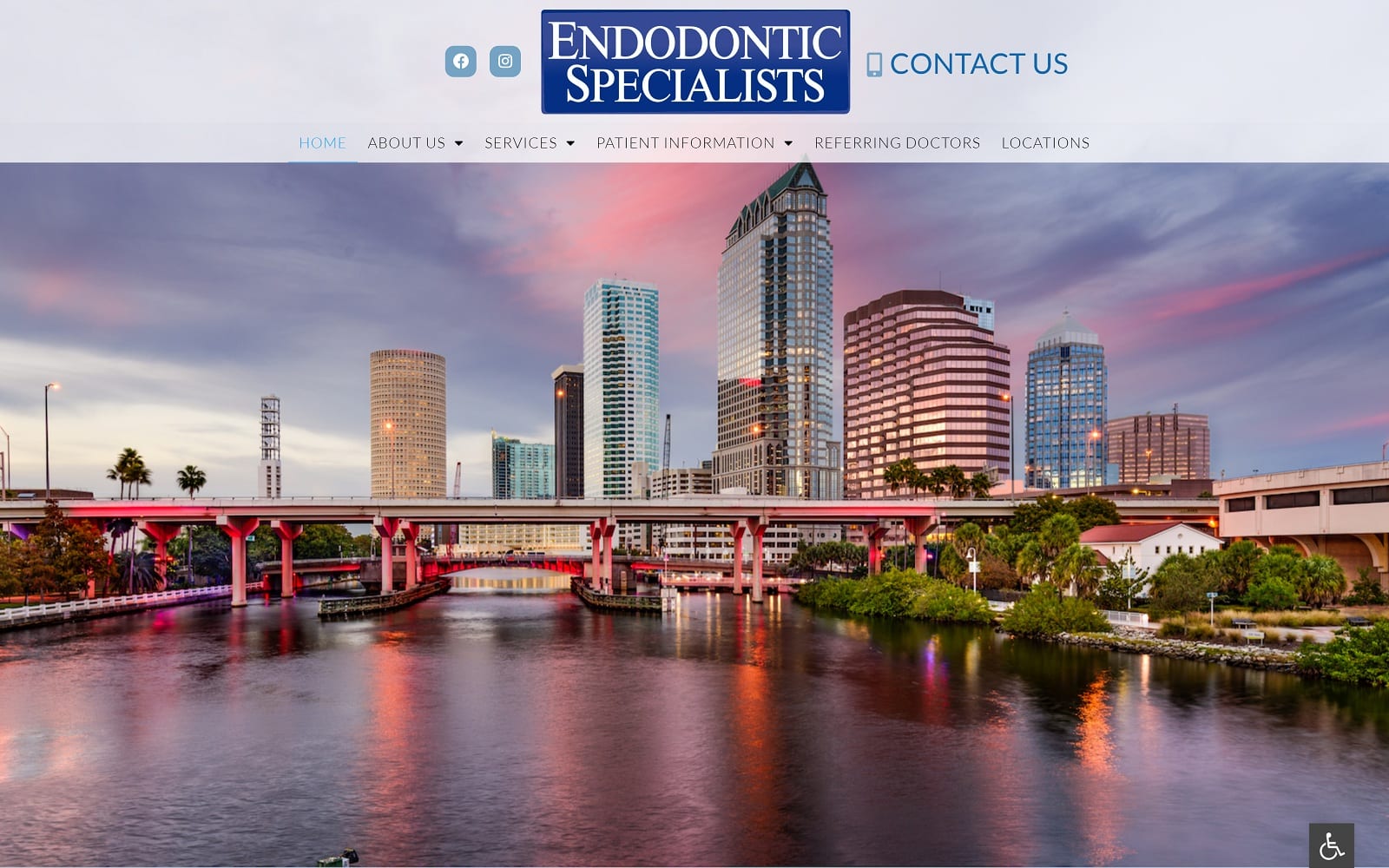
Beautiful imagery greets patients in the hero slideshow, highlighting the beauty of the Florida area local to their offices. This combines with a subtle white and blue color palette that helps to create great contrast for text. The blue element helps patients feel hopeful that working with Endodontic Specialists will ensure they see great results and get the smile they’ve always wanted. The service pages provide a clean and open minimalist experience that helps the patient easily gather the information they’re looking for. The videos on the service pages help give the site a modern and up-to-date feel while helping visitors gather more information about the services they’ll receive with this clinic.
Endodontic Specialists opens its endodontic website design with images of its local area with people experiencing an active lifestyle in the Florida sun. These steps help to build locality and rapport with its target audience by building a framework of relatability. The site goes on to show that they care about the voice of their patients by transitioning immediately into a testimonial slideshow. The site uses a minimum of text on the main page, letting the testimonials and imagery used in the site speak for itself. Once away from the home page, there is abundant information available to the patient seeking to learn more. These pages are tailored to the inquisitive visitor by using more text and less imagery, focusing on providing good data. Direct-to-map functionality is integrated to ensure patients can easily get to any of their multiple locations.


