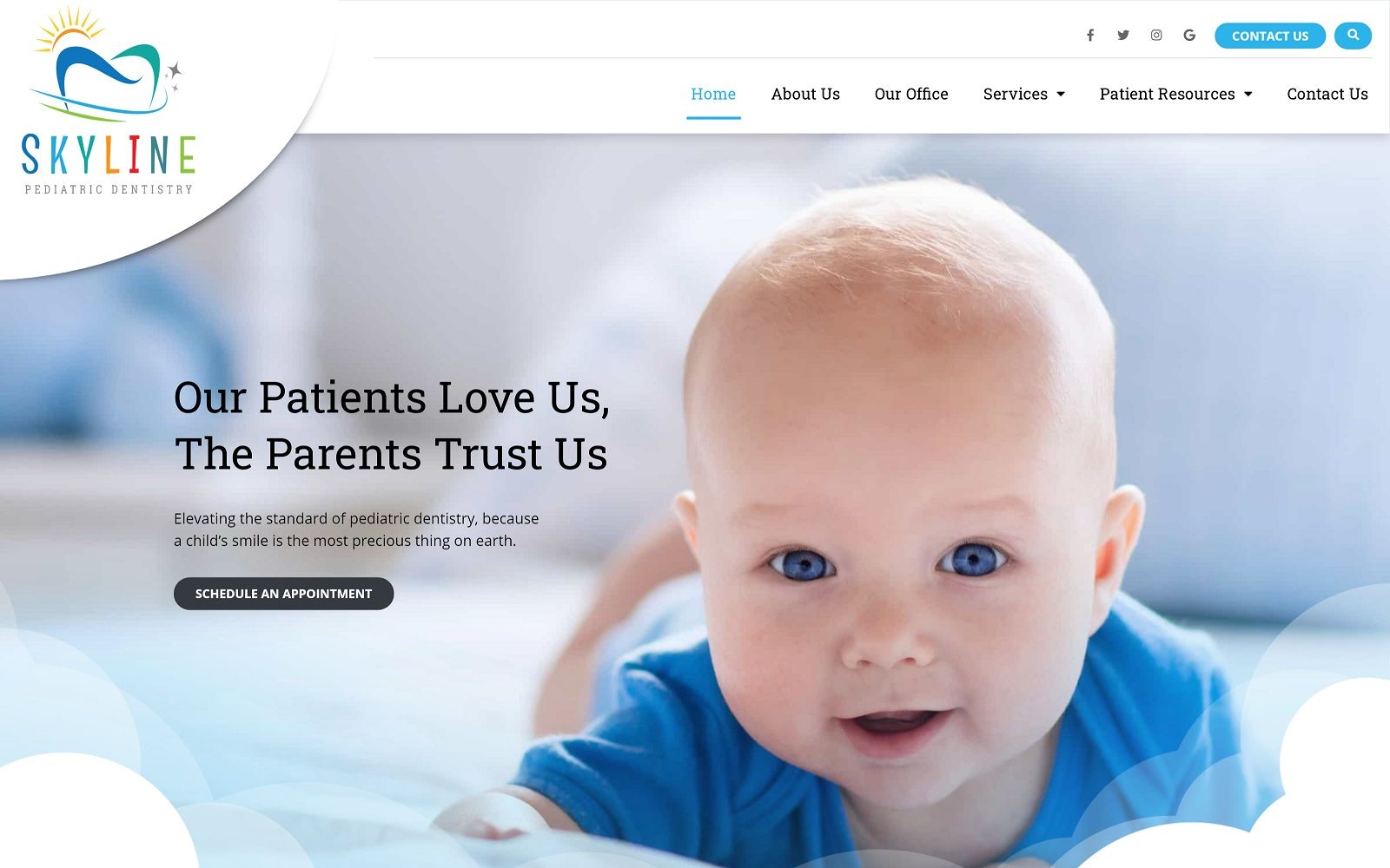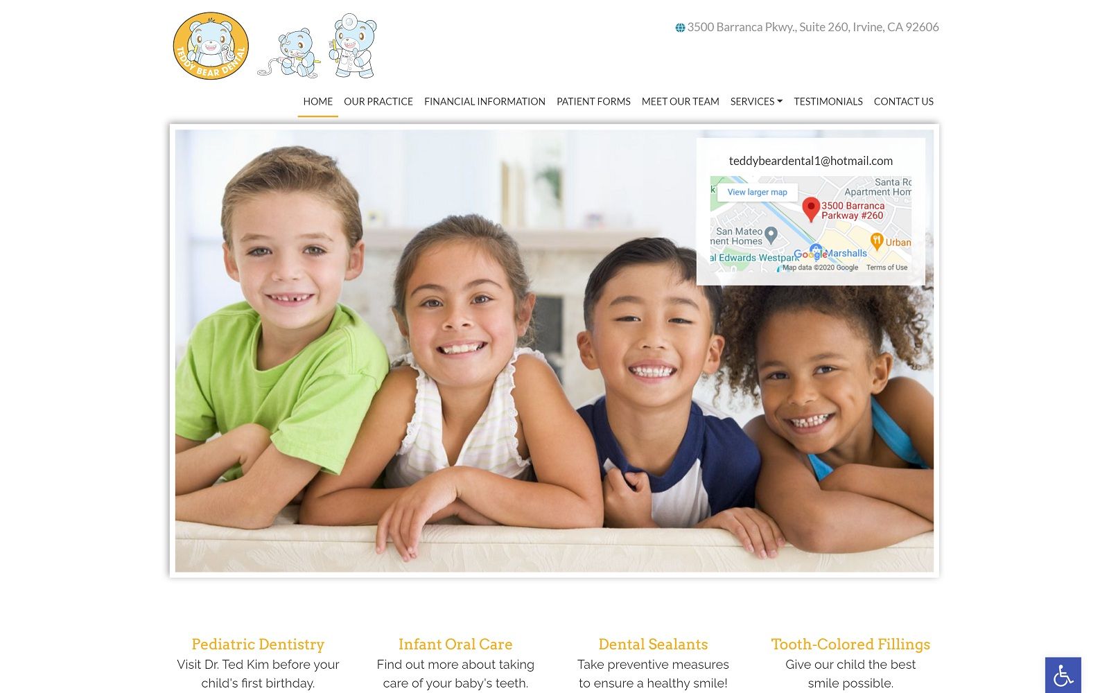
Teddy Bear Dental appeals to the adolescences and parents with its pure and modest imagery and color schemes, working with a golden yellow, baby blue, and turquoise to accomplish these ideals. Golden yellow contains warm undertones that associate with energy and vitality and is used as the action color to inspire happiness and boldness. Baby blue helps to appeal to children, and is a color commonly associated with children, and thus is used as an accent color. Turquoise acts as a tertiary color, complementing the warmth of the yellow and the cool shades of blue to radiate friendliness, happiness, and clear thinking. Its imagery targets parents of children, and appeals to a child-like state that’s playful, innocent, and joyful. By using bright, bold color choices, and complimenting it with innocence scenery and energizing photography, Teddy Bear Dental brings exhilaration and glee to its overall pediatric website design, thus complementing its image.
Teddy Bear Dental motivates its users to engage with its website, beginning with a solid, white header, containing the website’s business logos and main menu services, which transform into a hamburger menu on mobile devices. Its hero image contains a white background filter, showing the website’s logo, introduction text, and an action button for scheduling appointments. Images act as the background for sections of the website to help accent the website’s information, and its services section featured semi-flat panels that show the action button when hovered over. Near the footer of the page, the HIPPA secure form can be filled out, along with the website’s google maps widgets, contact information, and accessibility tool.