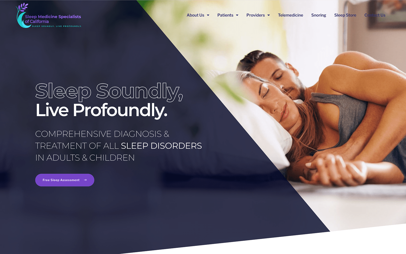
New design idea
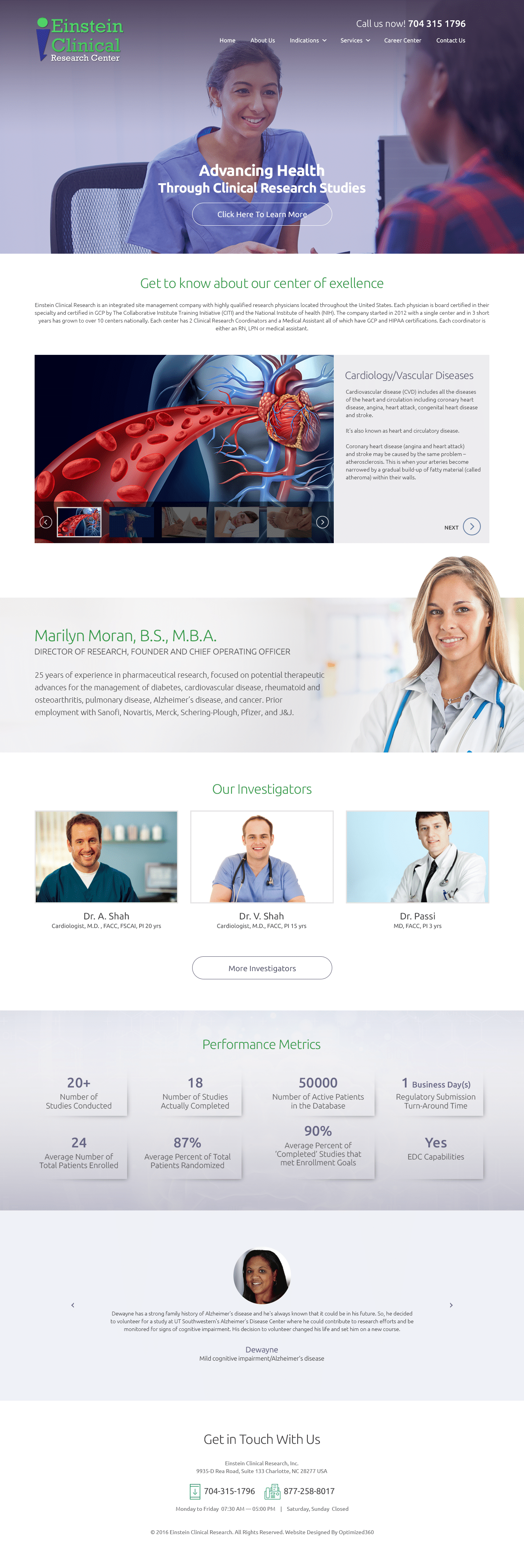
Einstein Clinical Research Center remains steadfast and dependable and shows these qualities through its color palette and design elements. Its color palette, comprised of Kelly green, cool gray, and white-smoke, combining serious hues with a touch of ambition to form a renewing atmosphere that’s competent and efficient. Kelly green, incorporated in its business logo and action buttons, helps to stimulate and modernize its home page, attracting viewers to its services and capabilities as a result. With the cool gray, which denotes tones of authority without overwhelming, and off-white, with adds subtle layers of depth and transition, the color palette ultimately forms a cohesive and professional space to represent its company image. Einstein Clinical Research Center thus integrates faint design elements, all of which conjoin with one another to form a bond of trust and dependability immediately to those who visit.
Einstein Clinical Research Center establishes its medical research website design by beginning with a transparent layer that lays the foundation for its web content, including aspects such as its company logo, click-to-call service number, and main menu services. Its hero image contains an action button, allowing visitors to learn about the center and its history. Each of its sections thereafter contains design elements such as slideshow presentations, overlay images, and action buttons for its services, doctors, and statistics. After the introduction of its head doctor at the center, the footer then encompasses the rest of the home page, including aspects such as its click-to-call service number, fax number, operational hours, and address.
