New design idea
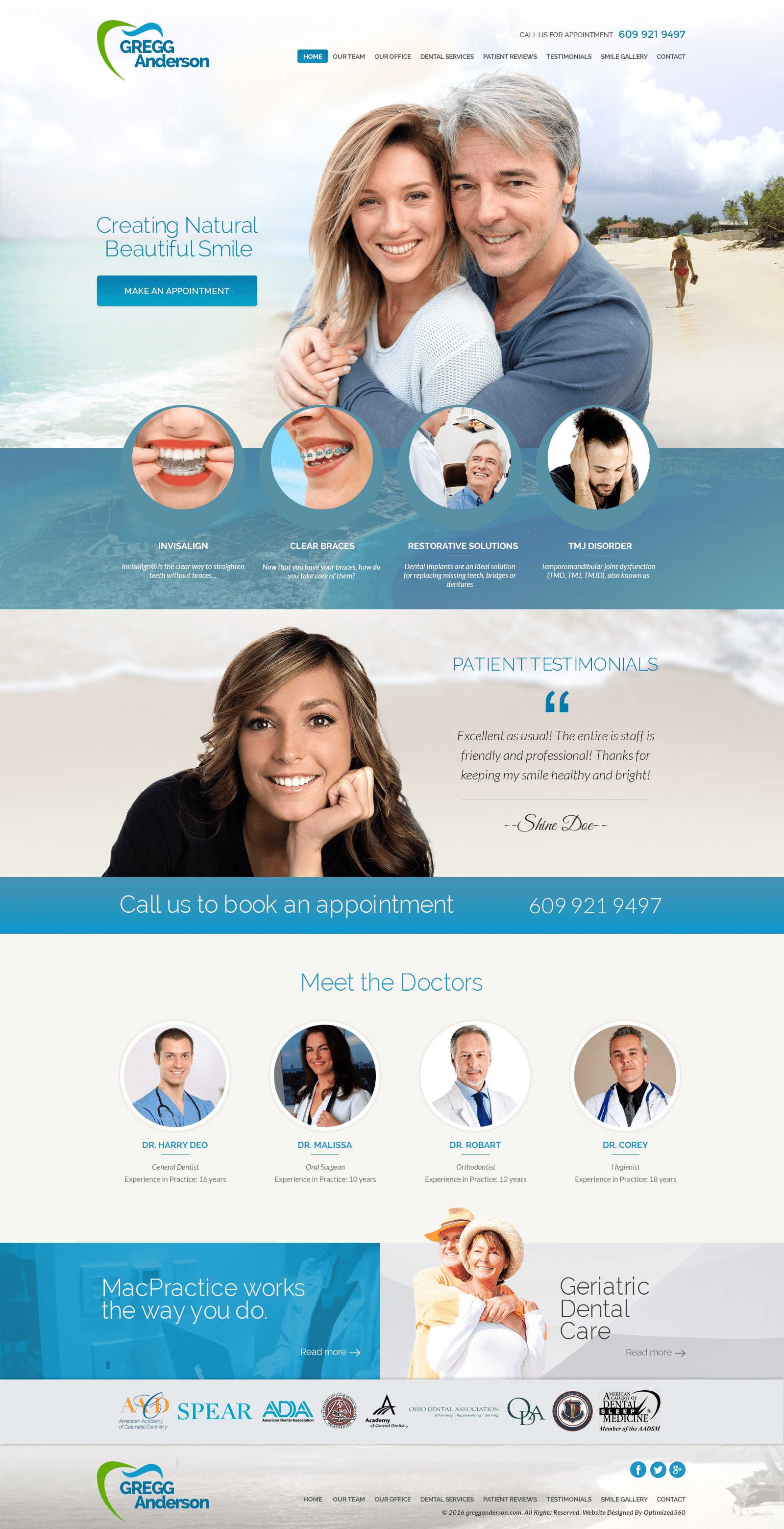
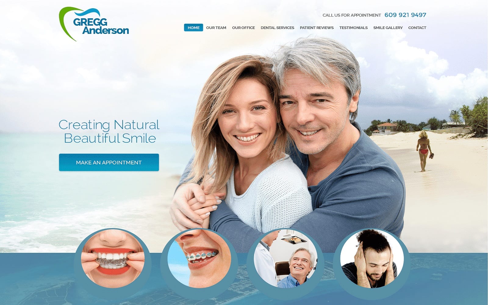
Dr. Greg Anderson attracts users to his website by including sea-themed imagery with traditional dental color palettes, including shades such as blue-green and beige to peak interest. The website utilizes the impressions of the beachside with its choice in photography, using the beige-color sandy beaches as backgrounds to highlight the effects of the blue-green. Blue-green is used as a color commonly found in nature but also connects with its dental profession through its cooler, greener shades that symbolize relaxation, cleanliness, and purity. Its color scheme and choice in imagery aims to alleviate worries, forming its web page into a picturesque space to learn and receive care. Blue-green’s presence as both the action color and primary color gives life to the website, directing the user’s eye towards every part of the page.
This medical website design is set in motion by using a transparent header, containing the website’s business logo, click-to-call service number, and main menu services. Both the home page link and the click-to-call service number are highlighted in blue for emphasis. Its hero image lays as a background for the header as well as the rest of the page, showcasing its introduction text and an action button for scheduling appointments. Below the header, its services are previews with semi-flat design, allowing users to engage with the website’s content and lead their view towards the rest of the website. About halfway through the page, a banner presents a click-to-call service number for contact. At the footer of the page, social media icons, as well as their main menu services, can be found for further information.
