Dr. Hadfield works in a specialized field where he is faced with people battling chronic pain. Dr. Hadfield uses his experience and a comprehensive treatment approach to help find relief for his patients. As with all forms of functional or alternative medicine/services, gaining the trust and commitment of the patient is the initial, and most important step of the process. We made a website that would help reassure and comfort patients with its informative web pages and easy-to-navigate layout.
Overview of the Design
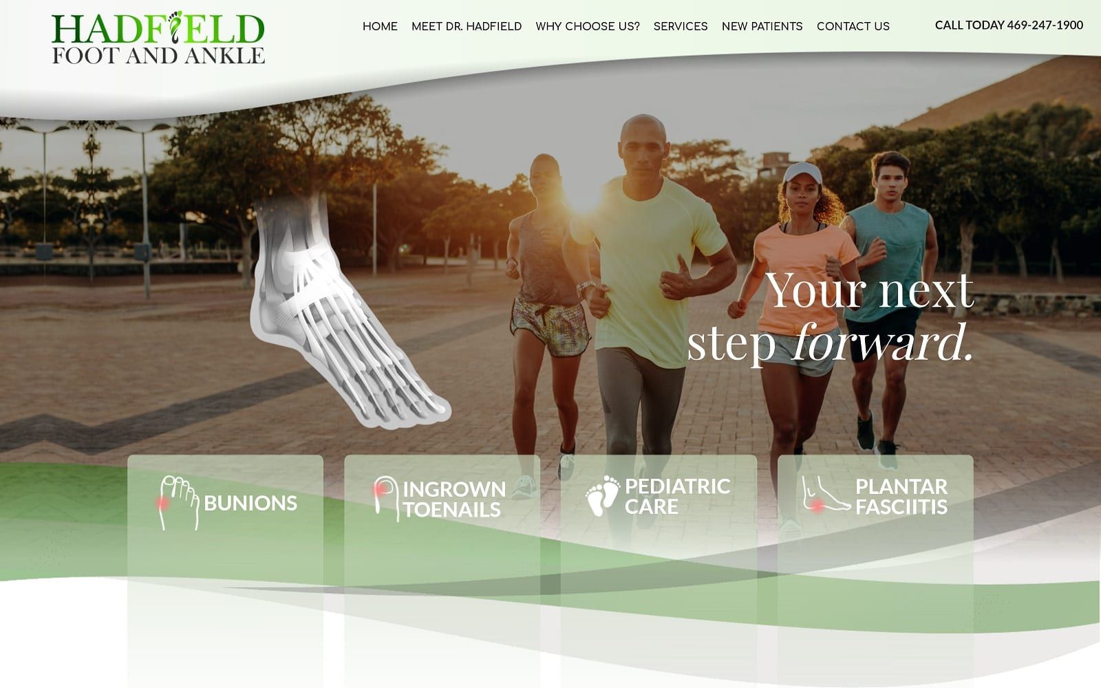
Dr. Hadfield is a podiatrist, he understands that foot and ankle issues decrease his patient’s quality of life. His website is made to help streamline the waiting game and get patients into his office as soon as possible. The homepage alone is very simple and aims to provide a mission statement and some of the key services offered at the office. When dealing in a niche that already has invested patients, you want to make the process as easy for them as possible. No need to go overboard on the glitz and glam when your experience and track record will do the talking for you.
Use of Colors
Based in the outskirts of Texas, we implemented a green color theme that would help add a sense of community to the website along with matching the overall branding. Green helps add a sense of professionalism along with compassion when done properly. We utilized the forest-green to help balance out the white space along with the text and help bring attention to the call-to-actions listed throughout the website.
Design Elements
The design of this site is very open and bright with a streamlined approach, at no point is there too much information presented, the overall feeling being one of efficiency and minimalism. Websites like this will appeal to professionals from every walk of life, encouraging them to bring their friends and family in for reliable and consistent treatment. Contact information, including a map showing the area around the location, are displayed in a very subtle way, nothing is up and in your face. This demonstrates a sense of respect for the visitor and indicates that the site is aimed at patients who know what they want and are looking for providers that understand that.
Marketing Aspect
The website for Dr. Hadfield is conveniently protected by SSL security. This is represented by the little lock displayed near the URL bar – a great way to prevent sneaky hackers from leaking important customer information. The overall vibe of the website is made to be friendly and accessible to both the young and old. Since pediatric care is held at the office as well, we wanted to ensure that we marketed for everyone.
The website is also equipped with ADApt technology – ensuring that potentially disabled patients get the full website experience as well. The ADA logo is conveniently located on the bottom right of each web page and allows patients that require additional assistance to adjust the text and images accordingly.
Image the Website Reflects
The website reflects a warm, positive and safe place like home. The fresh soft-color palette pictures are attractive and inviting. The visitors feel a sense of connection with the doctor through those smiling faces and active bodies on the website. One important aspect of the website is that it succeeds in creating the homely vibe making the visitor easy and comfortable to visit the facility without the scare of a “normal” doctor.