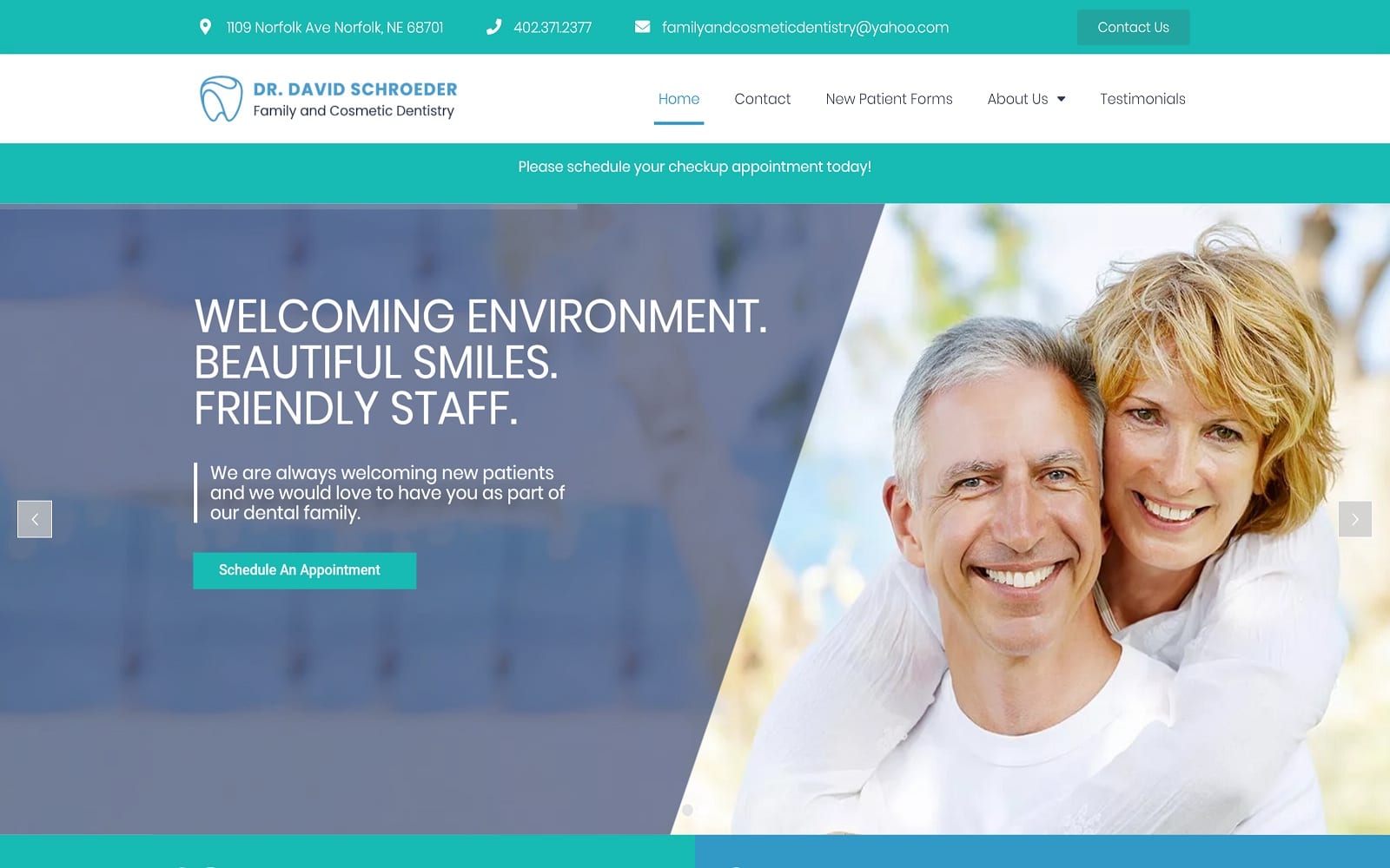
The medical website of Dr. David Schroeder has a classic medical appearance that is immediately recognizable to patients. The blue and white tones give it a clean and clinical feel while the images provide a welcoming warmth that patients seek in their dental care. Stylized icons are used to highlight important information and links to service pages. Blue, in its many shades, provides excellent contrast and draws the eye to areas where action is needed on the part of the visitor. The service buttons feature a subtle blow-up on mouse-over reaction that entices visitors to click thru and learn more. Patients are introduced to the clinic through the images provided on the Our Office page, showing a brightly colored child-friendly environment.
This website’s design is focused on delivering valuable information to its visitors in the form of images, comprehensive services pages, and built-in patient forms. These forms are used to help patients make the most of their visits by arriving prepared with no time wasted at the office filling out paperwork. The mouse-over reactivity of sections such as preventative care and cosmetic dentistry is used to draw patients in and have them curious to learn more about the linked services. Direct-to-map integration combines with click-to-dial functionality to make scheduling appointments and navigating to the clinic a matter of a couple of swipes of the finger.


